Year: 2014
Tags: Art Direction and Design, Brand Narrative, Digital Activation, Strategy and Design Thinking, Editorial design, Web development
-
 Share
Share
2,588 views
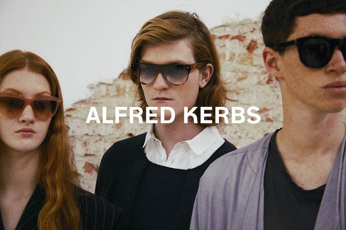
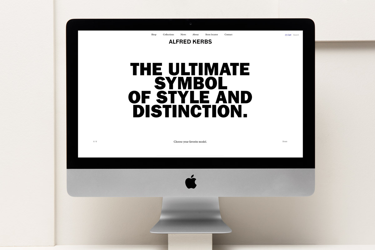
An enigmatic figure, an ultimate symbol of style and distinction
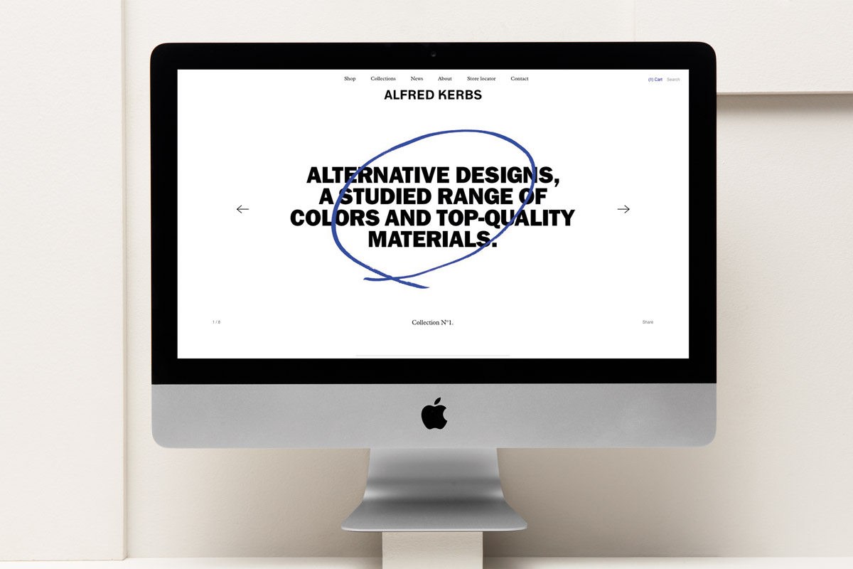
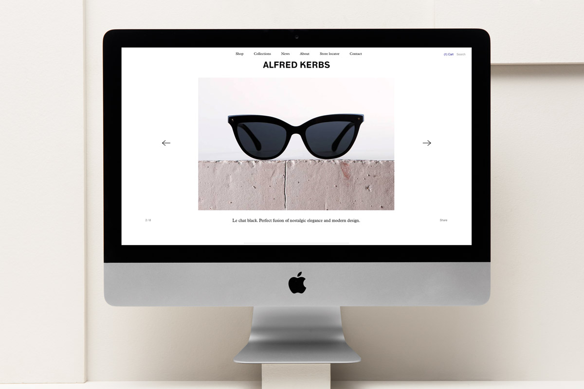
Imbued with charm and mystery, Alfred Kerbs is not an easy man to define. It can be hard to say who he really is, but it’s not difficult to understand what he stands for. As his enigmatic biography states, “Alfred Kerbs was born in Barcelona and now he is planning to conquer the world. Alfred Kerbs is an aesthete. His sunglasses are the ultimate symbol of style and distinction. Alfred Kerbs is a perfectionist. Alternative designs, a studied range of colors and top-quality materials. His creations are objects of seduction.” With the mission of establishing a new contemporary stylish symbol, the team of creatives and designers behind Alfred Kerbs’s enigmatic figure wanted to build their eyewear brand upon the concept of laid-back elegance, rationality and peculiarity.
A step backward
Initially, Alfred Kerbs partnered with Folch to conceive, design and create a website for the up and coming company. The primary aim was to launch the new brand, give it visibility, grow its reputation and add value to the website and Alfred Kerbs believed Folch could achieve this. From the initial meetings we felt that their current logo wasn’t working. We detected some problems by analysing the logo from different angles. It wasn’t just the the style and the aesthetic but issues with readability and reproducibility onto sunglasses became apparent. In order to clarify and communicate the issues with the current visual identity, we compared the Alfred Kerbs brand to that of its competitors and figured out where it would position amongst these other brands. Everybody was then confident and convinced that renewing the corporate identity was necessary.
Inspired by the values of accuracy, trustability and rationality we were seeking elegance by paying attention to the details.
An identity with attitude and elegance in the details
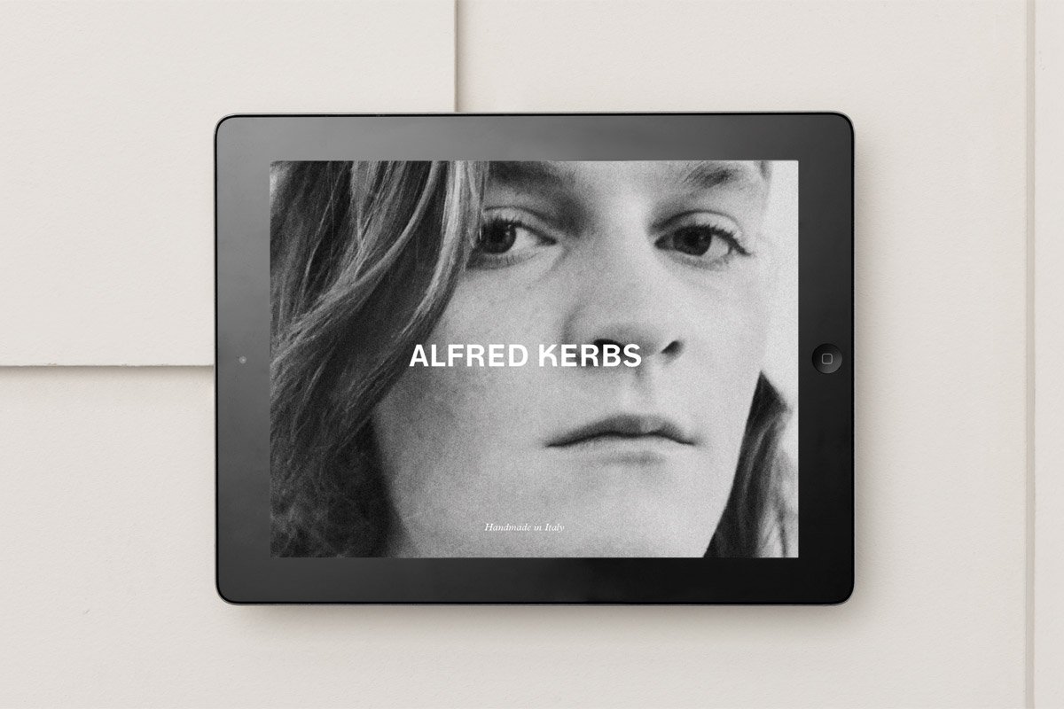
For the Alfred Kerbs logotype, we chose a newly restored classic typeface as a basis for applying the brand values. The goal was to “humanize” the forms of a grotesk classic — Neue Haas Grotesk which was redesigned in 2007 by Christian Schwartz — and in turn achieve a gesture in the typographic detailing. In order to achieve this level of detail, harmony and the perfect balance of features, several hand drawn sketches were made. Thereafter, the digitalisation process started and every detail was carefully crafted. The customization of the “K” character gives the logo personality, freshness, uniqueness and an all important attitude. In application, the identity is limited to black, white and a bold blue, adorned with some handwriting and manual gestures, giving it an elegant but ironic vibe. Also, to give greater dynamism, we selected a set of typefaces which would have a specific use in each application. A serious yet charismatic and likable typeface — the ITC Franklin Gothic Heavy — is used for visual and most impactful communications while Plantin Std Light brings a functional elegance, credibility and an attitude. The old-style serif typeface, designed in 1913 by Fritz Steltzer, is used for long and short text.
“We had three main concepts in mind: make the brand recognisable, establish Alfred Kerbs as a reference in the eyewear and fashion world and to create an efficient shopping experience.”
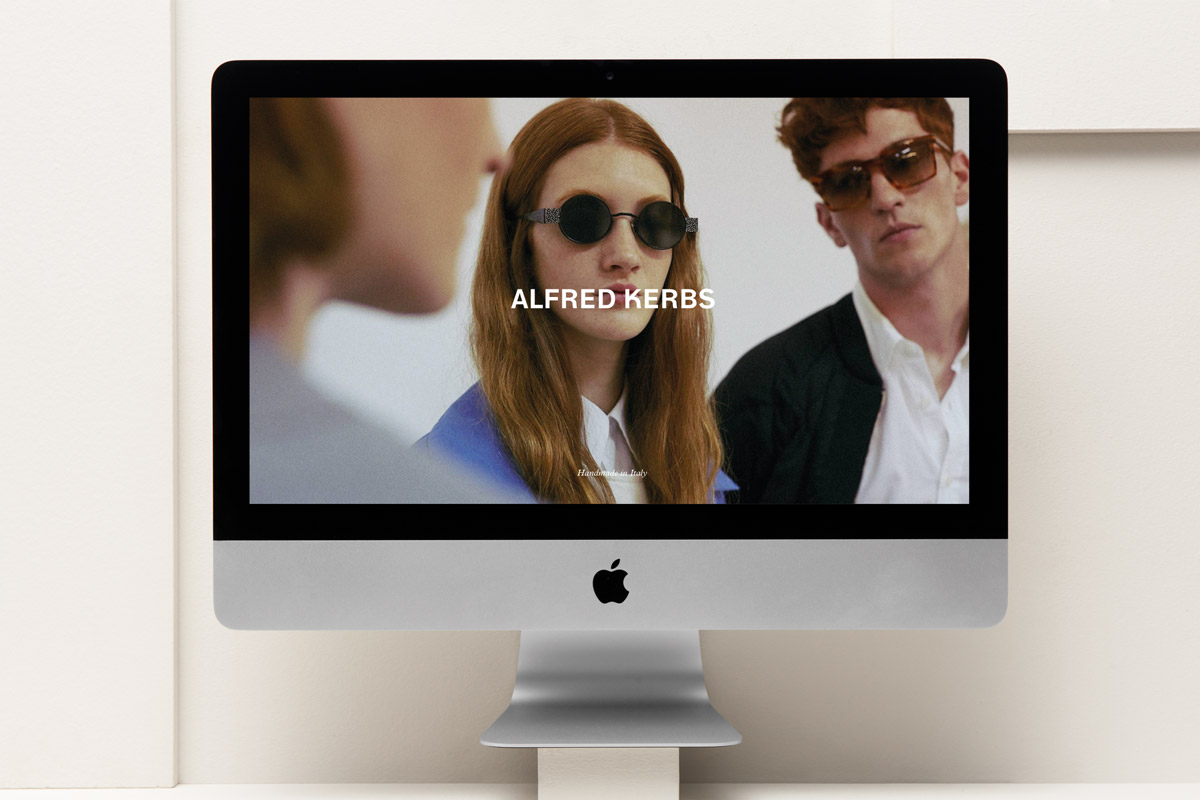
Brand recognition, style and purchasing process
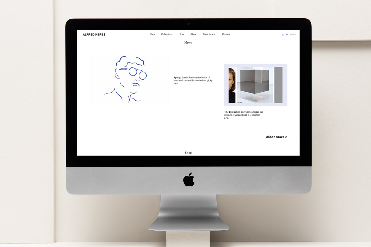
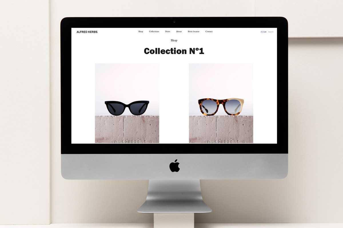
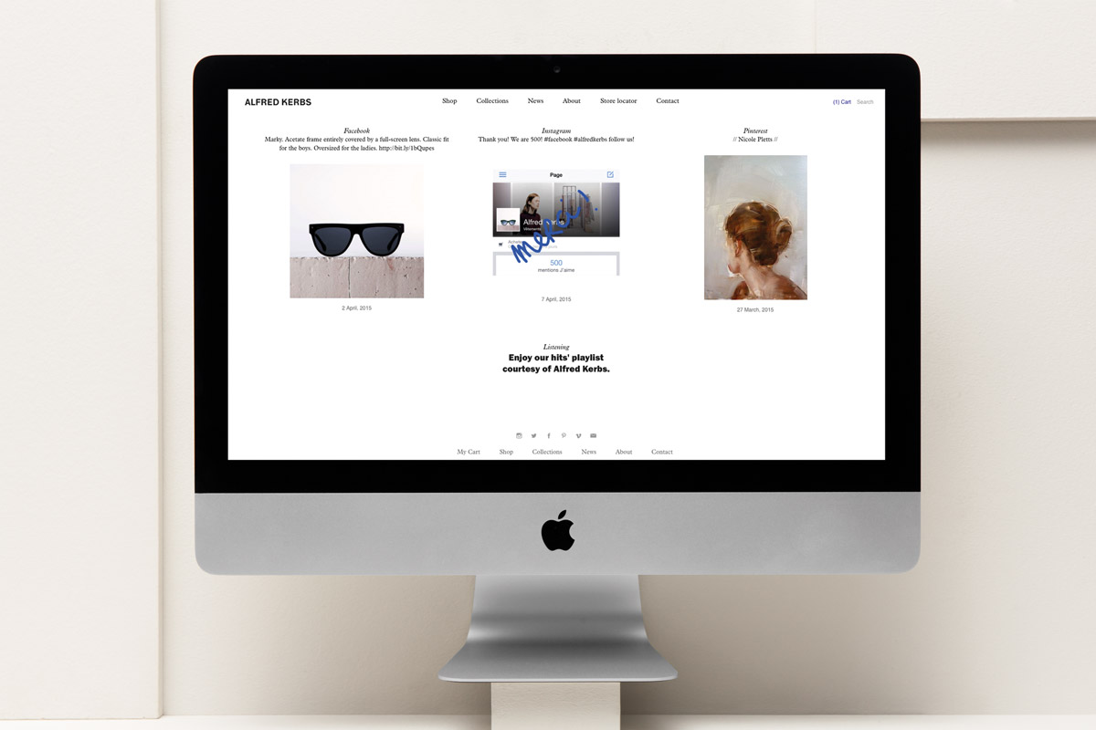
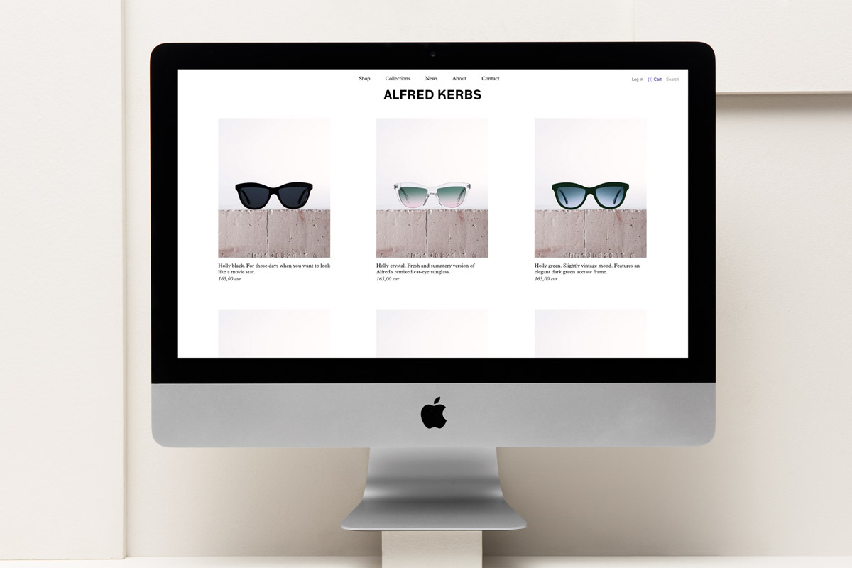
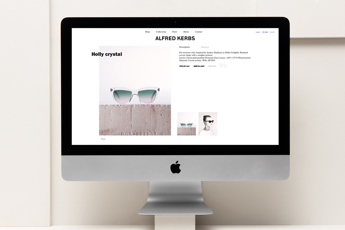
When we approached the design of the Alfred Kerbs website we had three main concepts in mind: make the brand recognisable, establish Alfred Kerbs as a reference in the eyewear and fashion world and to create an efficient shopping experience. As you land on the website Alfred Kerbs already shows up as a dynamic and visual brand. The homepage gathers all the content from the brand and provides the main news visually from Alfred Kerbs new collections, collaborations, discounts etc, as well as an overview of products, brand-related content and social network activity. Lastly, the product page is designed for the user to experience an intuitive yet captivating purchasing process, aimed at establishing a pleasant relationship between the customer and the brand.
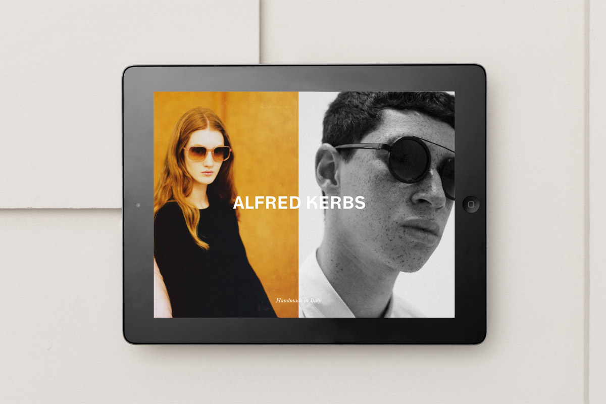
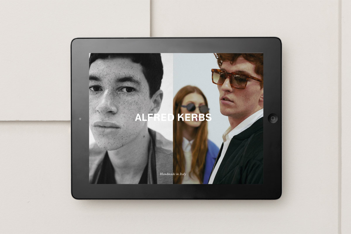
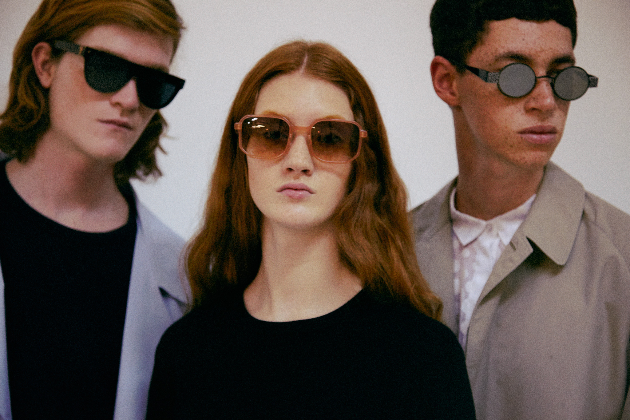
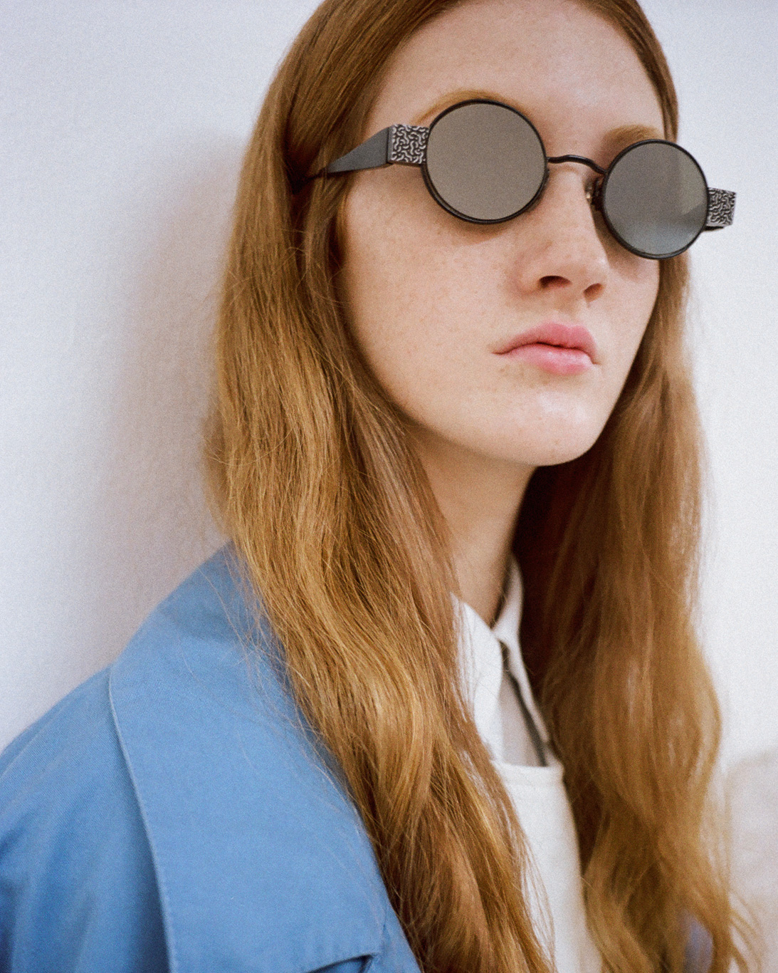
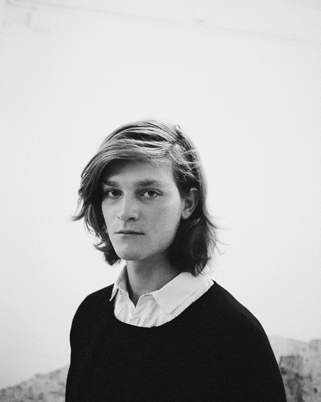
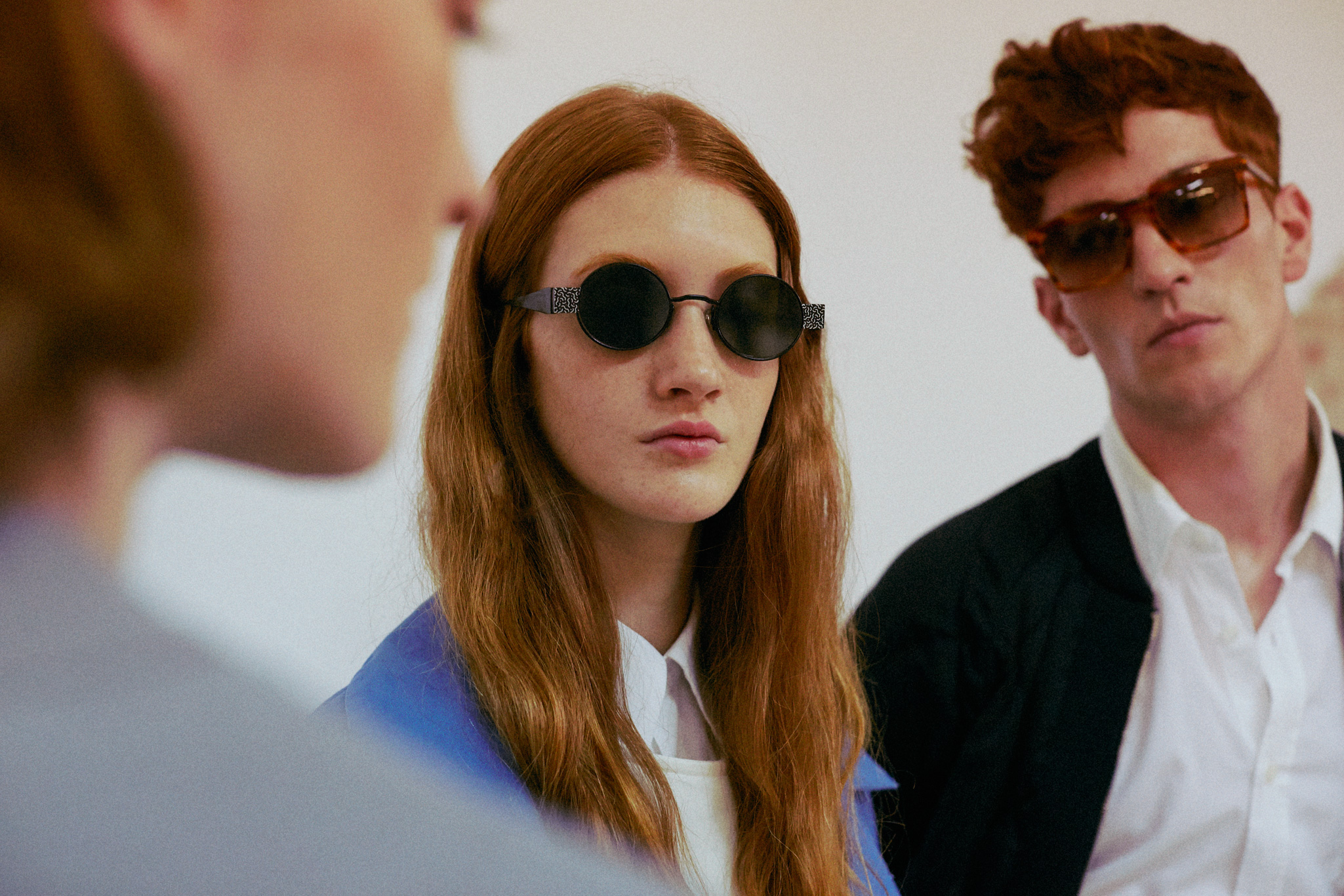
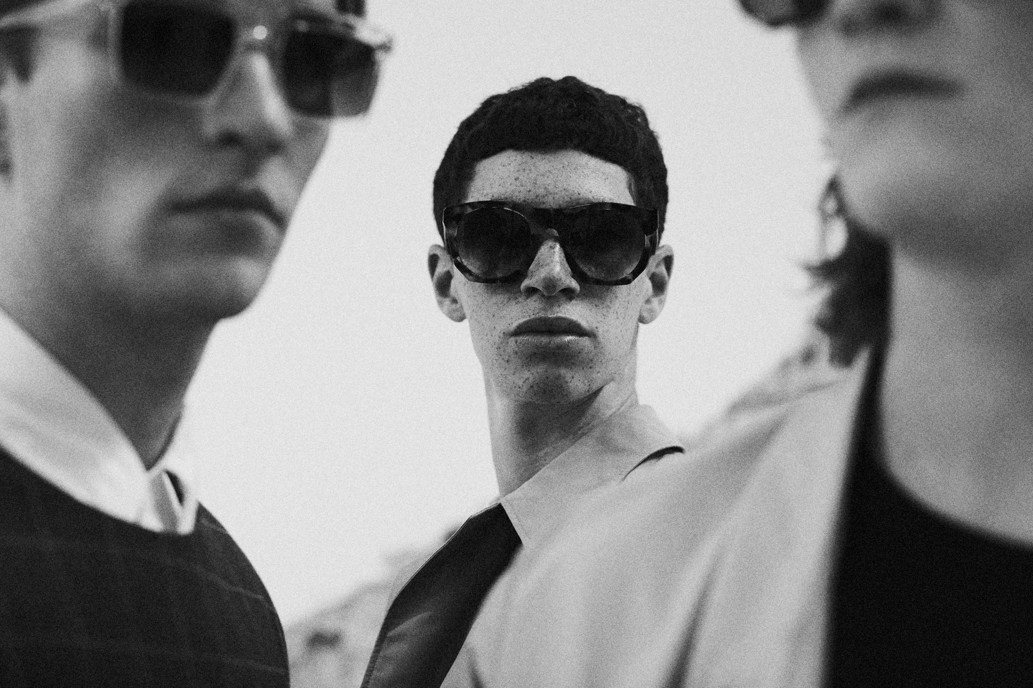
Red is hot: the campaign
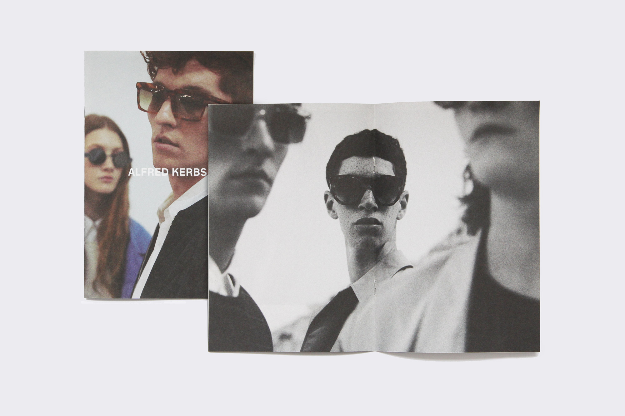
The art direction of the photography was led by the Alfred Kerbs team, who had a clear vision in mind for the aesthetic and the concept of the debut campaign. The first campaign seeking a point of controversy and irony, revolves around redhead models celebrating “ginger” as a symbol of eccentricity and fascination. Lea Colombo seemed the obvious and the right choice for the launch campaign “Red-hot right now”, recreating a backstage unique mood.
-
 of
of -
 of
of -
 of
of -
 of
of -
 of
of -
 of
of
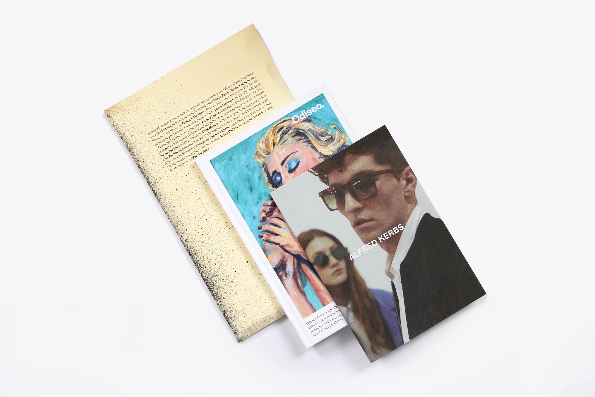
Odiseo introduces Alfred to the world
Odiseo, our sophisticated publication for adult entertainment which appeals to the confident and intelligent man of today, partnered with Alfred Kerbs to support their first campaign and the launching of the debut sunglasses collection. Alfred and Odiseo share a similar vision of the world, as well as a similar aesthetic style and target audience. An elegant and little booklet presenting the “Red-hot right now” campaign shot by Lea Colombo, designed and edited by Folch was included in the Fifth issue of the publication, where 3000 copies sold out in half a month.