Tags: Art Direction and Design, Branding, Environmental Design
Site photography by Ampi Aristu
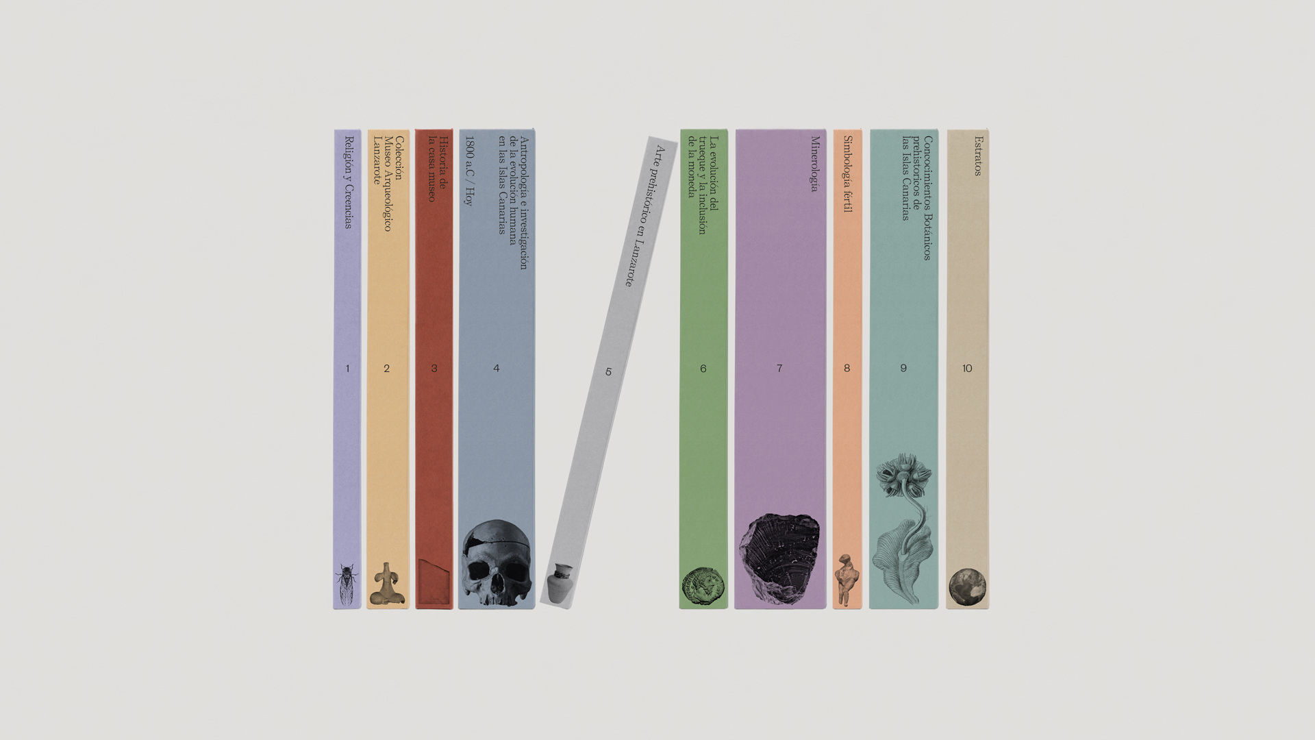
The photos of objects used in the graphic system were used exclusively for the proposal and belong to their authors
Written by Emmy Koski
Site photography by Ampi Aristu
The photos of objects used in the graphic system were used exclusively for the proposal and belong to their authors
Written by Emmy Koski
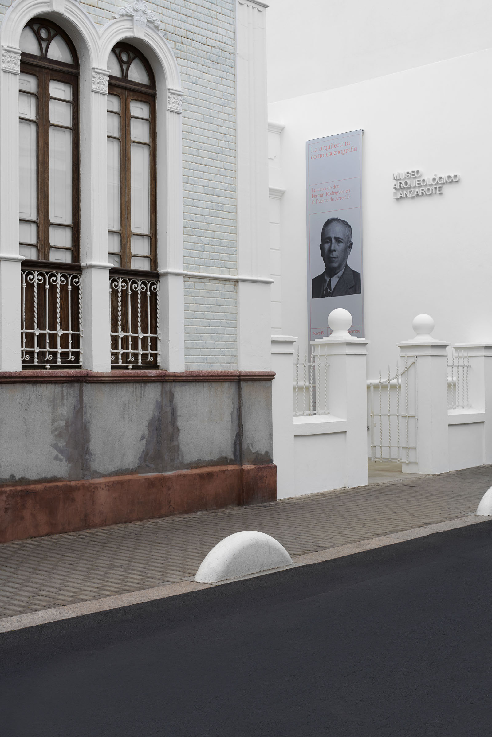
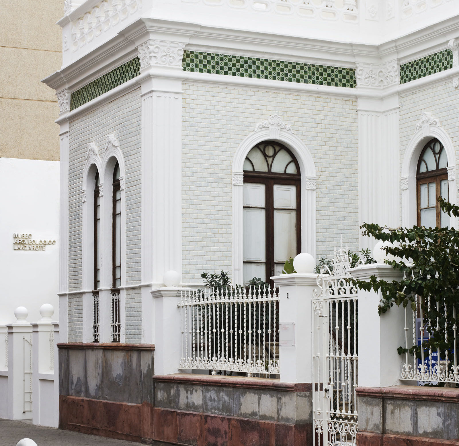
The great villa, now known as the archaeological museum of Lanzarote (Museo Arqueológico de Lanzarote) was bought by the city council five years ago and has been under construction until its official opening late last year. Originally a doctor’s residence, it had become an iconic building in Lanzarote and was ready to be opened to the public. Two wings were built on each side of the main building, A and B, where the archaeological exhibitions take place, whilst the main building is maintained for the public and explains the story of the residency.
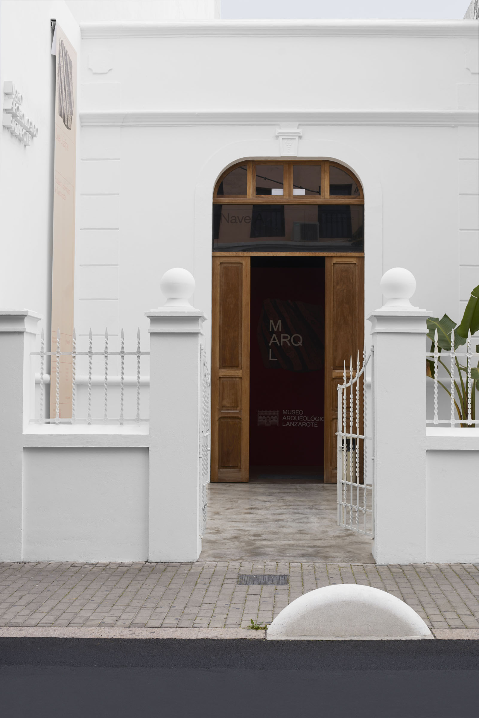
Unlike MoMA, MACBA or The Met, the reduced version MARQL didn’t work verbally. We decided to use the full name of the museum instead, Museo Arqueológico de Lanzarote, giving the new identity the weight it deserves.
“The challenge was to brand such a long name and/or a contraction of a difficult pronunciation and verbalisation.”
Albert Folch, Creative Director and Founder, Folch
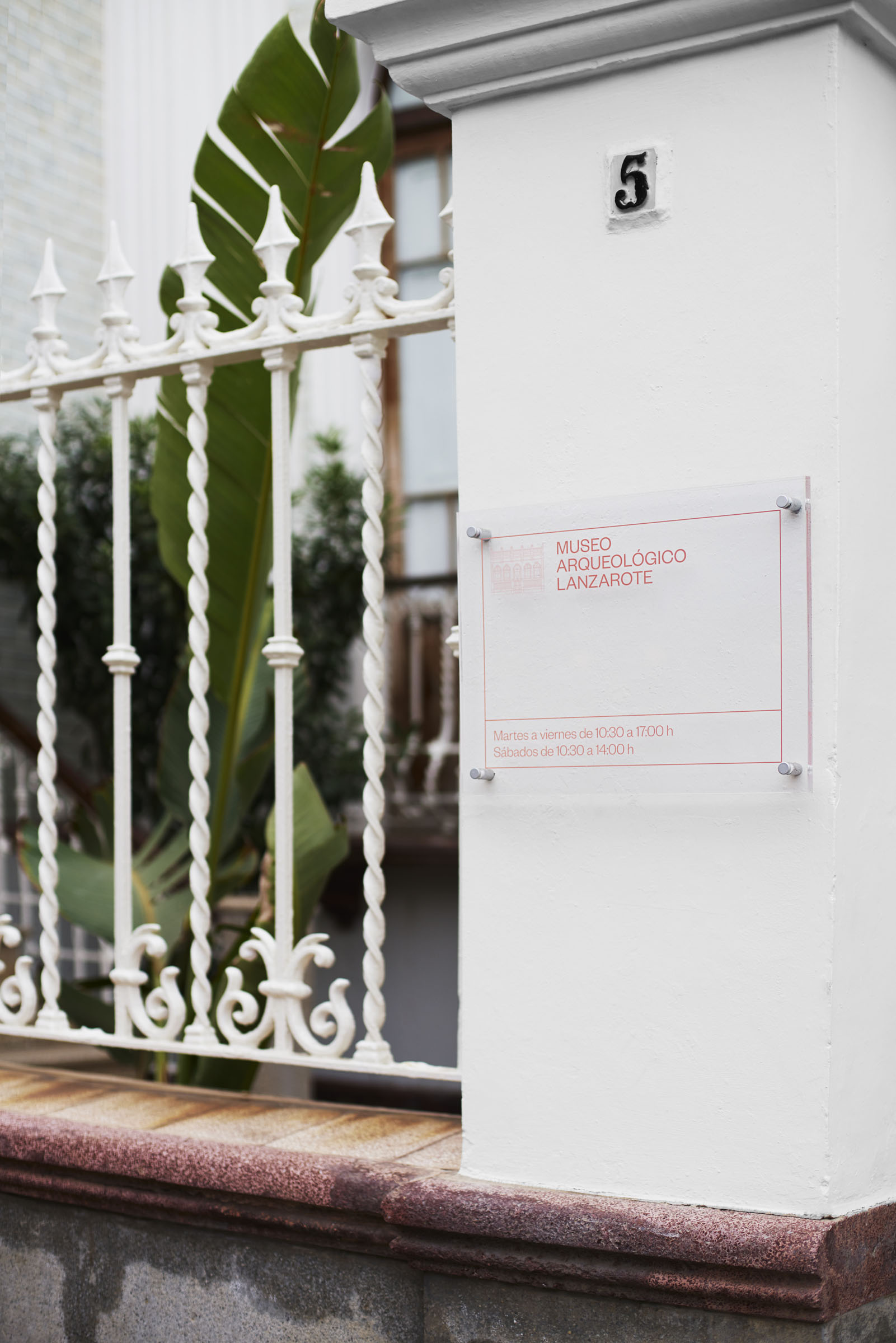
Using Founders Grotesk by Klim Type Foundry, the words are left-aligned in 3 rows, mimicking the shape of the building and occupying a block space when seen together with other logos. The contemporary typeface contrasts with the building’s ancient contents. By using upper case letters we allowed the block to stand out and work across both print and digital. Furthermore the block format allowed us to extract a reduced version, which works in the same frame.
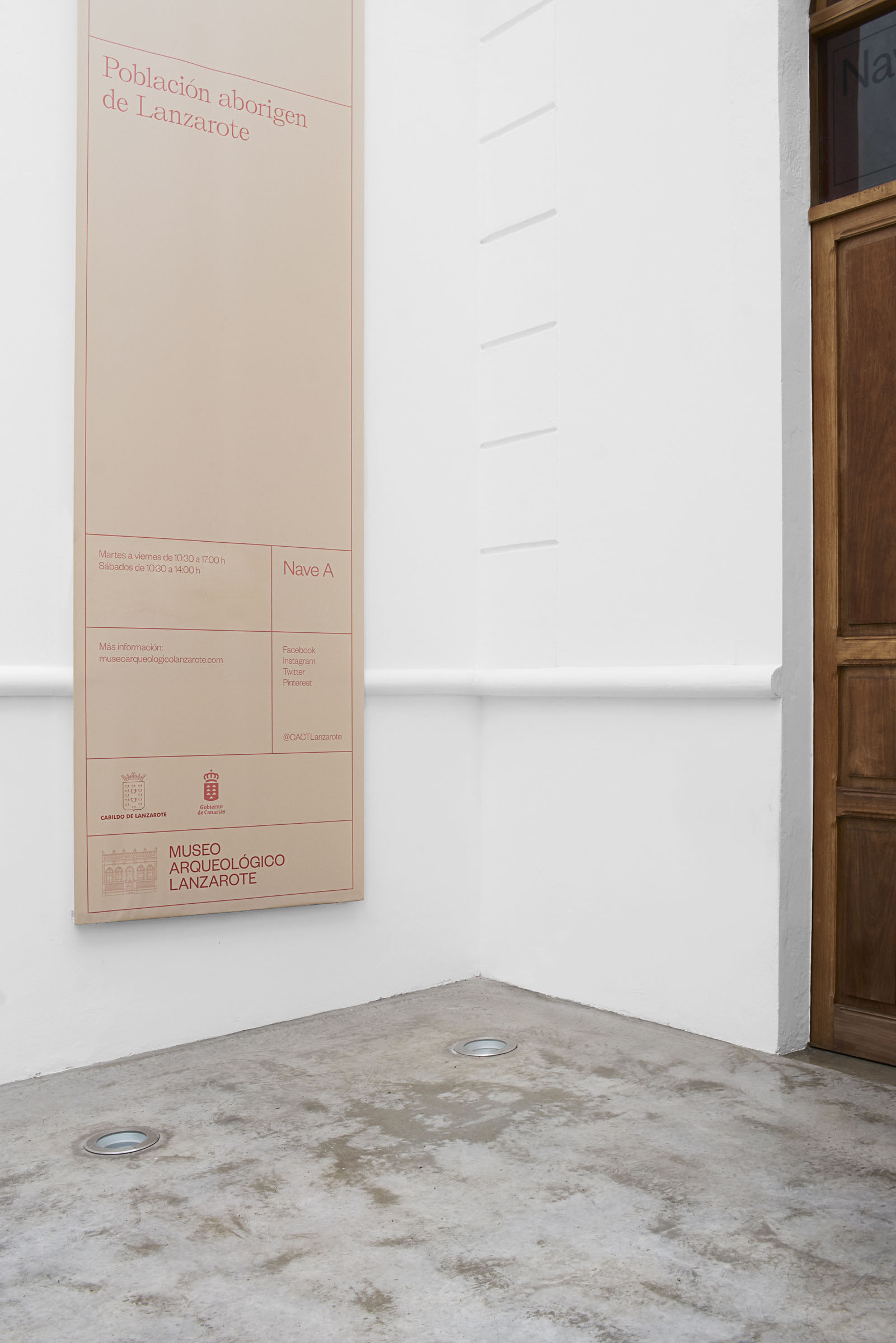
A secondary typeface created a crucial contrast and graphic richness, helping to separate and hierarchise the different levels of information across all forms of corporate stationary and communications. Self Modern by Bretagne Type Foundry, together with the primary Founders Grotesk, provides the perfect pairing – their skeletons have very similar forms and offer the right combination of personality and sophistication in their characteristics.
Since the building is iconic, we wanted to bring it’s features through a symbolic icon. Reflecting its heritage and connecting the museum to the building itself, we drew out a technical, sophisticated version of its structure to accompany the logo.
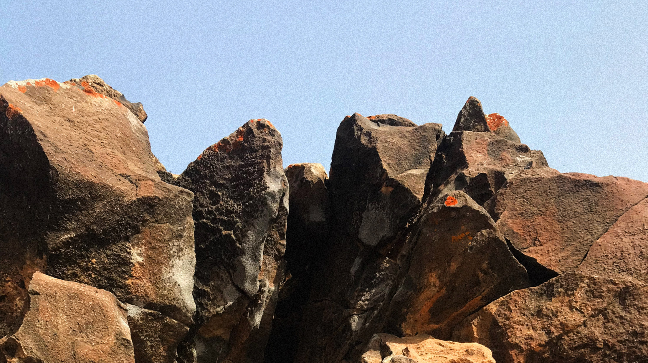
The otherwise stripped identity needed an interesting pairing in terms of colour. The black text treatment is paired with the secondary colour – a warm coral to reflect the temperate soil, alongside a wide earthy palette based on the pigments of the building, its archaeological elements, and the surrounding environment.
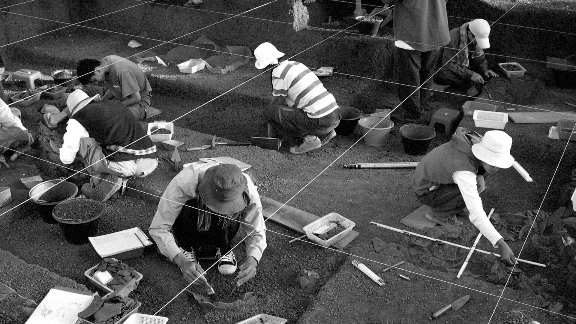
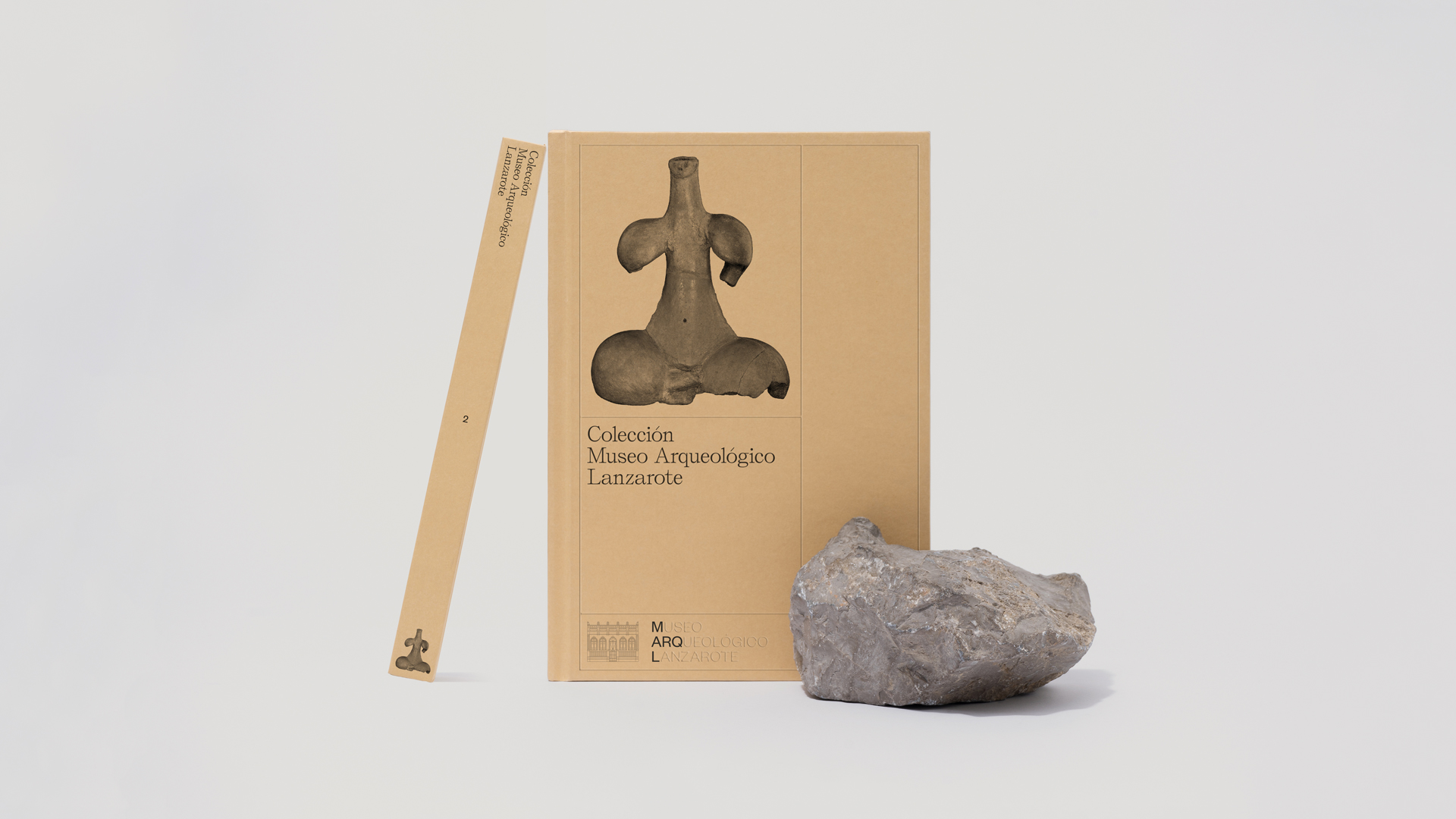
Based on the archaeological excavation site, we created a grid to contain all the information, combining the two typefaces and the natural colour palette. Coherently unified through the cut-out shapes of different archaeological finds, we created an imagery to complete the graphic system. The importance lay in the objects, their shapes and details.
Everything from books, flyers, posters, and digital banners to huge banderoles are all based on the fundamental graphic system, creating a dynamic setting, true to the building and true to its environment – a volcanic rugged terrain. Flirting further with landscapes and the concept of archaeology, the base stones for the bigger banderoles are made of natural stone from the area.