Year: 2014
Tags: Art Direction and Design, Identity, Merchandising, Signage, Wayfinding
-
 Share
Share
3,482 views
Building a visual mood
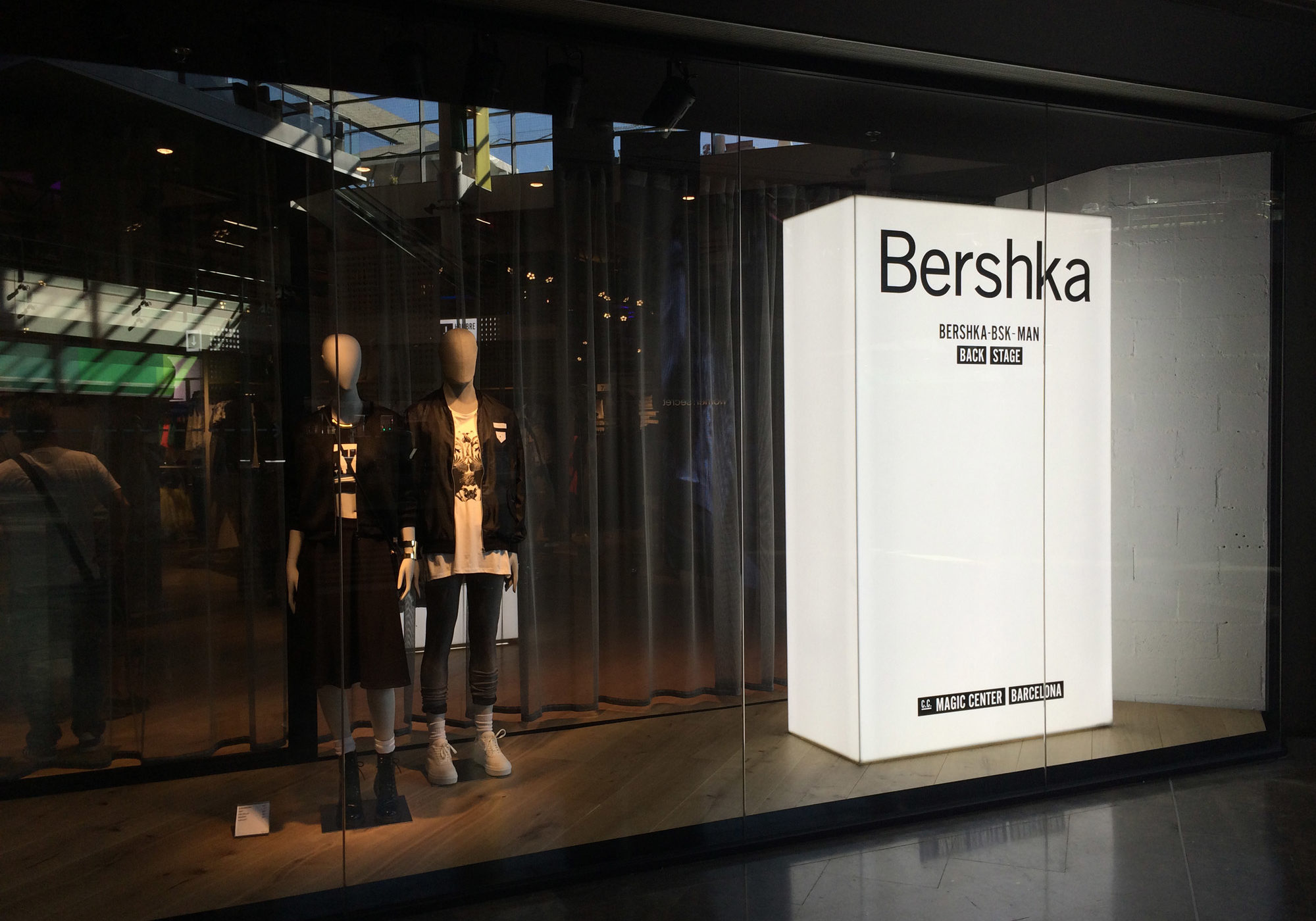
The clothing brand Bershka, part of the group Inditex and famous all over the world with over 900 stores in 64 countries, has a long story of partnership with the architecture design firm Castel Veciana Arquitectura. They are responsible for the overall design of the company’s retail stores. In 2014, the two founders of the firm Jordi Castel and Jordi Veciana decided to entrust Folch for renewing the point of sale graphics for the Spanish clothing brand. As we immersed ourselves in the Bershka aesthetic and visual code, we began to put down ideas and references in order to to follow the right path.
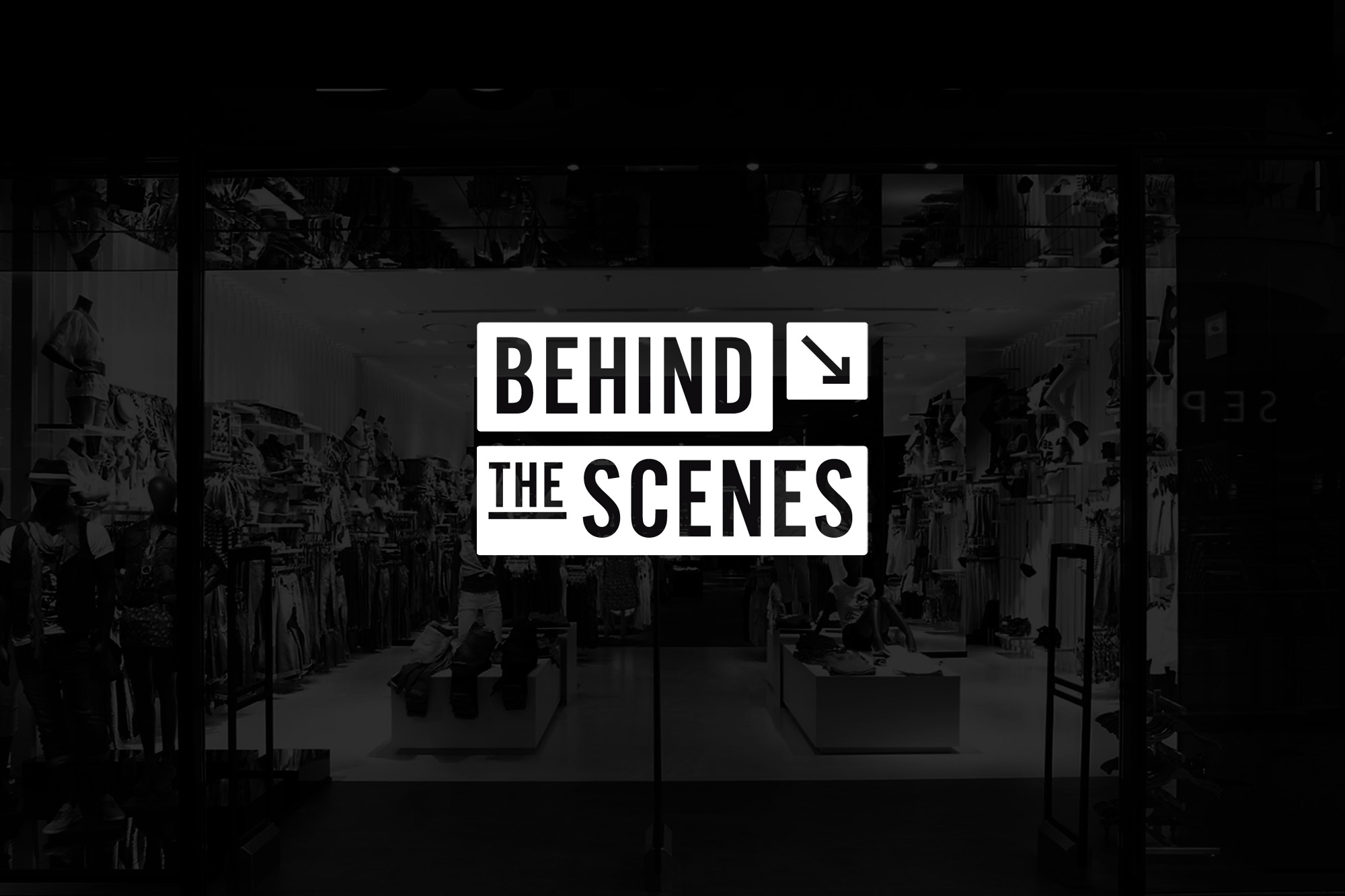
Behind the scenes
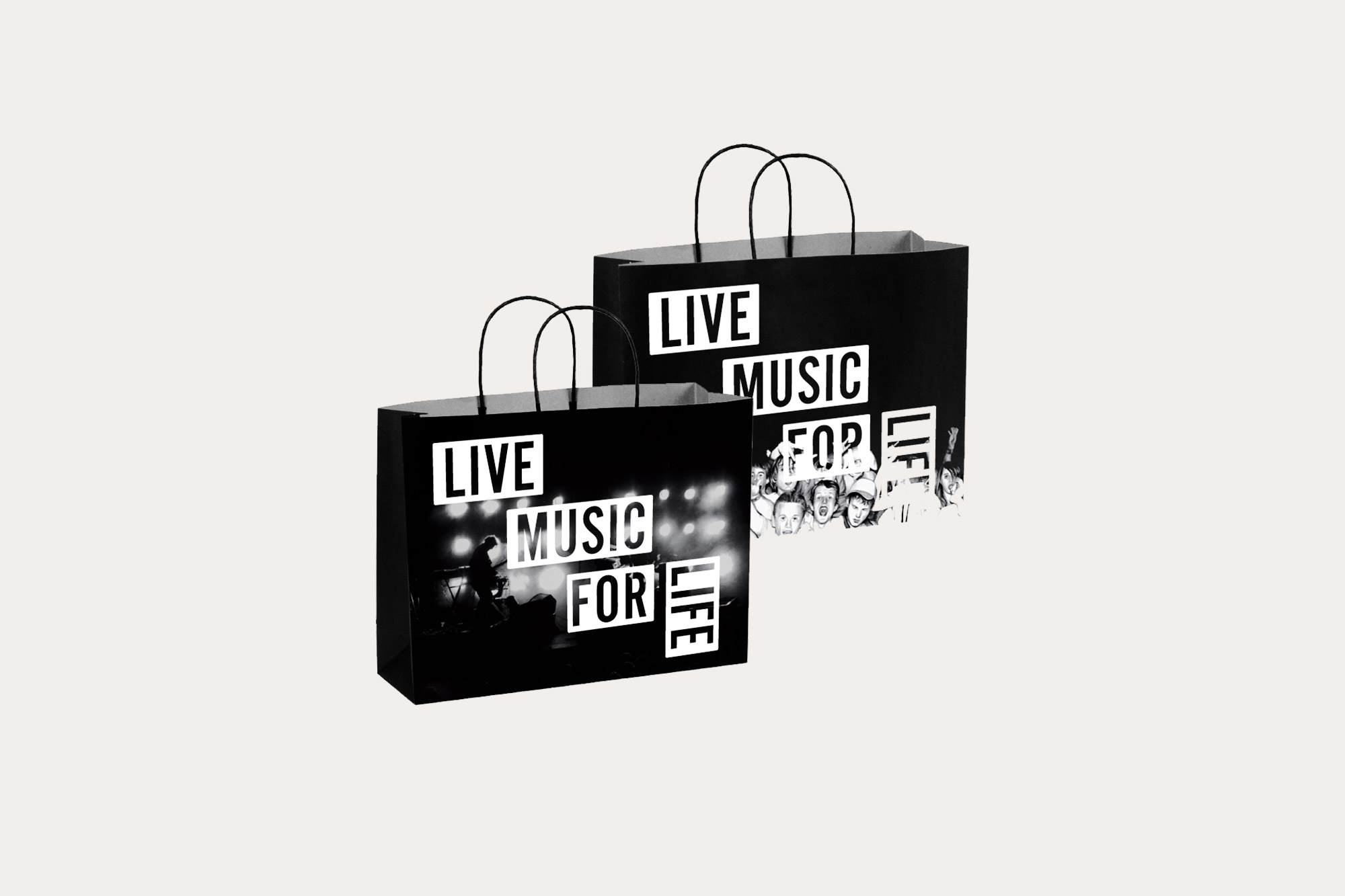
In the analysis of the brand and their customers, we identified the significant elements and stated clearly what were the crucial points to consider: the brand’s young and typical audience, designed by many researchers and commentators with the name of Millennials, was our main interlocutor. Our references were multiples, ranging from the Broadway atmospheres to an urban and young look. We wanted to communicate to Bershka’s young customers a cool, stylish yet elegant and monochromatic aesthetic: eventually “Behind the scenes” was the main theme that we we built the whole project around.
-
 Shareof
 -
 Shareof
 -
 Shareof
 -
 Shareof
 -
 Shareof
 -
 Shareof
 -
 Shareof
 -
 Shareof
 -
 Shareof
 -
Shareof
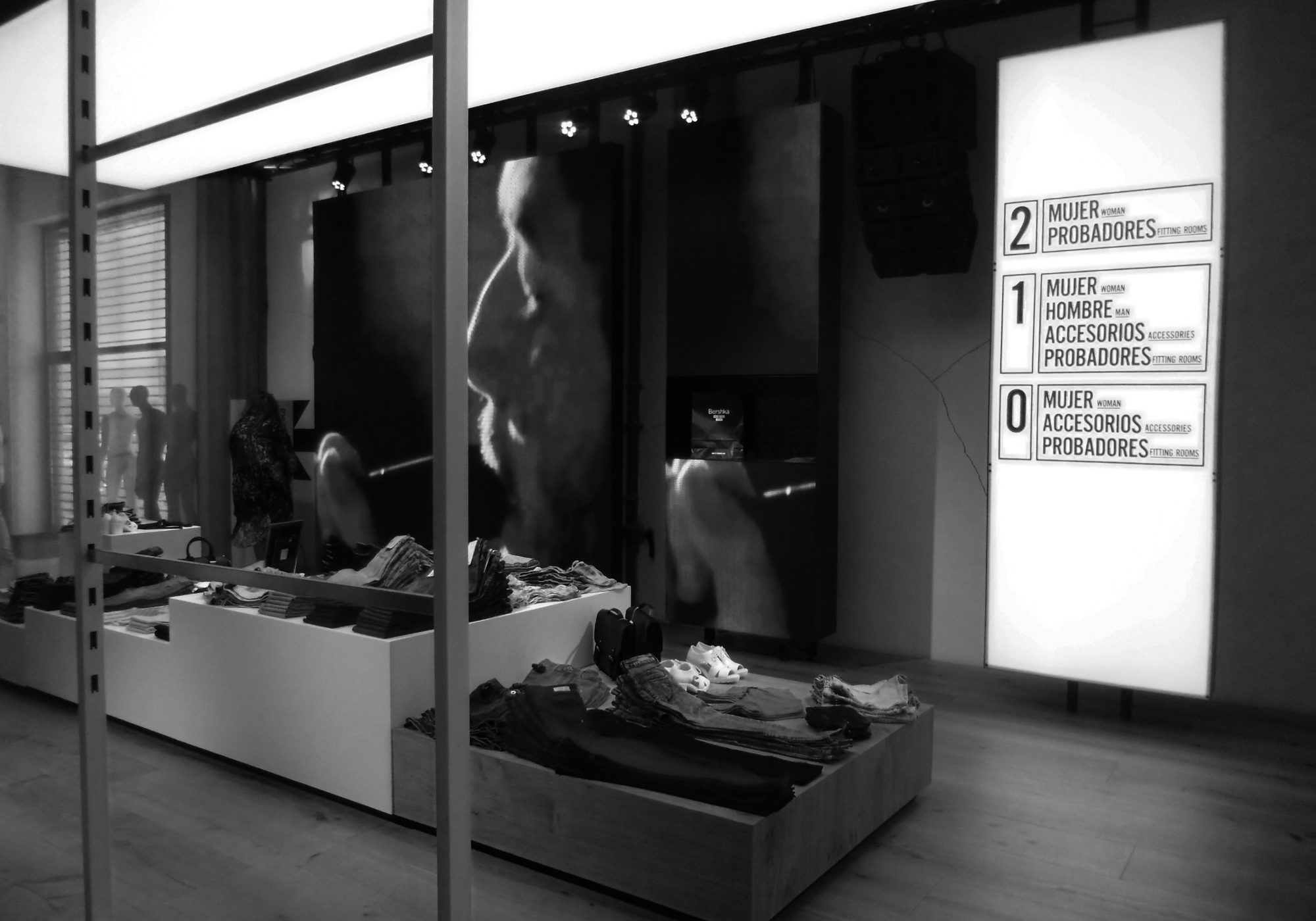
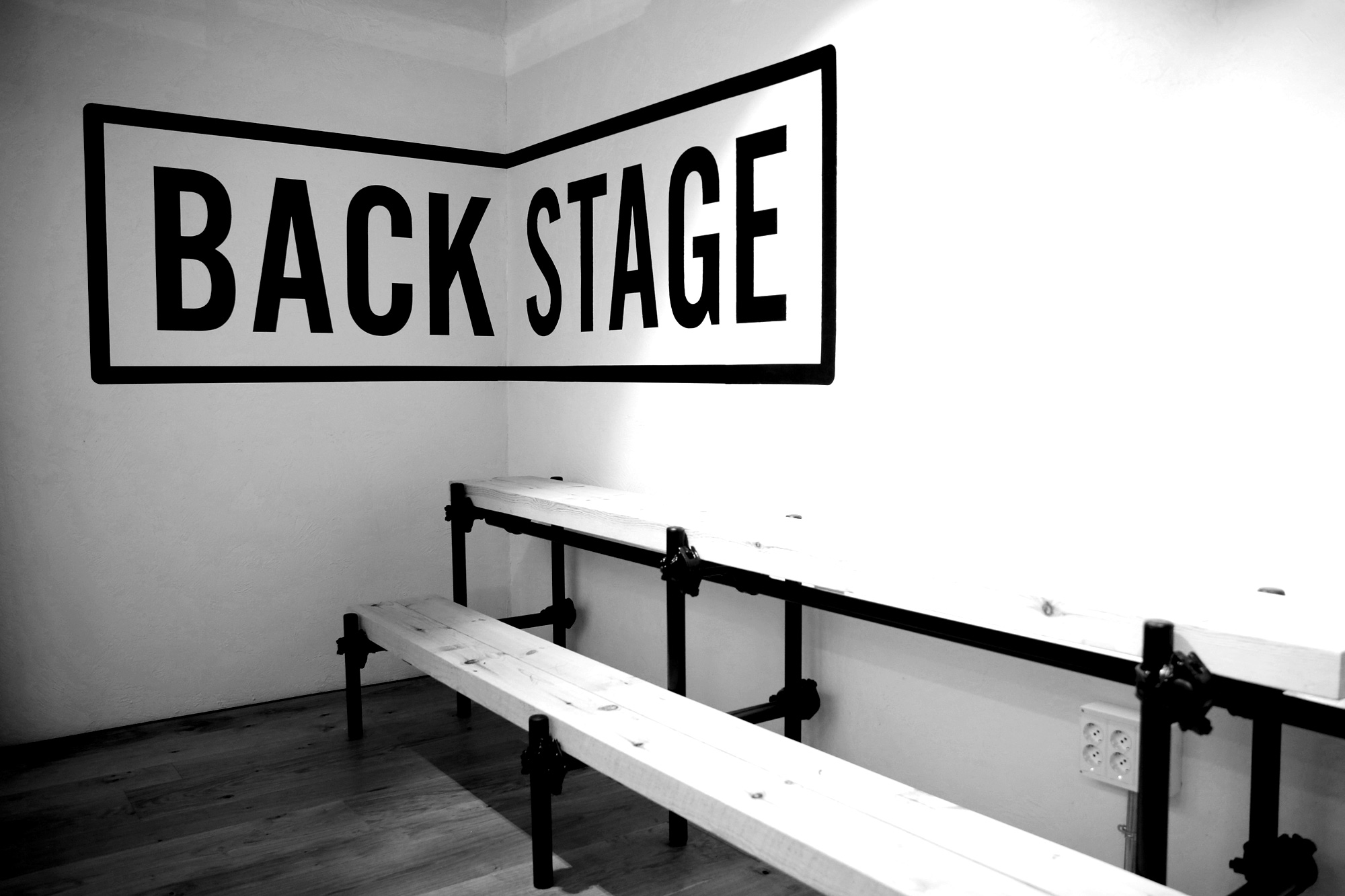
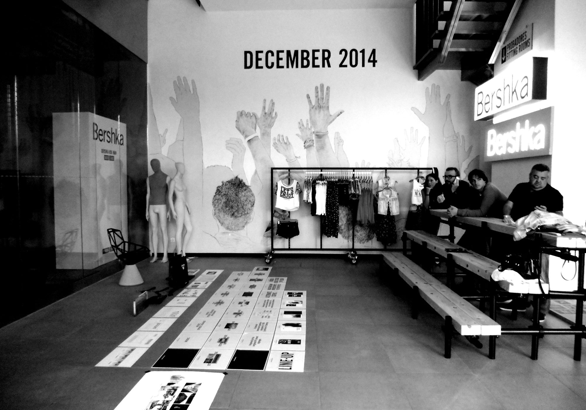
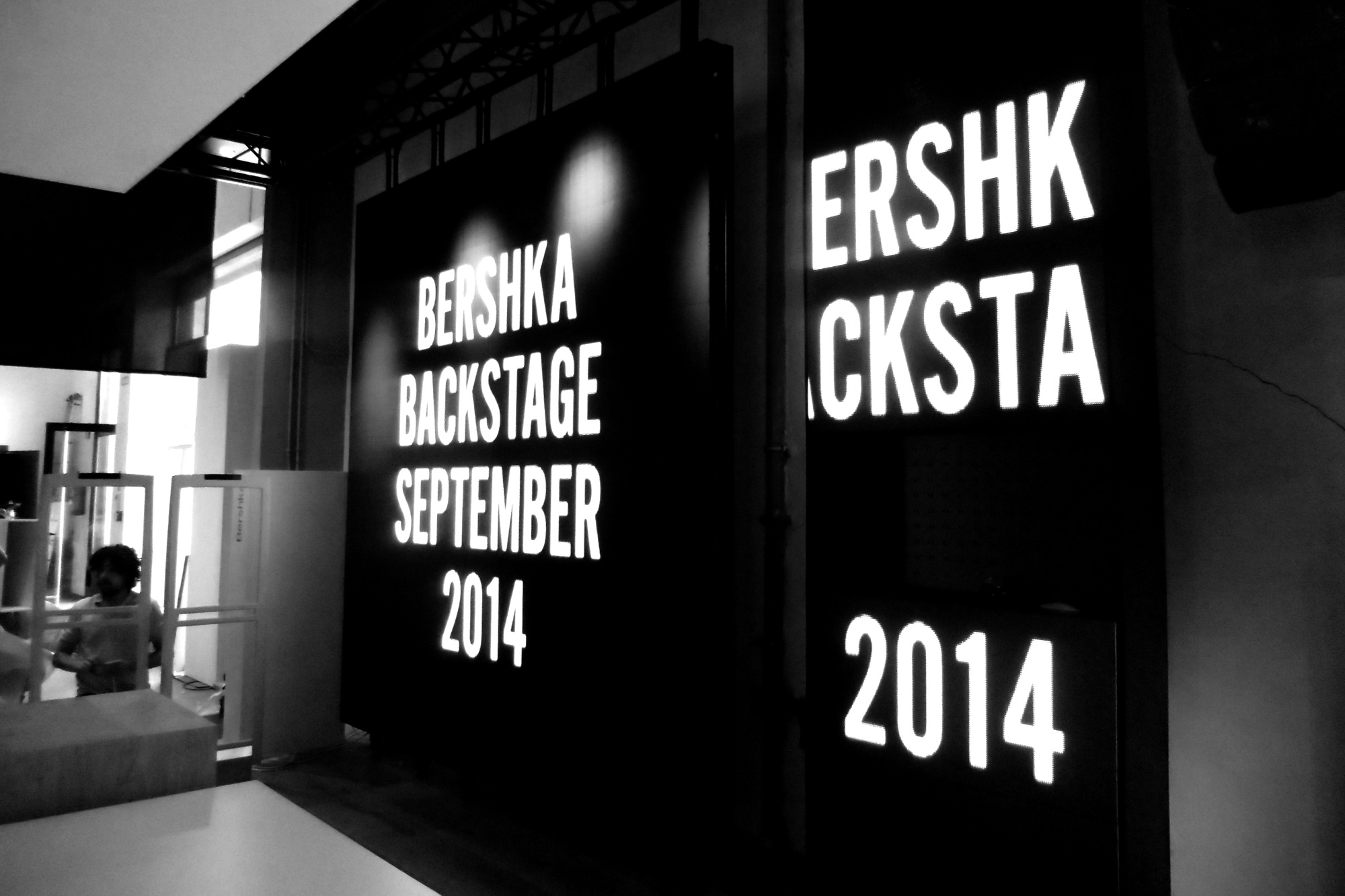
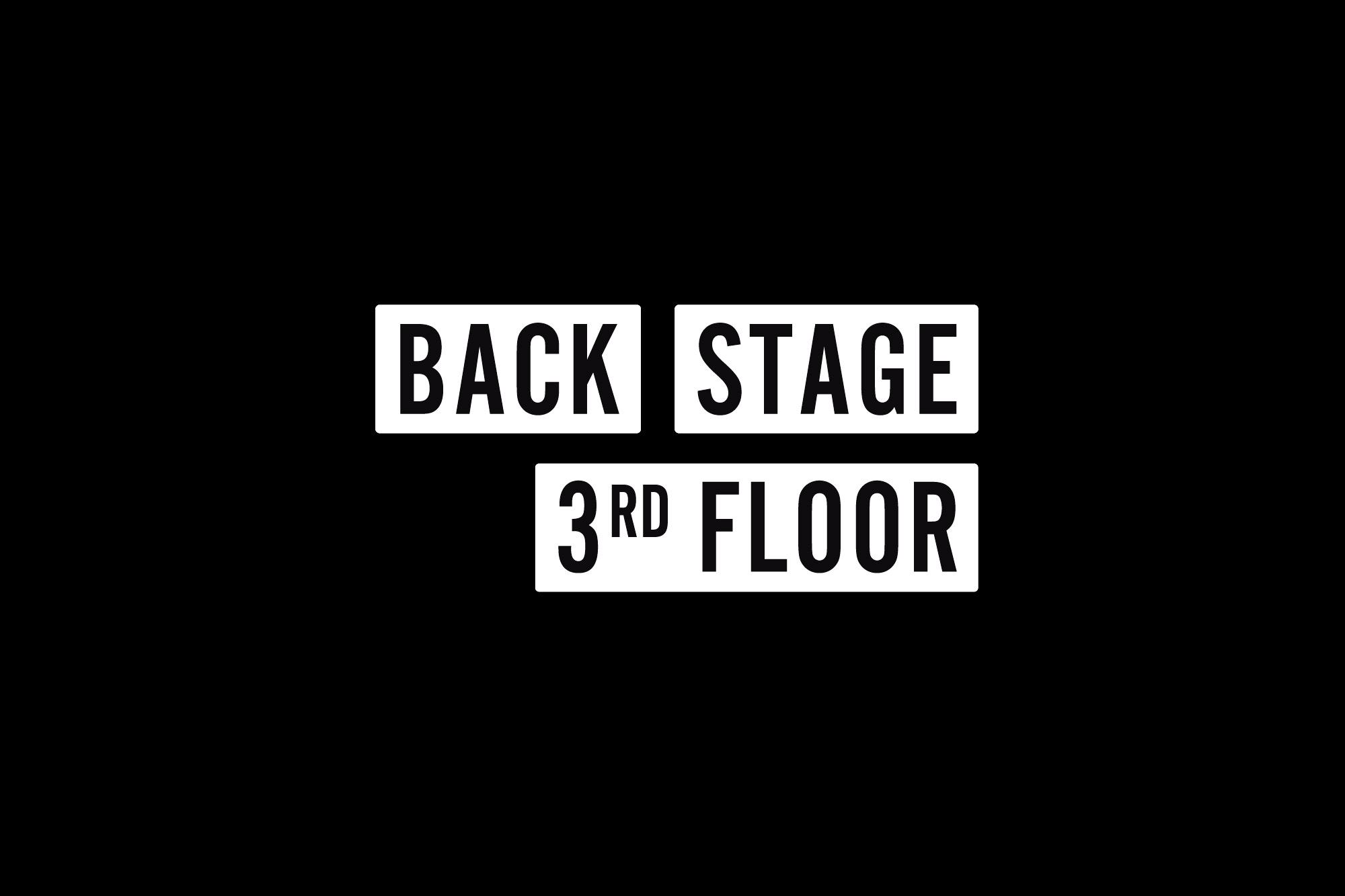
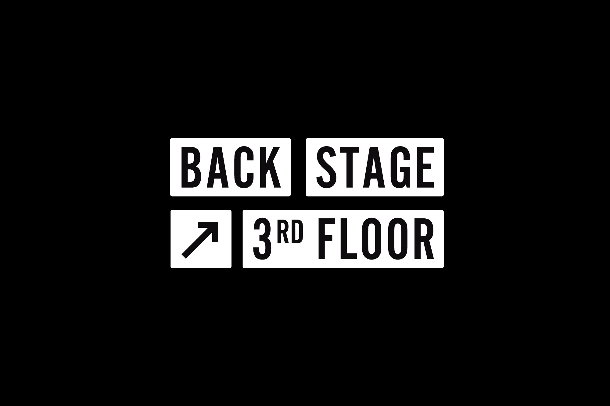
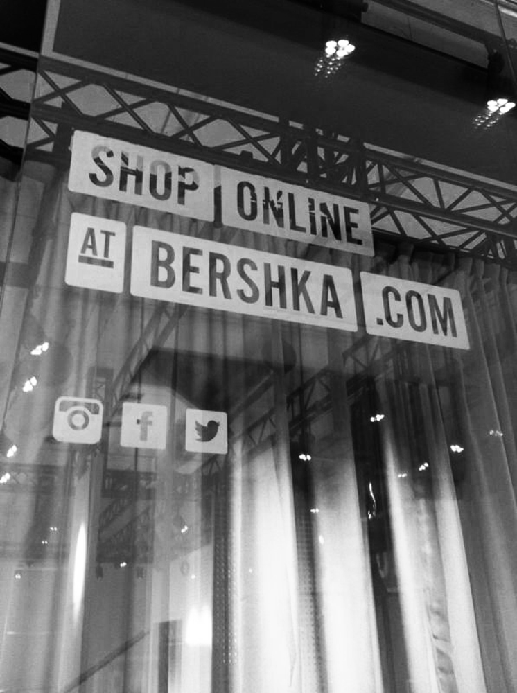
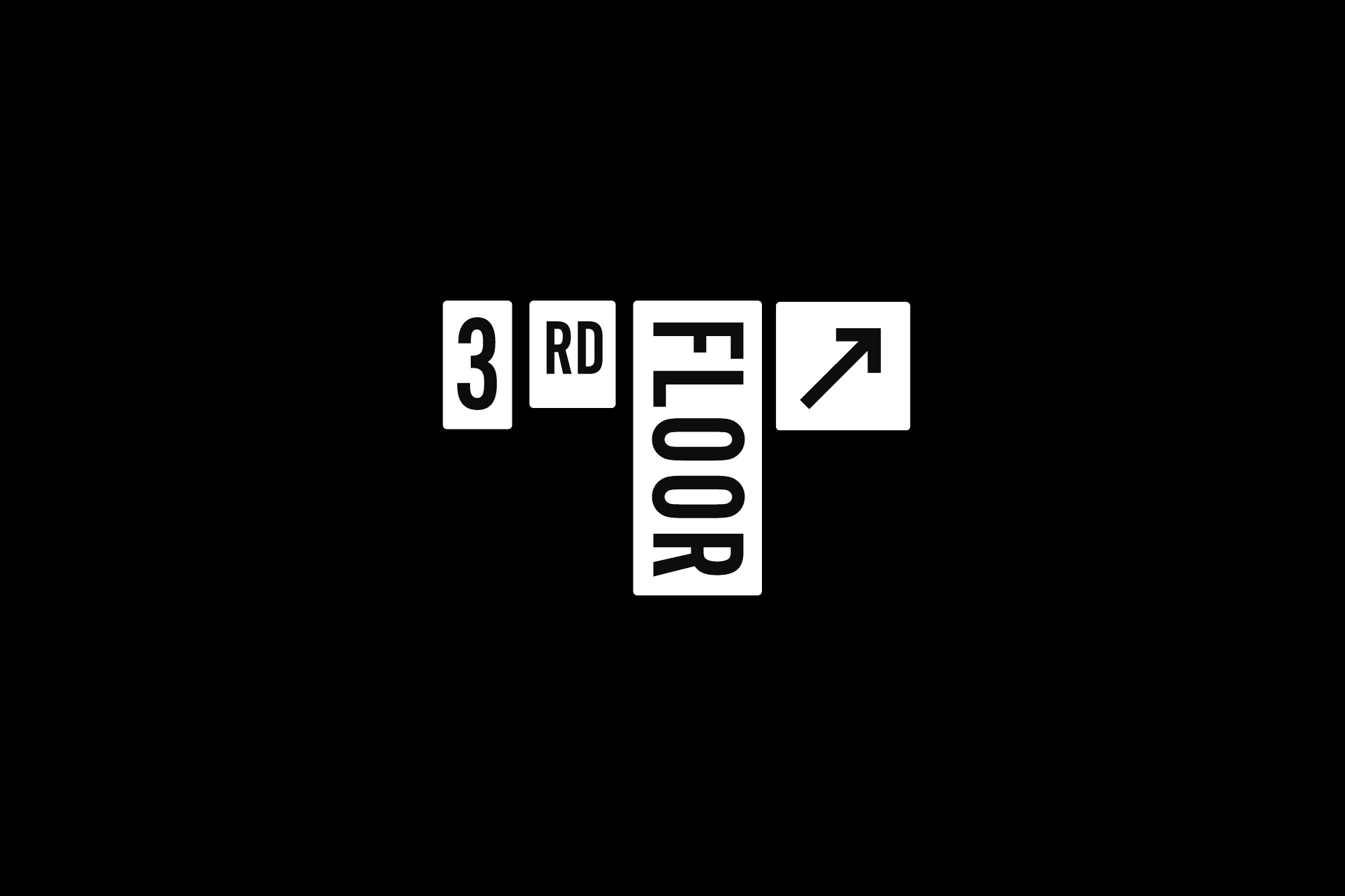
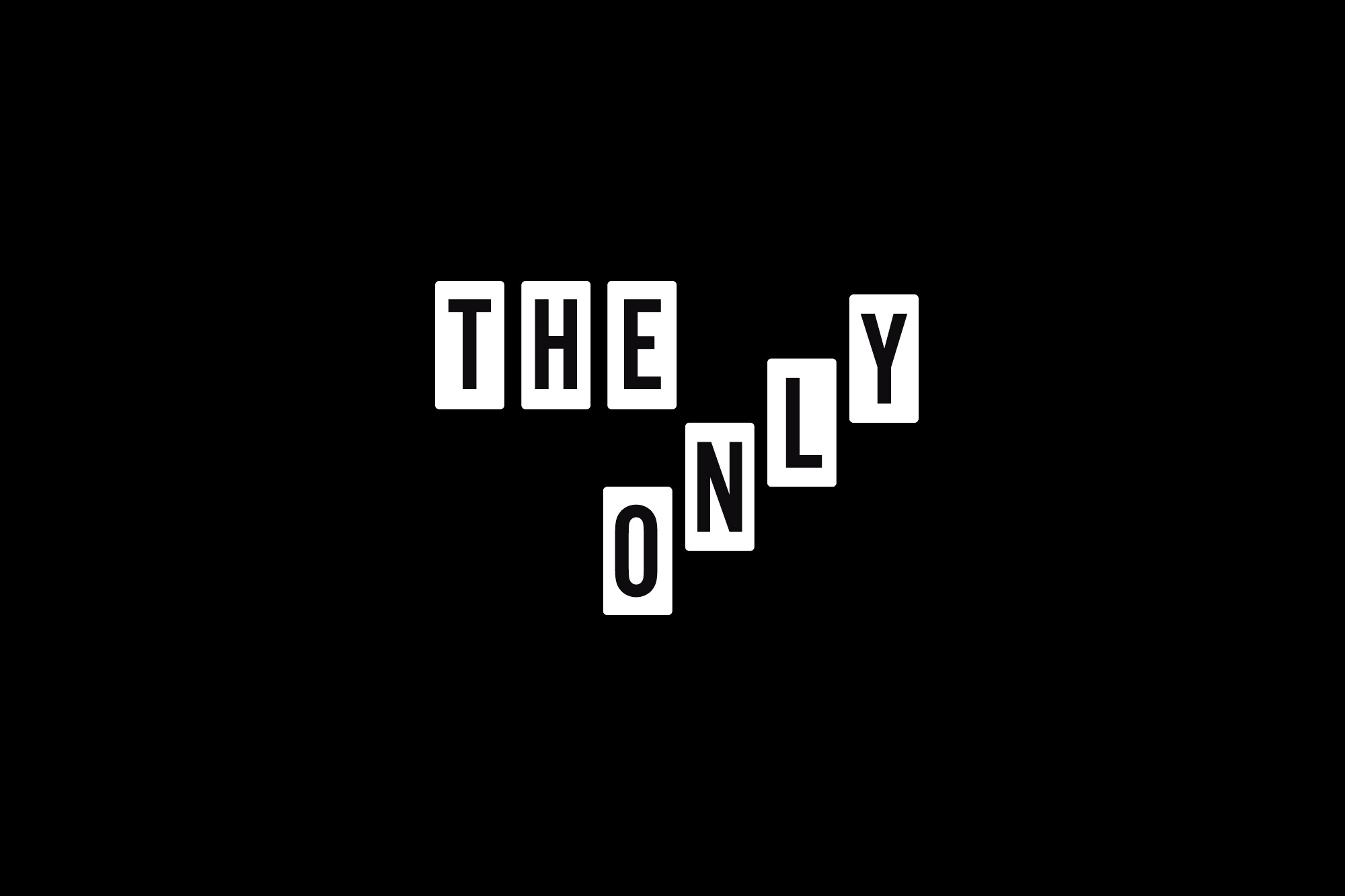
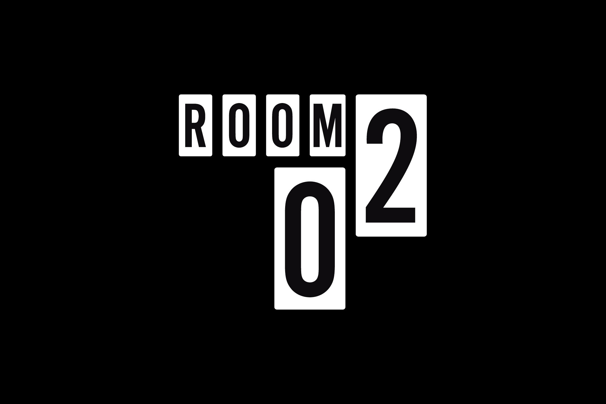
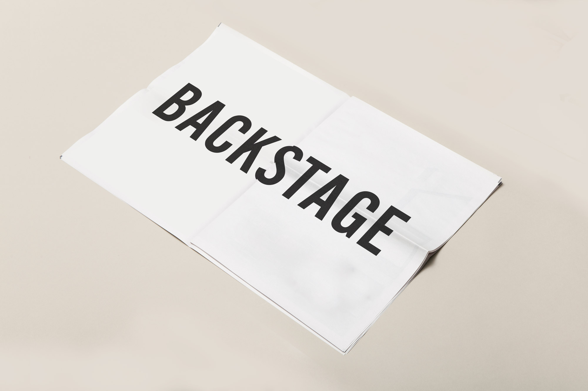
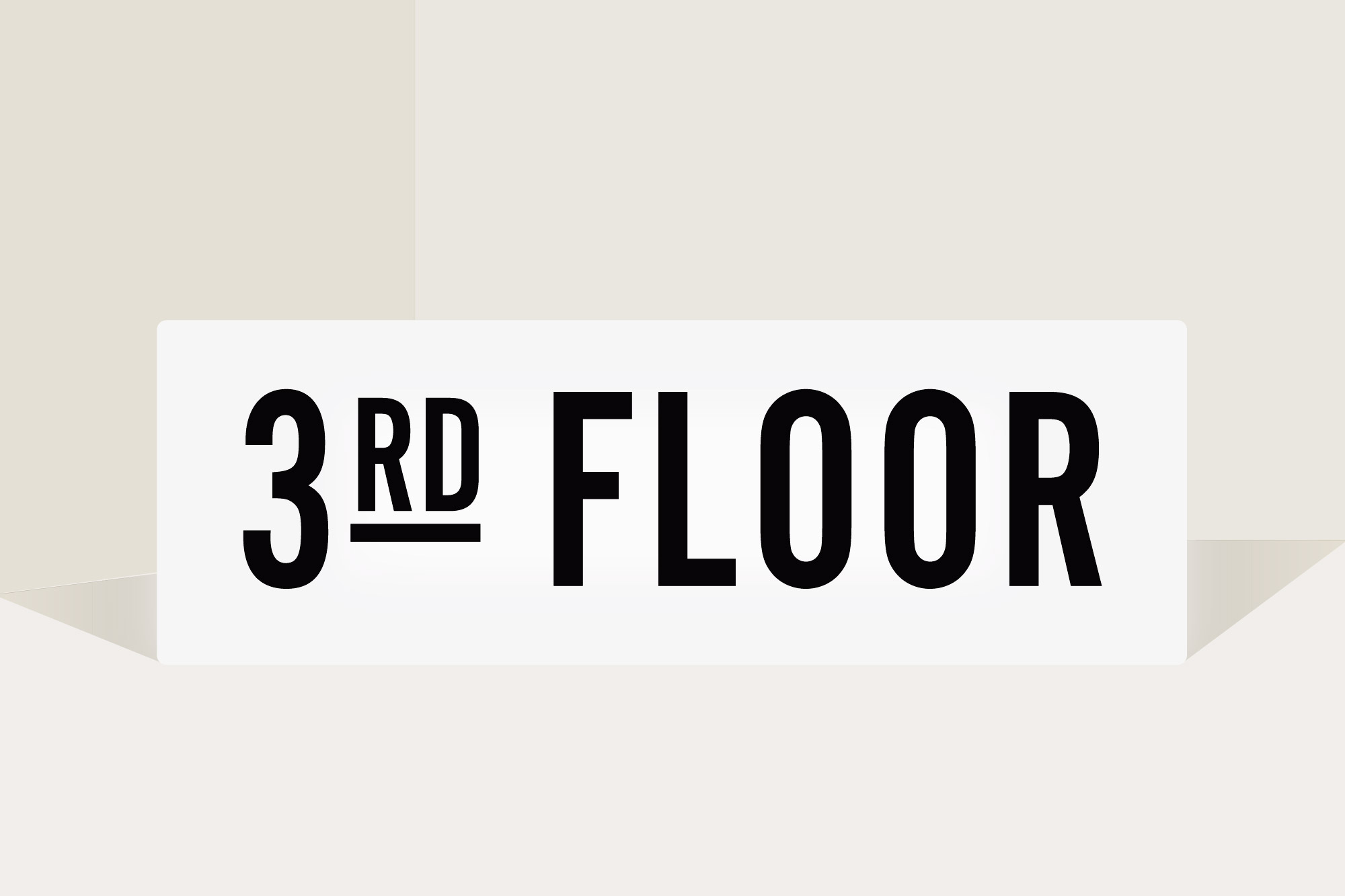
The main fulcrum of the project was of course the selected typeface: the Alternate Gothic, designed by Morris Fuller Benton in the early twentieth century, this was the ideal choice. The typeface —created by the prolific American designer as a condensed counterpart to the historically popular Franklin Gothic — fulfilled the requirement of fitting signage and directions into tight spaces while maintaining a robust, cool, dark look. Typographic details and the black and white palette have done the rest, giving character to the design. In a retail identity project almost only typographic focused, we partnered with the illustrator Chamo San to complete the design with a wall-sized illustration to be present in the selected Bershka’s stores.
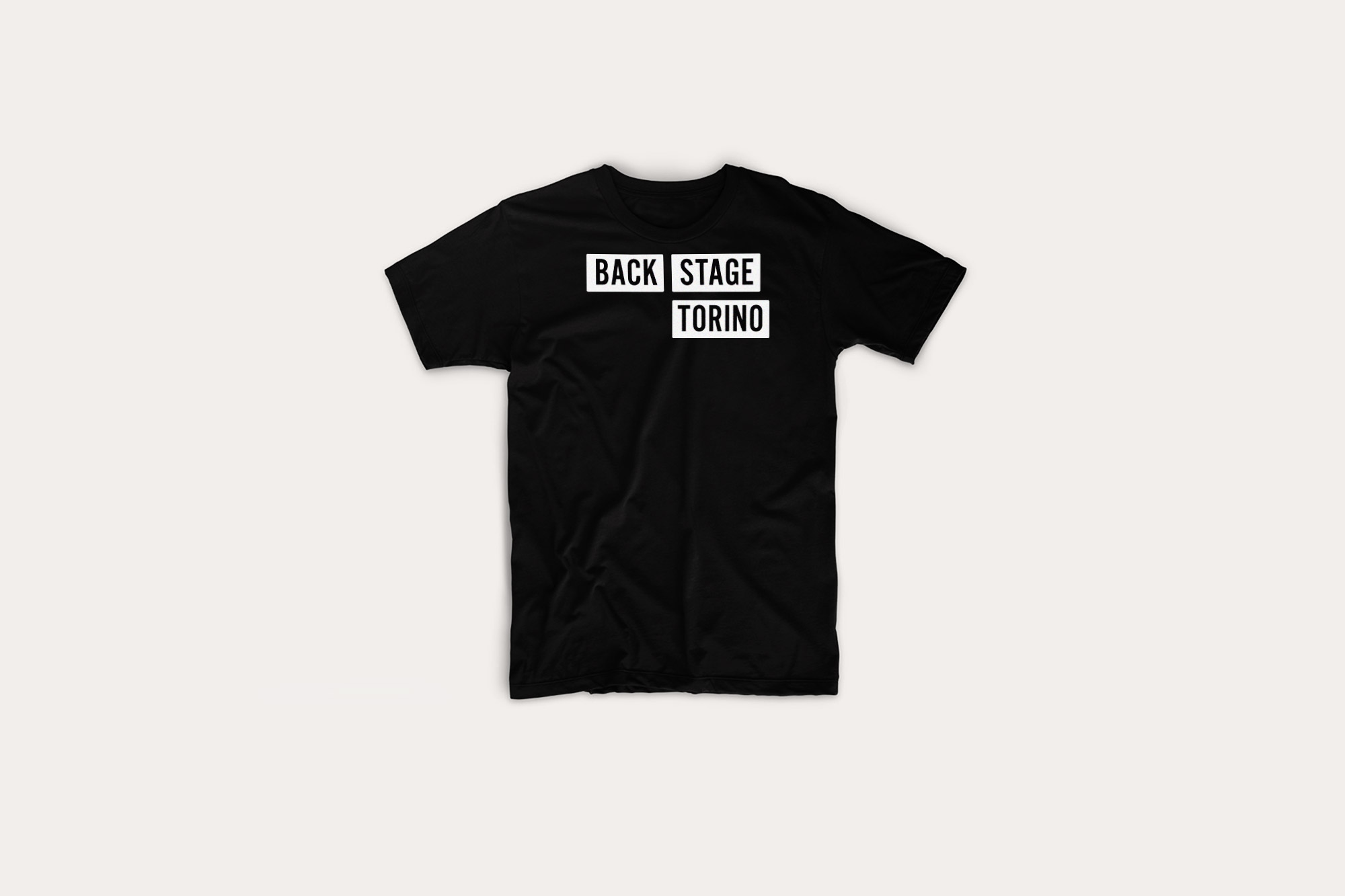
The new typographic identity —applied in a consistent quantity of different support from wayfinding to retail store signage, merchandising and supplies— was first integrated in the Turin company’s main store.

The wall illustration drawn by Chamo San and some merchandising elements.


