Mirada Imperfecta: The new perception of Barcelona
La Mirada Imperfecta (Trans. Imperfect Look) is representing the wish to change the perception of the city by avoiding glorified landmarks and iconic elements and instead giving recognition to the distinguishing features, the reality, the normality, the beauty of the everyday life in each neighbourhood. A Barcelona not defined by the Olympics ’92, but reborn through the eyes and thoughts of our team who do not carry the luggage of that decade. Half of the team derived from different parts of the globe, which also widen our possibility to reach beyond the local sight of the city to a broader external point of view.
The urge to alter the notion of not only the local channel but the city as well, through place branding, has been the driving force and motif behind the rebirth of betevé.
Due to the evolution of technology, perception of territories among other factors, the time had come for a complete renovation of the local television channel. Under the direction of betevé’s Sergi Vicente, in collaboration with Anna Guiot from ADG FAD, a contest between the design studios in Spain was organised. The first race took place and left three finalist –Mallorca based Atlas Design, Barcelona based Mucho and at last; Folch– to determine the final approach of the rebirth of Barcelona Televisió. For the final heat we partnered up with motion graphic studio Norte to bring the brand into movement and production company Goroka to widen the possibilities of producing narratives within the transmedia environment we had in mind. Folch took home the great honour to give new life to the city’s channel. One of our most extensive projects was set in motion.
Television vs. Transmedia
Television as a huge influencer during the second part of the 20th century is a story that had come to an end. The communication reproduced in one single medium results in one way channel where the user is passive and uninfluential, the schedules and emissions are established by the emitter and is rapidly consumed and decayed. The reached audience is a short percentage of its potential due to all the problematic factors, and especially the younger public is lost to the growing transmedia environment accessed through interactive devices. Through transmedia we can find new ways to understand communication. The relationship between the emitter and user is parallel and the user is given the opportunity to share, modify and influence their personal network in real-time.
With a transmedia approach the opportunities are endless for reaching the user, through multiple mediums, on a myriad of platforms and finally encourage interaction and conquer a widen audience.
Replant the strategy
Two realities are evident: on the one hand, it confirms what the macro level already knew: there is a deterioration of the television environment in the face of new technologies – especially among the millennials, a group that adapts much more easily and quickly to changes. 48,5 % of the citizens between 16 and 44 do not watch or know about the channel. On the other hand, it shows that the resources available to a local television such as betevé can not compete with their direct rivals. Besides the critical numbers of audience, another figure where -45.3% of the their daily viewers has dropped since 2009. In a world where television is history it is not enough to design a new graph to solve this problem in the background. It is necessary to apply the design thinking and to rethink the whole strategy and the speech of the brand. We had to generate a liquid identity.
“This time the internal discussion about the approach was big. We had to decide whether to accept the brief as it was or to confront it, in order to make them understand that the channel had to be rethought from the core. Finally, we realised that betevé needed to be redesigned strategically through design thinking, giving more importance and effort to content rather than creating fireworks and oversizing the design.” Rafa Martínez, COO and Partner at Folch
Liquid identity
In a multiplatform transmedia reality the function of the figure of the logo is questioned: it is not enough to define a corporate colour and generate a logo to establish a differentiated brand. The contents generated by the brand must coexist within environments outside the corporate context. Dealing with an identity in a new paradigm requires and is achieved by generating a liquid identity. Not only specific codes and a graphic system are crucial, but defining and working in a concrete way around the content is the key, such as finding and following the tone in writing, art direction in image, video and sound and treatment of attitudes and values.
Three statements for the switch of paradigm
The link to a technology with a clear tendency to obsolescence – television – should be eliminated, instead the aim is to become a transmedia medium. The transversality of media, channels and content to which aspiration is unreachable if the brand is not territorially disconnected from the physical limits of the city. The third true weight of the identity will be in the management and editing of the differentiated strategic content and narratives, which allowed us to define the universe of liquid brand.
“I feel honoured to have contributed to the way I believe the city must be perceived. It’s a political act.” Albert Folch, Founder and Creative Director at Folch
Eliminate the implicit ideas of television and localism
We considered that the problem of verbalisation that BTV / Barcelona Televisió did not only lie in the difficulty of the citizen to identify the brand, but inevitably linked the chain to the concept of Television and limited it to a closed and concrete territorial area. It is precisely the verbalisation of the acronym that helped us to solve the problem: it became a word with its own entity, and eliminated the implicit ideas of television and localism.
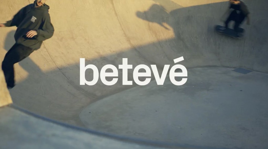
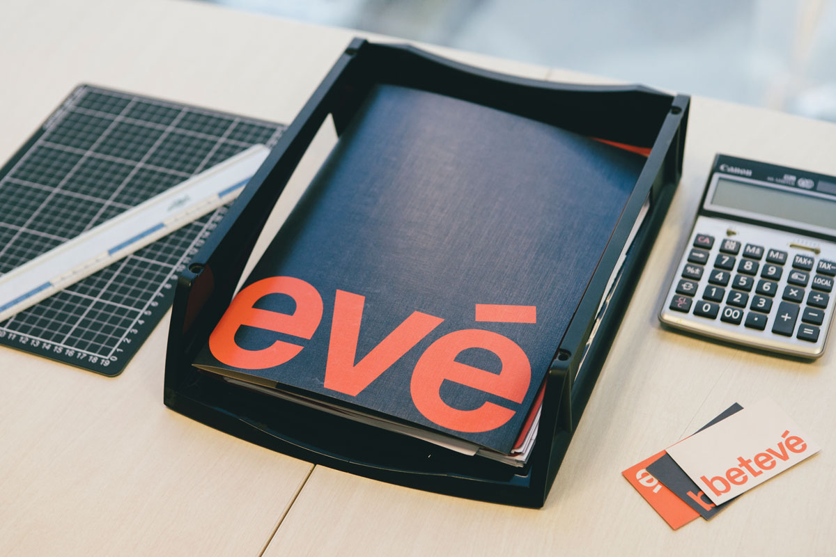
Understanding the use of the lower case as a brand statement, an important gesture that helps to link the brand with the user, and which implies a series of values that will, from now on, identify betevé.
The lower case letters conceptualises the accessibility, the interaction, usability and simplicity that the new brand stands before. betevé is a part of the community and unifies without use of capitalisation.
When the pixel returns to the curve
The objective has been to find a typography sufficiently characteristic to be a differentiating element, but at the same time consistent and suitable to be used exclusively in all applications of identity. Its approach takes advantage of technological limitations as a pretext to impart a series of details that makes it unique. Px Grotesk by Nicolas Eigenheer is conceived as a bridge between the most classic ways of writing and the new digital environment.
Although the radical change of betevé, we wanted to maintain an emotional bond with the hearing. A less aggressive red, less strident, warmer, closer, more earthy supported by a white and a black slightly lowered of intensity completed the colour palette, without great artifices.
“More than designing an identity, we wanted to create a system that would in all its simplicity still have great impact and recognition through the use of type and colours.” Sergi Vilà Bori, Designer at Folch
The identity as a vehicle to explain the new verbalisation to the audience
We needed to develop an umbrella brand which stands solid, yet flexible and systematic, to find the recognisable brand architecture that works both alone and in relation to its many sub brands. To hierarchise the elements alongside the colour and typographic weight, the display of the sub brands keep the lower case became the essential part of the visual code.
Thanks to this system we could move away from the excessive logocentrism and instead add richness to the visual system opening up the endless possibilities to create the sub brands necessary, whether which area they might be related to, following the brand language and architecture.
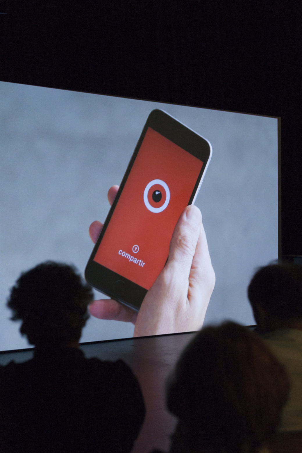
A symbol of interaction
The first identity of BTV was characterised by the use of the image of an eye as an indispensable element of the brand. Although the element was obviated in the last redesign, its recovery can favor and enrich the visual language of the new identity. The eye acts as an indication of participation and interactivity. It is the link with the audience, your graphic representative within the brand. It is essential to differentiate and make the spaces for participation easily identifiable to the audience.
Spreading the campaign
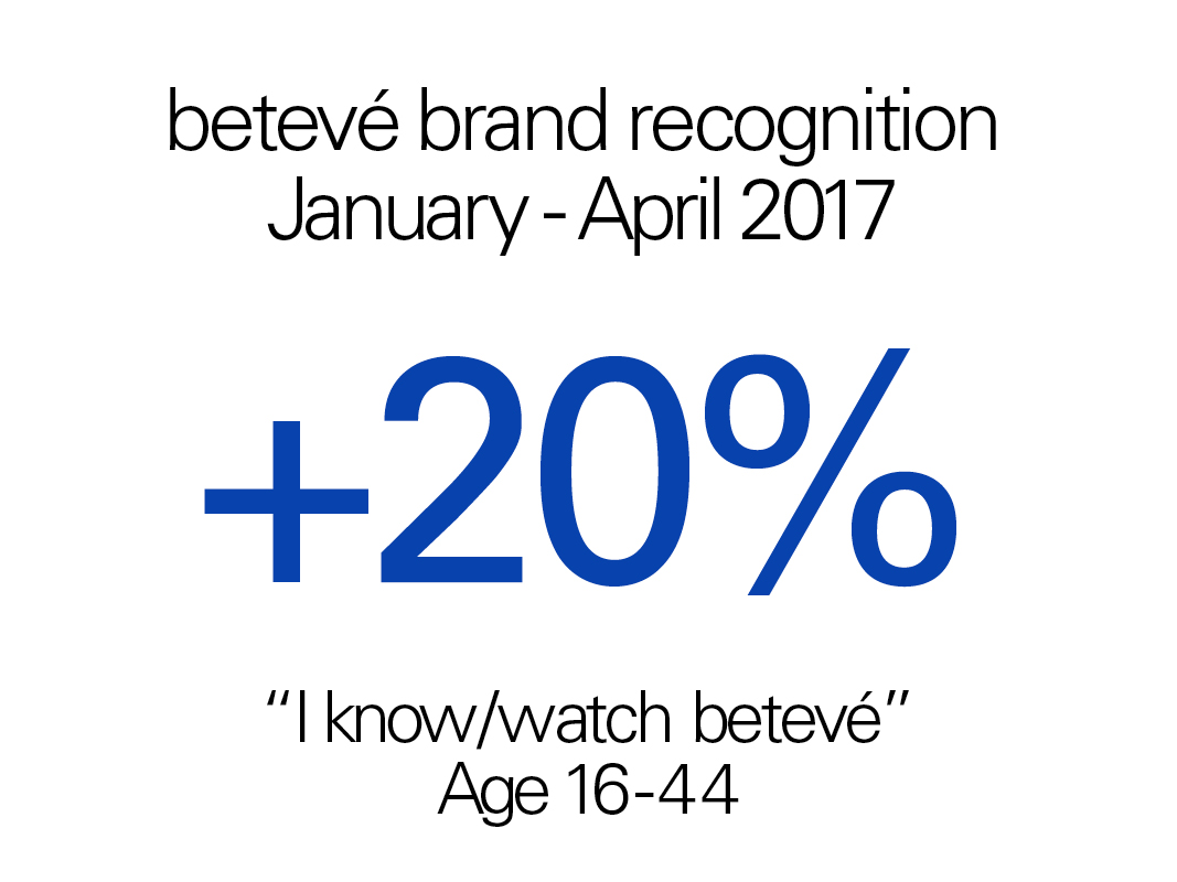
A research survey done by the government before the campaign indicated 46-50% of people between the age of 16 and 44 didn’t recognise or watch the betevé brand; a clear indicator that we had to change the brand from its core. To test if we succeeded we investigated the same research survey done during March and April of 2017, one month after the launch and spread of the new betevé. The survey proved we achieved considerable improvement when it comes to brand recognition and use, with only 30% of people between the age 16 and 44 stating they didn’t know/watch the channel. This rise in recognition also had repercussions online with a rise in followers on all betevé’s social media: +102k followers on Twitter and +13k followers on Facebook (July 2017).
Spreading the campaign
Throughout the month of February 2017, as the rebranding was announced, fifty different commercials were run across the channels of the most important Spanish national media and the most influent local ones: El País (+3m followers on Facebook), Diari Ara (+247k followers on Facebook), El Periódico de Catalunya (+633k followers on Facebook), Sport (+1m followers on Facebook) etc. as well as specialised media like Time Out (+200k followers on Facebook), Butzaca (+34k followers on Facebook) and more. As for digital press, Folch produced 50 different versions of digital commercials in 20 online publications, adding up to a total 3.300.000 views.
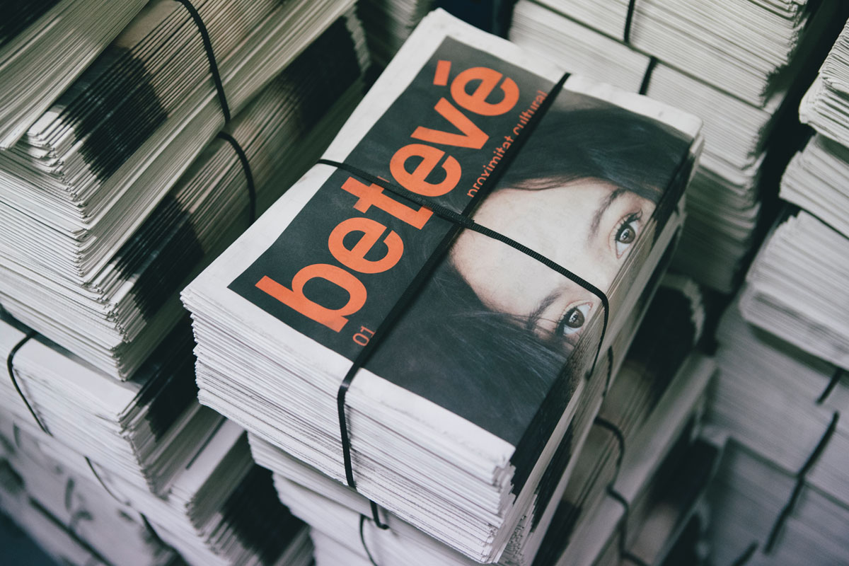
The posters campaign celebrated the reborn of Barcelona’s own media, as the campaign reached every neighborhood for week: 2.149 banners in metro, 35 customised buses. 32.000 posters, 92 opis and 1880 flags across the whole Catalonia. The newspaper was printed in an edition of 70.000 copies and handed out at specific points throughout Catalonia. Also, as we kept some copies available in our online store, the newspaper is still being ordered on a regular basis.
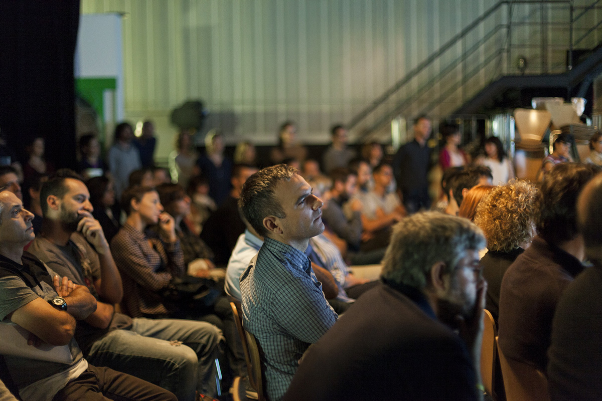
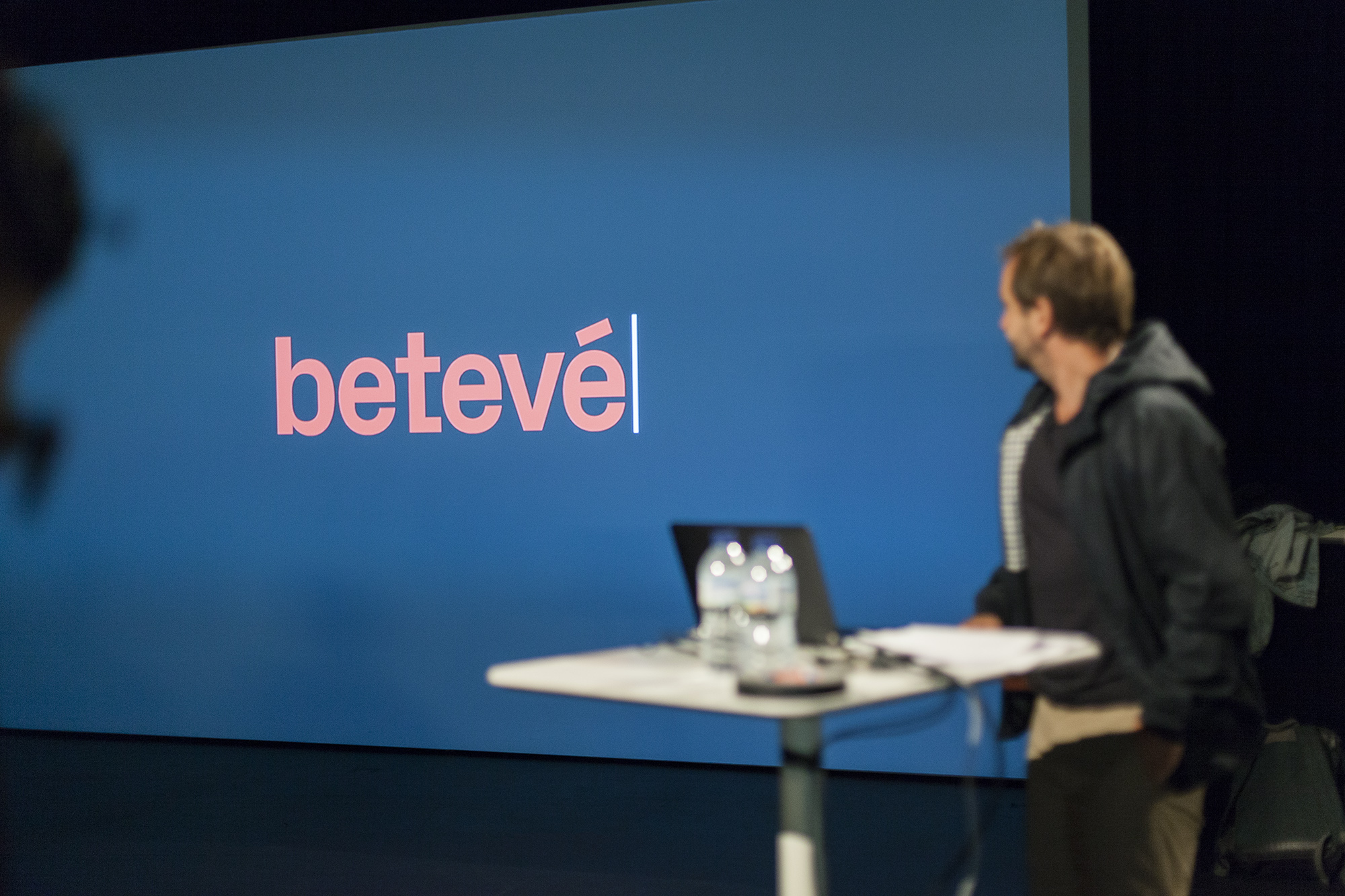
As we were transforming a beloved television channel, various Spanish media wrote about what was happening: El Periódico (+633k followers on Facebook), El País, NacióDigital (+270k followers on facebook). The campaign was also an exercise in re-branding and various specialized digital media explained our working process from a design focussed perspective. This resulted in a presentation of the new identity in the CCCB museum (+60k likes on Facebook) in Barcelona and online coverage onGràffica (+240k followers on Facebook) , UnderConsideration (+20k followers on Facebook) and Brandemia (+54k followers on facebook), among others.
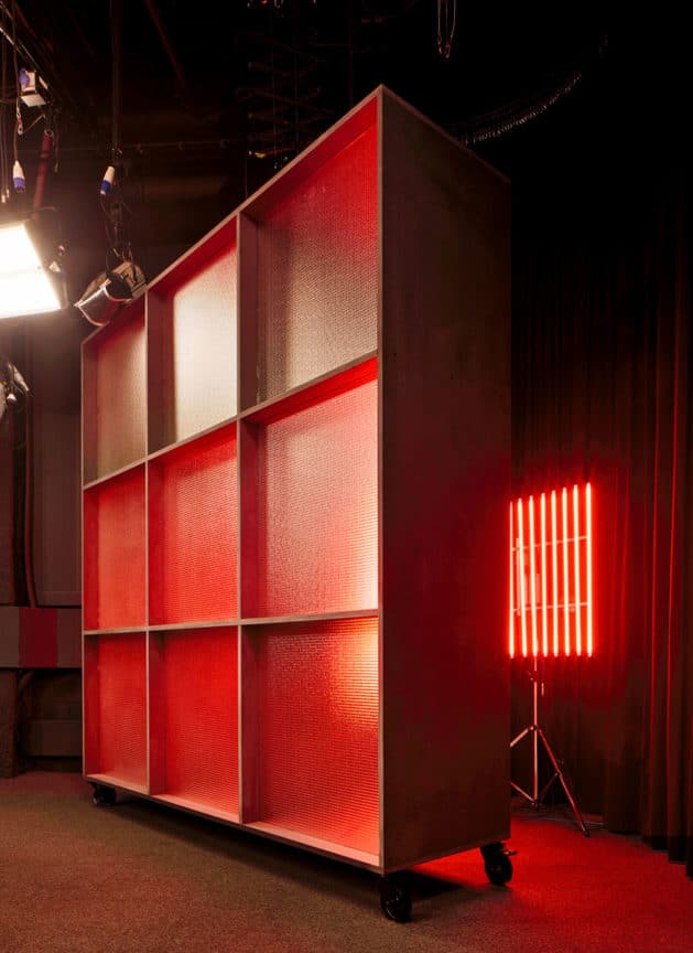
Building a space around the brand
For drawing up an interior environment around betevé, we needed reinforcement. The interior designer and architect Stefano Colli was at our service. Due to earlier collaborations with Stefano we knew he was the right person to understand the language of the brand and find an interesting solution that would meet the requirements of the newsroom and other interior applications to the spaces. The importance laid in a functional multidirectional space where the use of light and textures creates a new dynamism in a corporate mood. Overwhelming, yet forceful and solid.
“We understand the design of spaces as a support for corporate identity; As part of a communication system. We are interested in communicating values, messages and emotions through spaces. Materials, colours, textures and the use of light are elements capable of establishing important relationships when defining a communication strategy.” Stefano Colli, Designer & Architect
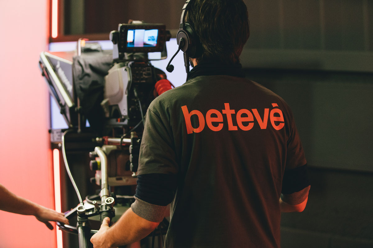
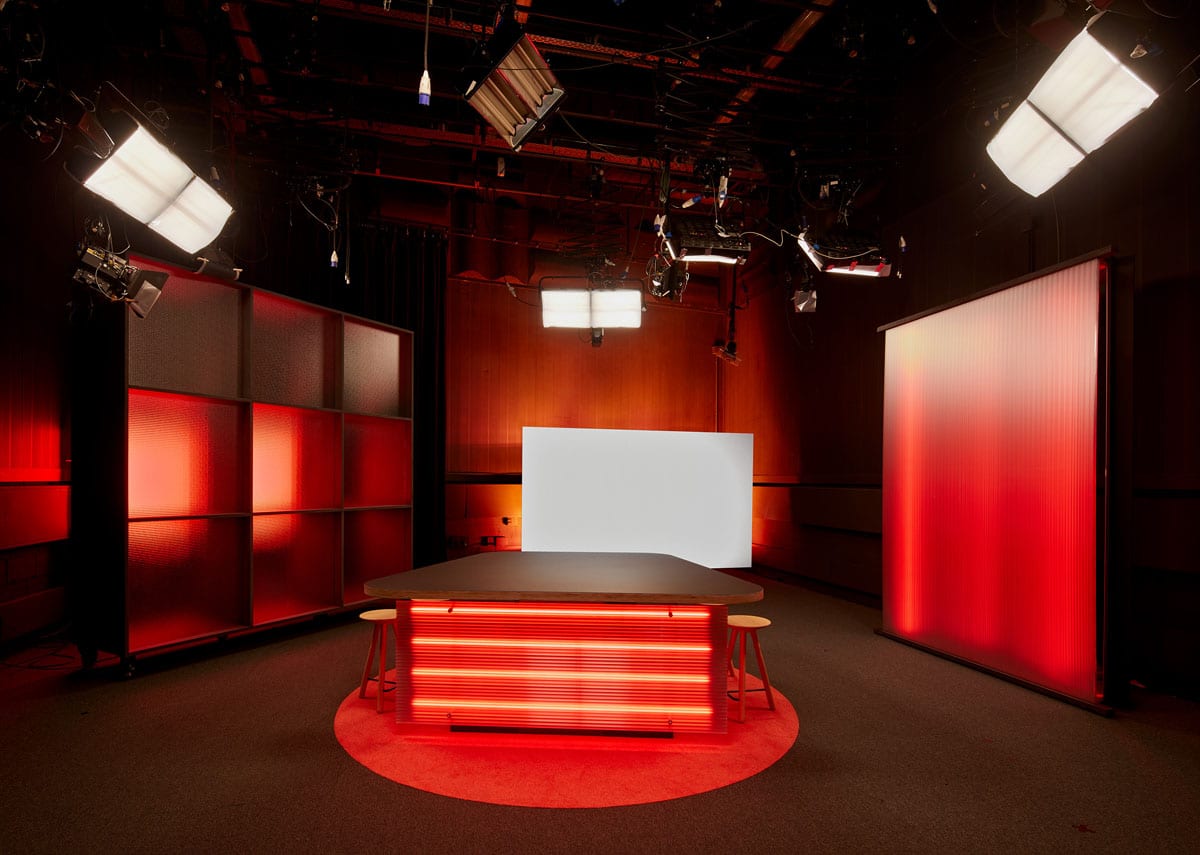
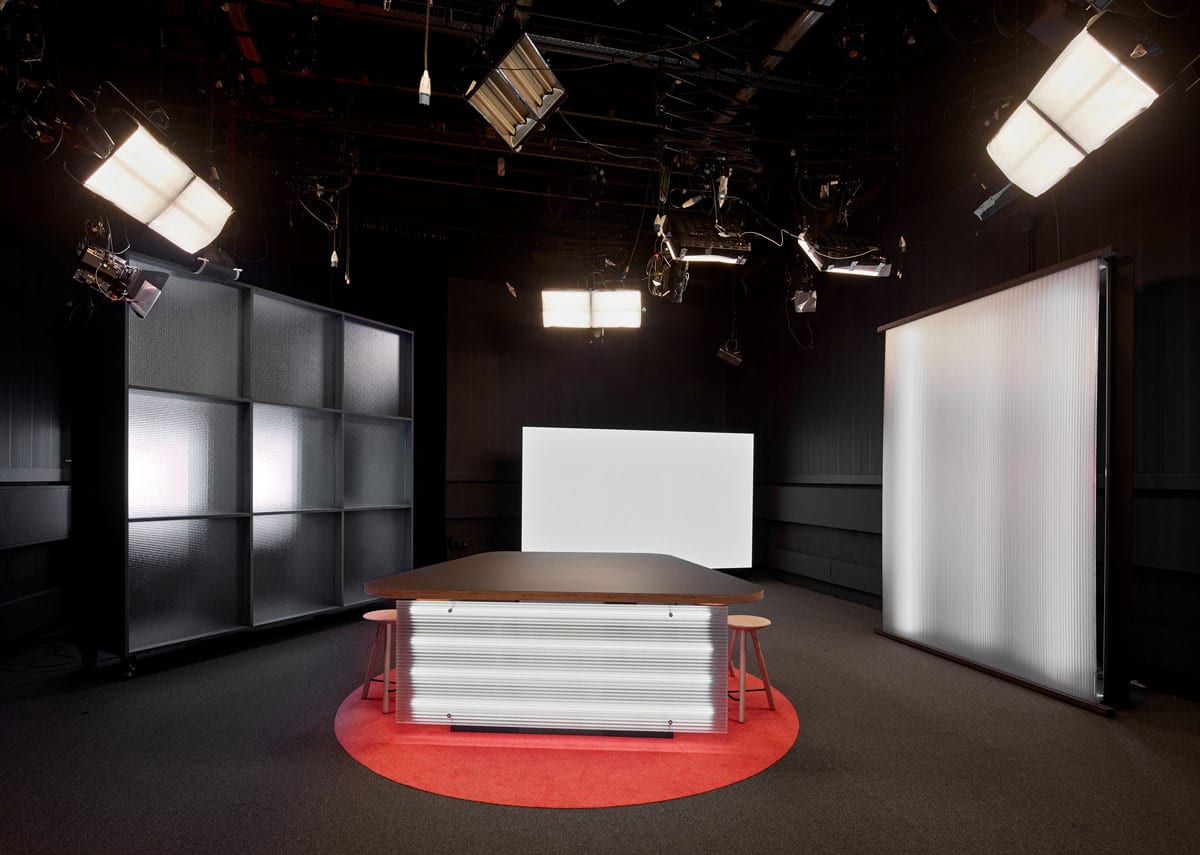
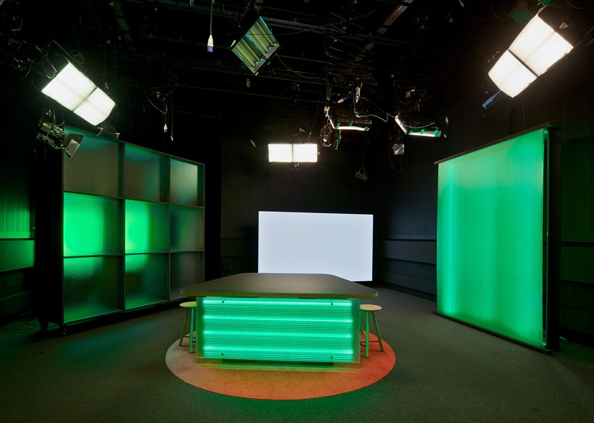
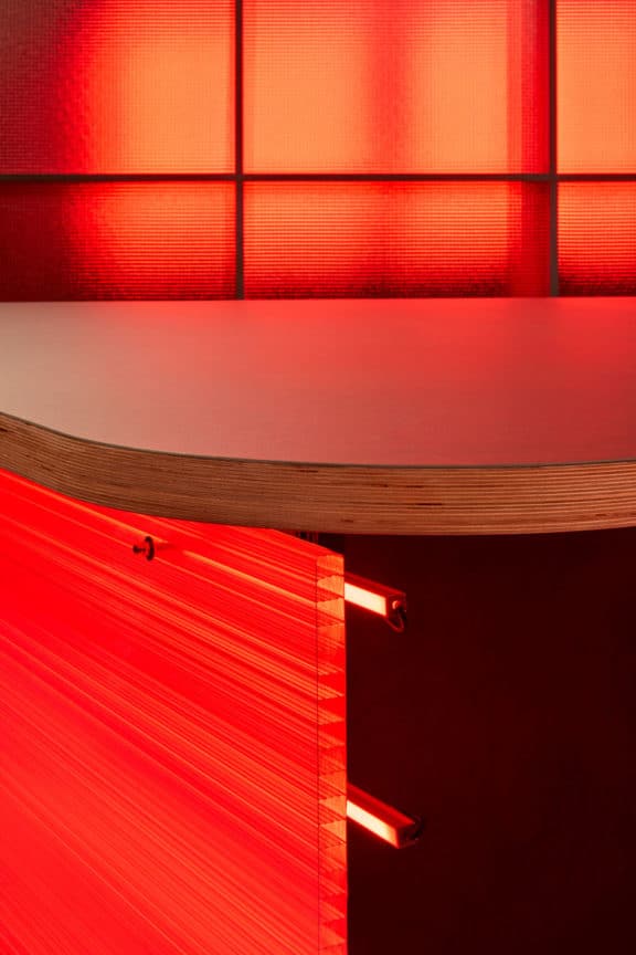
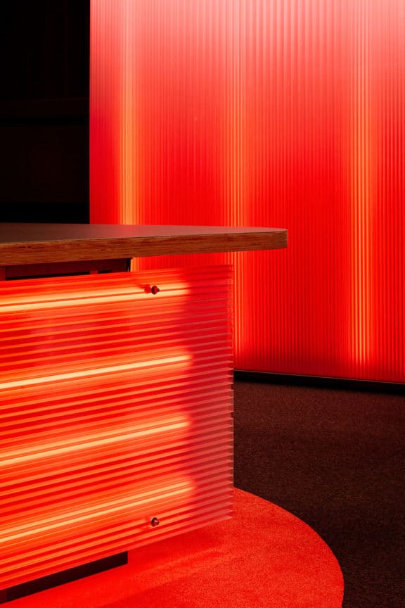
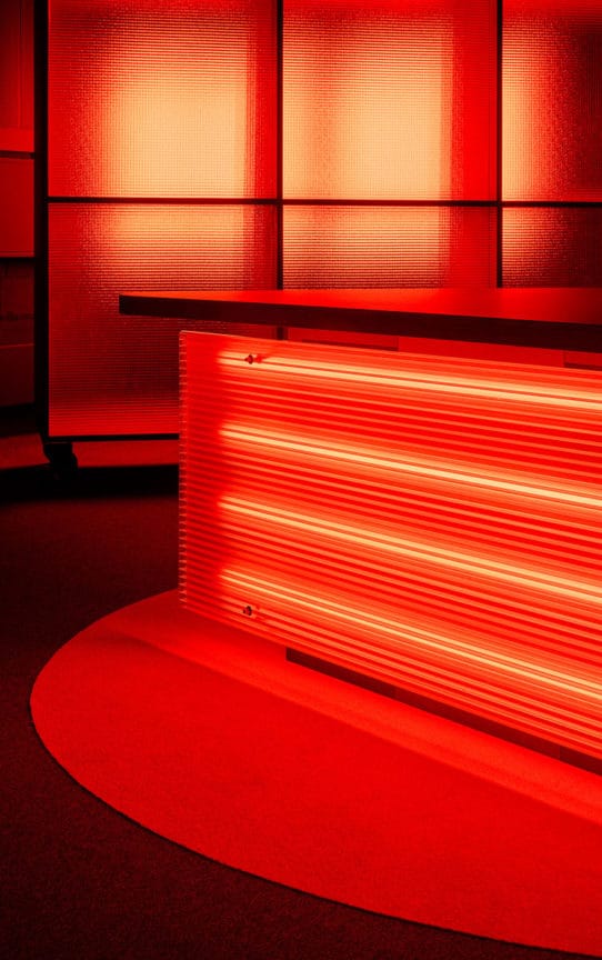
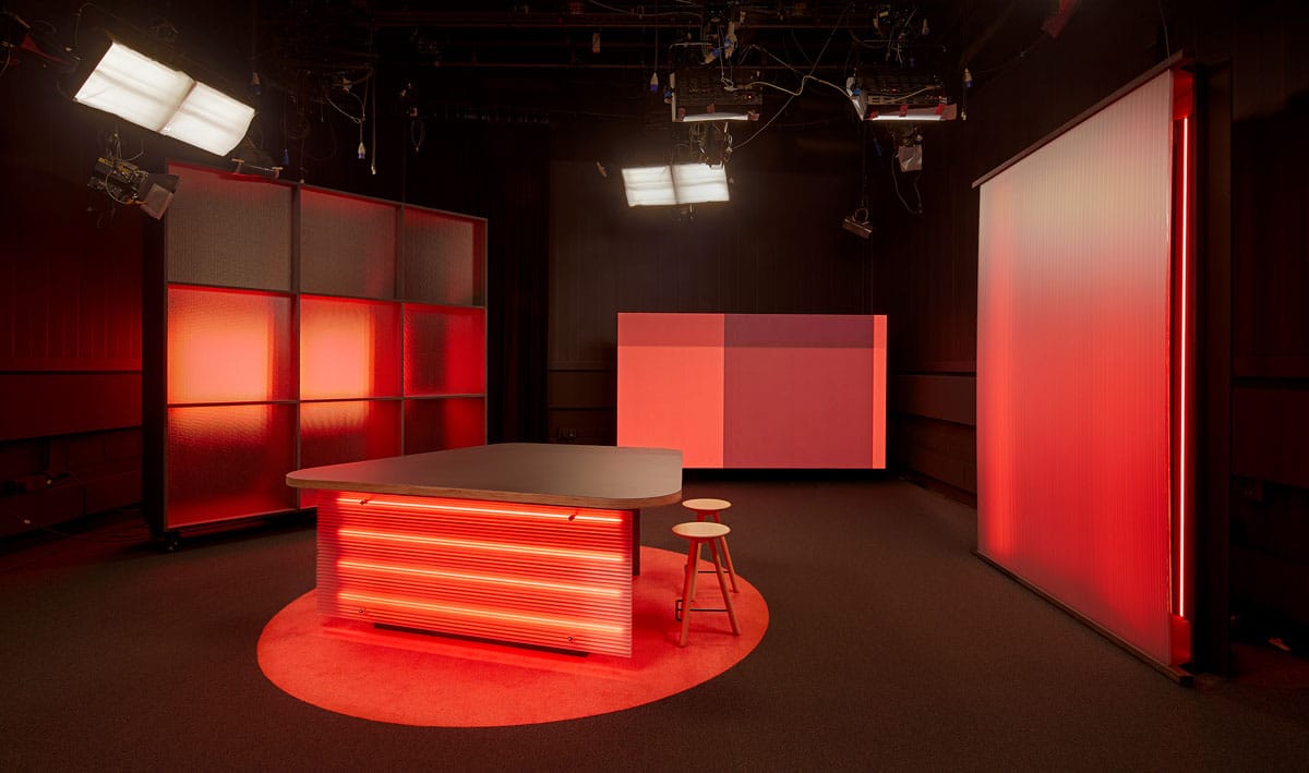
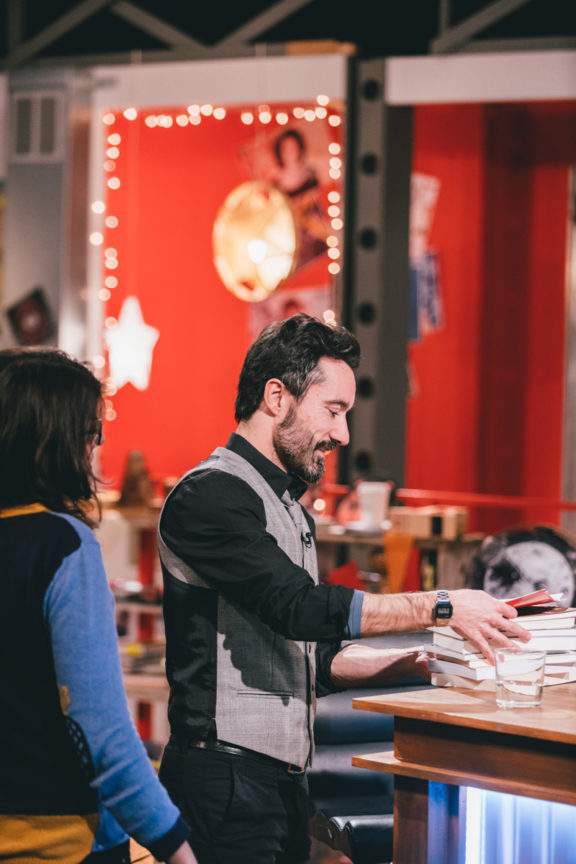
Building a dynamic news studio
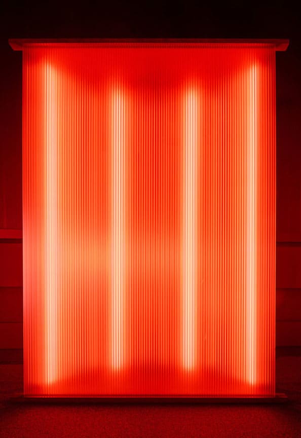
The material played a crucial point when creating a dynamic news studio. The screens are accompanied with surfaces from led supported cellular polycarbonate which gives the studio multiple options of lighting and moods. The reinforced glass partitions reflect the adjustable lights and create the essential atmosphere of the space. By breaking the otherwise innovative transparent materials, a soft circular carpet reinforces the intimate environment and the three-legged beech wood stool by Martín Azúa for Mobles114 reflects the archetypical idea whilst integrating a contemporary sense.
The fundamental prism of betevé: content first
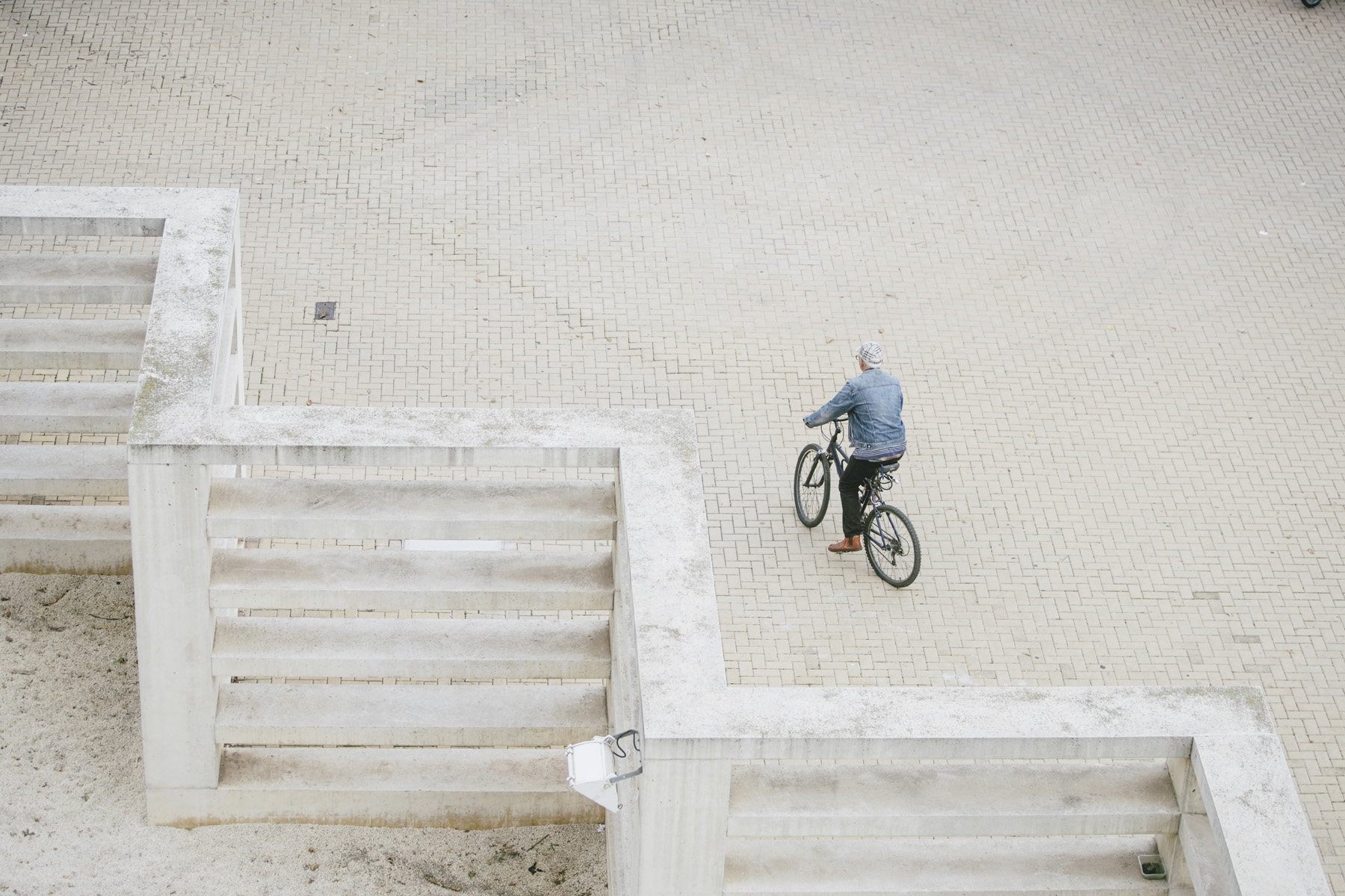
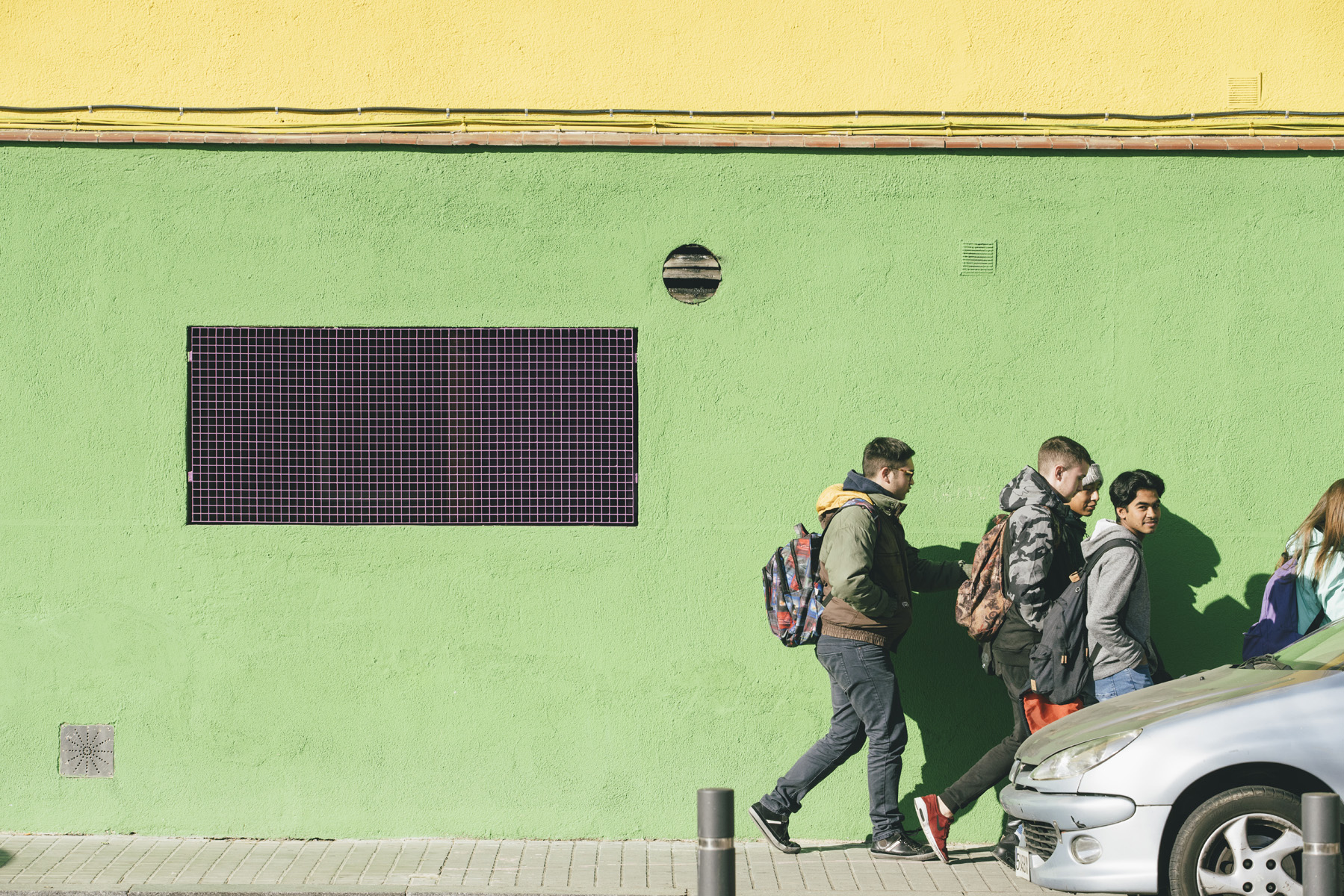
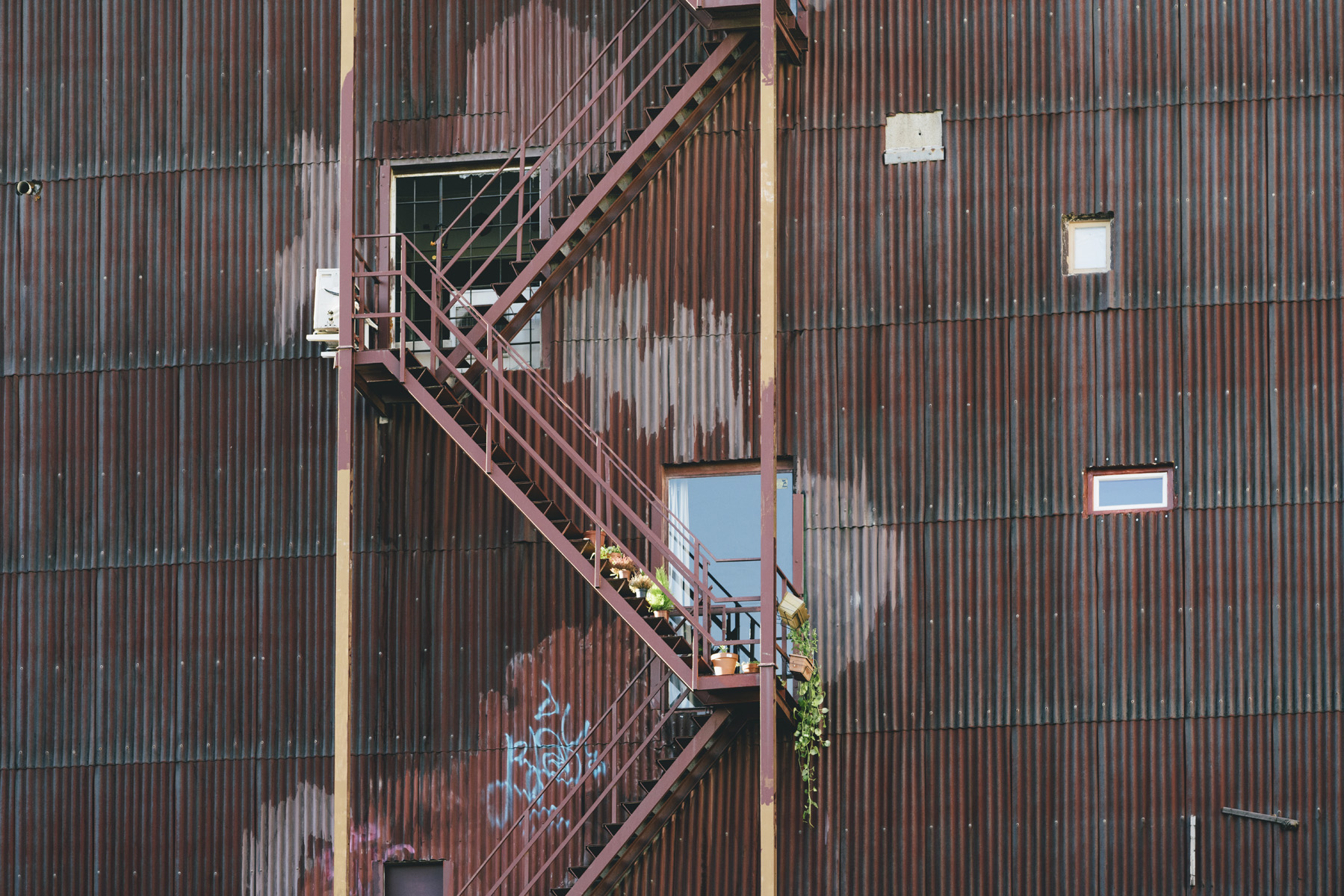
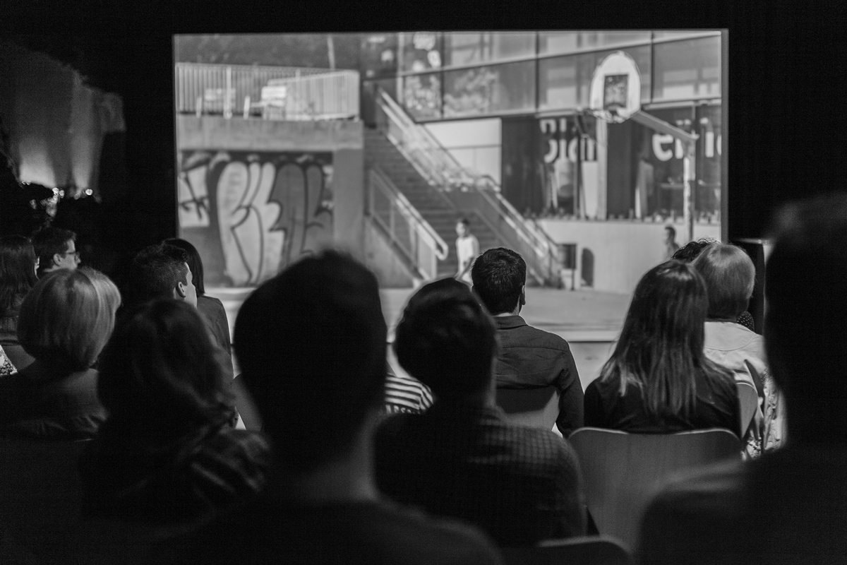
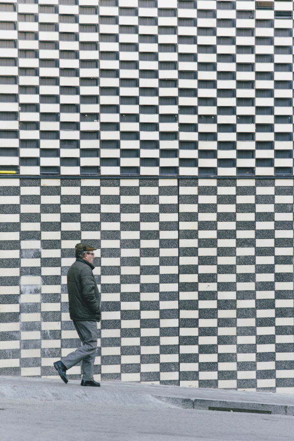
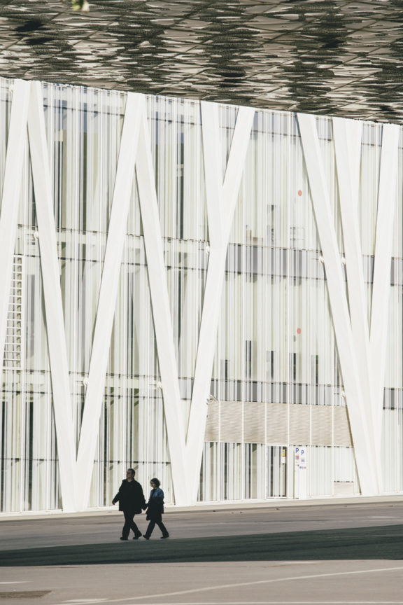
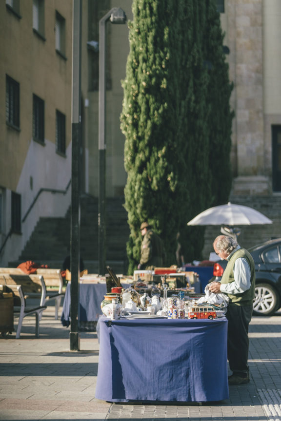
Going back to the initial force behind the rebirth of the brand –the urge to shift the archetype of the city– we had to find a tone of imagery that could portray the reality and environment that surrounds the citizens and in this way manifest and bring the channel closer to the audience. The direction of art and strategic content creation became the fundamental tool to achieve a unique style and tone when creating their image library and short pieces of self-promotion.
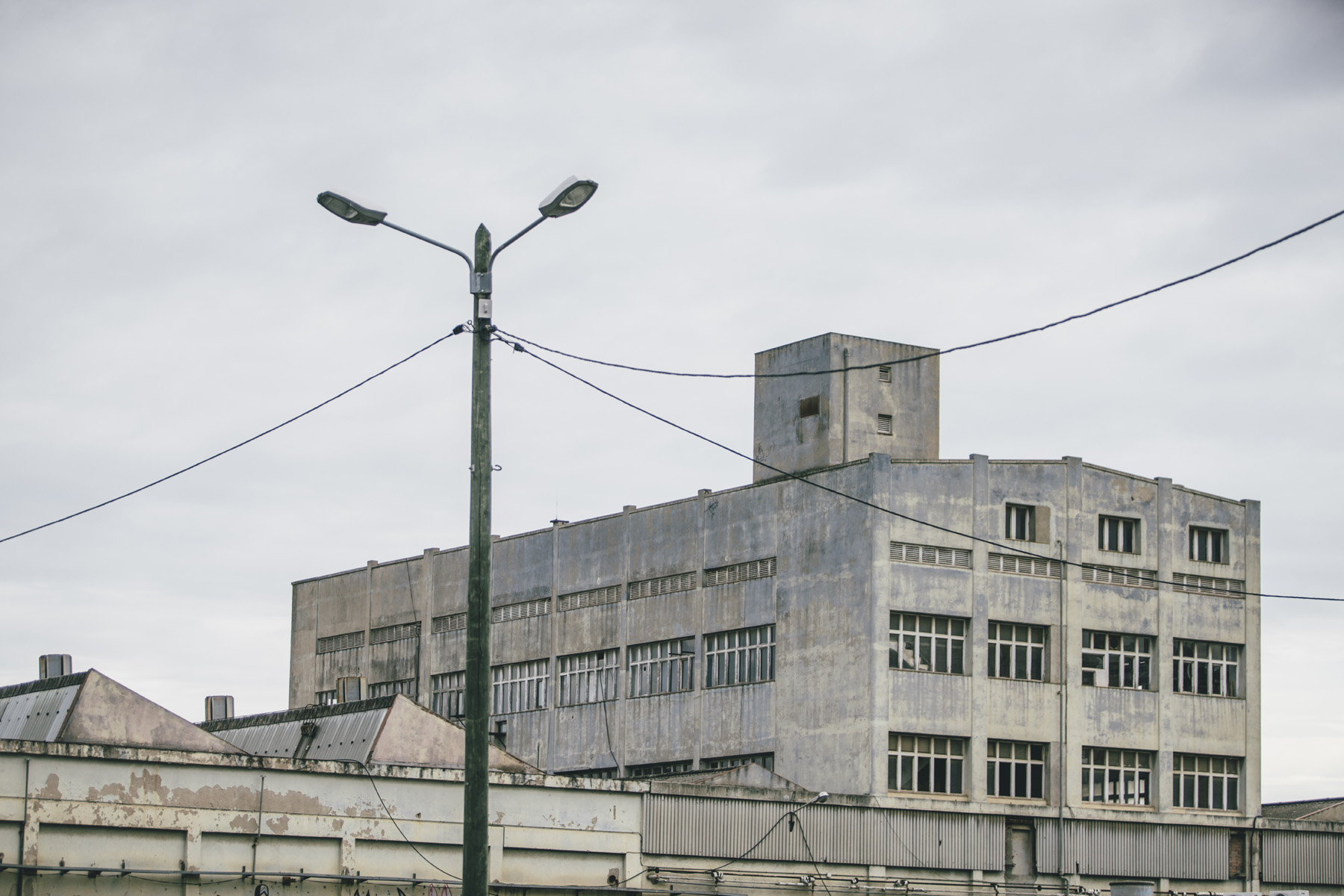
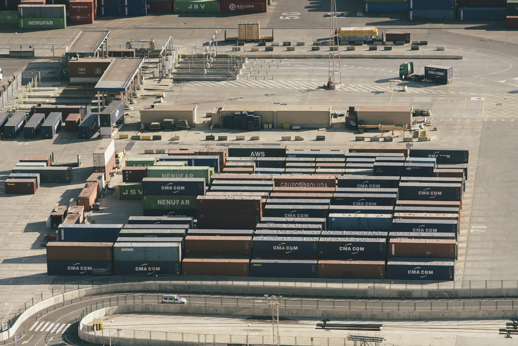
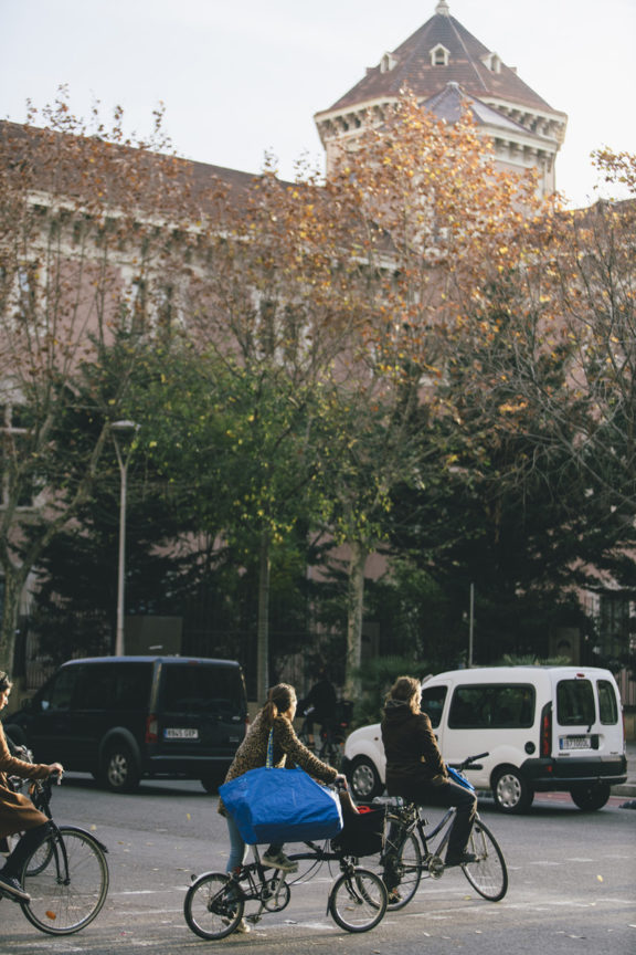
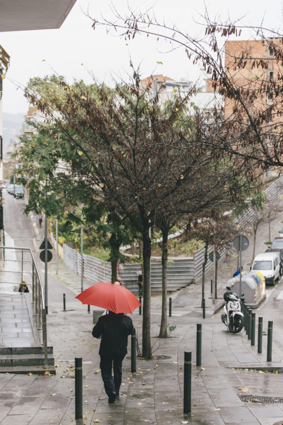
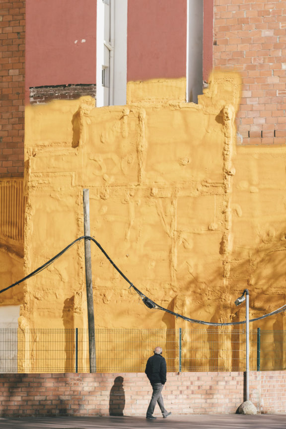
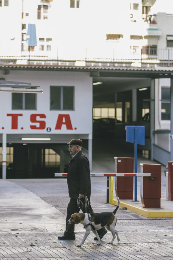
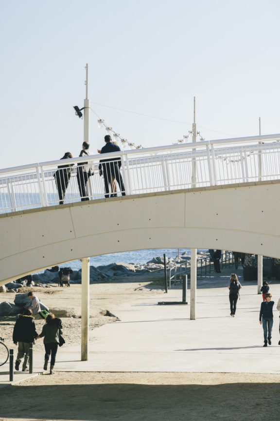
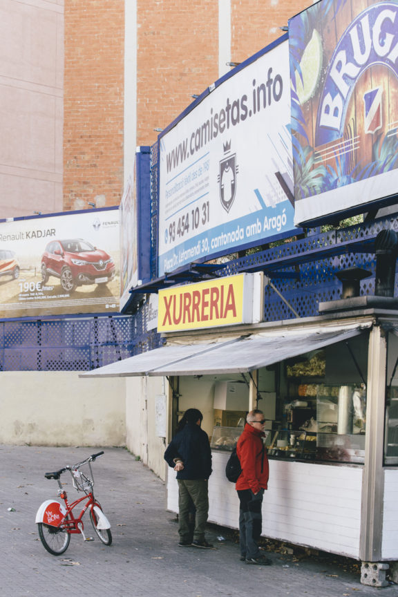
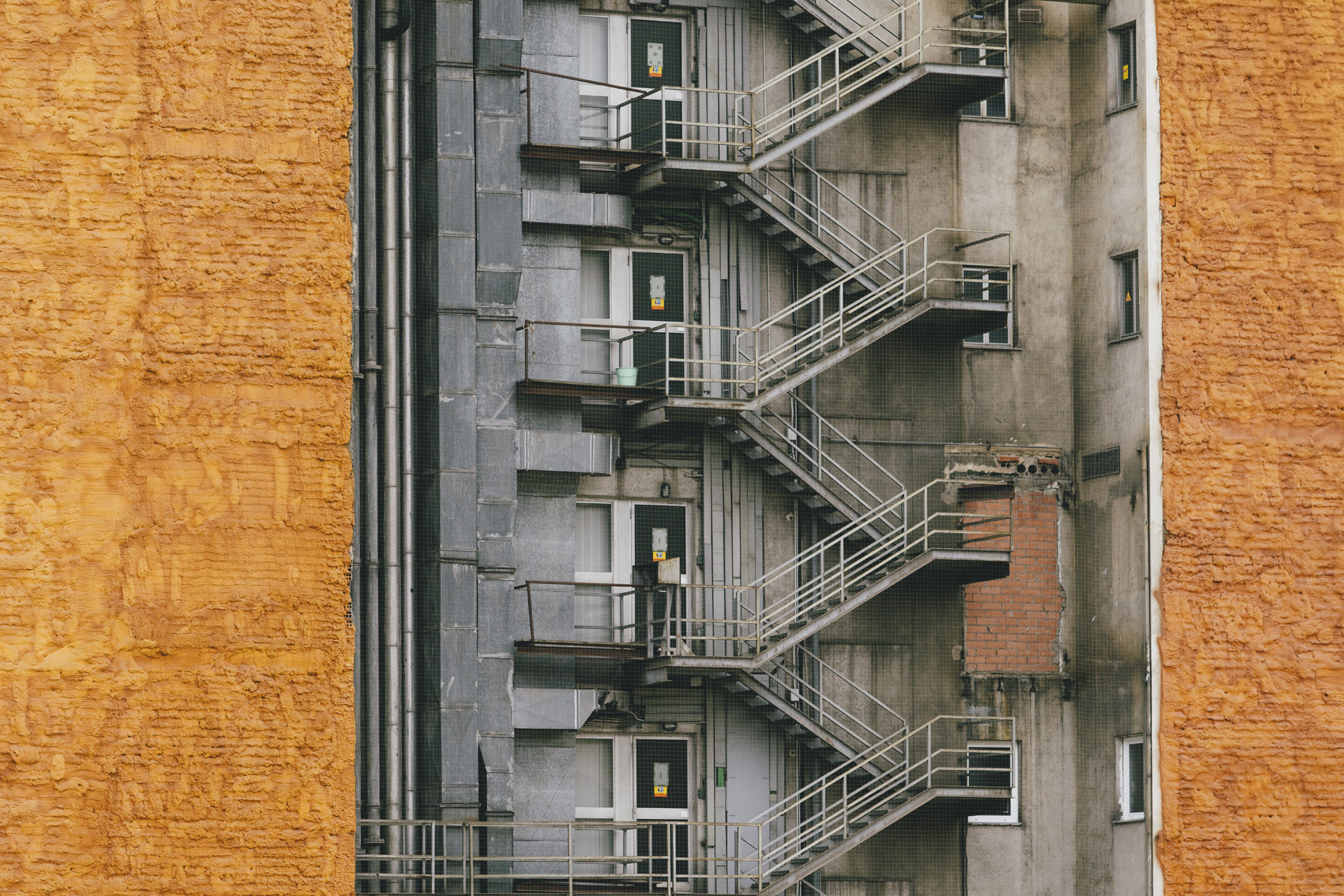
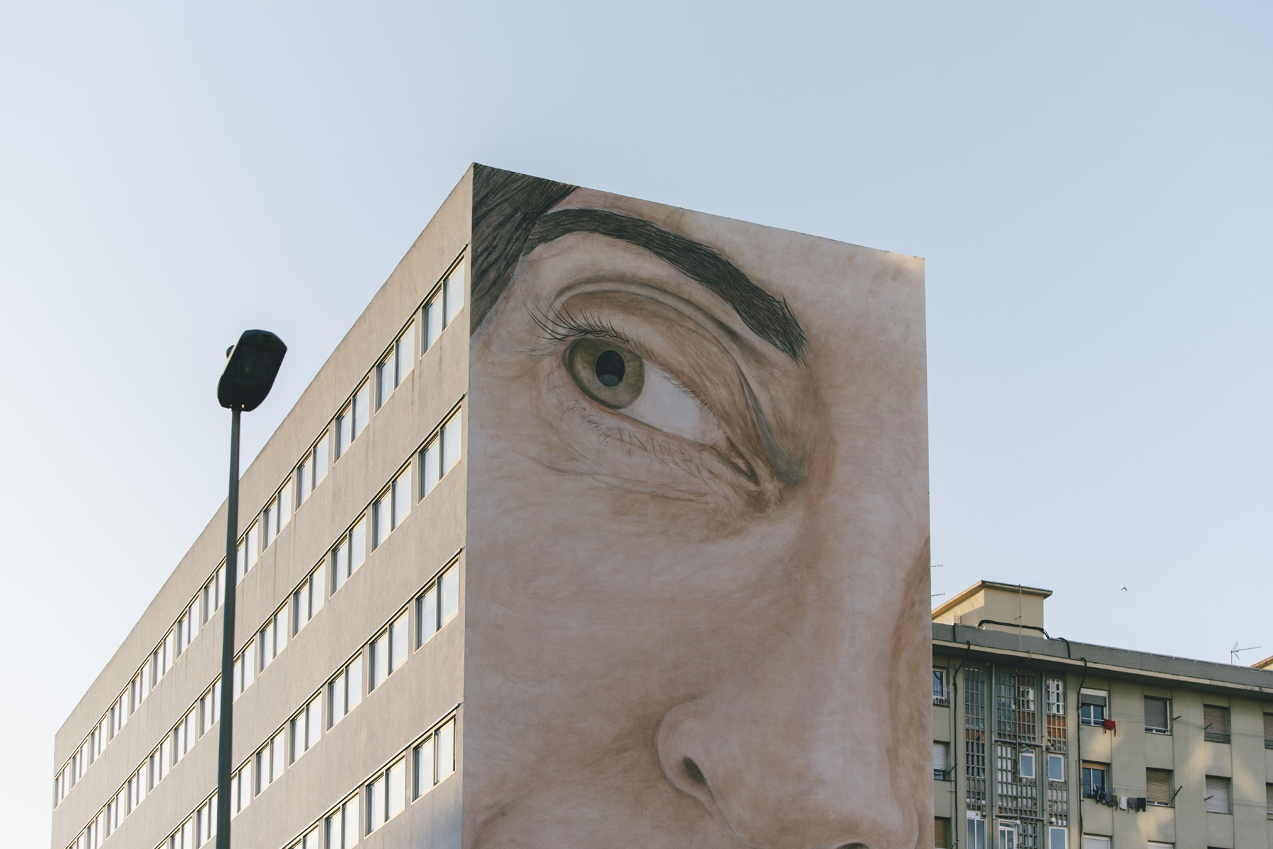
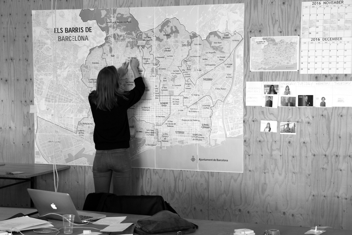
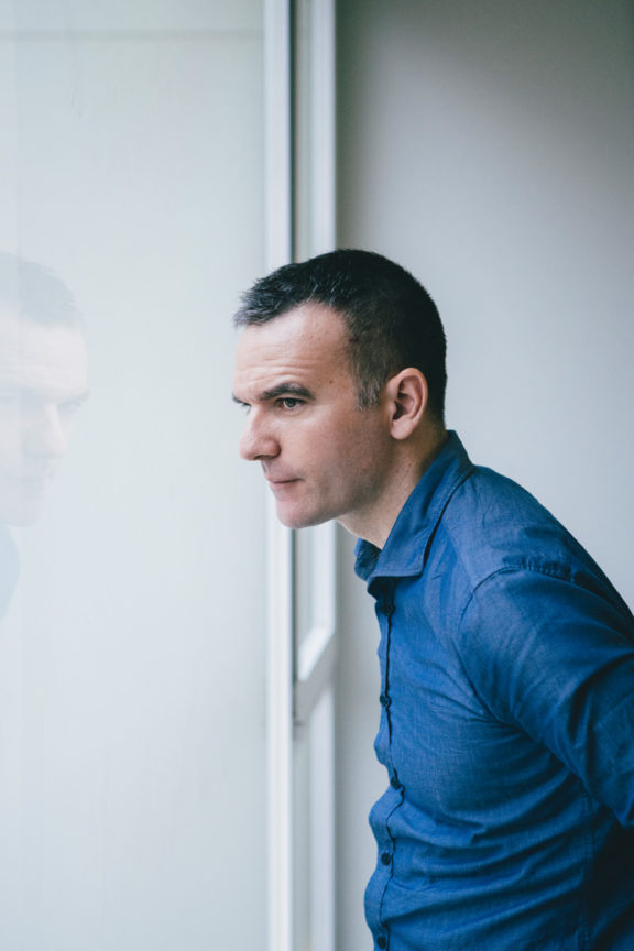
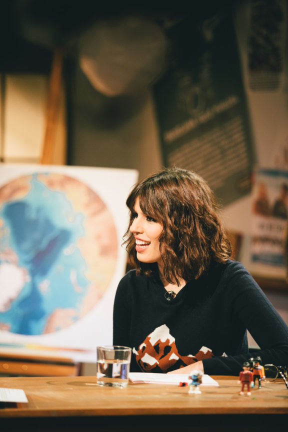
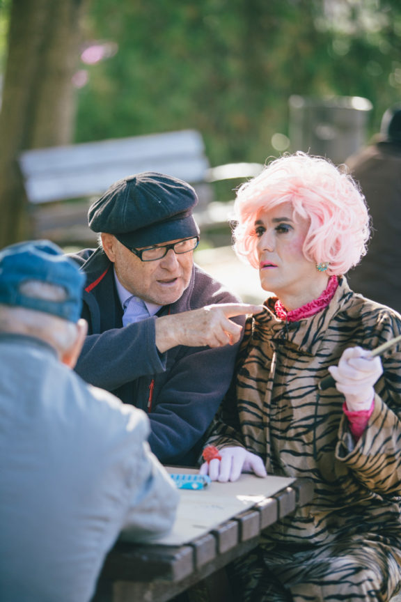
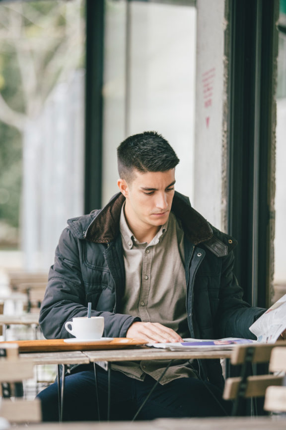
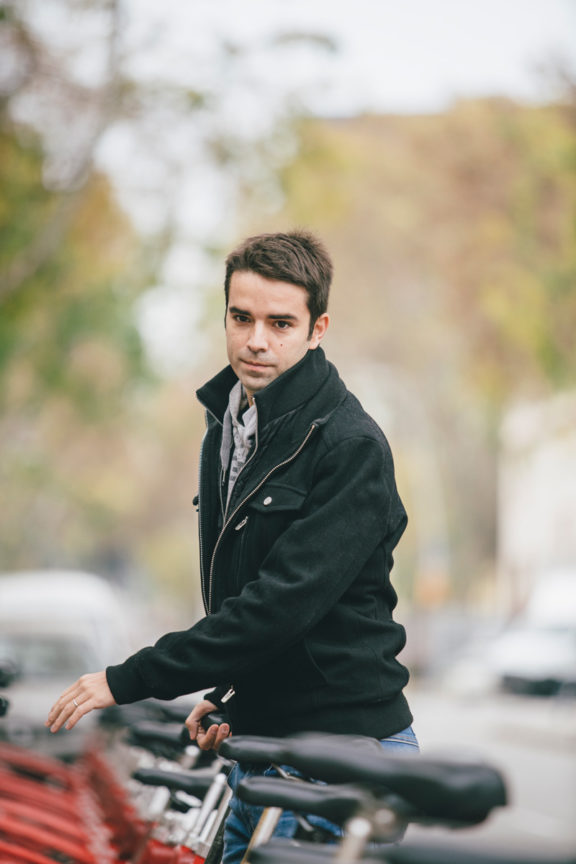
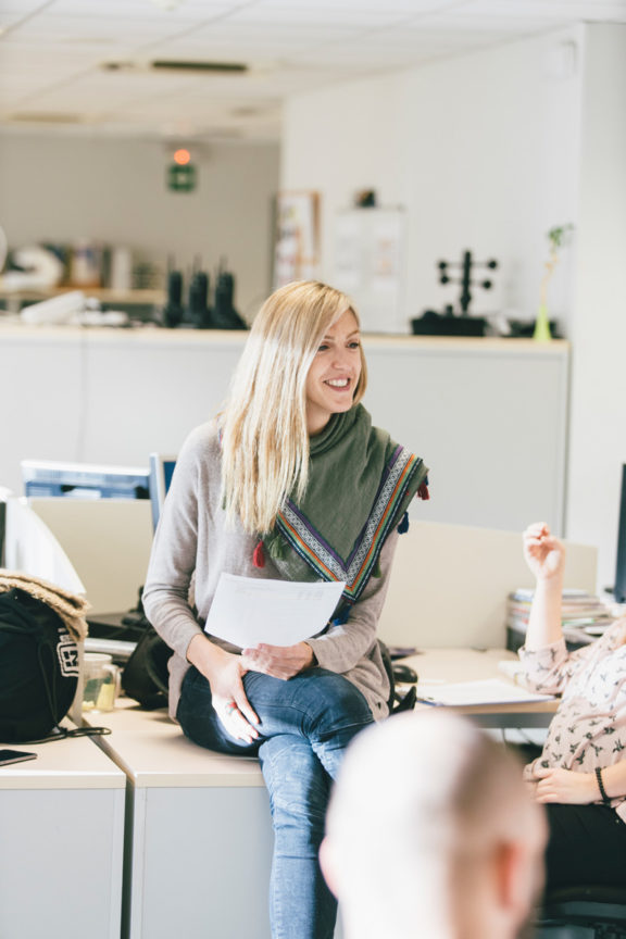
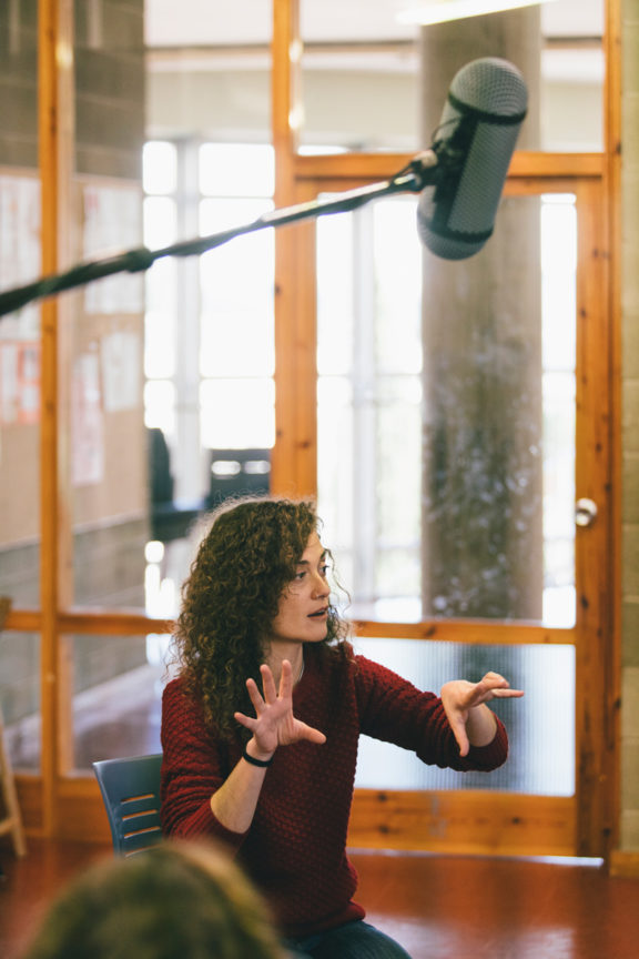
Leo García Mendez had the important role of building up the image library, during months he has captured the essence of the 73 neighbourhoods of Barcelona. A plentiful number of 2.800 photos of numerous of sport activities including football games in Camp Nou to surf in Barceloneta. Covering all the cultural events such as theatre, concerts and dance, governmental spaces, politician headquarters, public services among other important factors which define our city.
The creative production company Goroka was the natural choice of associate. Through earlier collaborations, such as the travel collective Eldorado, we entrusted their documenting lens to capture the essential audiovisual pieces for betevé. The present resources in the digital language like zooms, loops, gifs and cinematography came to play a huge role in the visual approach.
“When we capture an image we are reinterpreting reality, we put the camera at a certain height, we use a specific optics, we order colours, textures and proportions looking for beauty, and above all we choose a moment that seems to bring value, that counts for something, a fragment of history that we believe is representative for the city.” Guille Cascante, CEO of Goroka
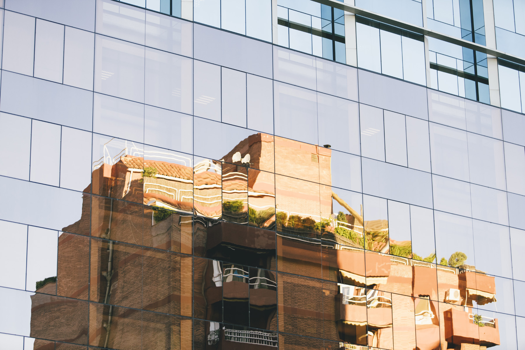
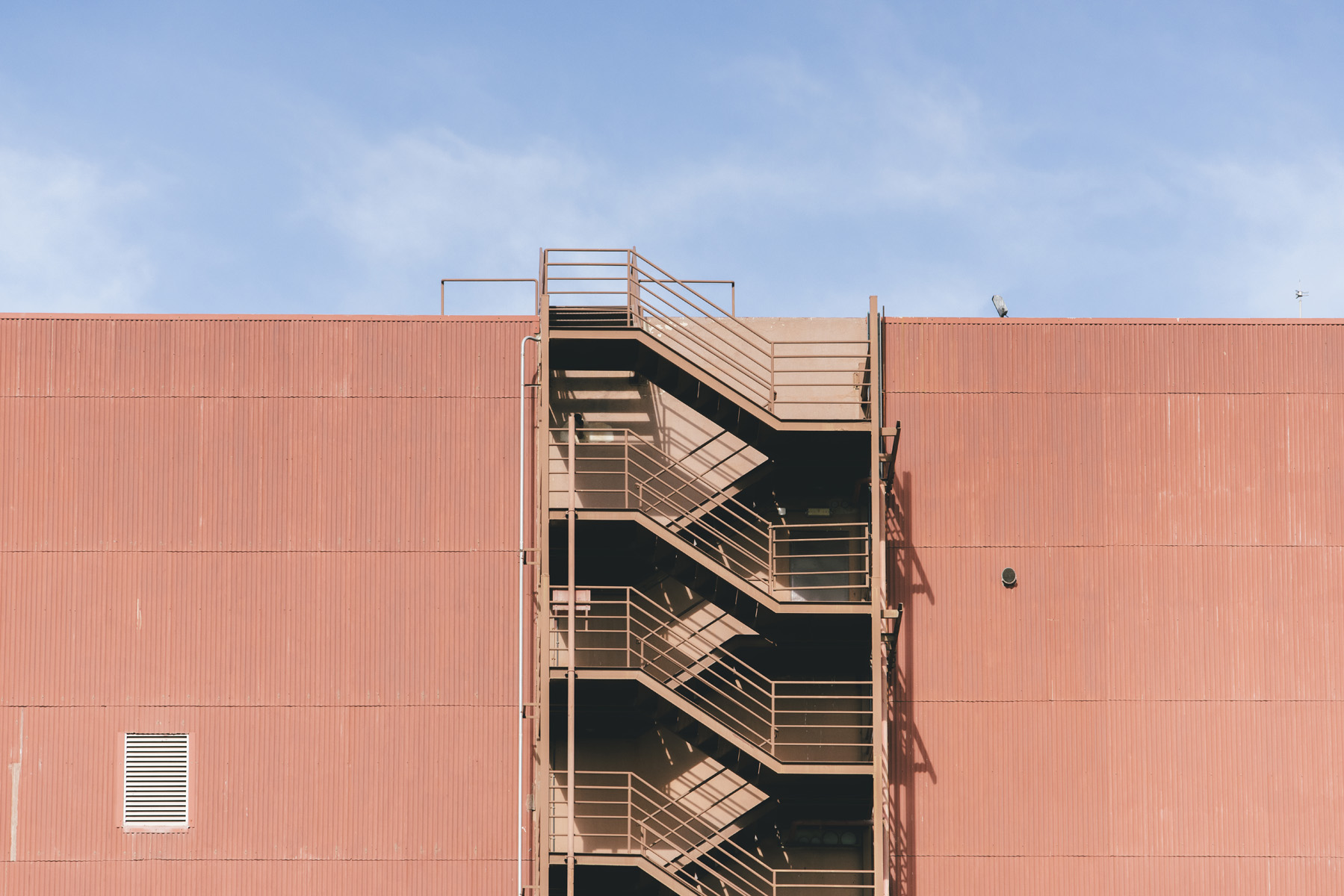
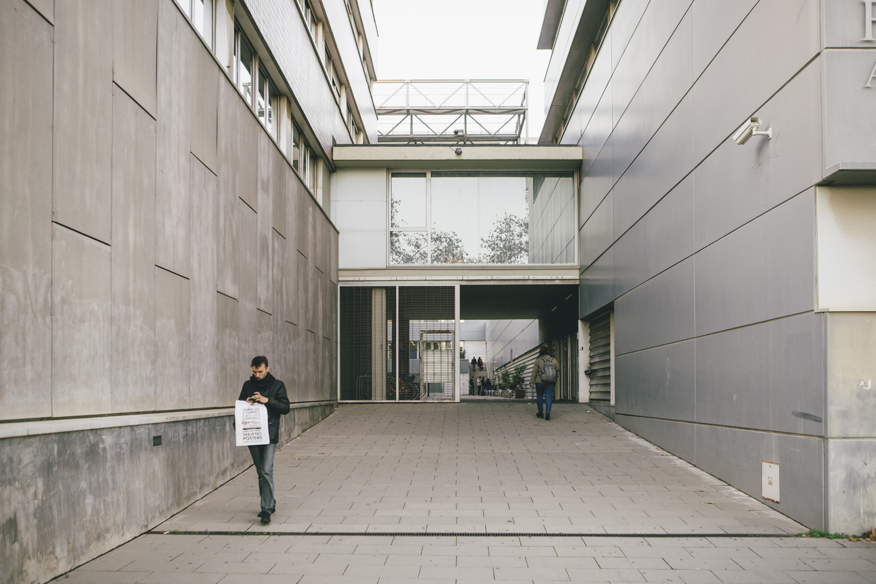
Besides the audiovisual pieces we needed to build up an image library to be able to control the voice and tone of the channel and enclose the shift of paradigm. We commissioned the photographer Leo García Mendez who possesses a great experience in documentary photography in the mood we aimed to capture. A very photographic approach with natural light, fixed plans, moving elements and colour saturation of the urban space gave us a more general view of the extraterritorial city.
The anonymity offered by the urban space contrasts with the personality of those who inhabit it. To portray them in their daily activities, in a sincere but anonymous way, manages to reflect their character and, therefore, that of the city. Alongside, architecture plays a fundamental role in perceiving the city. The spaces, the materials, the forms and the textures all configure the environment where we live. Framing the details that shape these elements brings a new vision of the urban space.
Brand in motion
We believe the moving brand relies and is defined based on three fundamental parts: motion, image and sound. Motion as the vehicle through which the audience receives the content, the true protagonist of betevé which should reign over any other element. The motion is crucially following the codes of the digital world interface, user experience and responsive design, reinforcing the idea of a betevé as a Transmedia medium. Simplicity, clarity and solidity are the key concepts that have guided this entire development of the moving brand of betevé. The motion graphic studio Norte understood our ambitions, and with their expertise in animation we could truly meet the expectations to find a distinct movement for betevé.
“It is not the first time that Norte is involved with branding for Television, but this time the project was much larger, especially on a strategic level, where it was about generating a transmedia narrative with motion as a support.” Salva Borrego, Project Manager, Norte
Setting the movement of betevé requires an understanding of a myriad of devices, their functions and interfaces. Vertical and horizontal displacements, so called “swipes”, zooms to enlarging and reducing the content, the imitation of digital writing, adaptability and the folding and overlaying of images were the key movements to apply to the brand.
Dynamic applications and symbols
The main fly is reflecting the liquid character of the brand. It is encouraged, alternating the umbrella brand and the corresponding decline at any time during the broadcast. The complementary information of the status bar has been redesigned to adapt to the brand language, so has the symbols and infographics. Maintaining graphic coherence has been the main objective to produce all post-production graphic material. The representation of information in a graphical way follows the codes marked by the identity: orthogonality, geometry and colour.
“I think a brand which own formal structure already predicts that it will move allows developments in motion from its own form and communicate a multiplicity of concepts and contents” Ana Zelich, Member of the ADG FAD jury, Co-founder of zeligstudio and Mediapro
Designing a sound
The composer Nil Ciuró, born in Barcelona, has managed to capture the essence of the project through a unique sound composed especially for the occasion. The fusion of the acoustic world with the digital universe was the basic concept to create the asymmetrical, minimalist, innovative and contemporary style that breathes the composition. The use of sound as a visual element, in constant dialogue with the image and the animation, an identity that complements and expands the visible and brings us into a sensory three dimensional space.