Year: 2015
Tags: Art Direction and Design, Creative Production, Strategy and Design Thinking, Creative direction in production
-
 Share
Share
3,471 views
A cult publication rewarding the best ideas in the country
Like every year, all Spanish creatives’ ideas and projects get together in the Advertising Annual, edited by Club de Creativos. CdC is a non-profit organization whose work fosters creative work in the country and promotes the association of the professionals in the field. With a high-selected jury, Club de Creativos chooses the best projects from designers, advertisers, illustrators all across the peninsula and rewards their work and careers. CdC is a unique organization and its Annual is a “cult”. In the last sixteen years, the most prestigious creative studios of the country —Mucho, Erretres, Design by Atlas, among others—have been entrusted for curating the book each year. For this reason there were high expectations when we were called to design this year’s Annual.
“Thanks to the Annual we can analyse brands’ health, monitoring their growth and evolution year by year.”
Rafa Antón, Club de Creativos Chairman
Beauty and experience
We couldn’t start without taking into account one of the topics that fascinates us the most: what is a book today? Its main function has of course changed dramatically in the last decade: introducing an interesting yet puzzling question, what is the meaning behind books today? Our answers can be summarised in two words: beauty and experience. We strongly believe in the physical presence of a book and its unique features of establishing a relationship with the reader, creating an experience with them and a situation around the object. This is the approach we took as we started to design the Annual.
-
 Shareof
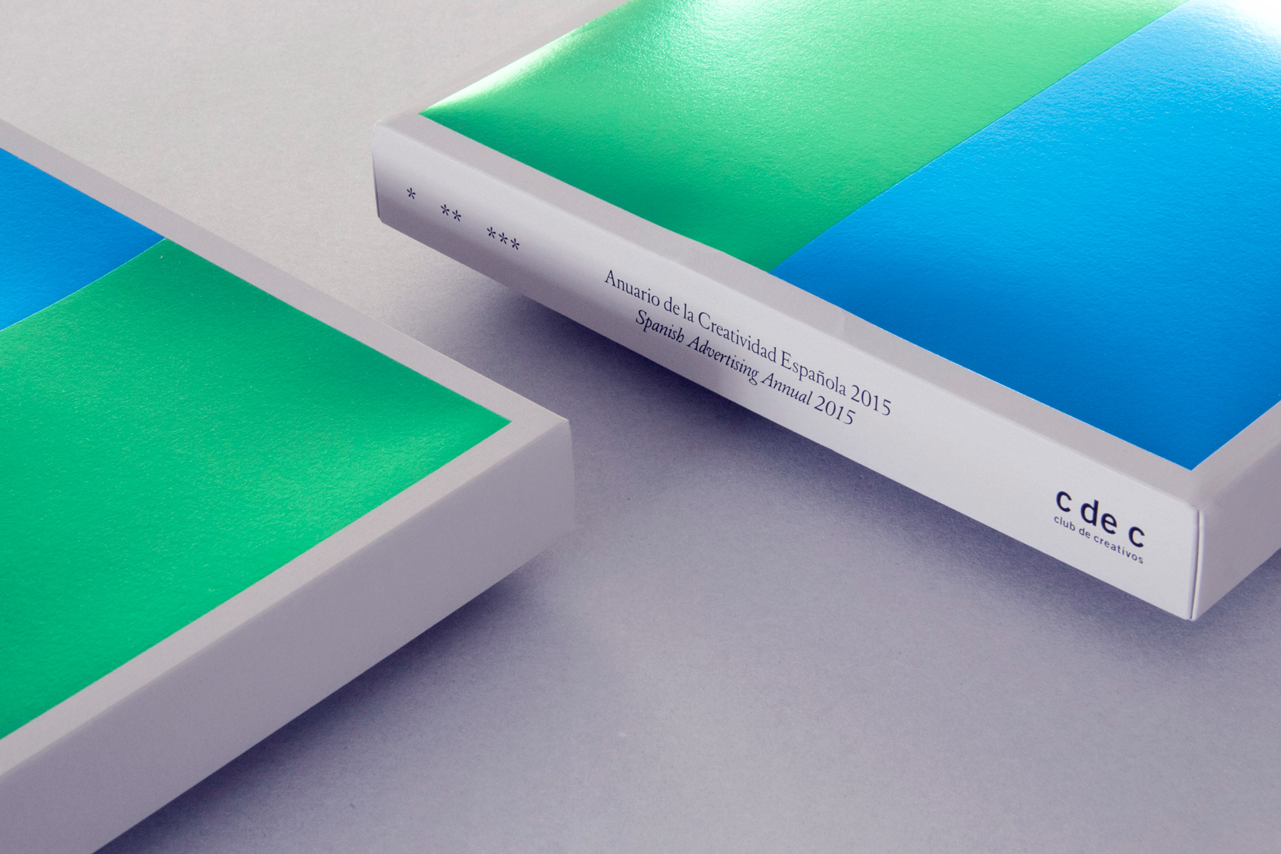
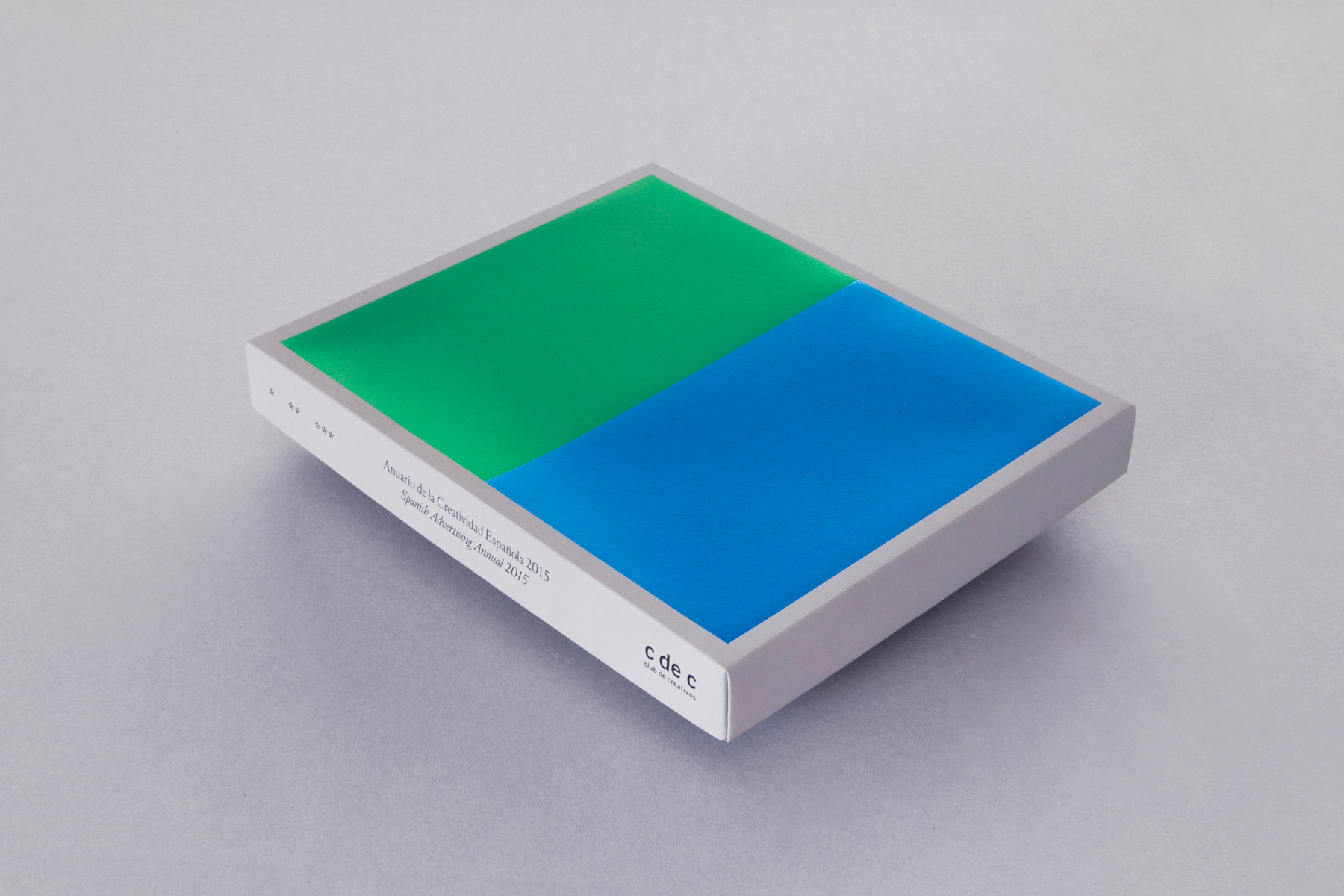
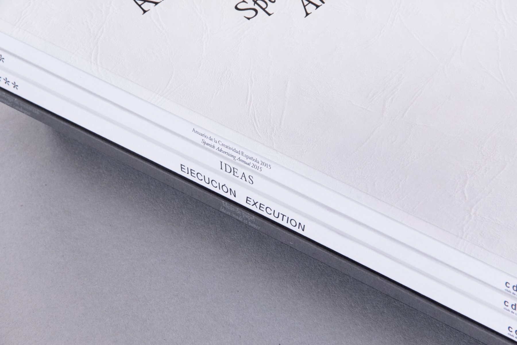
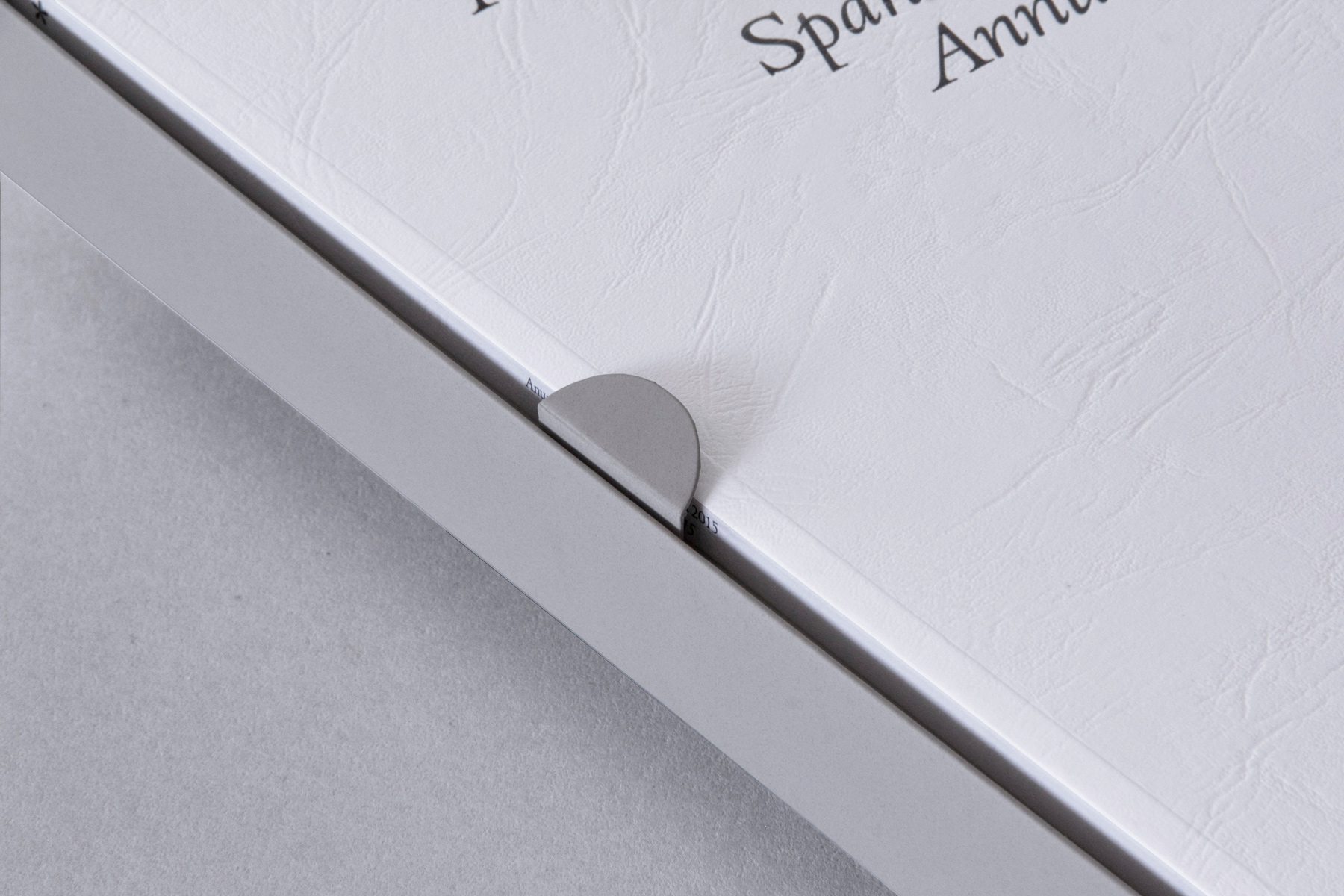
All the institutional information is contained on the spine, while the geometrical and abstract cover features two rectangles representing the two souls of the book.
How one book turns into four
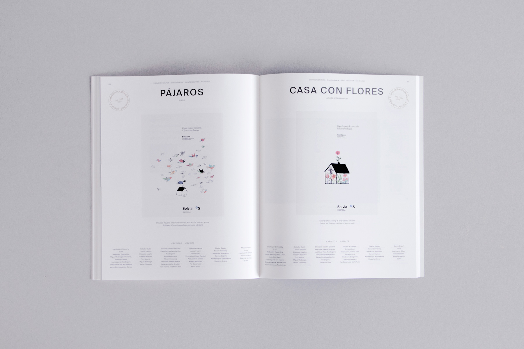
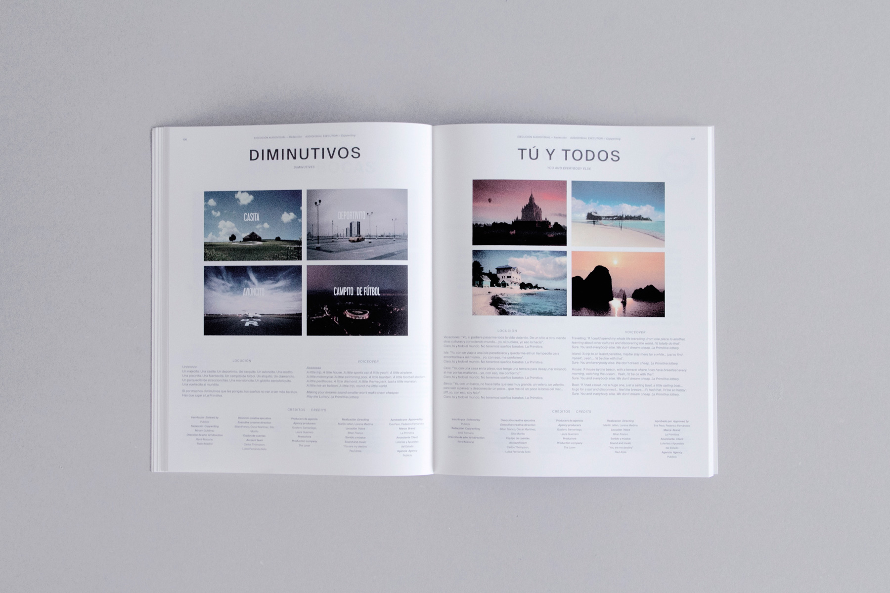
The categories of the CdC awards resembles the two momentum of each project: Ideas and Execution. Projects are judged in these two main categories and are moreover divided into market segments. The Ideas section features all the projects developed on a conceptual level only, while the second category Execution showcases all work in their final stages of development. Apart from these two pillars, an institutional part presents the information about the Awards and the Jury as well as presenting the Grand Prix.
XVI Anuario de la Creatividad Española by Folch and previous editions from other Spanish studios.
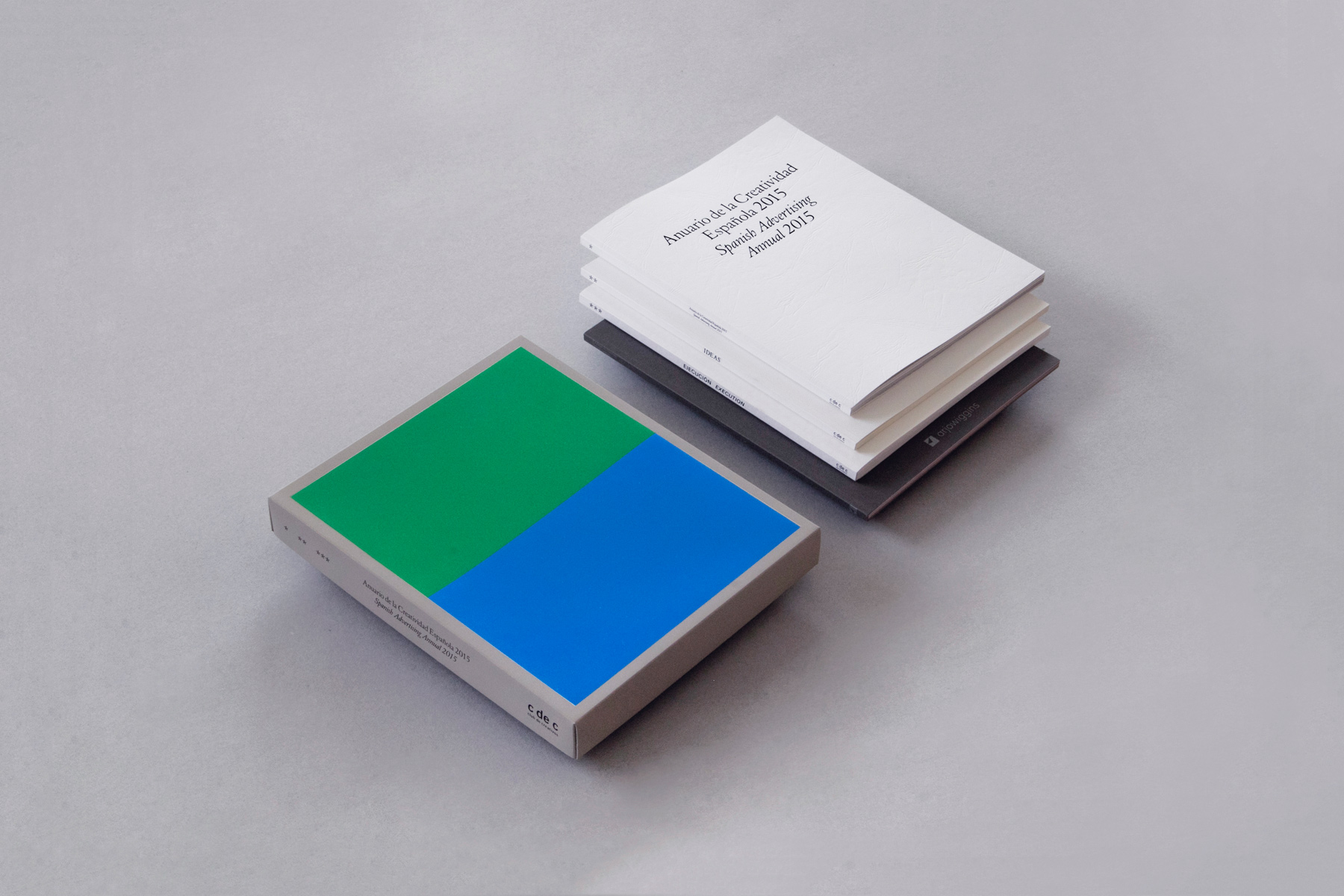
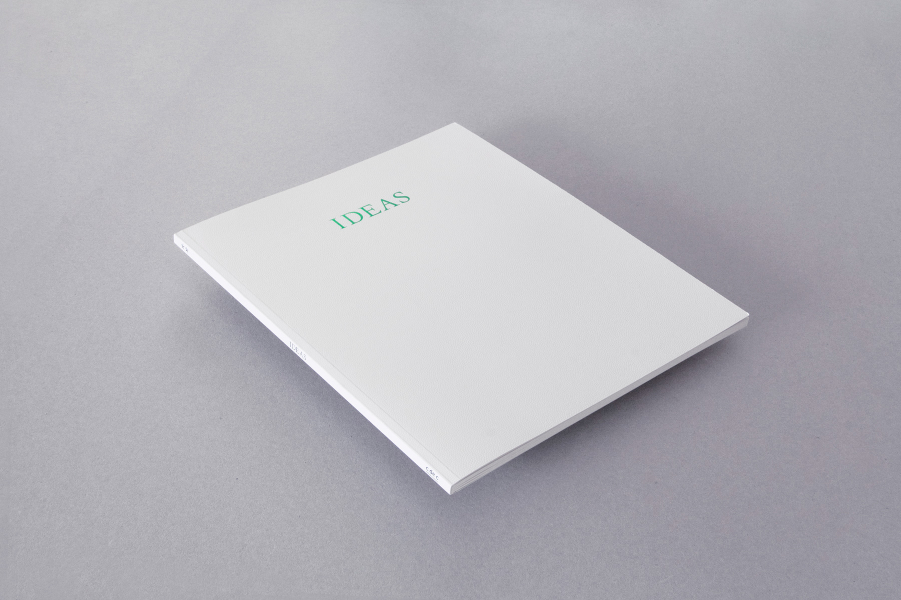
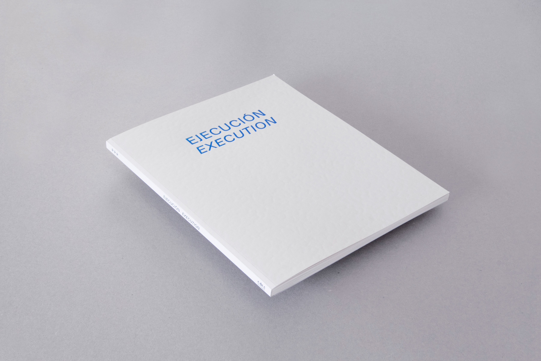
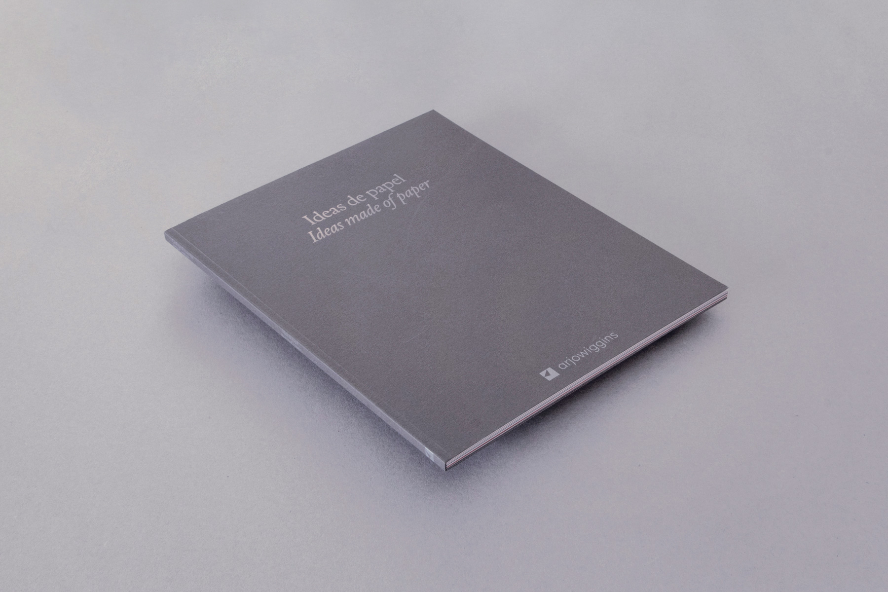
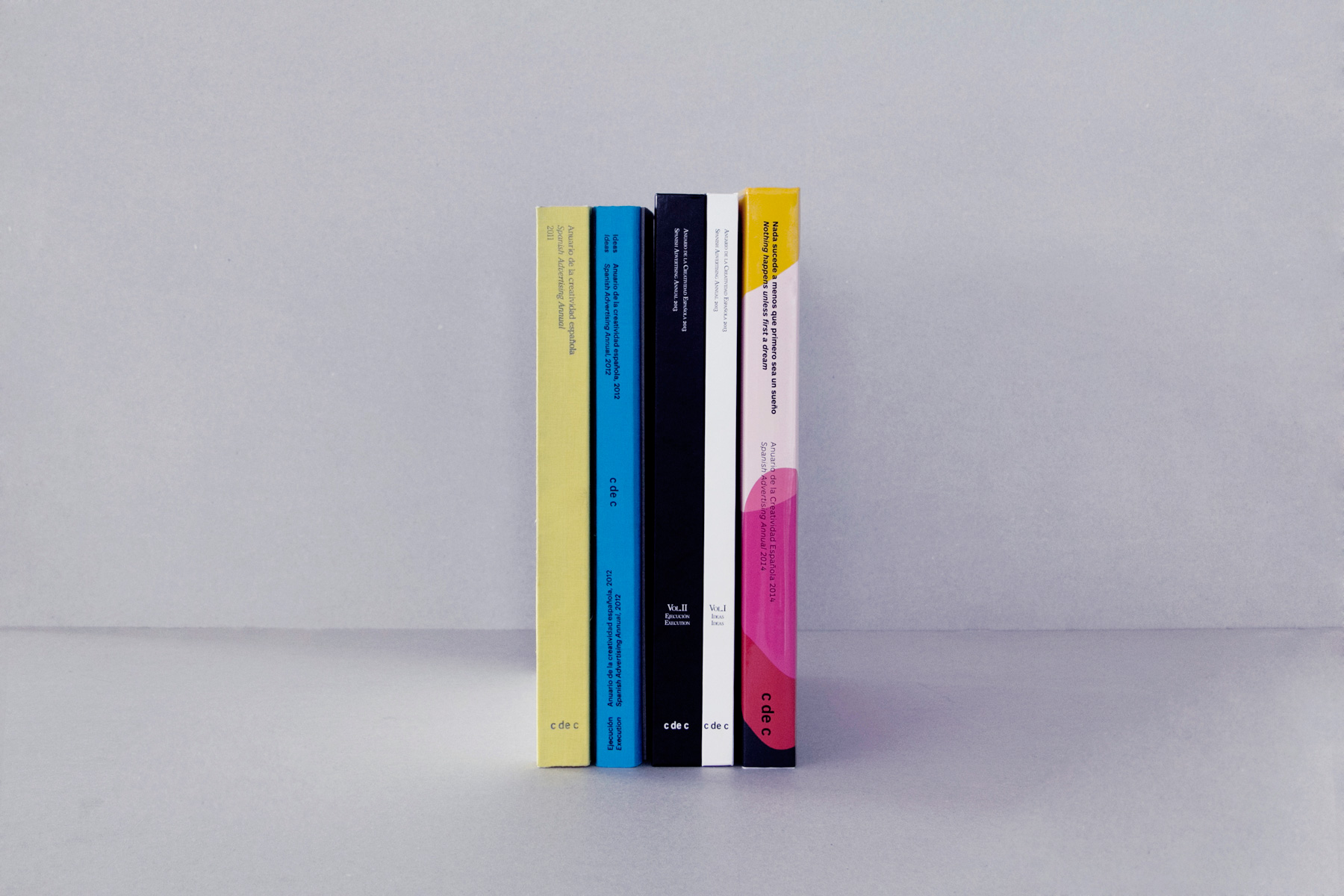
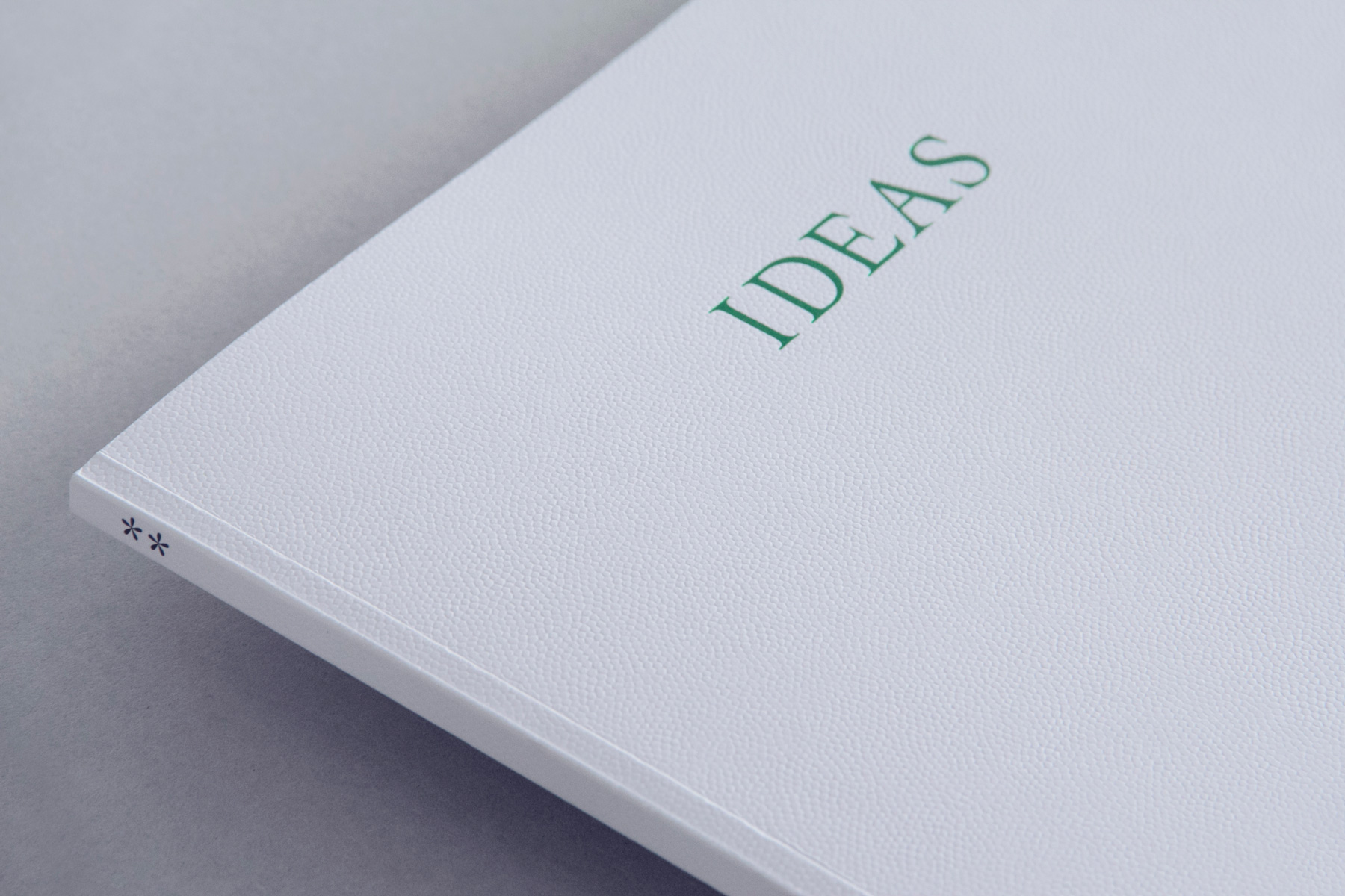
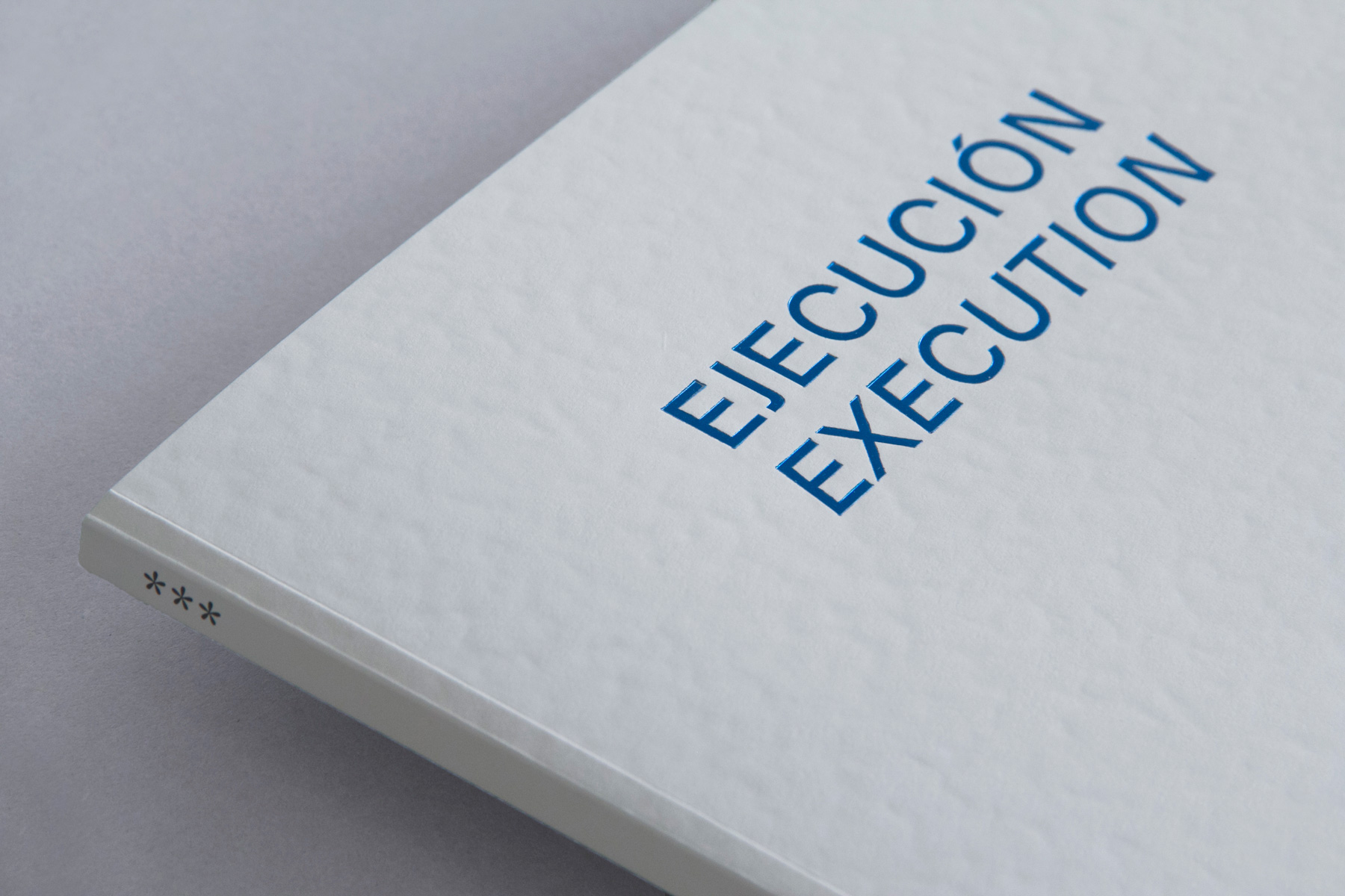
Then comes the idea: we didn’t want these sections to be mere parts of the book. Instead, we wanted these different categories to create, to form a book. In light of this, we decided to split the Annual into 3 different books —physically characterised by a considered selection of materials— stored in a solid paper box. To achieve this we needed special partners for a complex production process and to feature diverse quality materials, so we teamed up with the printers Agpograf and with Arjowiggins Creative Papers. This lead us to add to the three main books —Institutional, Ideas and Execution— a fourth book, Ideas Made of Paper, showcasing a selection of creative papers by the leading paper manufacturer. A minimalistic paper box envelops the four publications; rectangular green and blue stamping foil feature on the cover, representing the dialectic Ideas-Execution, as well as enhancing the book/object.
Finding order and balance
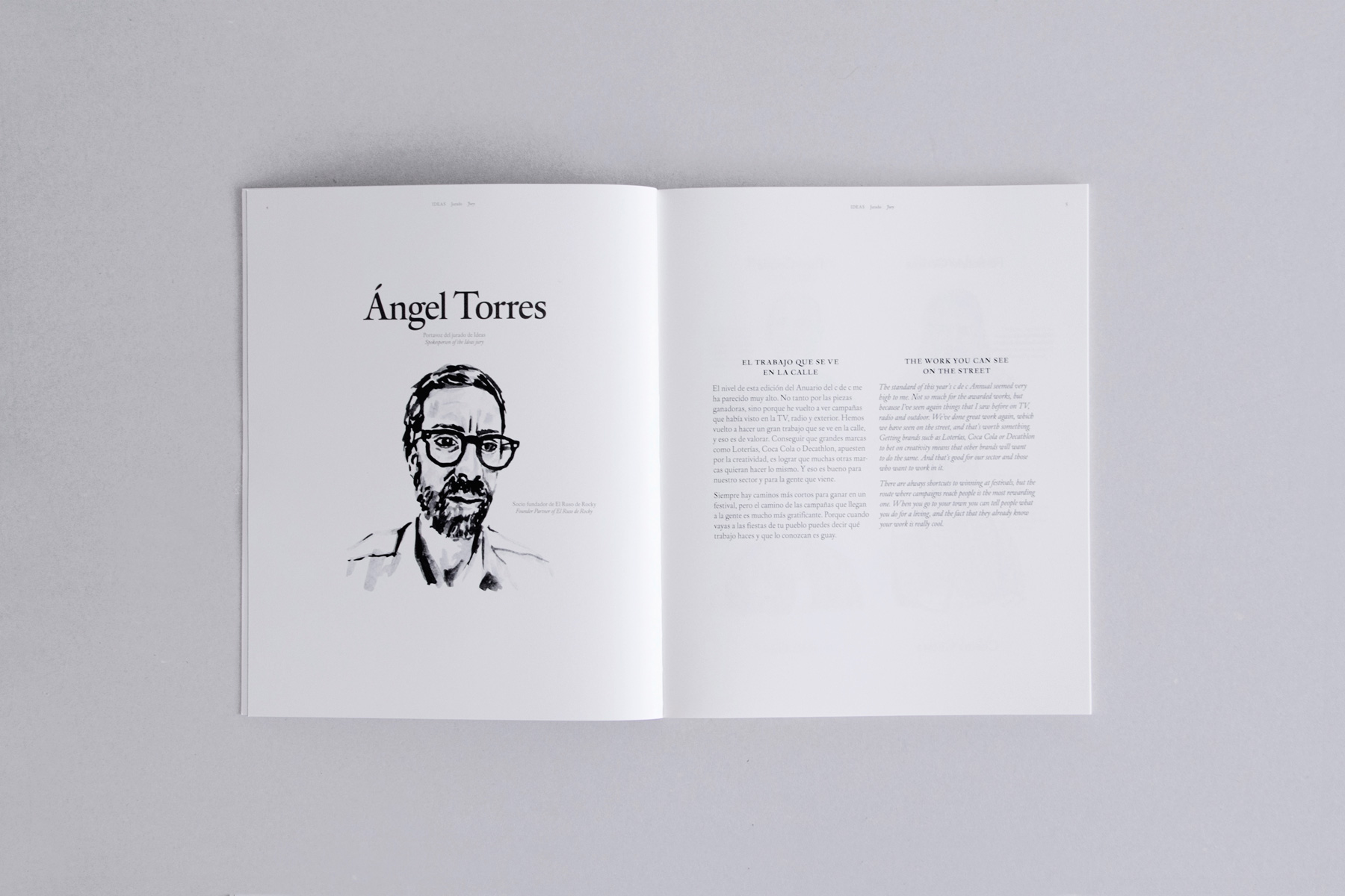
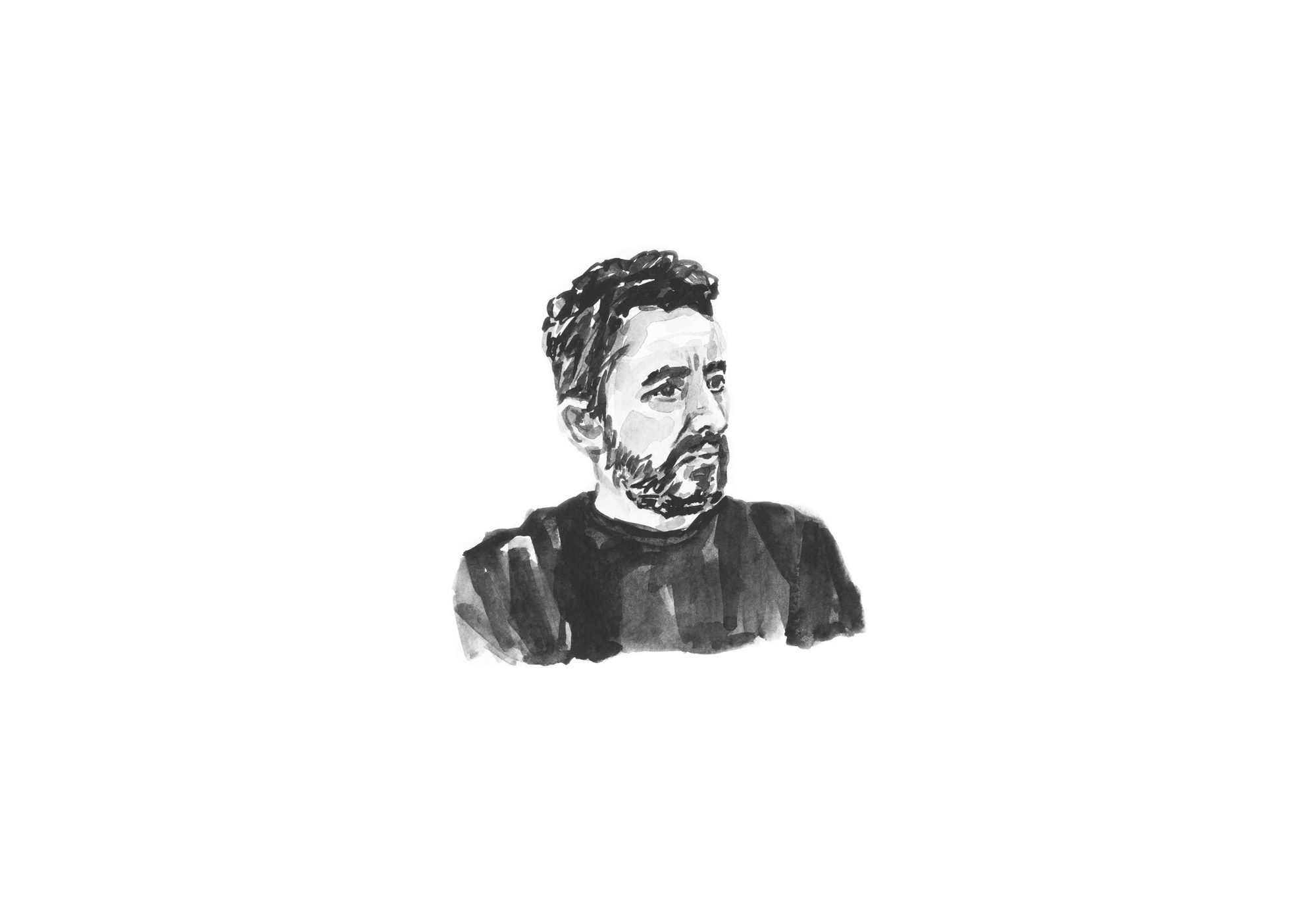
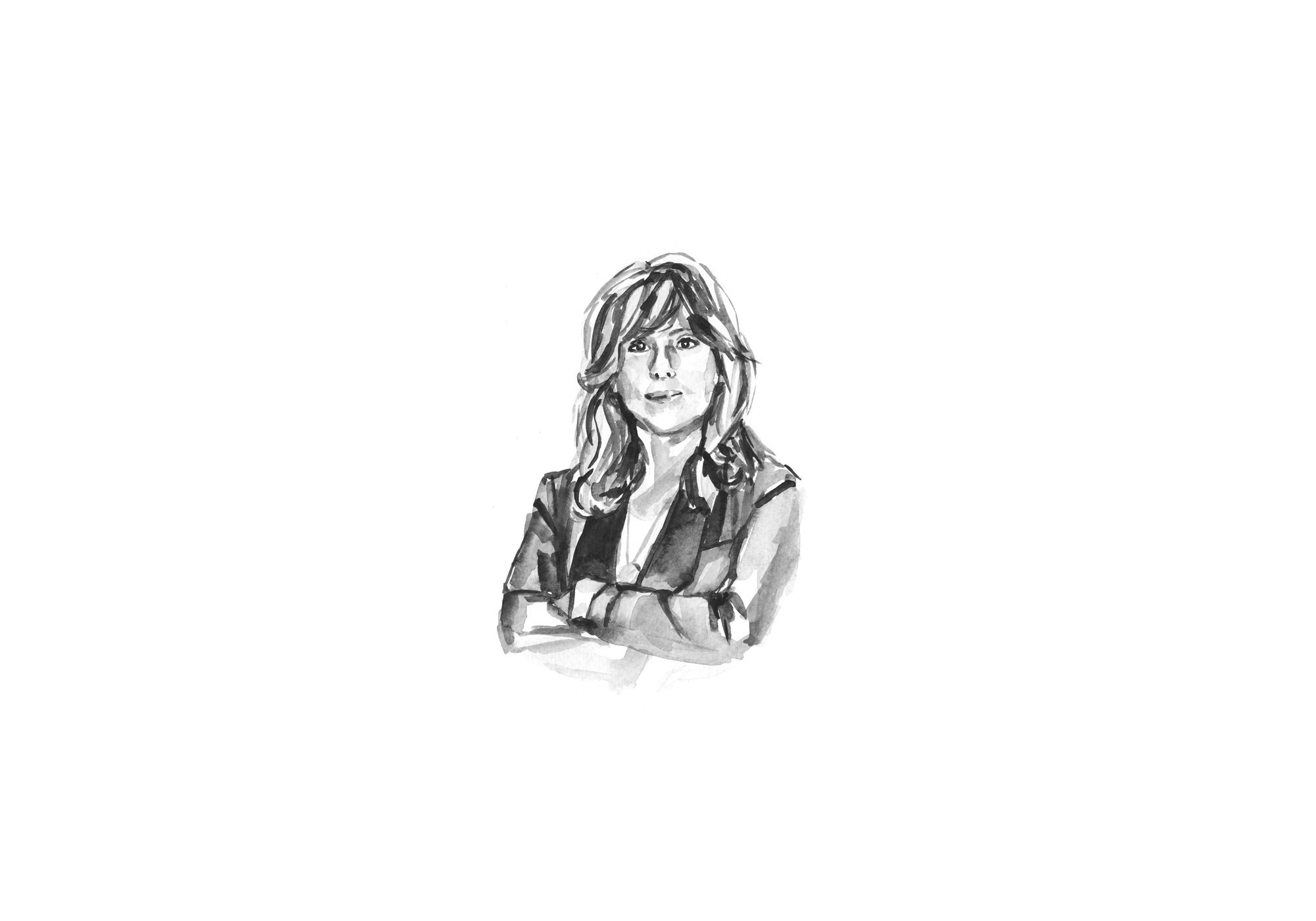
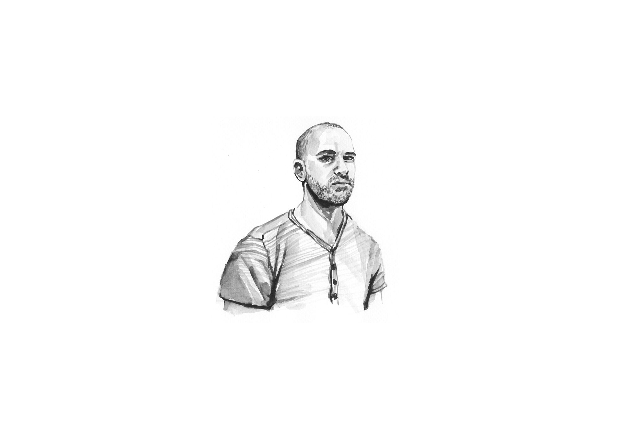
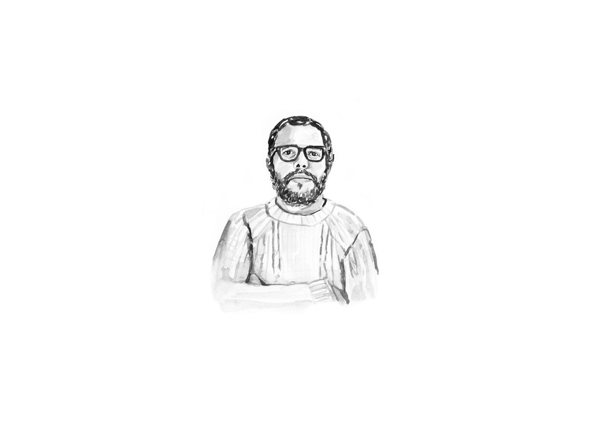
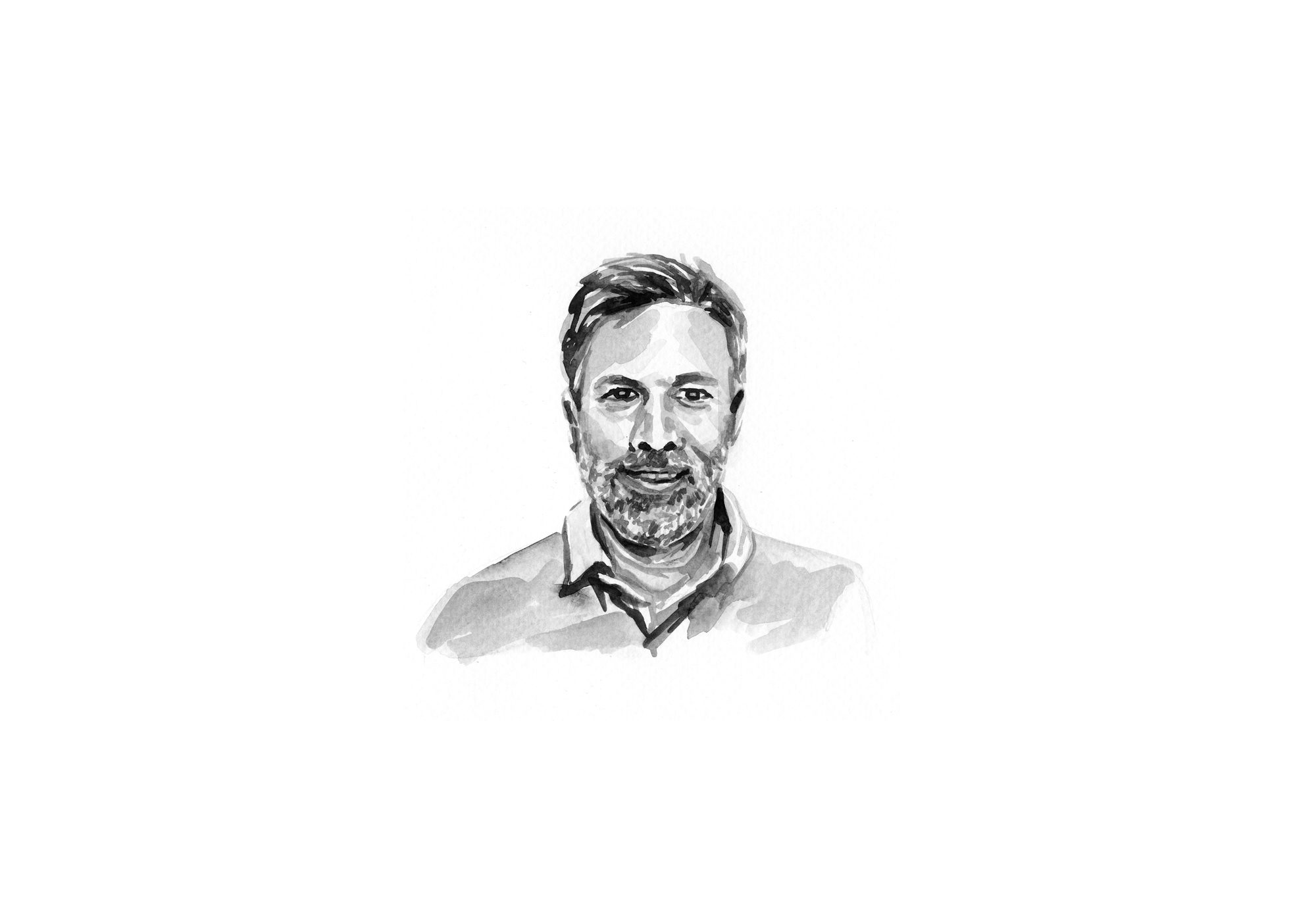
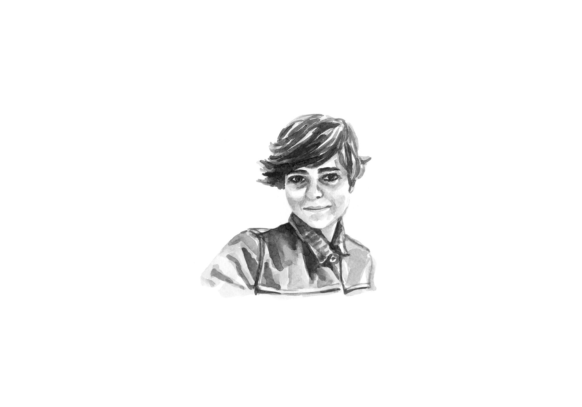
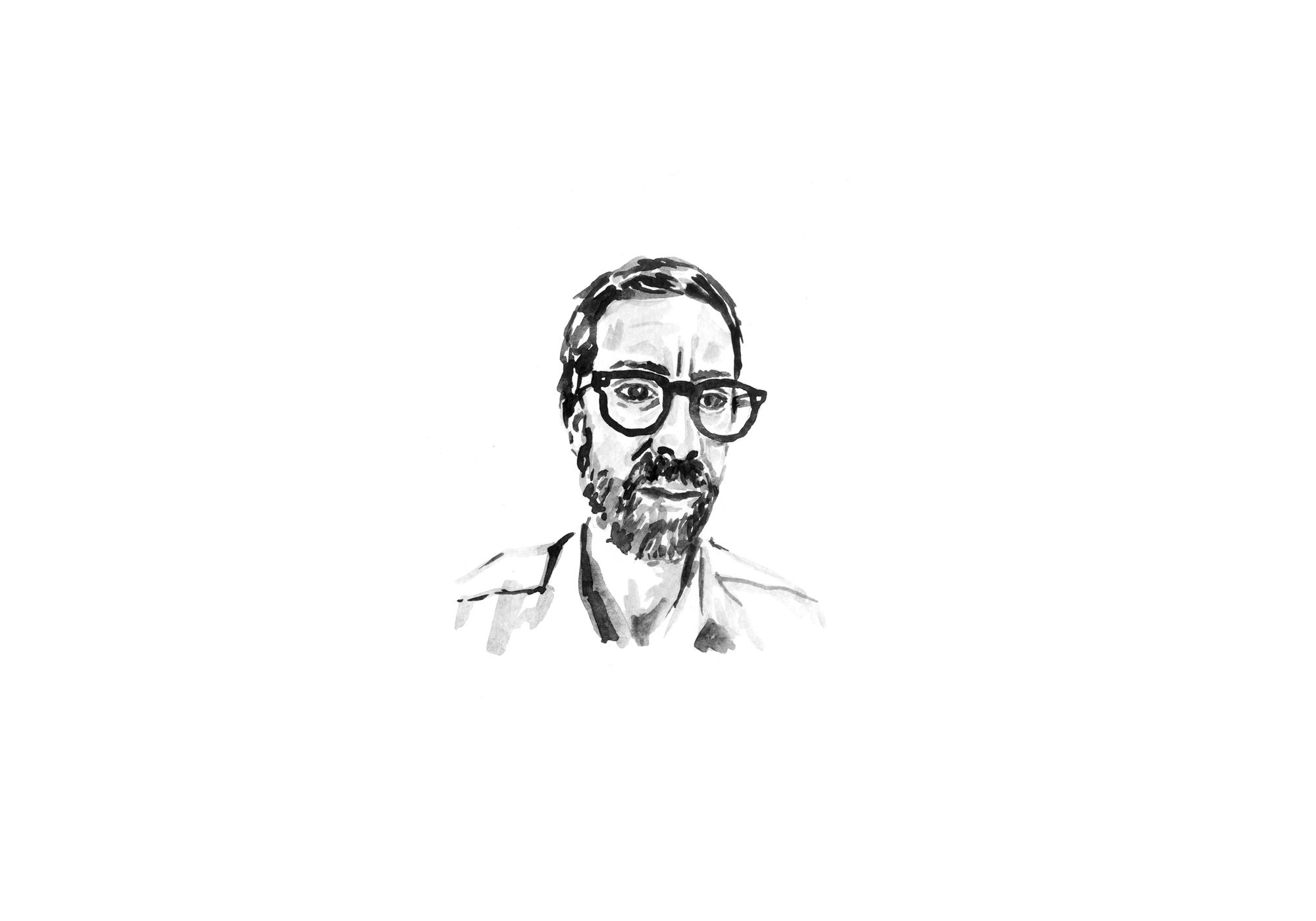
Our design choices were orientated towards an overall clarity, providing visual order to the layout, keeping any kind of embellishment to its minimum form. We decided to achieve this result by playing with two main actors: the ancient elegance of DTL Elzevir —a revival typeface designed by Gerard Daniëls and produced by the Dutch Type Library— which we used for the Ideas book while the Execution book is set is Union, designed by Radimpesko as a synthesis of Arial and Helvetica. The two typefaces find their match and harmony across the whole project, and are accompanied by the Suisse, from the foundry Swiss Typefaces. With this delicate balance of typefaces, the watercolor illustrations of the Jury by artist Ángela Palacios dovetail perfectly, pursuing a gestural and manual attitude while respecting the Jury’s facial features.
-
 of
of -
 of
of -
 of
of -
 of
of -
 of
of -
 of
of -
 of
of
Essentiality in design, richness in materials
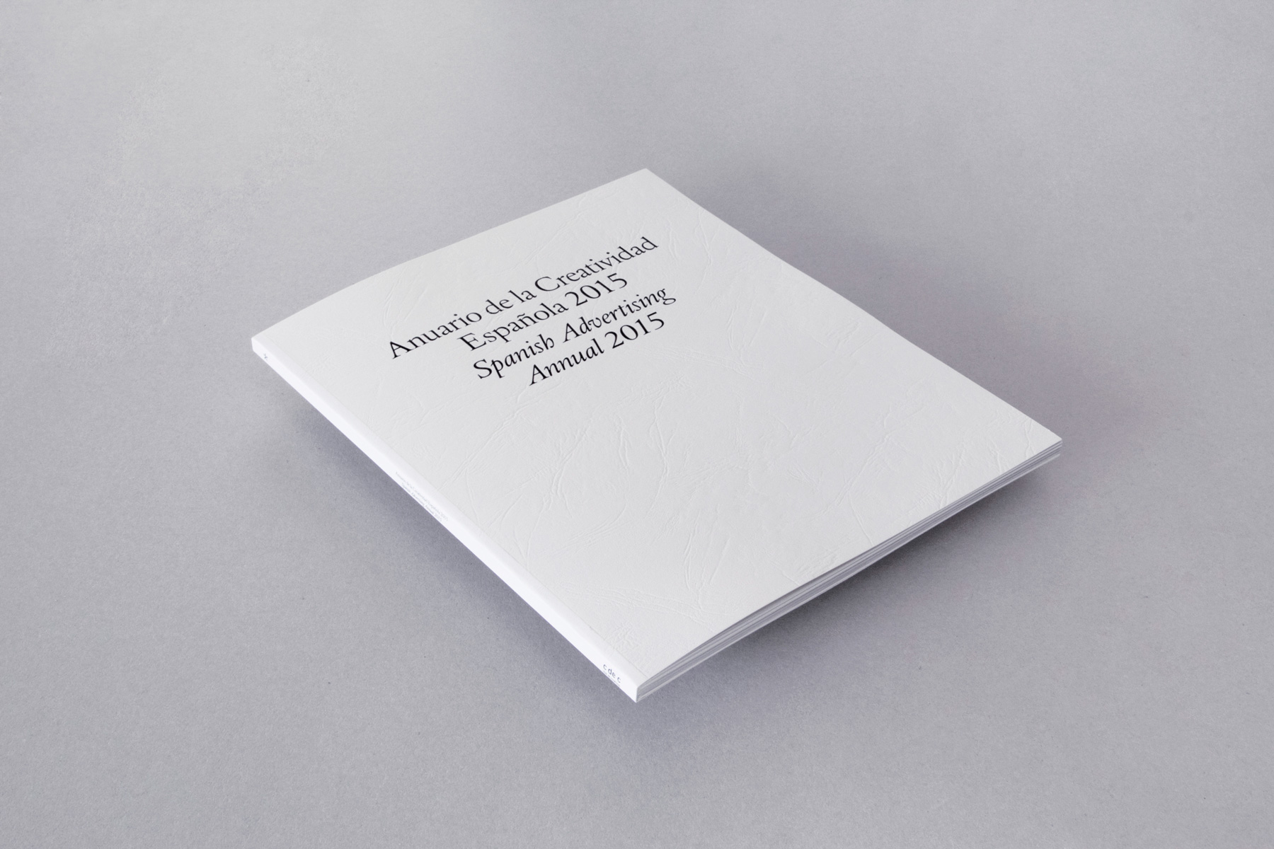
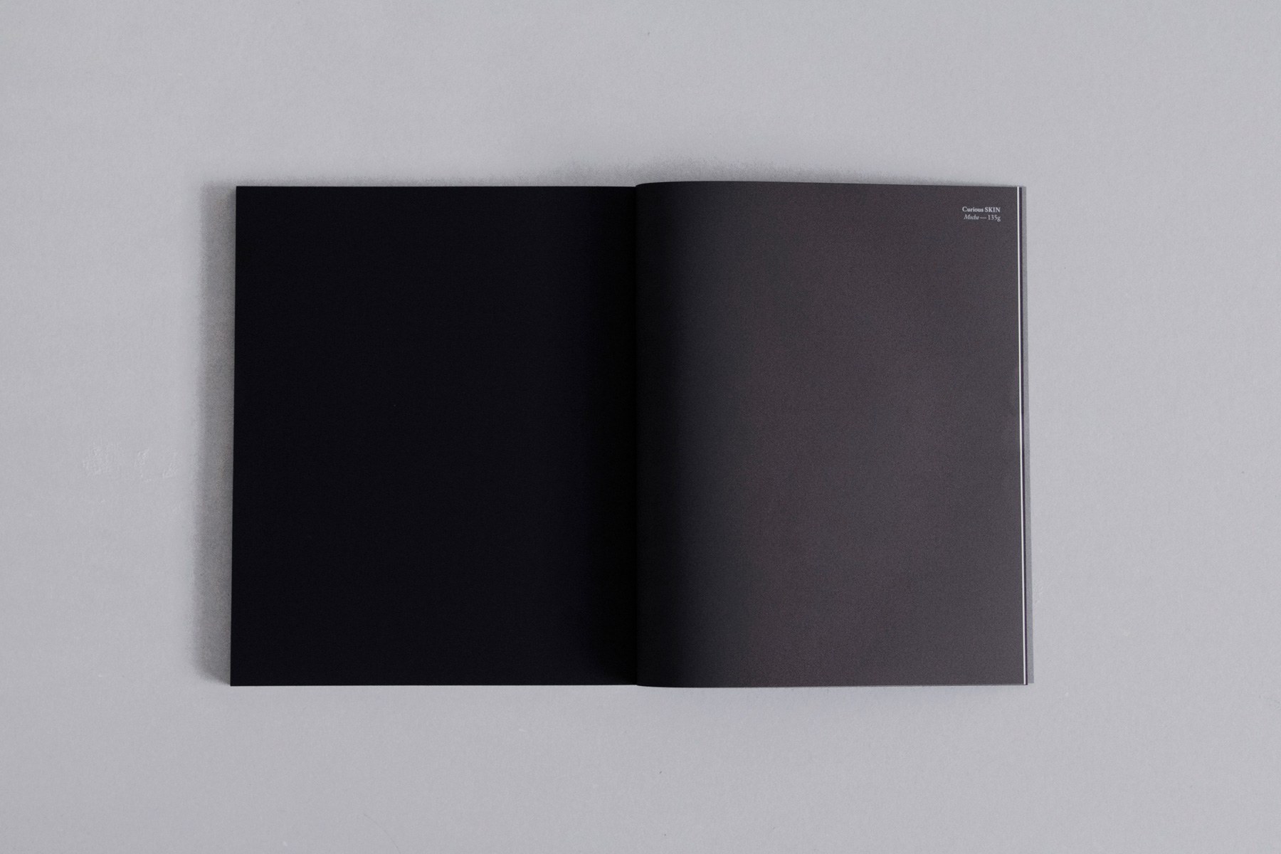
As previously mentioned, the layout is essential and functional: contrary to the past editions, the project files are set horizontally and thus allowing wider landscape pictures creating white spaces that increases readability. Regarding the materials used, all the papers are produced by Arjowiggins whose high-quality creative papers allowed us to create the reading experi- ence we seeked. The Institutional book features the Keaykolour original for the cover and a Curious matter Goya white for the dividers. The Ideas bookcover presents a green stamping on a Keaykolour embossing mosaic snow white, whilst using a Conqueror Cx22 Oyster for the internal pages. Finally, the Execution book features a Keaykolour embossing anvil, enriched by a blue stamping, using the Conqueror Cx22 Brilliant white for the inside pages.
-
 of
of -
 of
of -
 of
of -
 of
of
A box containing Spain’s best ideas in communication
The Annual was presented in Autumn 2015 during the traditional ceremony with the most important and relevant creative minds of the Country. Guille Viglione, president of CdC, opened the act placing emphasis on the importance of the Annual as a keystone of the organization as it “reunites in a book the history of Spanish communication”. The ceremony was also attended by Rafa Antón, partner and founder of China and president of the Jury, and Albert Folch who was responsible for the design of this year’s Annual. As part of the tradition, the first copy of the XVI edition of the Annual was delivered to a selected advertiser, in recognition of their work and efforts on supporting creativity: this year was the turn of Federico Fernández, head of advertising at Loteria y Apuestas del Estado. He received the Gran Prix for the campaign “El mejor premio es compartirlo” (“There’s no bigger prize than sharing”) by the agency Leo Burnett. In the last editions, companies such as Camper, Félix Muñoz, Banco Sabadell and Dewar’s have received the prize.


