Year: 2016
Tags: Art Direction and Design, Brand Narrative, Creative Production, Digital Activation, Strategy and Design Thinking
-
 Share
Share
8,078 views
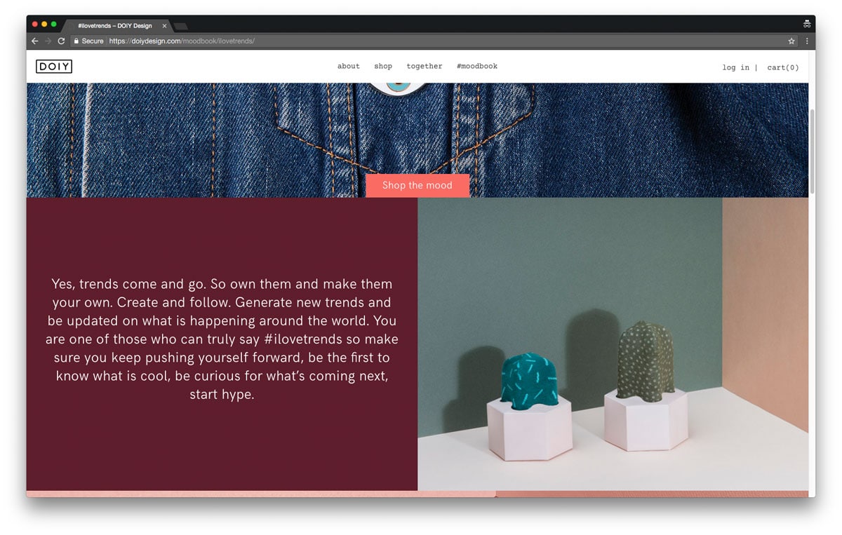
A bold move of a 360 turn
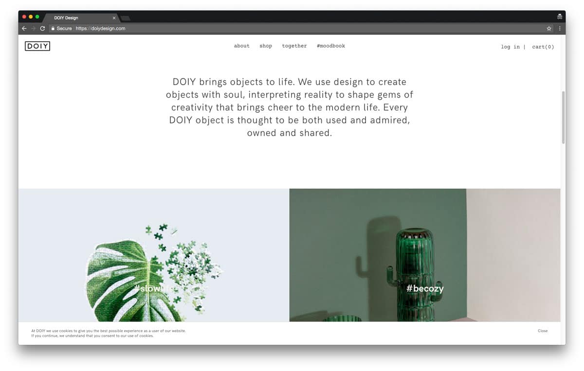
It is not very often a company of great success wants to completely revolutionized their approach. A bold move of a 360 turn of all channels of communication within a short time frame. Elodie Deviras and Jaime Monfort came to us with a request to do so for their potent product design company DOIY. Missioned to shape gems of creativity to bring cheer to modern life they had a clear vision of the renewal of DOIY, touching all the points of the company, from strategy and art direction to packaging, catalogues and digital platform. During this time we built a trustful relationship and worked together with DOIY on improving the strategy, sharing creativity through an open dialogue.
“We didn’t want an evolution, we wanted a revolution.”
Elodie Deviras & Jaime Monfort, founders of DOIY
-
 Shareof
Opening up the target for a broad channel of communication
DOIY’s identity and communication was outdated and didn’t fit with the new product line and brand approach, with new designs and introducing materials as ceramics, porcelain, metal and wood. The brand needed to mature: follow the contemporary vision and change the general impact. DOIY’s products are sold in both well selected high-end stores and design focused retails, but as well to larger chains.
Challenged by the solution of finding a visual expression that would appeal to the enlarged purpose, we started our research. It took courage to make this important decision of change, especially with the narrow timespan. By widening the target, we also risked to loose the already established market but luckily Elodie and Jaime entrusted our experience, and had themselves a very clear idea of the need of a new direction. With this new idea and strategy of the DOIY brand in mind, we could start to explore the values and importance of a broad communication.
“Opening up the target from an earlier quite innocent and infantile approach gave us a new visions and ideas of communication. The brand communication had to agree with the quality of the product, the target group and be applied to a wide range of transmedia channels.“ Rafa Martinez, COO & Branding Consultant
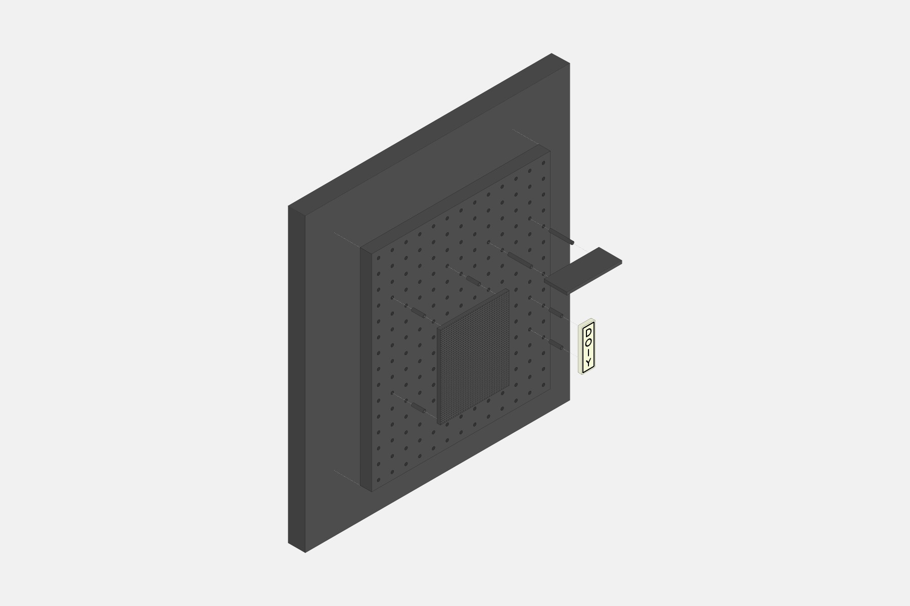
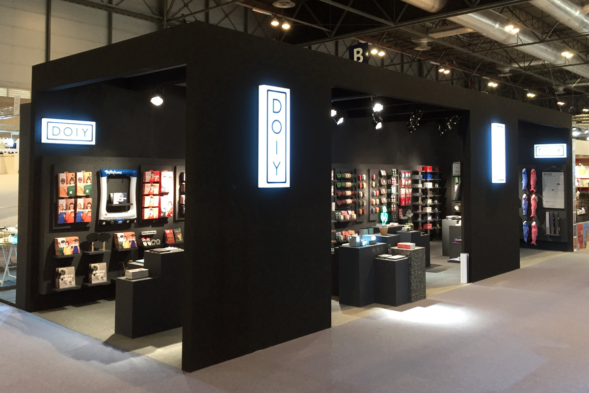
Urban precision and flexibility
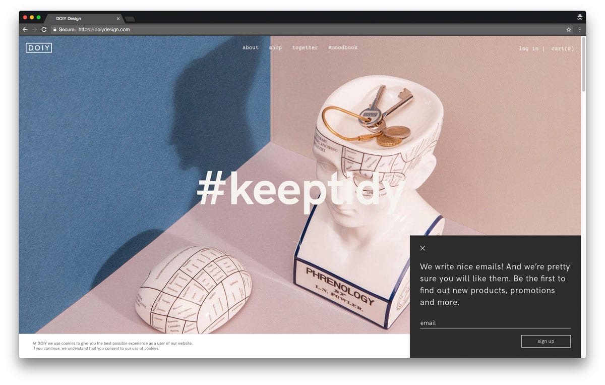
The products of DOIY naturally drew us to Japanese culture. The details, the playfulness and the accuracy of the production: as an inspirational concept, Japan became key to the new identity. Without taking away the diversion of the brand, we created a formula of the letters that could, as the neon signs, appear in vertical, horizontal and squared containers, animated and static. We gained the urban vibe through the neon shaped characters and the the maturity of the brand was now reflected in the new identity.
“We wanted to create an editorial environment strong enough to support the products in a new context through multiple platforms”Albert Folch, Creative director
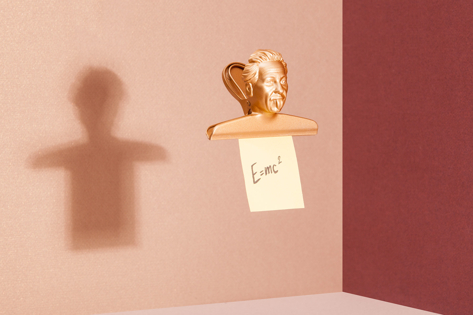
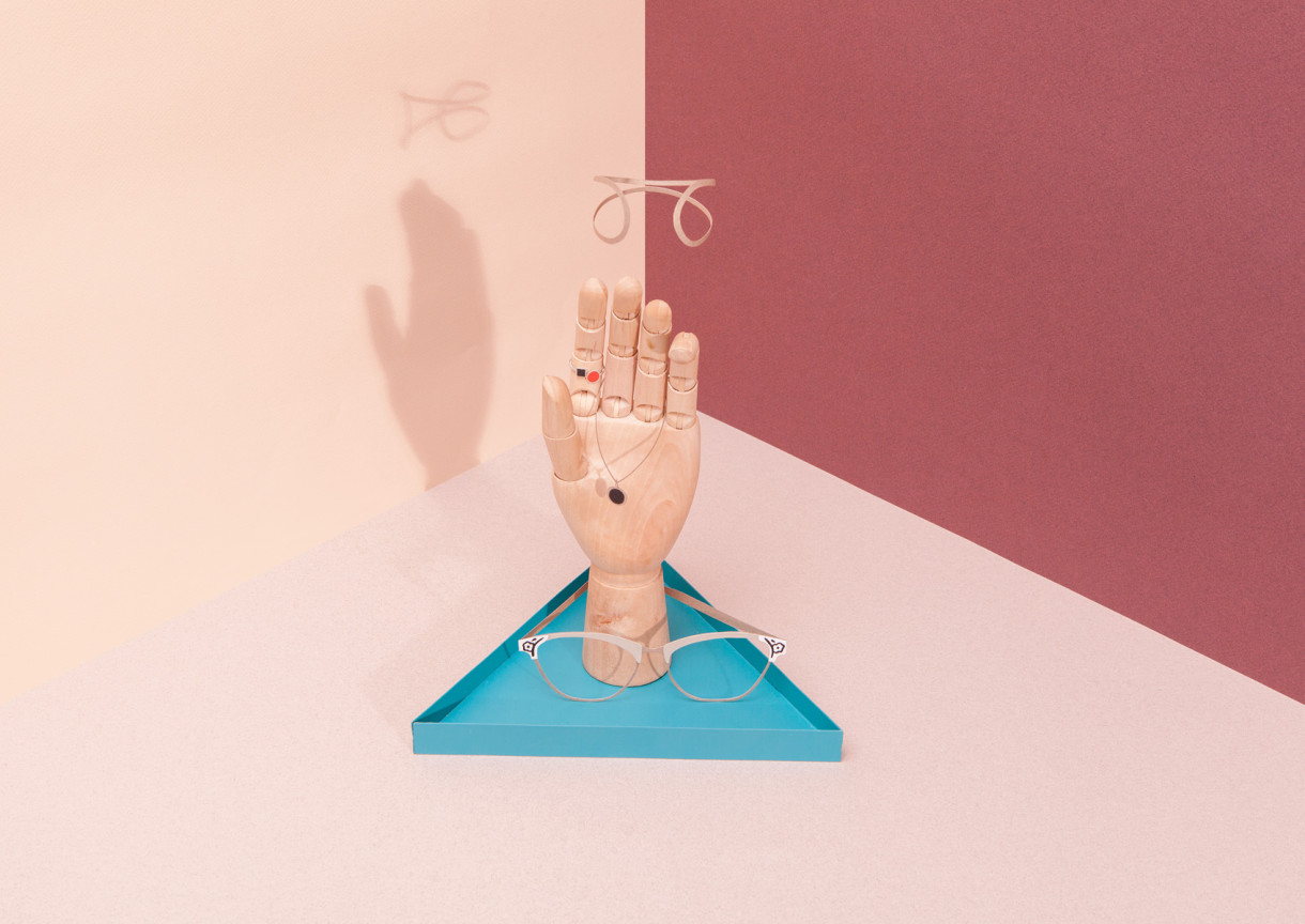
Creating new visual landscapes
One important realisation while defining the product photography was the constantly increasing presence of social networks in our daily lives. The art direction in photography had to be solid, give a strong visual impact and work in a modern global network.
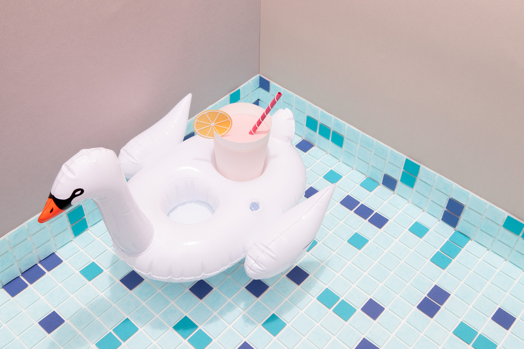
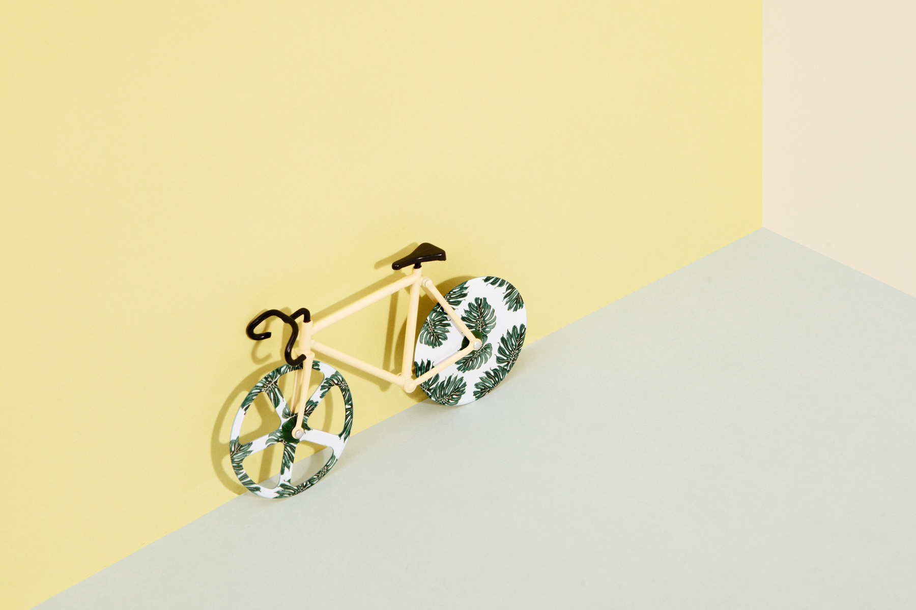
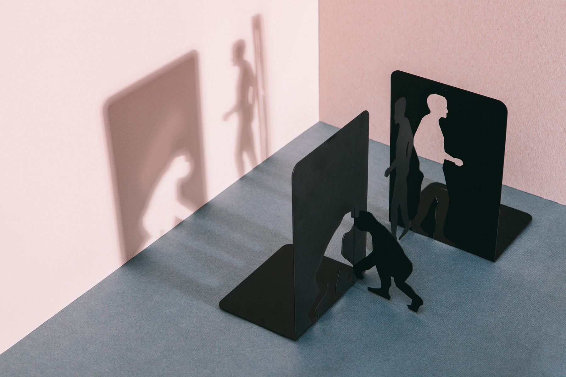
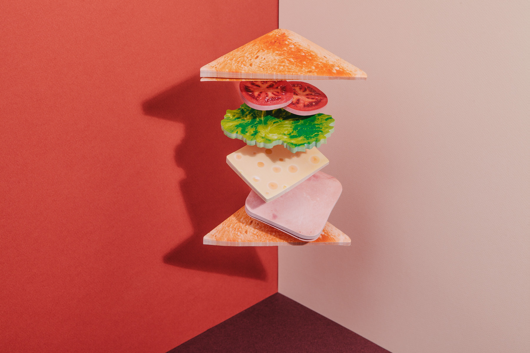
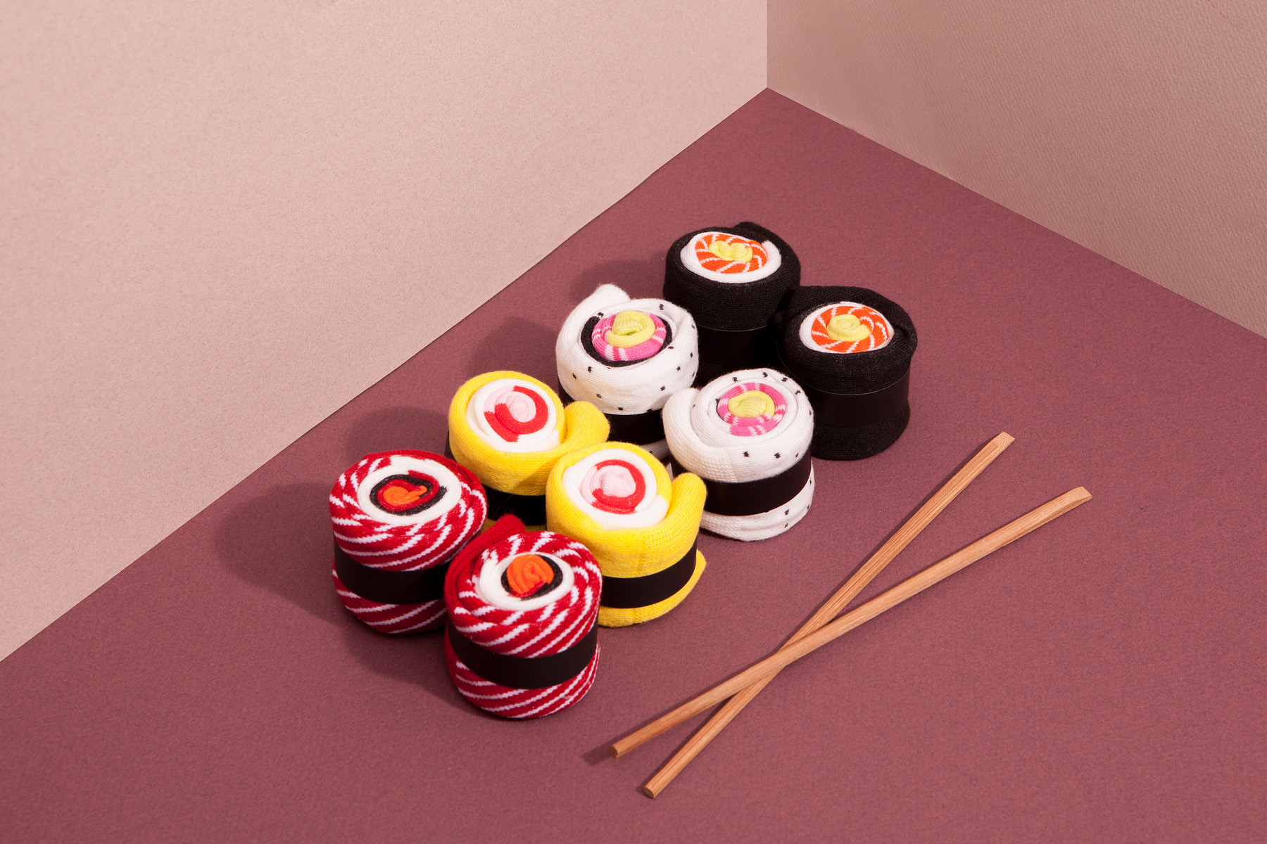
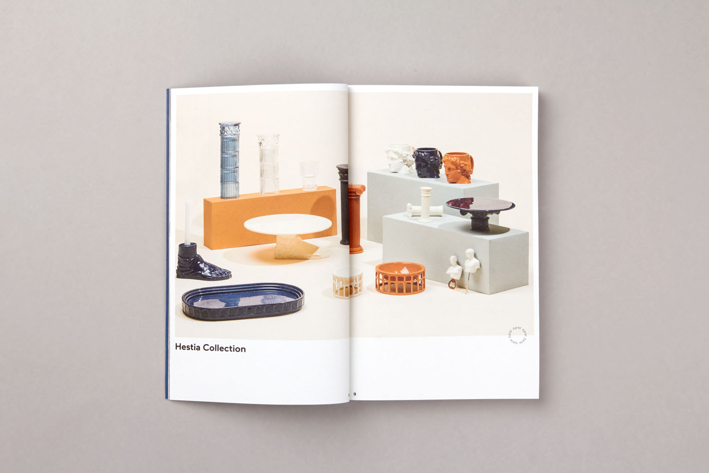
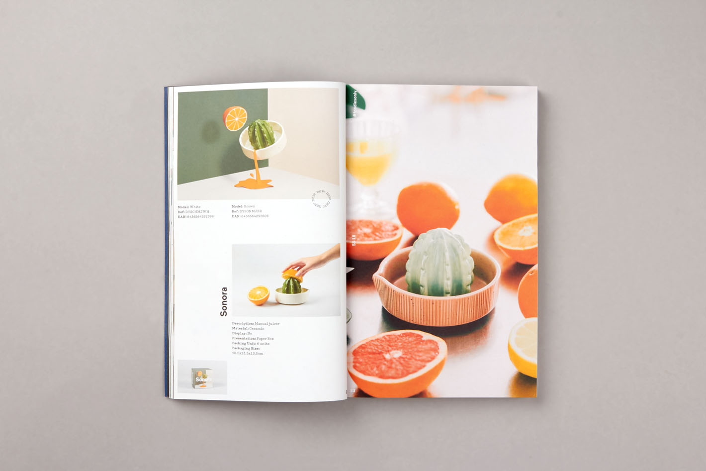
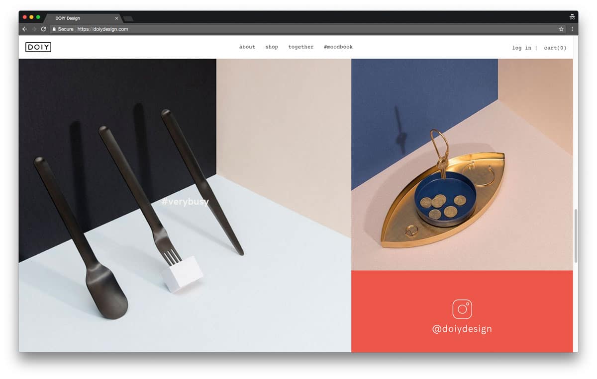
Still inspired by Japan and the precision of origami and paper crafts, we commissioned the paper and set designer Raya Sader Bujana to create a colourful visual landscape where we could display the products.The mesmerising detail of Raya’s sets and the accurate photography by our recurrent collaborator Leo García Mendez created the perfect atmosphere. Due to the intense months ahead of us, we mounted the workshop for Raya in the studio and created a temporary photographic set so we could control every detail of the production.
Navigated by a clear colour palette —defined by a sober, elegant and sophisticated range of tones— and paper textures, the direction took shape and Raya could start to generate ideas for the props. The products made from mostly plastic and similar materials, are displayed in a minimal environment based on a play with colours, textures and perspectives. Alongside the products made from materials such as ceramics, metal, wood and porcelain, required a more lavish set design with detailed cuts, folds and paper props of real life objects. The sets could be unified through the colours and textures and the products –despite their diverse appearance and use of materials– moved into a coherent environment.
-
 Shareof
“Words can work like images. Through language we create a vivid imaginary around a brand while showing things instead of just telling them.” Vincenzo Angileri, Editorial Director
Giving DOIY a voice
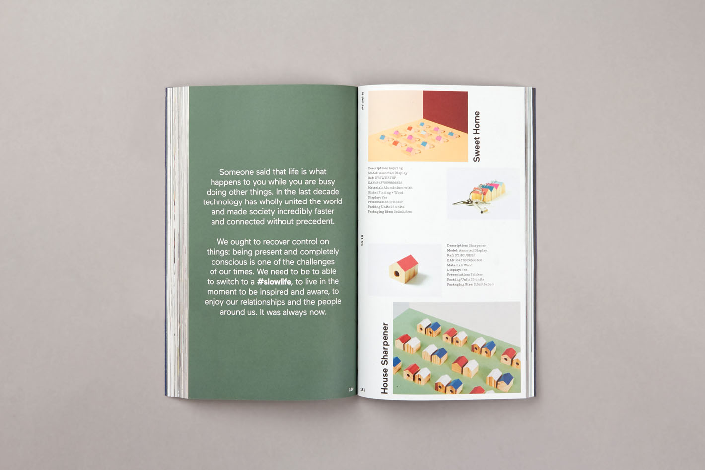
The universe of words enclosing the renewed DOIY should be both amusing and informative, narrating the brand in a easy, attractive and clear way. The whole idea of copywriting revolves around “What if monotone objects were brought to life?” is the fil-rouge behind the storytelling developed for DOIY. Copywriting seeks interaction with the reader by speaking to him, using inclusive verbal forms and expressions coming from the spoken language.
-
 Shareof
Flexibility and balance in the diversity
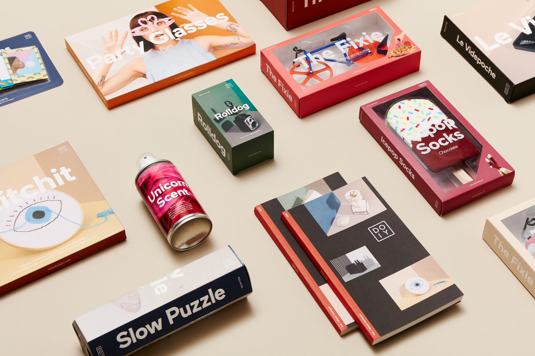
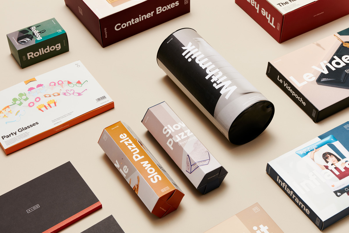
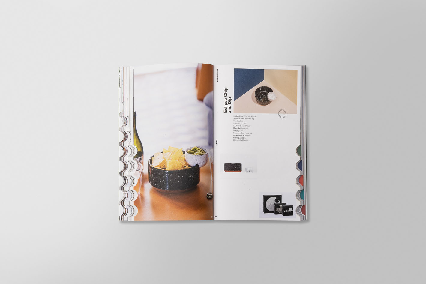
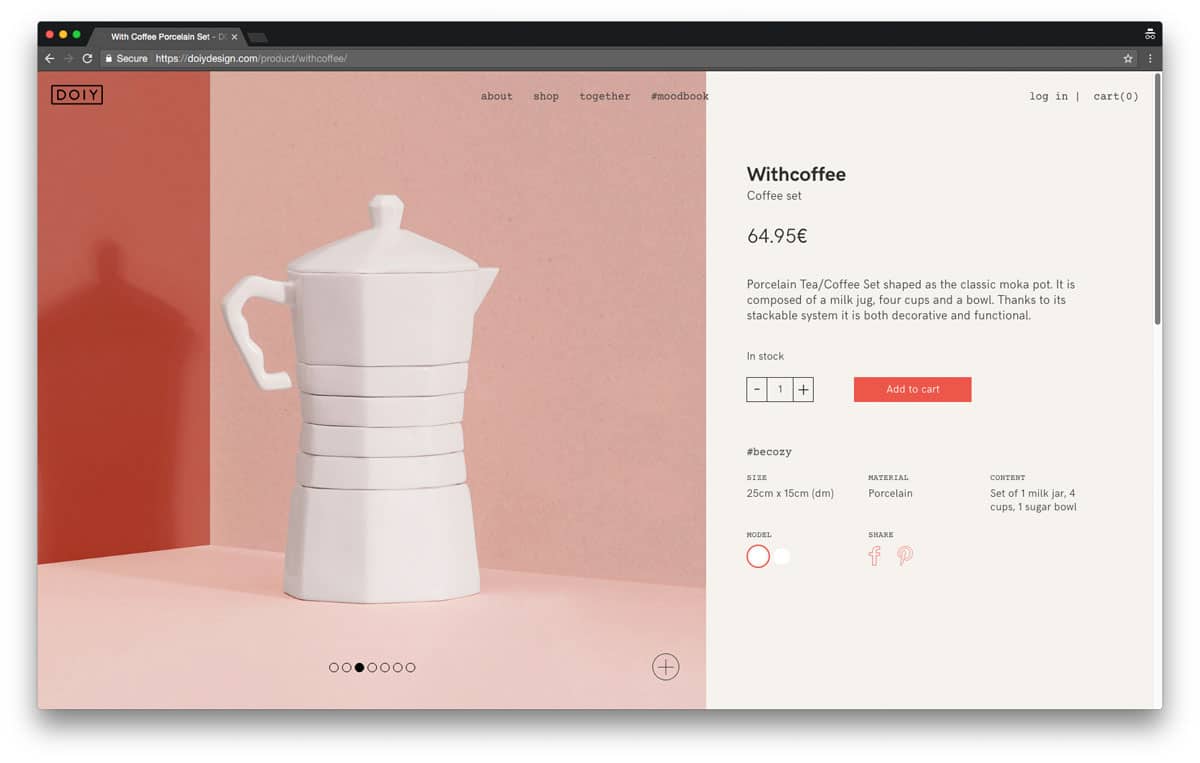
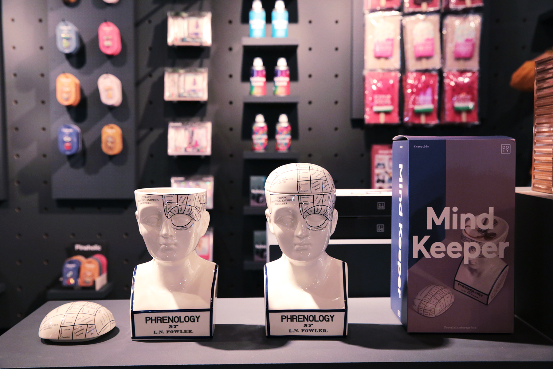
The packaging was the point of connection of the re-branding, the crucial moment where everything came together. The most challenging of all parts was to find the flexibility and balance in the diversity of formats and shapes —From small open boxes and tags to big cylindrical containers— while keeping down the costs in production. A clean frame exalts the photography providing the packaging with elegance we were looking for, with a legible and balanced type enhanced the overall simplicity of the packaging.
Crucial legibility
On a typographical level, the legibility and boldness played a major role in our decision. The sans-serif Maax designed by Damien Gautier for the type foundry and bureau 205 had the stain and personality we aimed for. The thickness of the characters are defined to be readable on top of any kind of photography, colour or texture. The organic letters gives both maturity and personality.
The complementary typeface Typewriter created a dynamic balance in the descriptive texts. The typeface itself has a good amount of personality yet the crucial legibility.
-
 Shareof
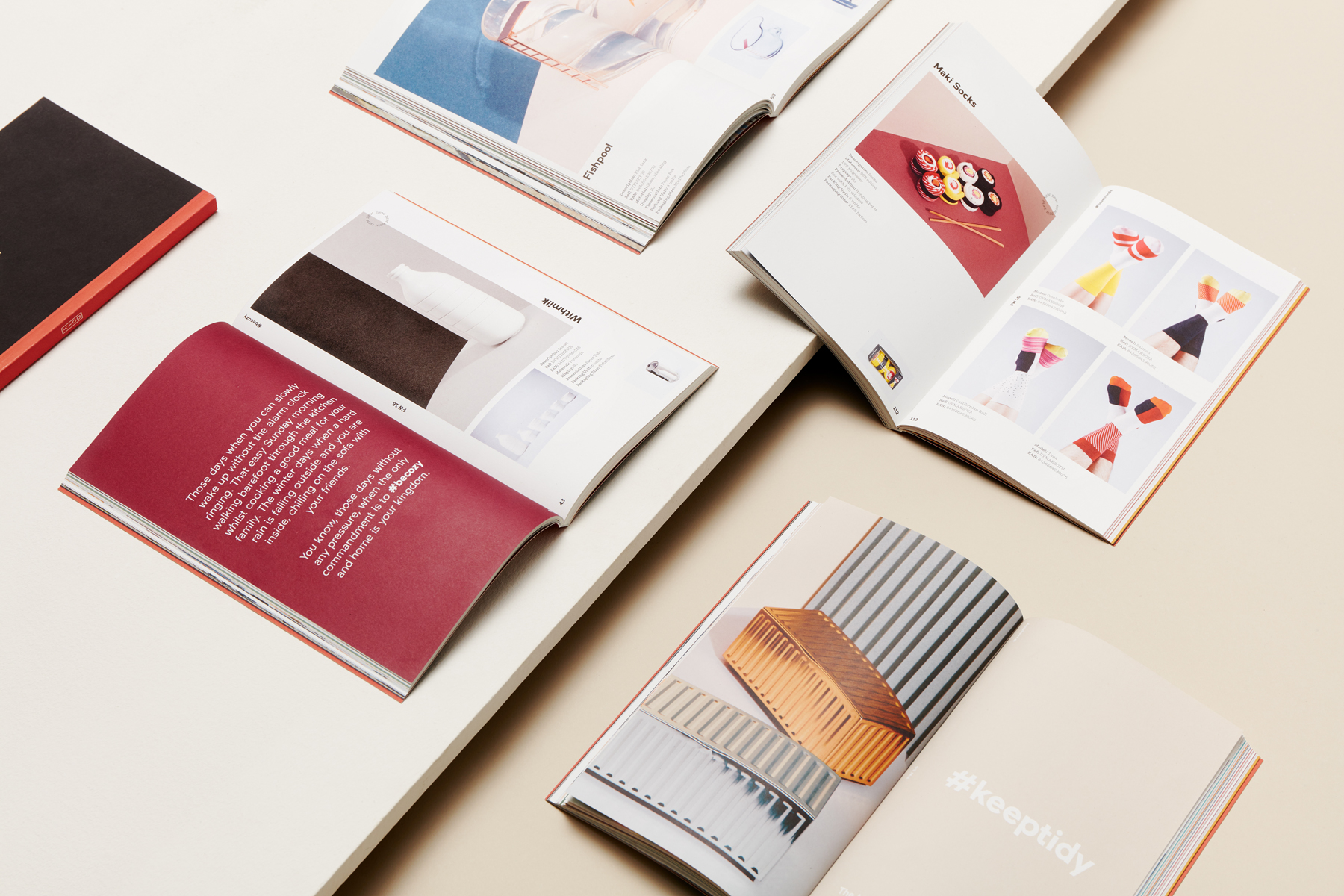
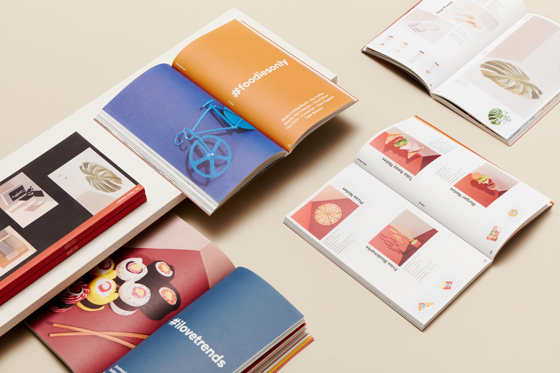
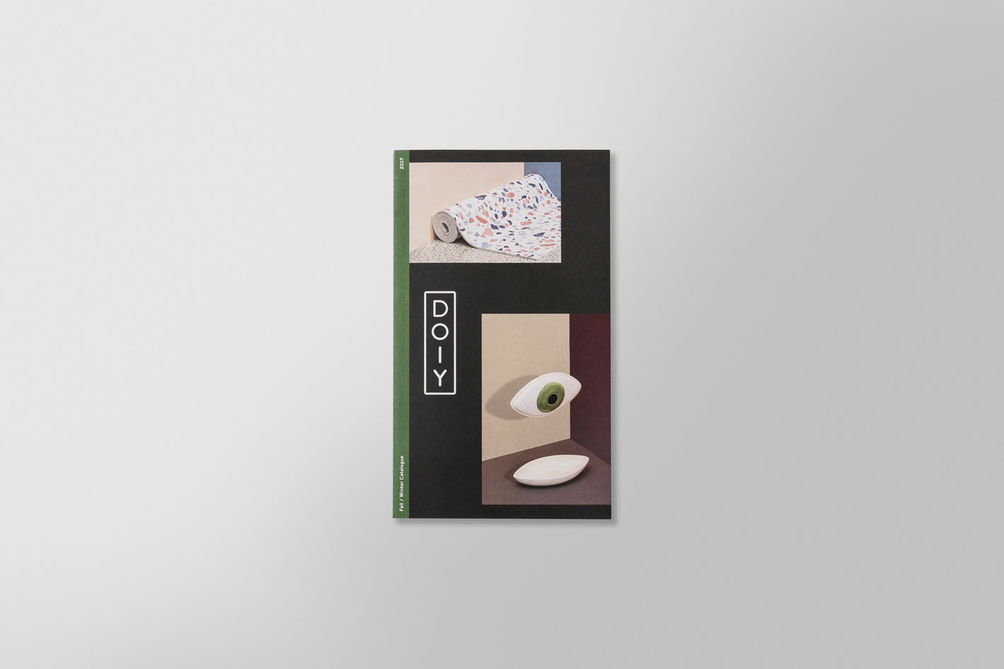
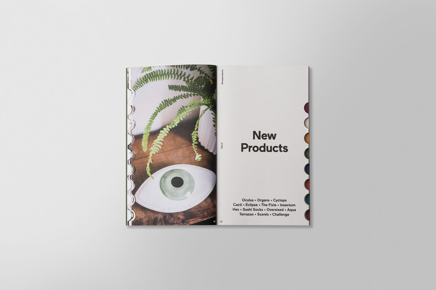
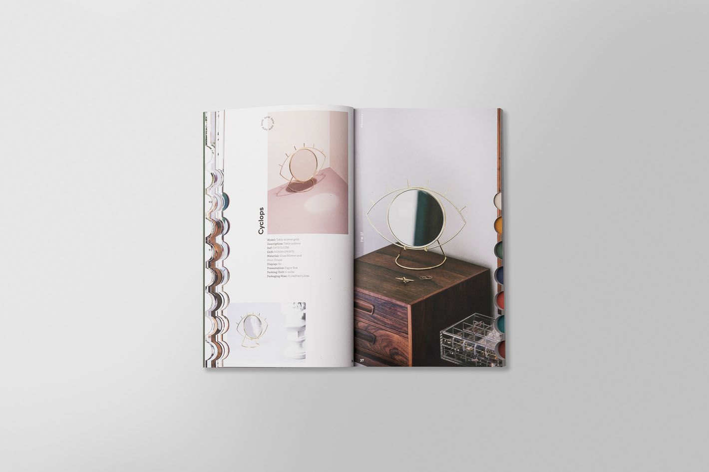
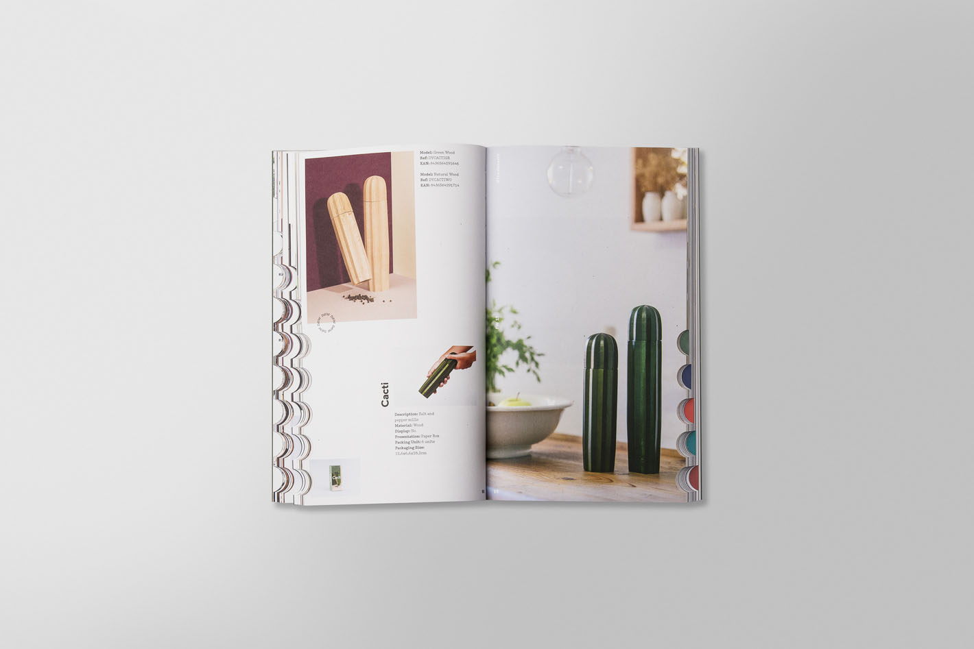
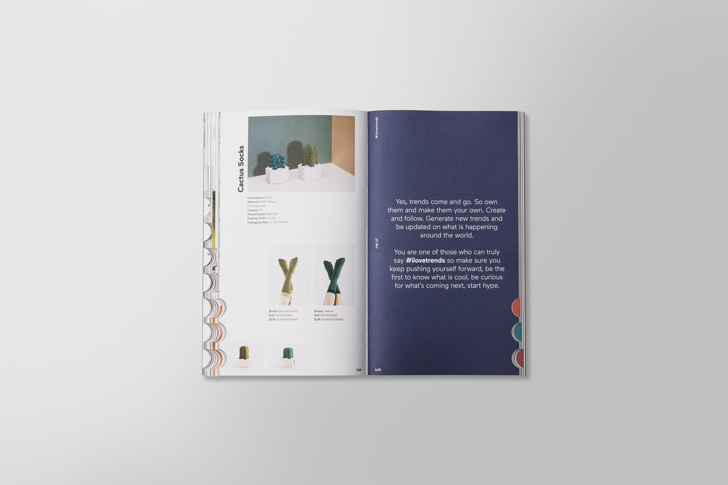
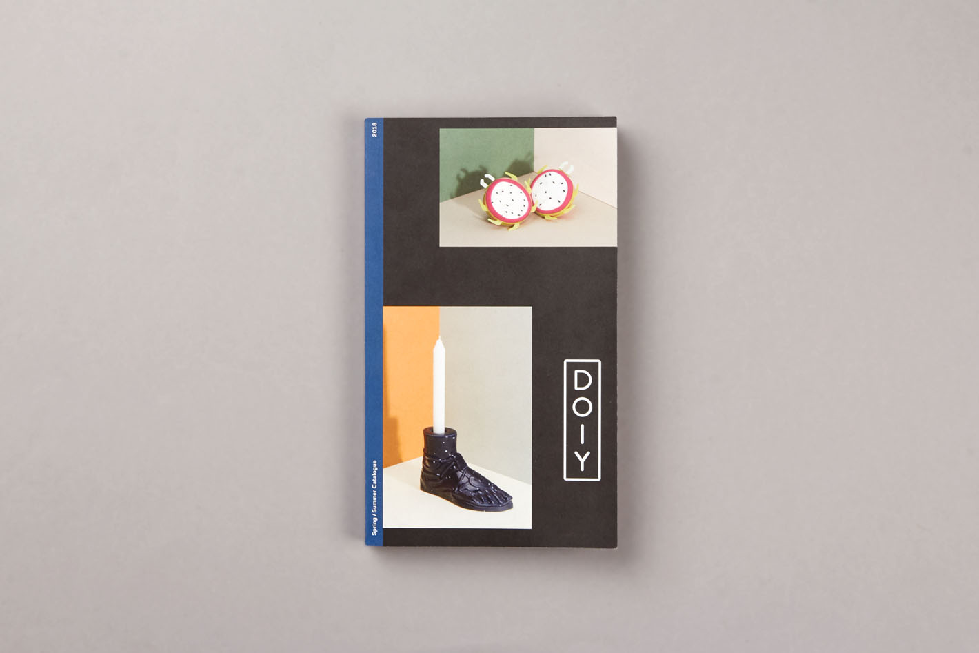
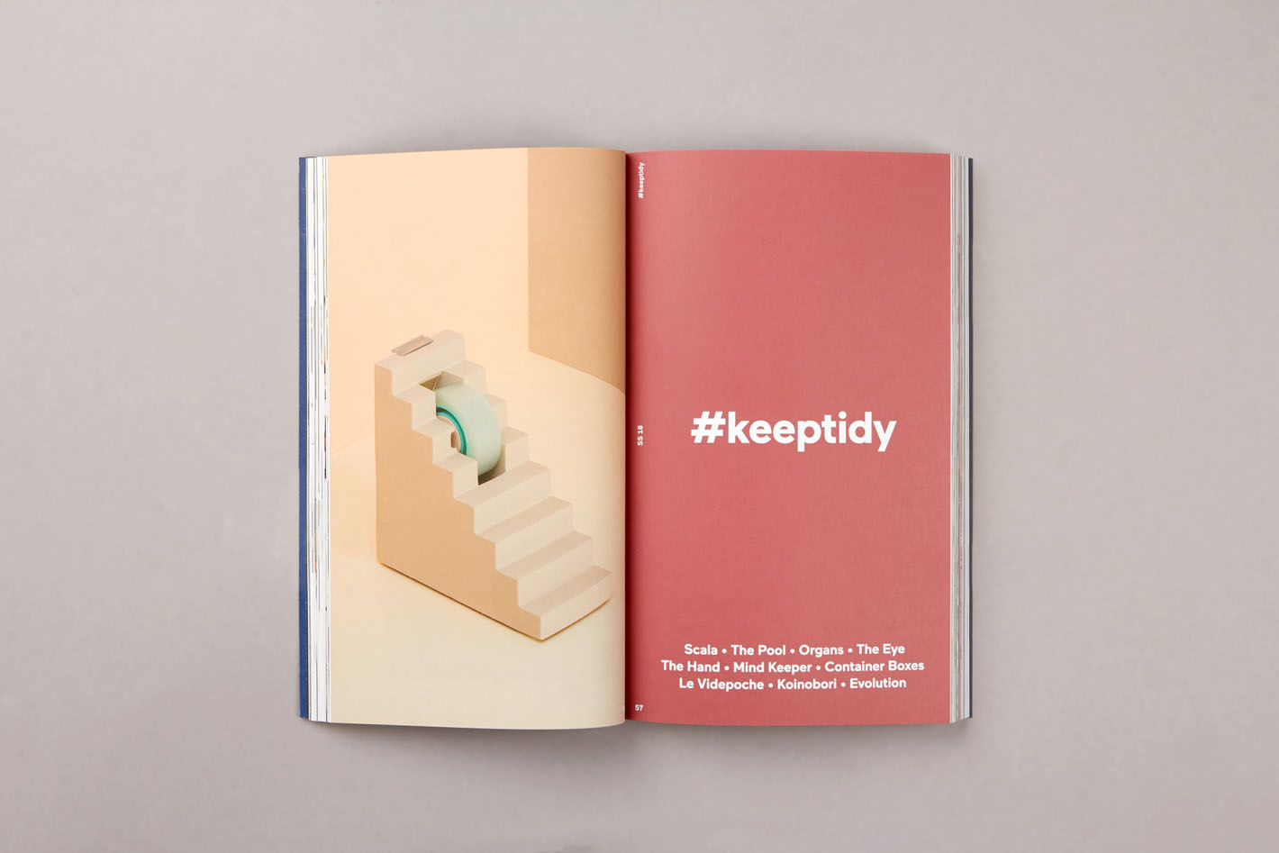
Renovation the concept of catalogue
We wanted to transform the idea of a product catalogue and introduce the content–written and visual– to an editorial publication, an environment closer to an art or design magazine.
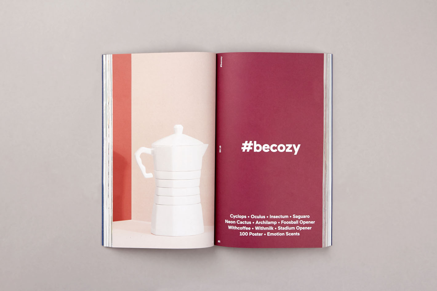
Through elegant layout and the stylish still life photography we could create an interesting grid displaying the products. To add further personality we decided to stand out in choice of format. Not only to give an unique expression, but to meet the limited budget of production. The quite narrow catalogues are embellished with four typologies of covers, this to show the diversity of products already at first sight.
AW’17 and SS ’18 catalogues for Doiy took a turn in art direction bringing the products into lived spaces and Doiy closer to a interior brand.
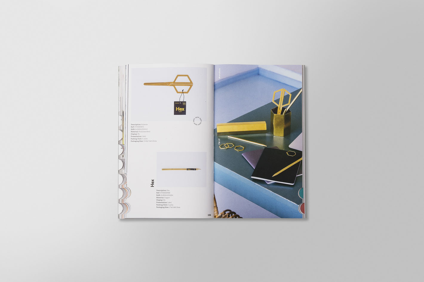
We commissioned the photographer Iris Humm to capture the products in their right element through her clear lens. The products were shot in different locations, both in home environments and in the impressive spaces of the boutique hotel Brummell, an extensive creative production by White Horse. This new lifestyle approach combined with the duo toned sets by Raya Sader Bujana and Leo García Mendez gave the catalogue the fine balance of a stylish matured interior brand.
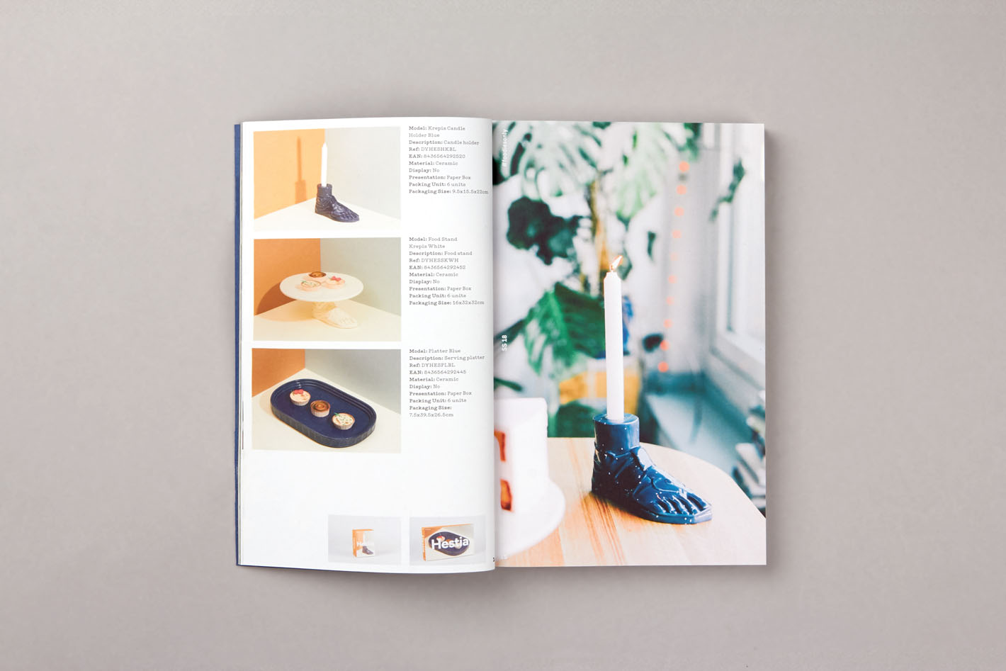
Moving beyond a traditional e-commerce by creating a publishing environment where the product can be displayed through the the coherent brand language, visually and in terms of tone and voice, maintaining consistency with other applications.
The role of the image has been fundamental to transfer the imaginary brand to the website therefore we created an editorial feed in the homepage where the imagery could have its space it deserves. The user of DOIY needed a site where they could understand the brand and the relationship between the products by theme, colour or material and easily see the product in its entirety. Together with LLOS we could develop a digital platform where filters and navigation work coherently with the necessity of the brand.
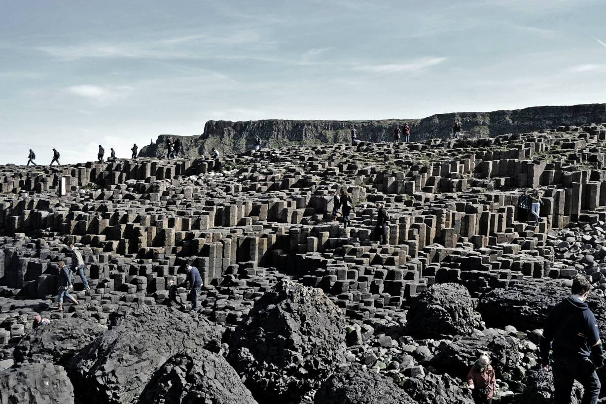
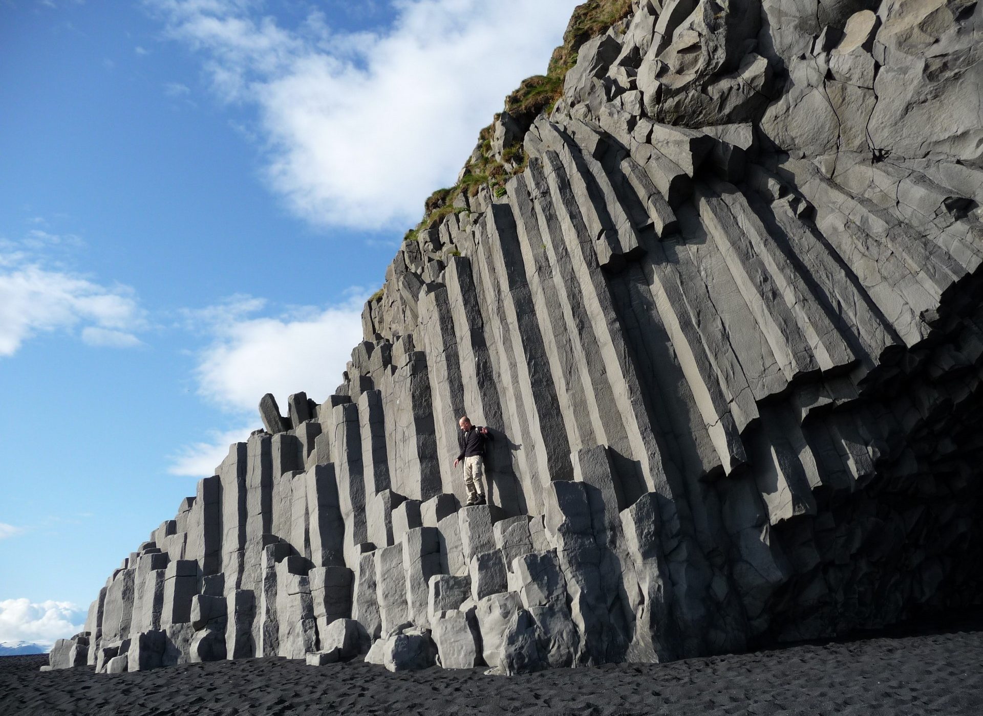
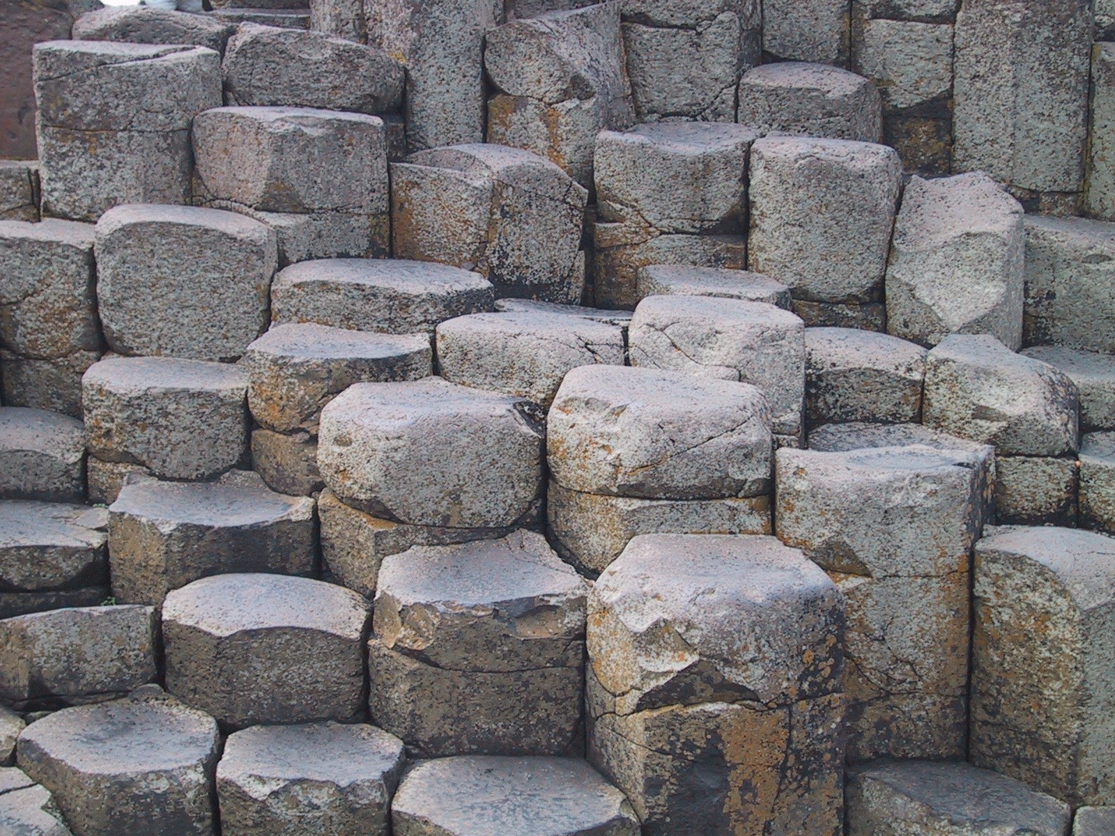
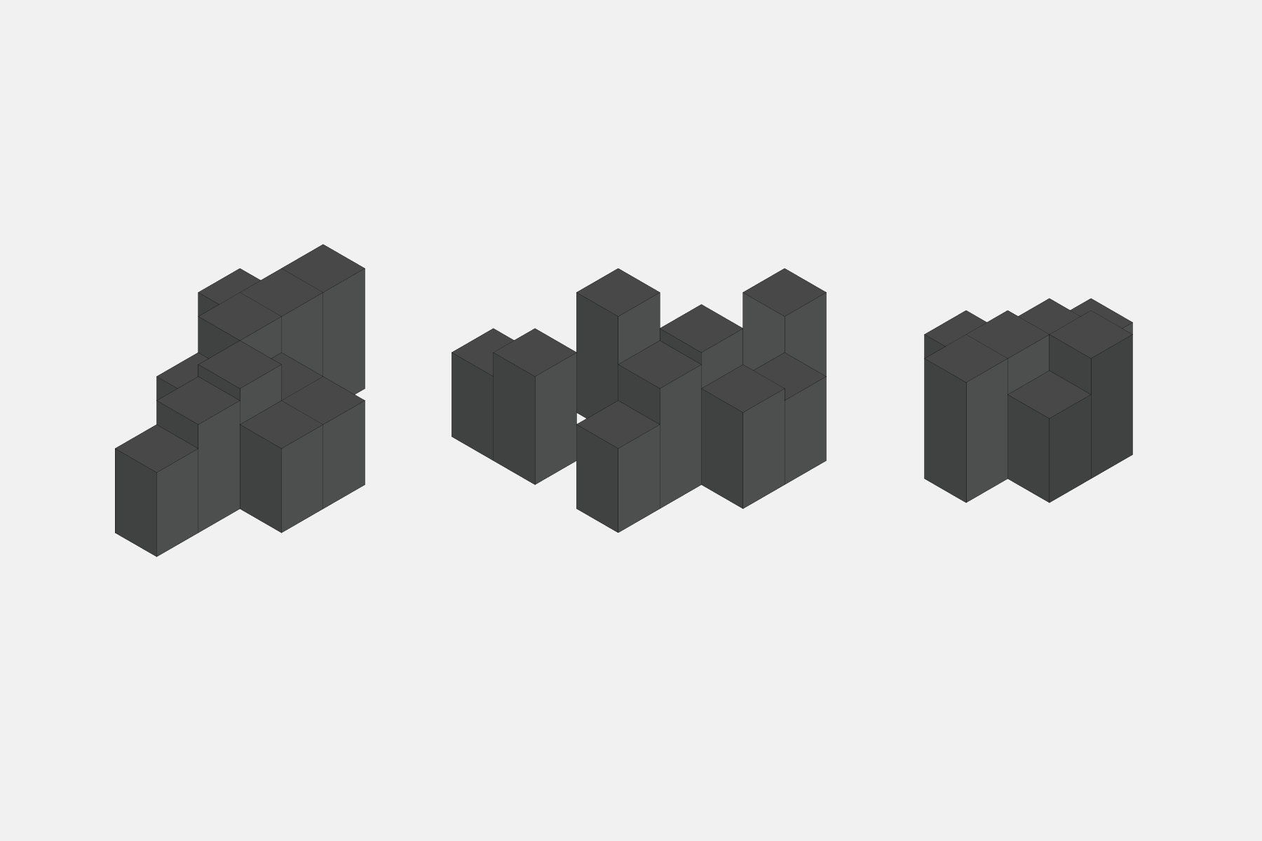
Basalt columns and shaped rocks were the main inspiration when designing the stands and display for DOIY
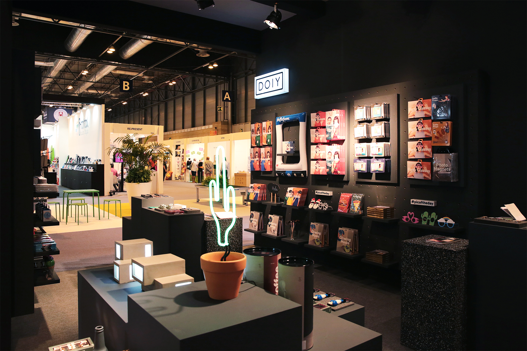
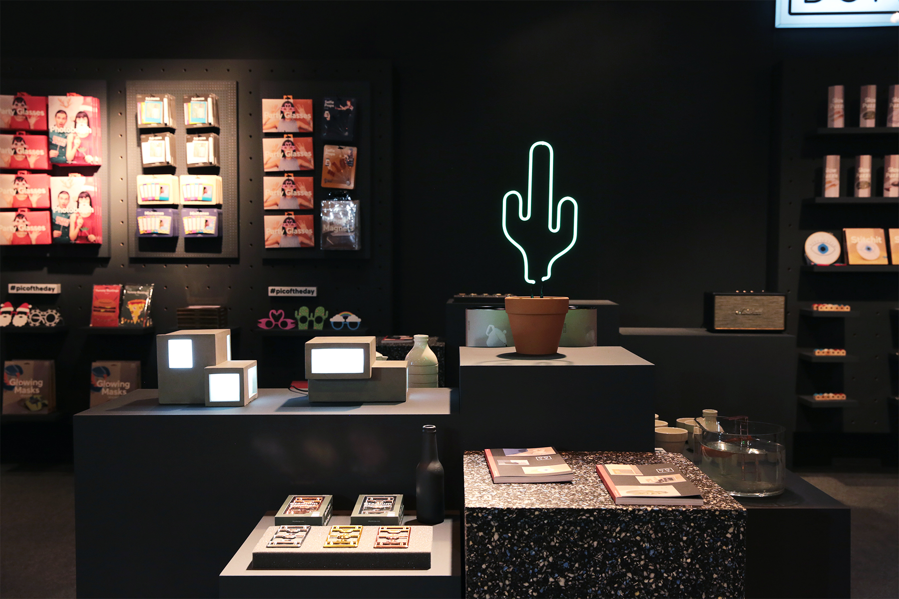
Staged levels of display
Inspired by the etage shaped rocks we created a modular system in different sizes and heights for the fairs. The system gave us the opportunity to display and highlight the products on different levels. Using a dark, almost black colour for the modules, the packagings–with their light sober tones–stands out and accentuate from the background.
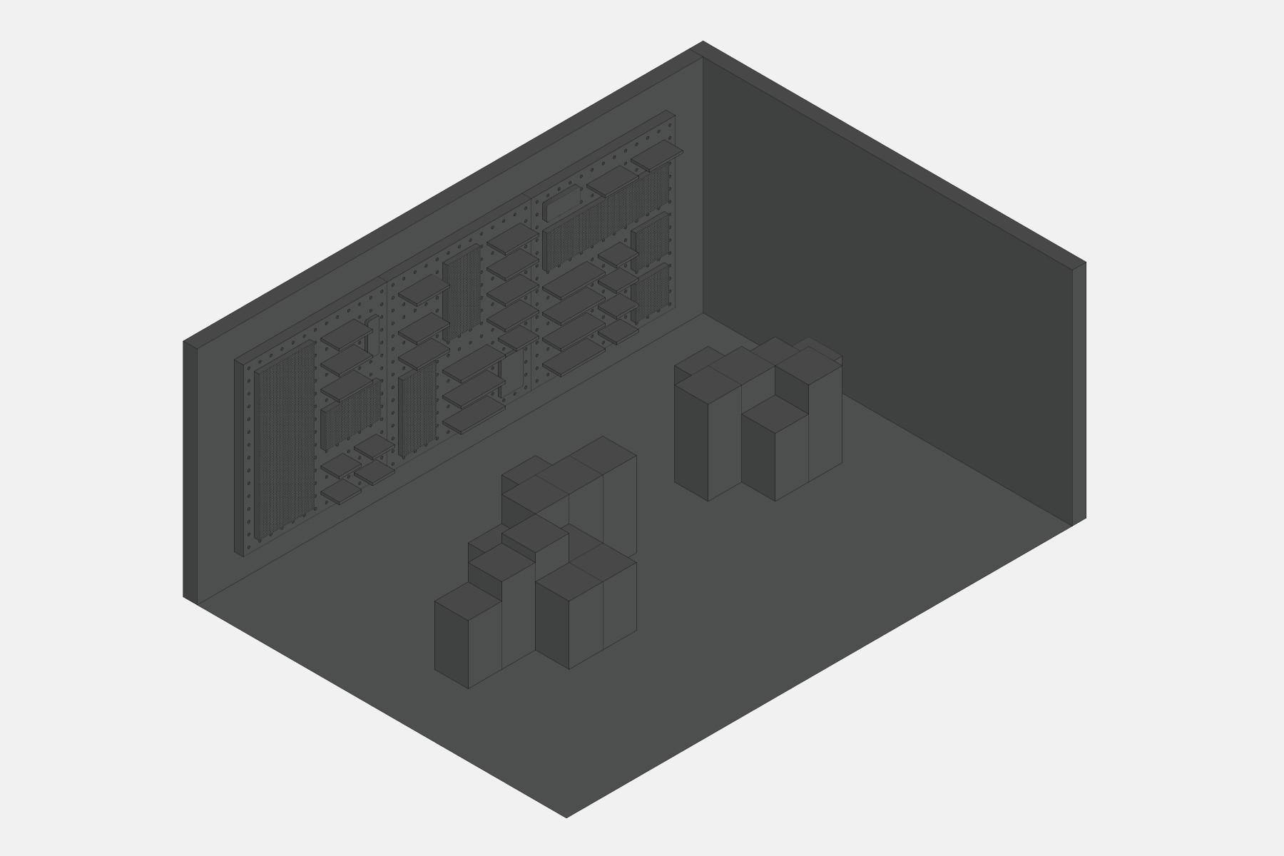
Technical drawings of the modular stand designed for DOIY.
-
 Shareof
 -
 Shareof
 -
 Shareof
 -
 Shareof


