Year: 2014
Tags: Art Direction and Design, Creative Production, Book
-
 Share
Share
5,174 views
A paper on nature and architecture for ETH Zürich
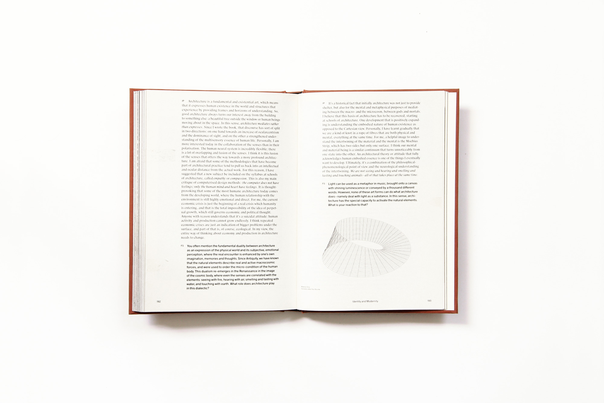
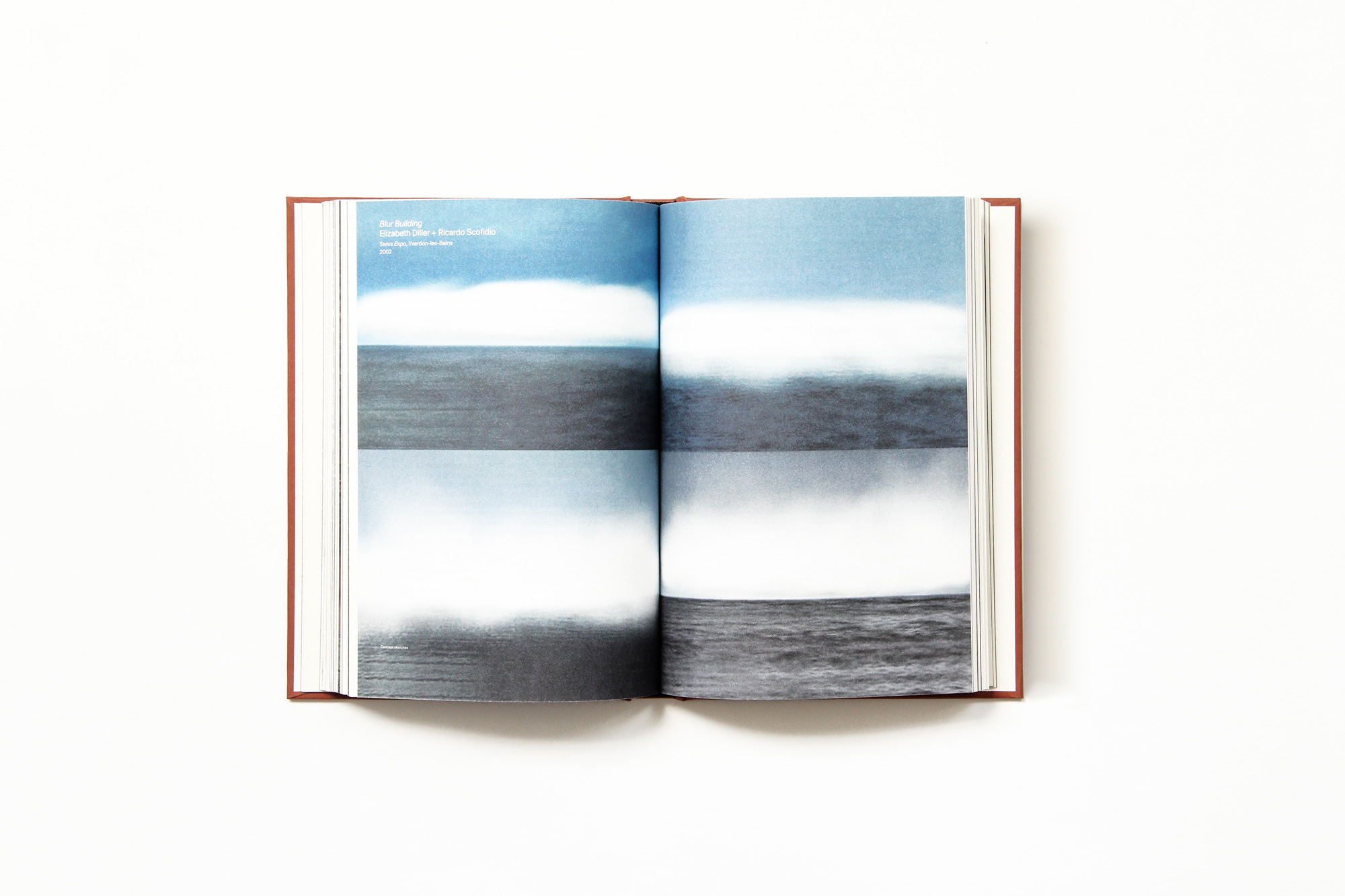
The book Earth, Water, Air, Fire: The Four Elements and Architecture is the seventh (and last) Architectural Paper that was developed at ETH Zürich Chair of Architecture by Dr. Josep Lluis Mateo. Mateo, an architect and professor has become one of our most established clients over the past few years and he entrusted us to design the publication which constitutes all the final outcomes of the course he directs in ETH Zürich. Co-authored by the Austrian architect Florian Sauter, the book addresses how nature and life are connected to the four principles of Earth, Water, Air and Fire and how natural elements should inspire our architectural actions today. Published by the New York and Barcelona-based Actar Publishers, the publication features contributions by internationally renowned figures such as Iñaki Ábalos, Günther Vogt, Stan Allen and Tadao Ando, among many others.
Reorganising the elements, designing complexity
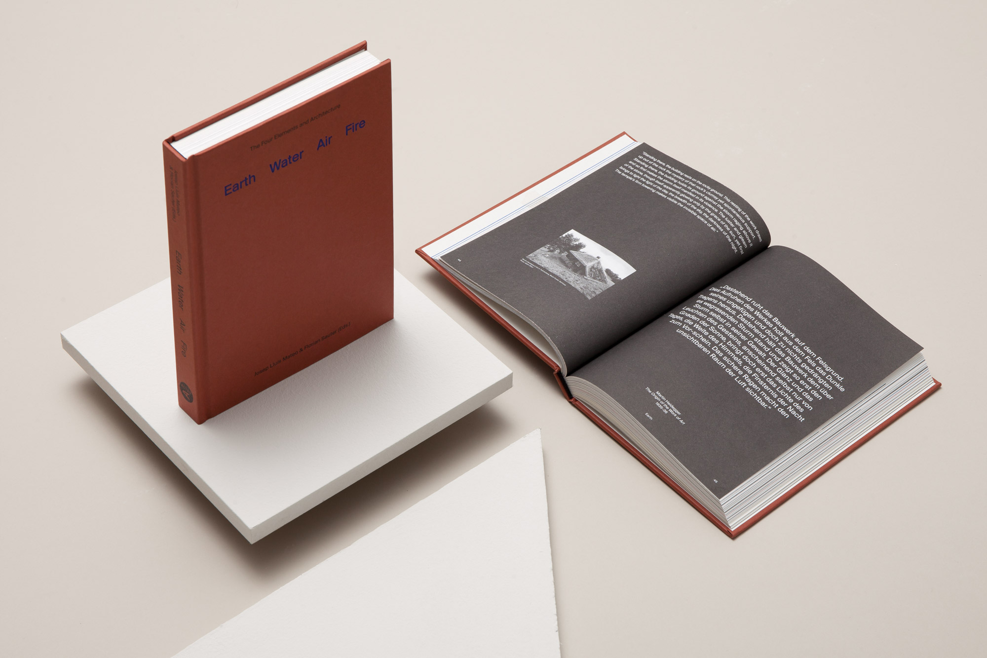
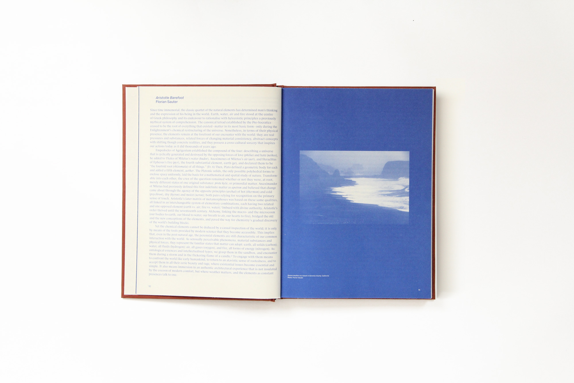
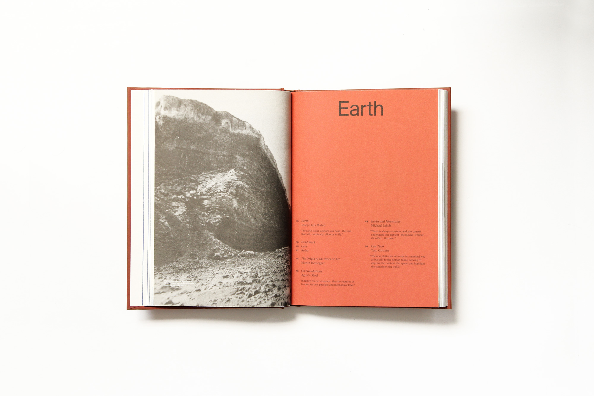
The core of the publication is divided into four parts after the four natural elements: Earth, Water, Air and Fire. An introduction to the theme of the relationship between Architecture and Nature opens the book and a plea for Identity & On Teaching completes the book. We started by taking into account the books complex nature: several types of different content, structured around four pillars. We proposed to break away from linearity – to get rid of the notion that this book is going to be read from beginning to end – and to make it easier for readers to find the four main sections: Earth, Water, Air and Fire. To achieve this, the physical build of the book needs to be carefully considered and designed accordingly.
“Conceptually, the design proposal we prepared for Mateo stemmed from the mixed origins of the book: a modern architectural approach to a subject (the four elements) that holds esoteric connotations.” Pol Pérez
Finding an order in the materials
The way the book is produced speaks of the way the content is structured: the different materials — together with the presence of an insert— draw clearly a distinction in between the sections, making the fore edge a useful navigational feature. Furthering the distinction between the four elements and the surrounding content, it was decided that these sections would be printed using one ink, therefore the content needed to be designed accordingly. For the four element central sections, were designed as many layouts as many different types of content. Also, the first page of each element works as an index of its section. Lastly, the book, bound with a hardcover, was printed on Arctic Volume paper, making it surprisingly lightweight despite the significant number of pages.
One font family fits (almost) all
Given the complexity of the book and the multiplicity of text styles throughout, we decided to work with a font family that had several different styles. We chose the Suisse BP, a beautifully-designed family by B+P’s SwissTypefaces, a type foundry dedicated to the design and production of Swiss-style typefaces. In addition to the primary font, we thought that a secondary support font would be useful: FF Elementa, a slab typeface from the Lithuanian type designer Mindaugas Strockis, perfectly suited our purpose.


