Year: 2013-present
Tags: Art Direction and Design, Digital Activation, Strategy and Design Thinking, Branding, Identity, Web design
Awards: Bronze Laus (2014), Silver Laus (2014)
Designed by Folch
Designed by Folch
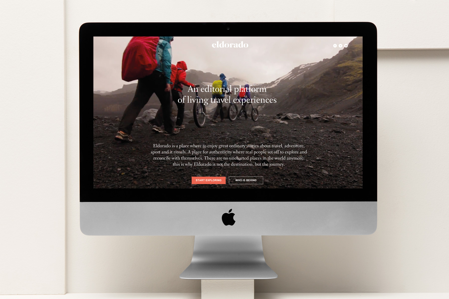
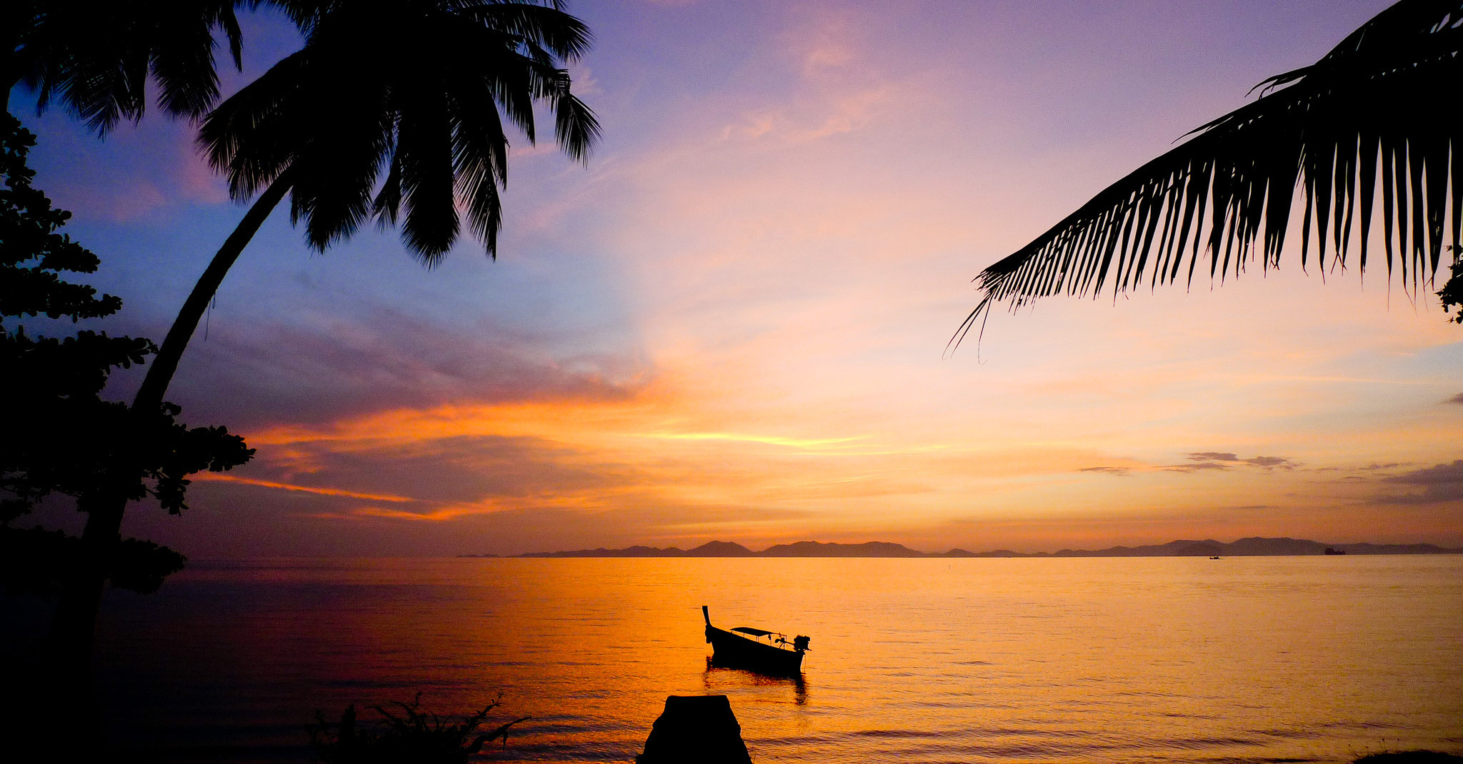
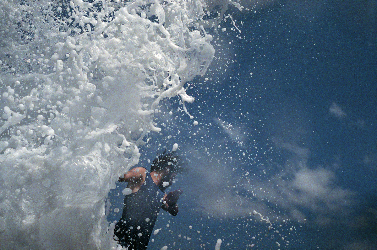
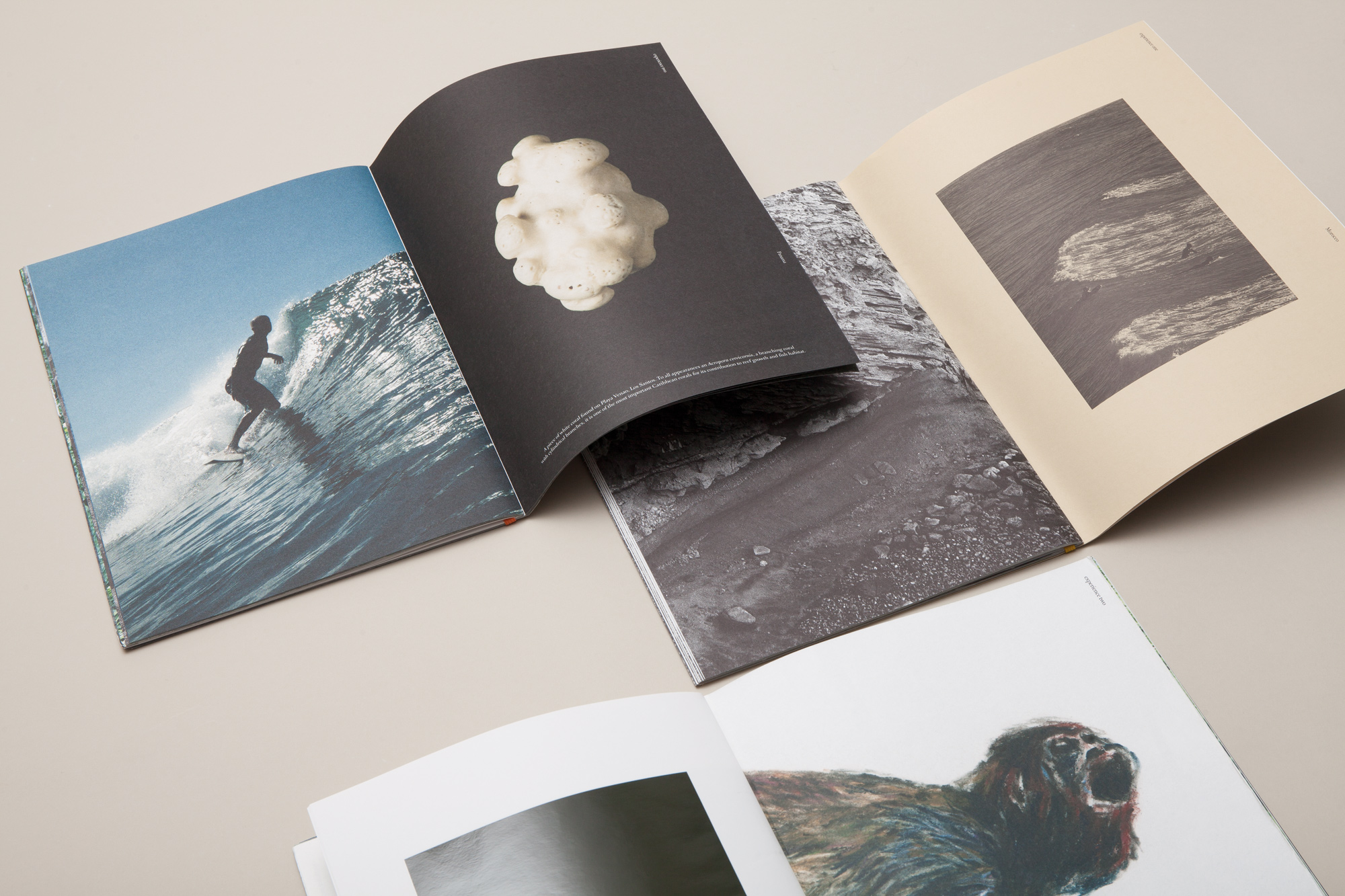
Four friends, Xavi, Santos, Dizy and Albert are packing their belongings, getting the last things ready and finalising their travel arrangements.Their surfboards are already there waiting for them at the entrance, ready to go. They are heading to Morocco. Albert Folch and Dizy Díaz came back to Spain after the surf trip and, like everybody would, they were looking forward to developing the huge quantity of pictures captured along their journey. As soon as they received them, they were amazed. They felt that they needed to do something with them. Eldorado experience was born. Started almost by chance after the surf trip to Africa, Eldorado is now the most ambitious project by Folch. Eldorado is a transmedia editorial environment that celebrates the sublimely aesthetic of the outdoors, seeking the intimate travel moments, the observations and the reflections, the sport and its rituals, the innate spirituality of Man against Nature.
“In the digital age, people are no longer interested in having physical things, but they are interested in having beautiful and inspiring experiences to share” Rafa Martínez
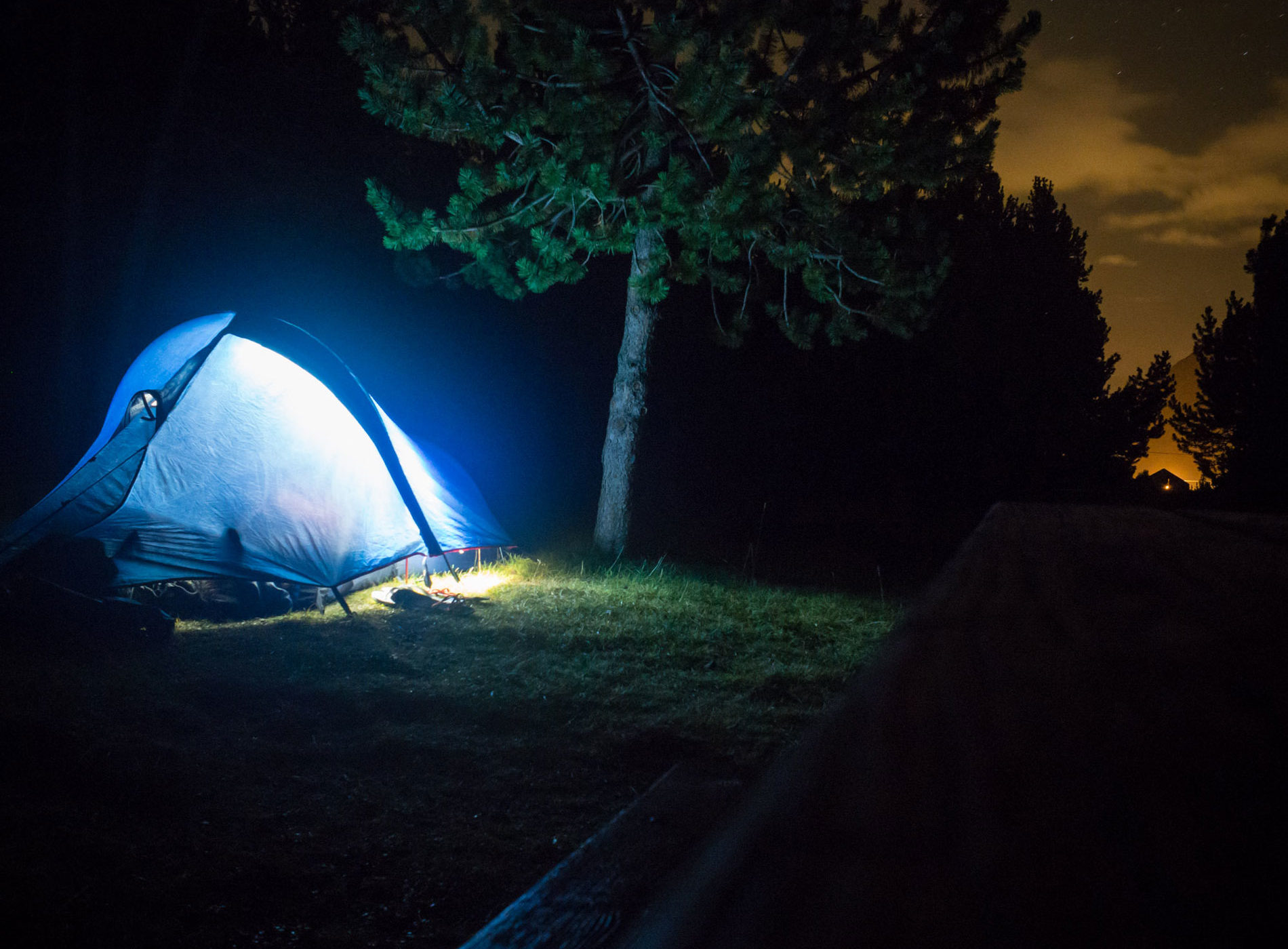
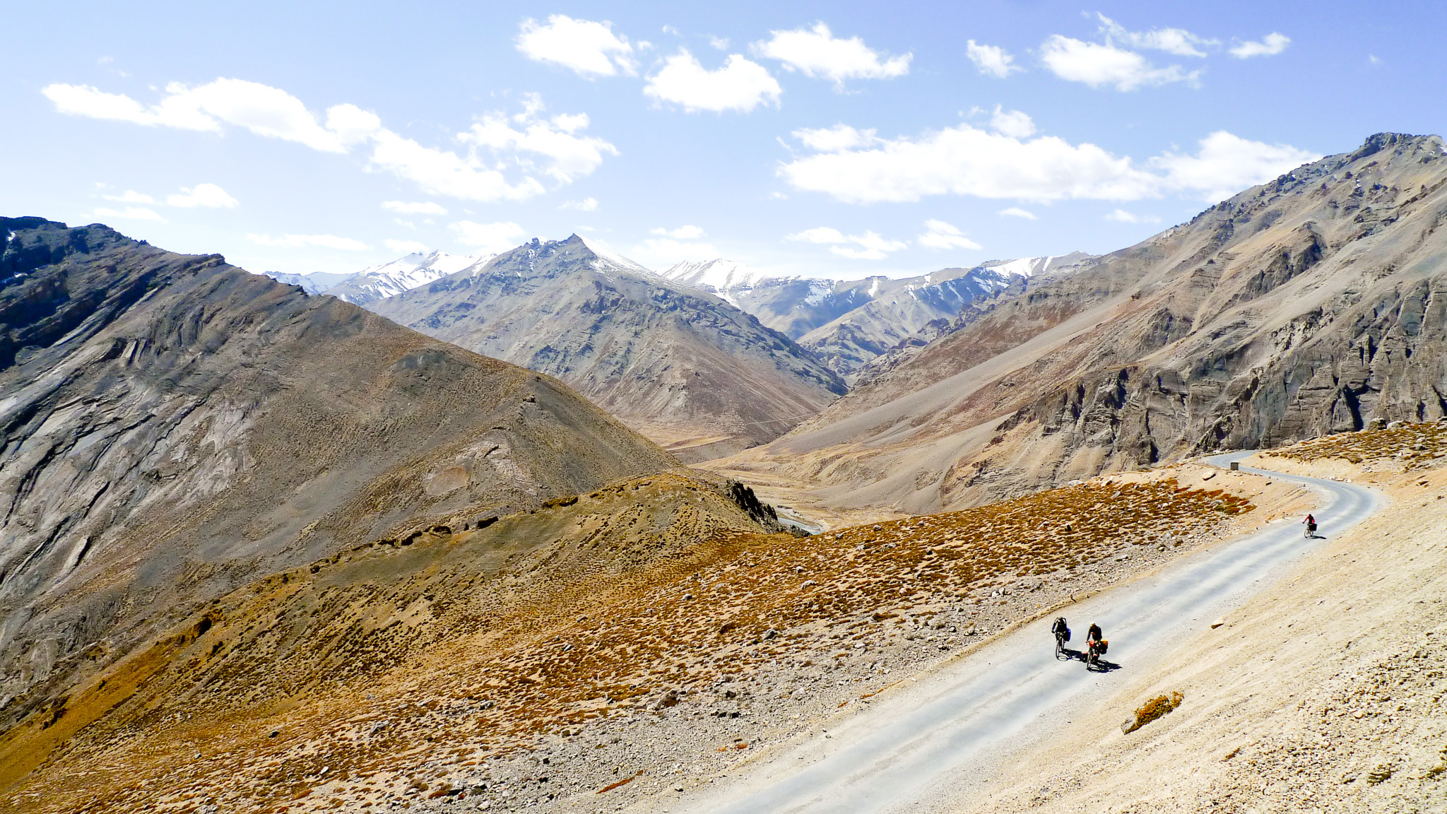
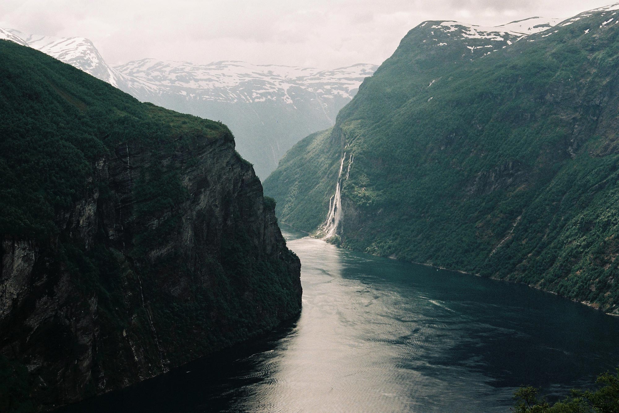
The world has already been completely explored, there are no uncharted places anymore: the only things that make an experience unique is the intimate vision, the personal journey, the inner time of the traveller. People are taking more and more advantage of their free time and leaving their cities to explore the countryside; they are rediscovering the pleasure of the outdoors, seeking a disconnection from the urban life. The digital possibilities are setting us free from physical working places. These opportunities, that once only belonged to the big urban centres, are now available everywhere. Creativity has left cities and moved to a new environment. Artists, designers, creatives don’t need to live in metropolis anymore. With Eldorado we tell and spread people’s inspiring stories and their search for answers, beauty, spirituality and their reconciliation with nature. The concept behind the project was born after this intuition and now Eldorado aims to be a guiding light for all who want to follow the modern escapism movement.
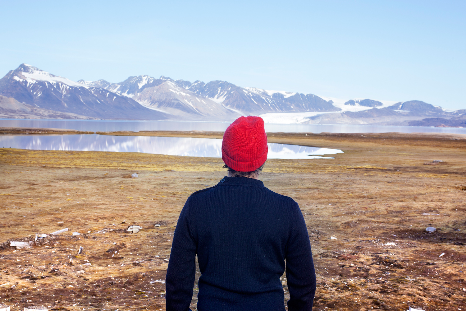
‘Portraits at the edge of the world’ is a series about stories of people living in the remotest corners of the world. This short film is set in Kusuluk. Read the full story on Eldorado
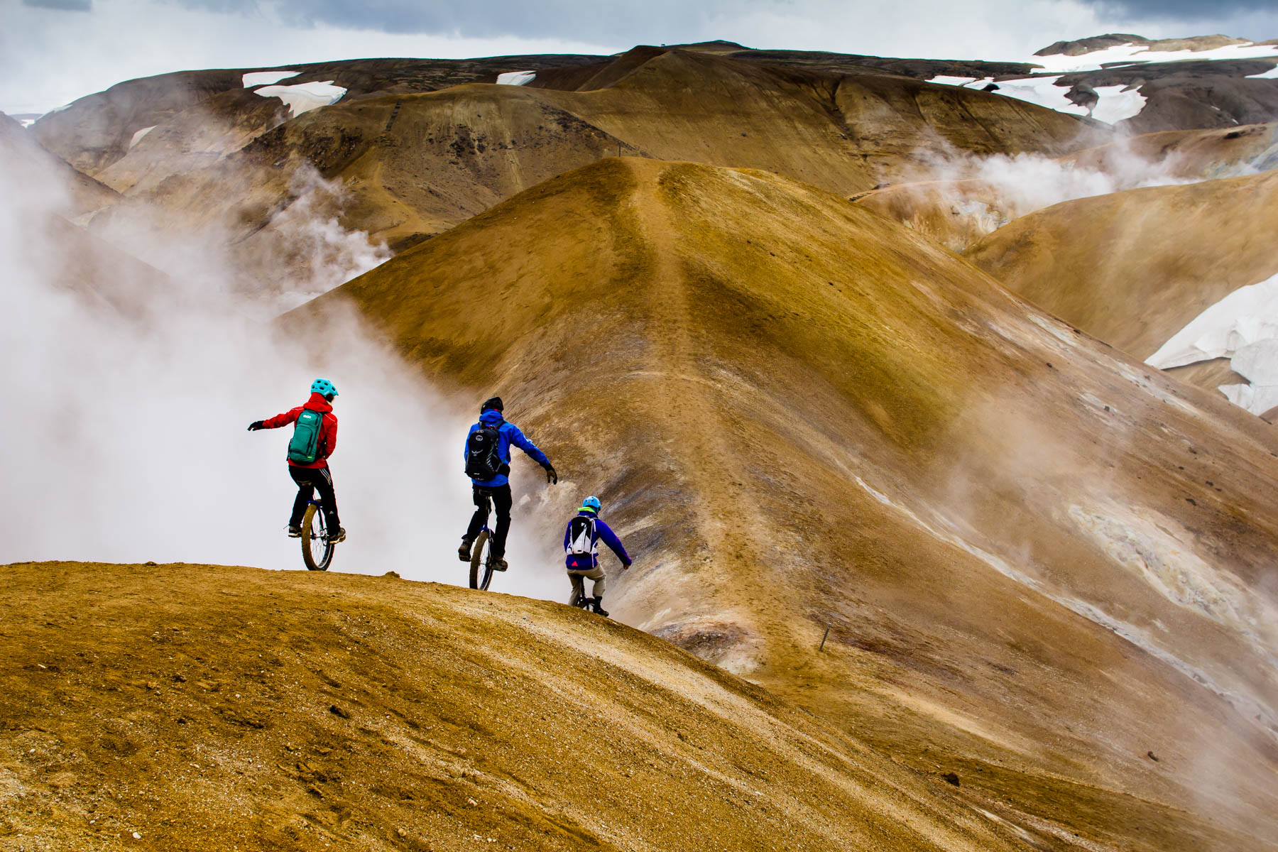
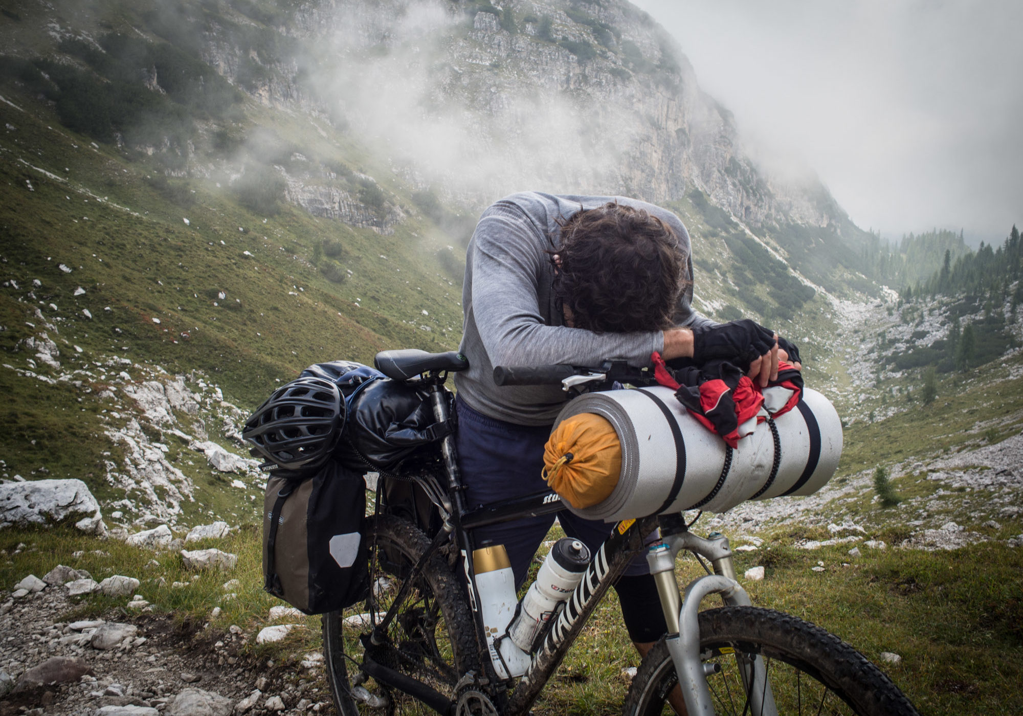
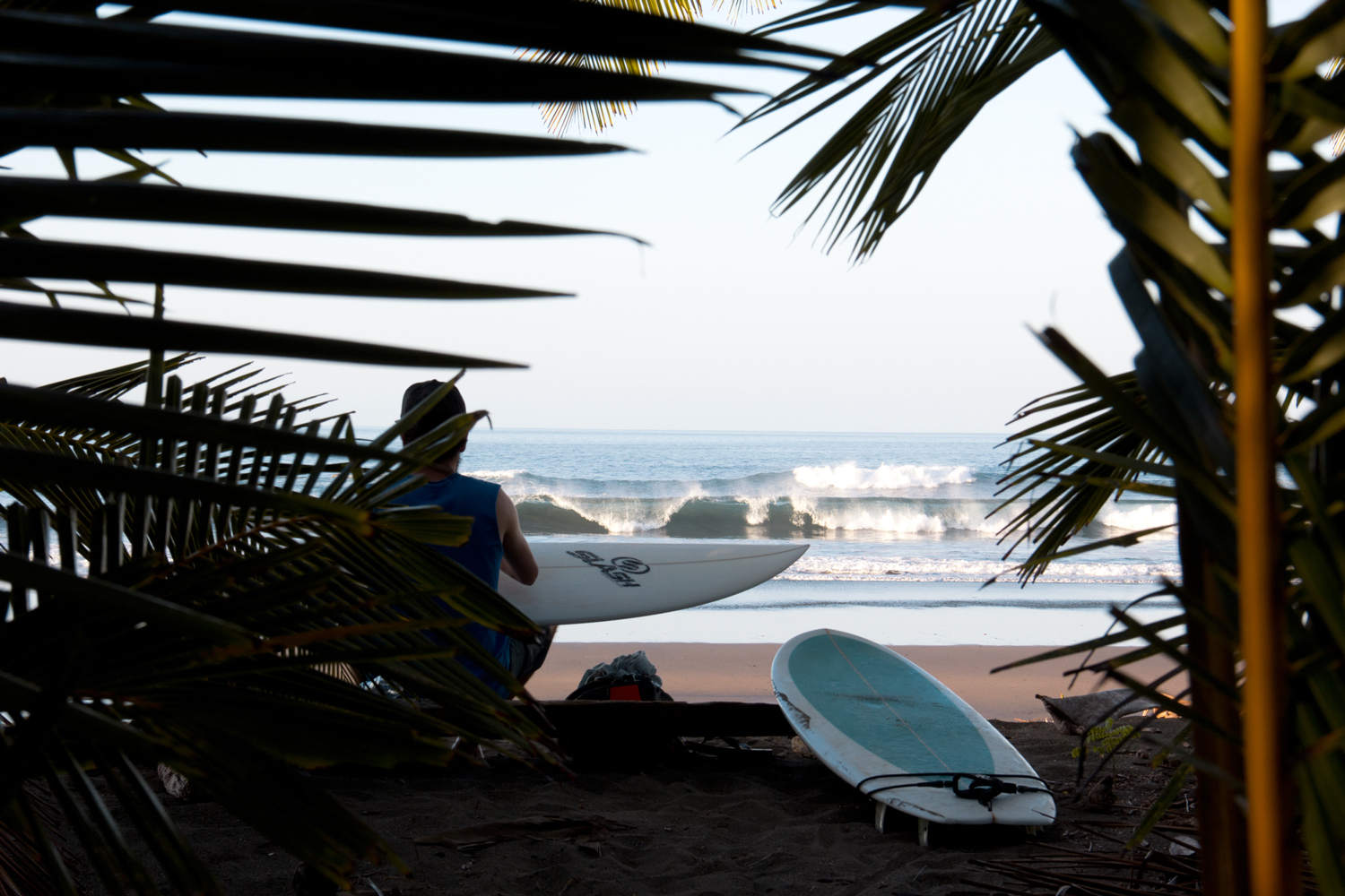
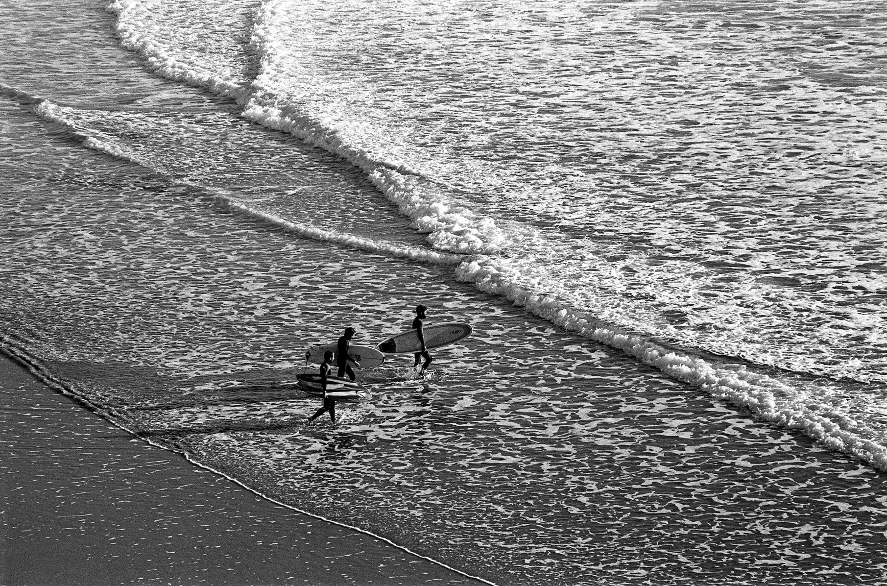
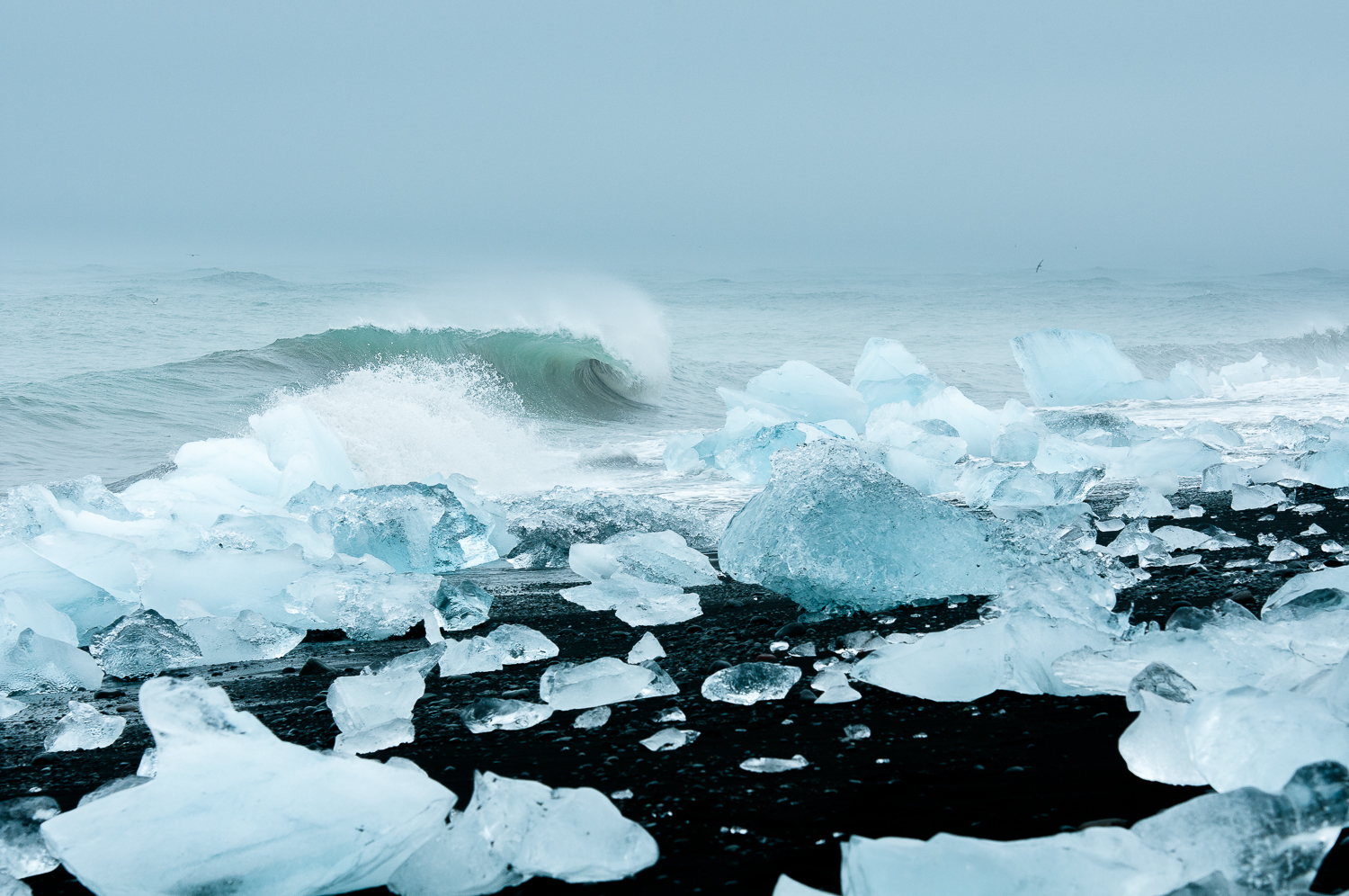
Photography: Sailing the Arctic Anna Huix; Iceland on one wheel Stephanie Dietze; TransAlp Jean-Marc Joseph; Surf Panama Dizy Díaz;
“In the cities we are frustrated because of the high living costs and population density. With the eruption of the financial crisis, we sought to rediscover our values, trace back to our roots and squeeze in at least one break during the weekends to be closer to nature. We need to rest, connect with the land and pace our frenetic rhythm.” Albert Folch
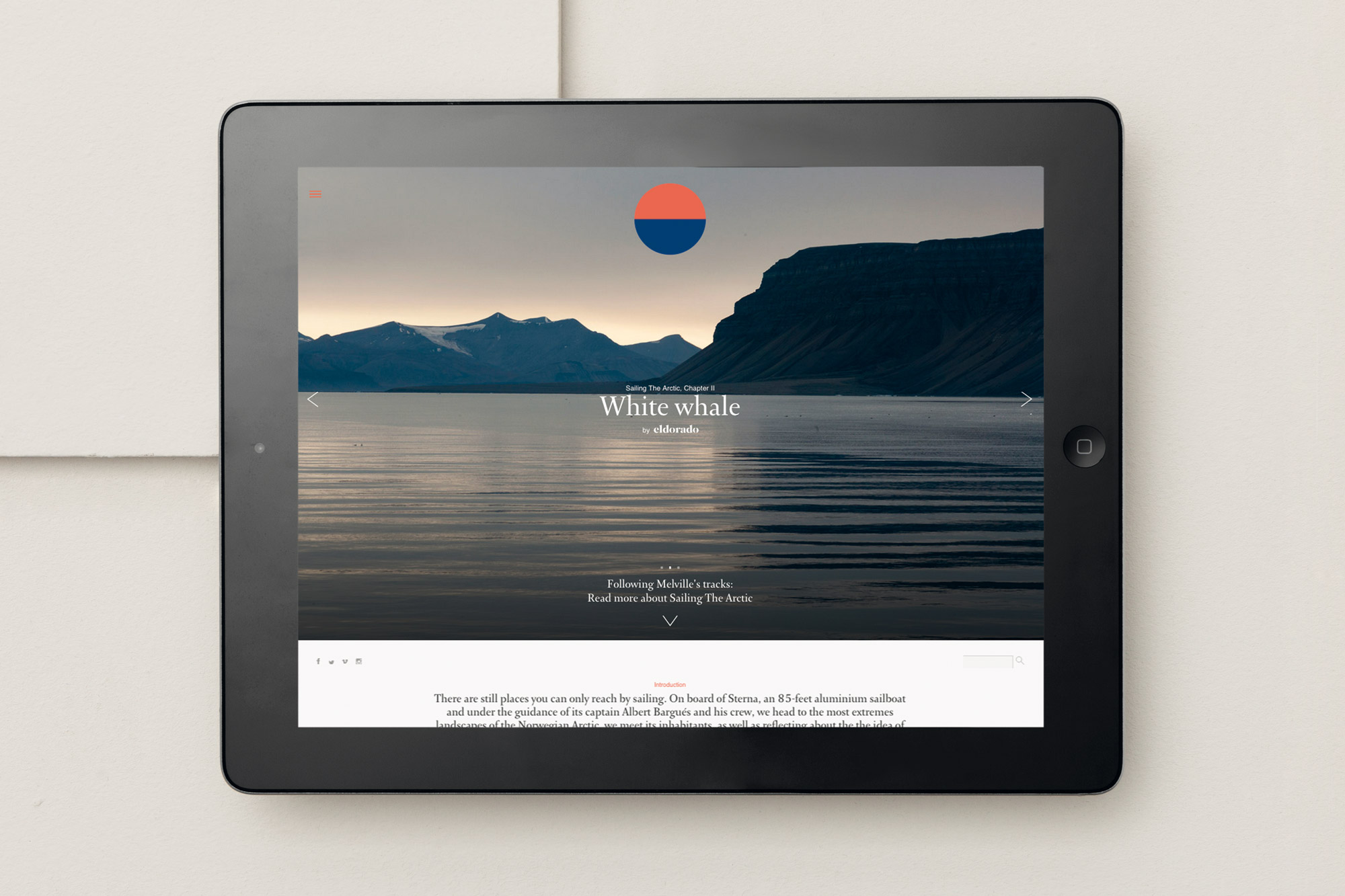
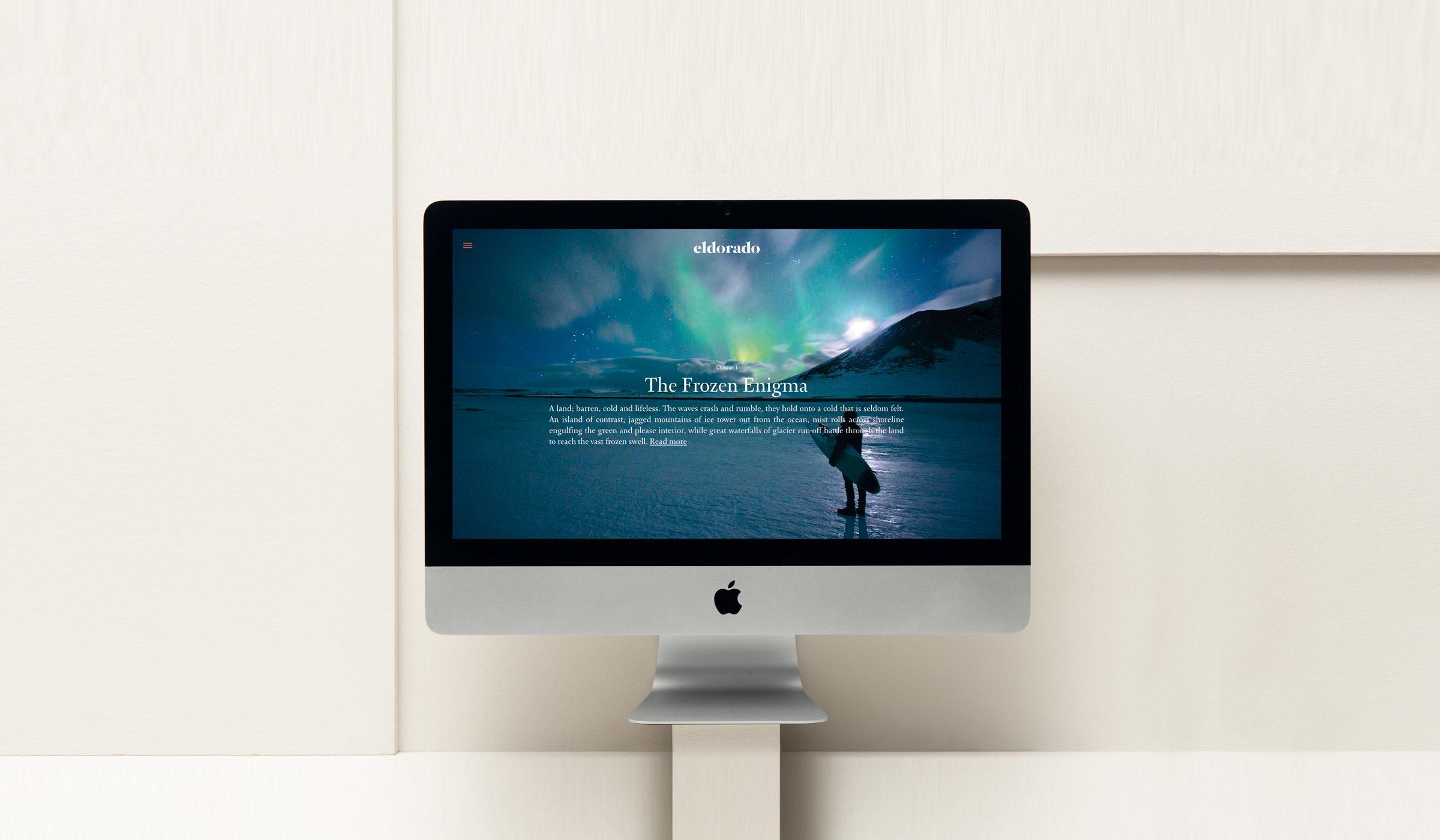
Having started in print form, Eldorado needed to expand, embracing adventure and all outdoor sports. The editorial digital platform, creates a new insightful way to build storytelling and gives a new depth to the featured stories. Eldoradoexperience.org is also aimed at allowing a new reading experience within digital media that could resemble the analogue pleasures of paper while introducing multimediality, telling stories with words, pictures, videos and sounds. With this in mind, the structure of the pages echo the way you read a book of stories: you can choose to start reading the story you are most interested in and it will then lead you to the next chapter or to another story, recreating in digital the natural circularity of reading.
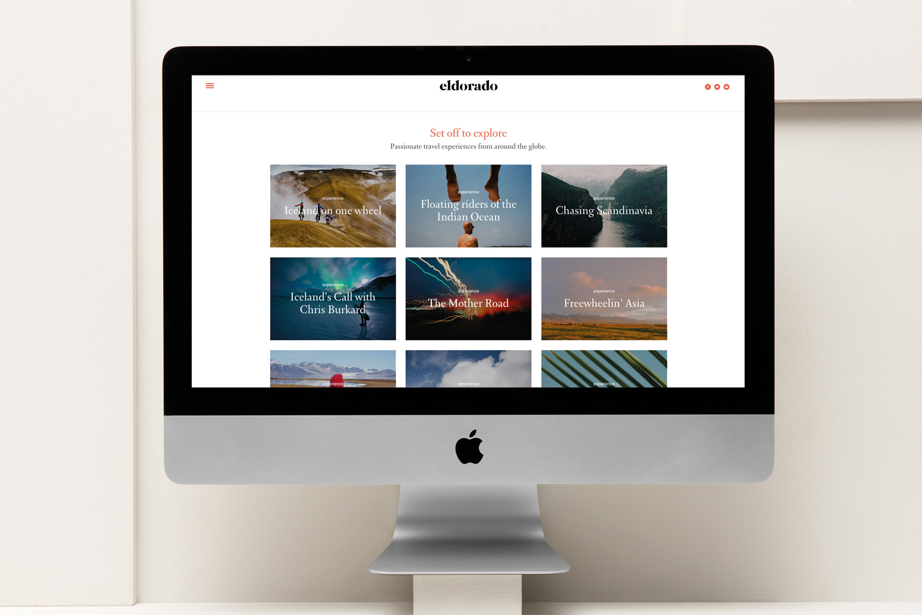
With a strong aesthetic approach and a long-form narrative storytelling, the stories are divided in thematic chapters, following the urge, the personality and the vision of each traveller besides being an attempt of representing the uniqueness of each journey.
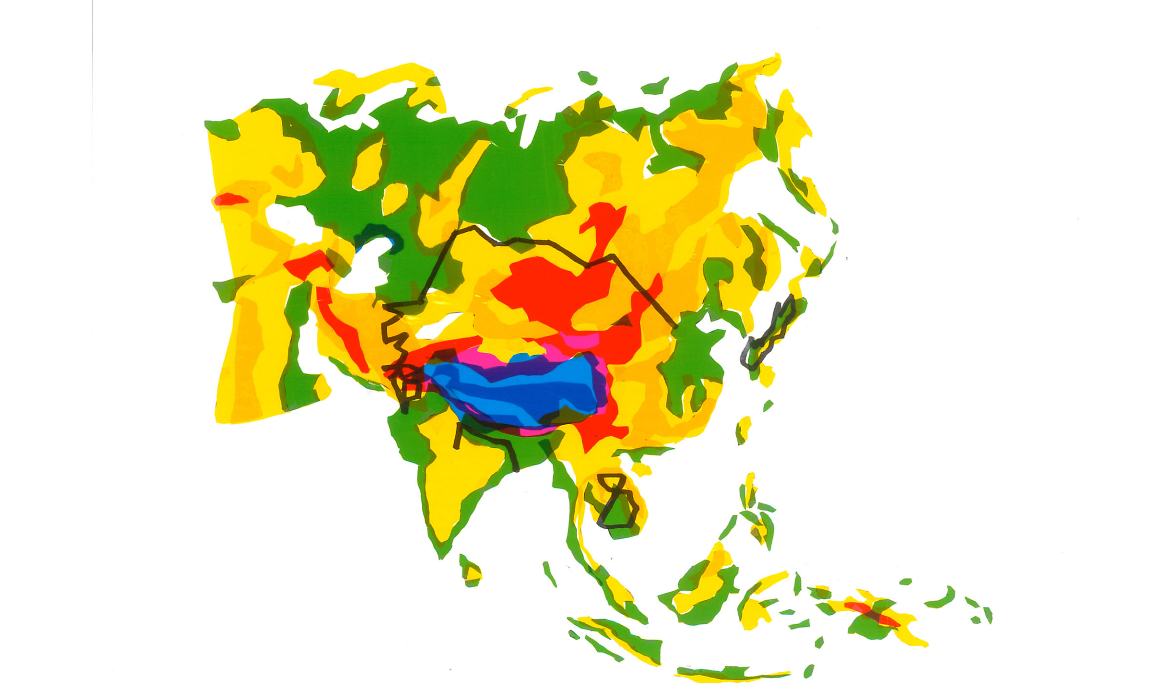
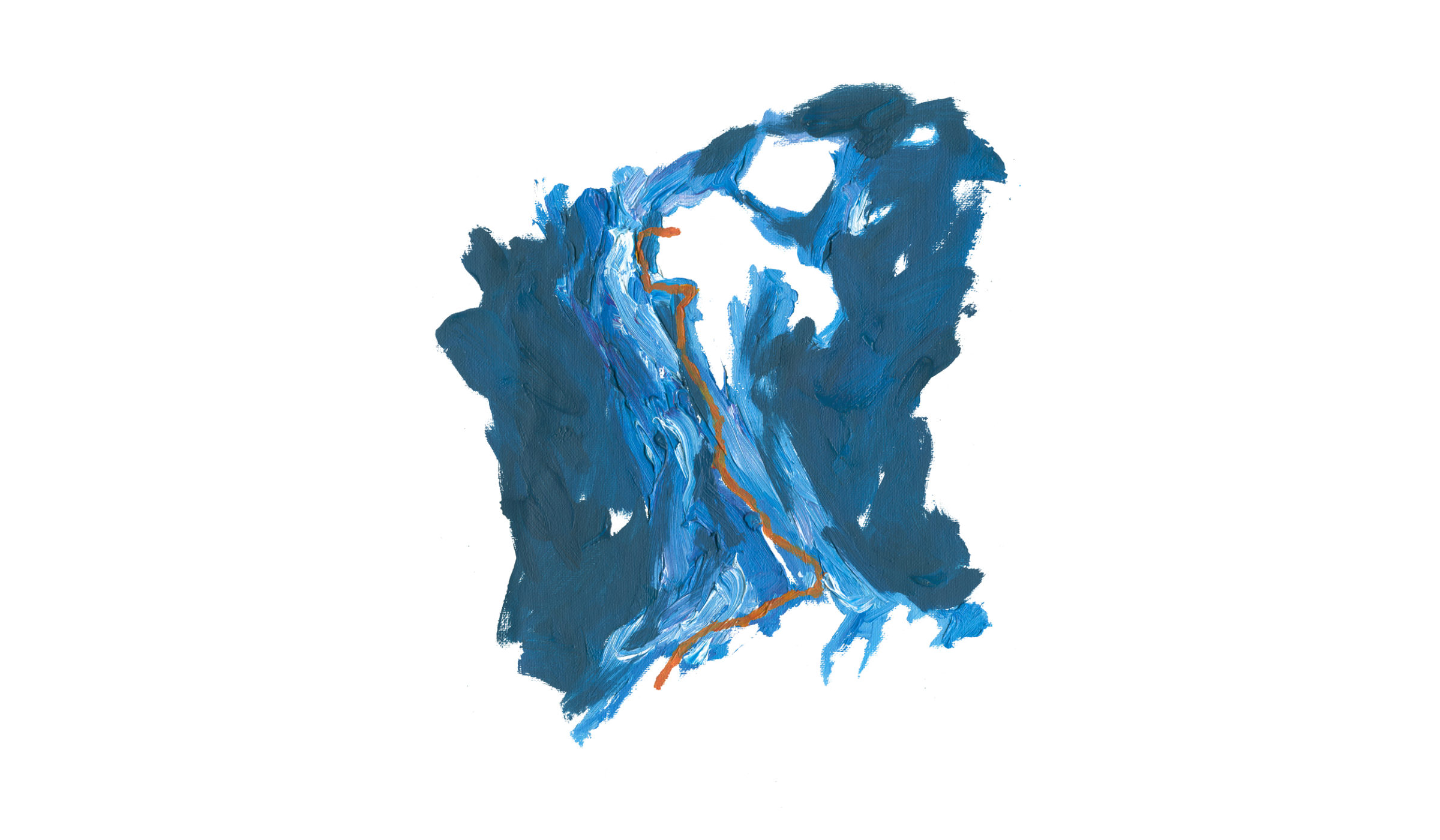
Maps are a way of organizing wonder, someone said: travel maps as seen by the artist Ángela Palacios
Visual content stands as the protagonist of the platform. As the platforms primary approach is aesthetic, travellers images are given special prominence. Typography was another essential element. Rooted in traditional typography but with a modern touch, Eldorado’s distinctive typeface, Arnhem excels in setting long passages of text. Due to its character, Arnhem, set in large size, doesn’t get lost in unusual and distracting details whilst also retaining enough personality to convey a subtle and aesthetic finish to extended texts. Helvetica Neue LT is its rational and functional counterpart. Lastly, both the blank spaces and the sporadic occurrence of other graphic elements enhance the essentiality and the importance of typography and images. The vertical structure for reading, that has a smooth transition in between chapters, is only interrupted by the off-canvas sidebar menu, allowing you to navigate through the different sections of the platform.
Images being the lifeblood of Eldorado, the partnership between Folch and the film producer Goroka, which specialise in producing video content, was a natural occurrence. Founded by the filmmaker Guille Cascante, traveller by nature and huge sea lover, Goroka broadens Eldorado’s possibilities, opening up a new world of expression through an audiovisual approach. This spirit of collaboration is strongly present in Eldorado so the project grew and this synergy eventually worked as an hub, turning little by little Eldorado into a collective of content creators, filmmakers, designers and storytellers.
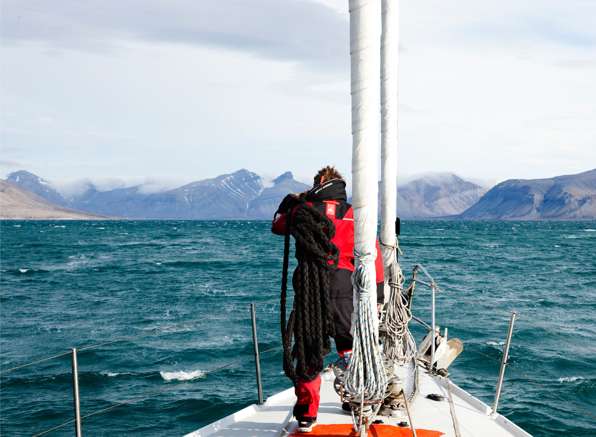
“White Whale”: in the mysterious Arctic Ocean, following Melville’s tracks. Produced and directed by Goroka, presented by Nowness
Moving image and documentary films are the perfect media for telling stories. They help convey words, imagery, music, sounds, simultaneously while involving people in the brand’s storytelling, the aesthetic imaginary and values.
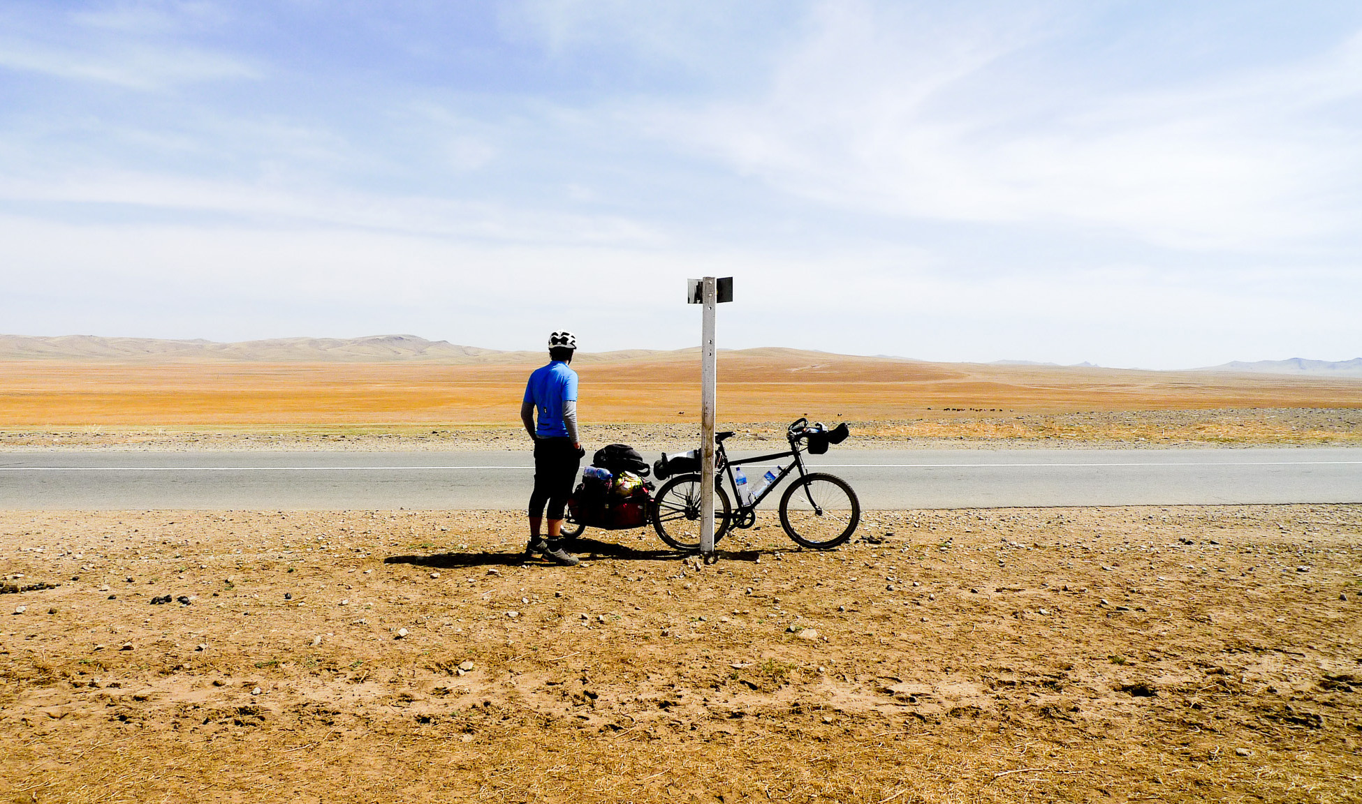
Short film for the story “Iceland on one wheel” Filming & Editing. Stephanie Dietze and Lutz Eichholz
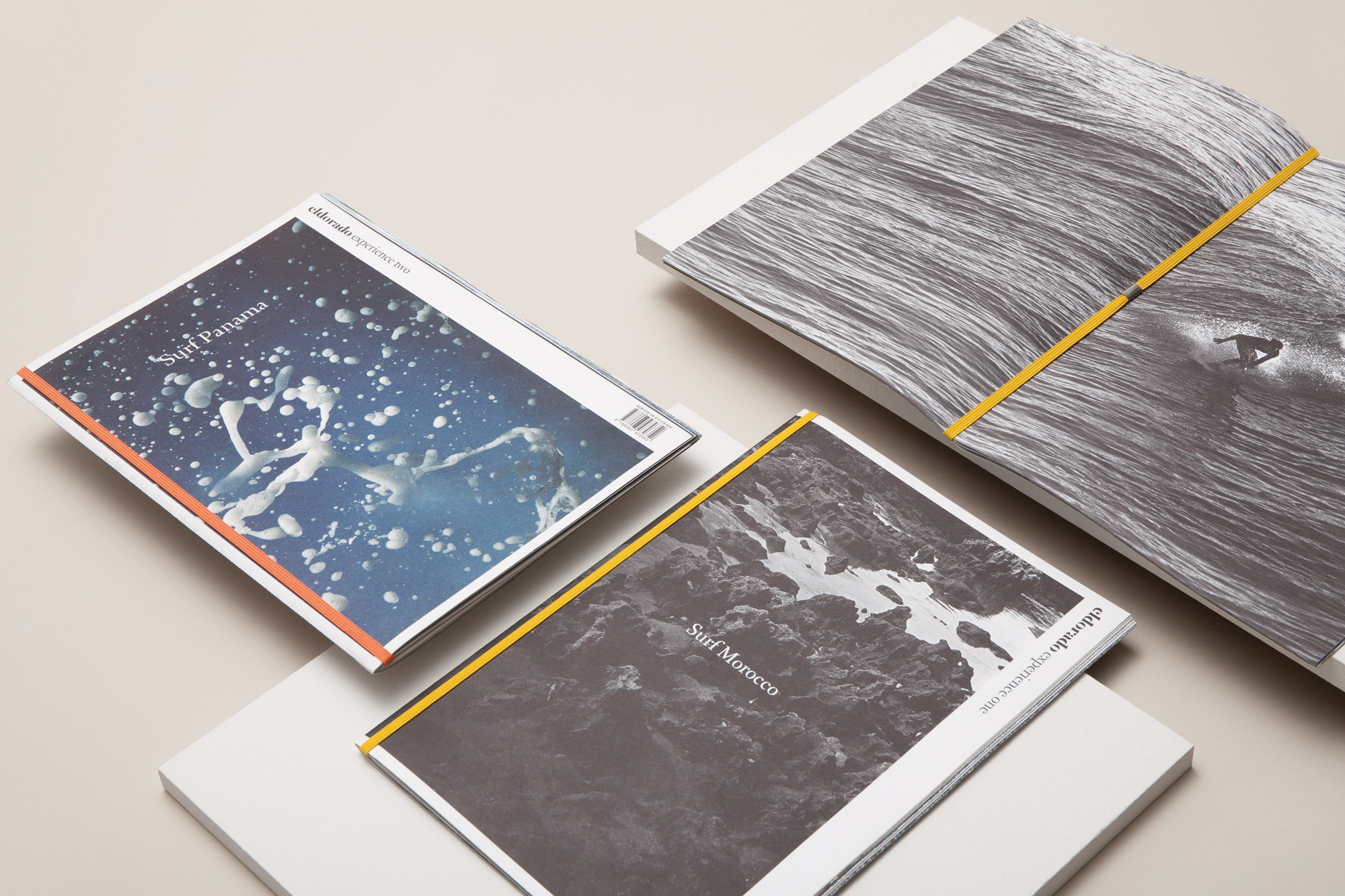
Print is the form of how everything started. The format in which we shaped the first issue — the Surf Morocco— was representing the urge, the simplicity and the beauty of the journey itself. It is a wish to flee from the conventional “magazine” format and reach new editorial solutions. A limited edition black-and-white photographic book with a fine organic material selection: a simple and sleek elastic bind that holds together the publication and its elegant and essential look. The intriguing travel pictures by Dizy Díaz are harmonically accompanied by Ángela Palacios and Pol Montserrat’s beautiful illustrations. An evocative text by Xavi Carbonell opens the publication which, without any stockist distribution, sold out in a few months.
When the idea of the project came to mind, we started looking for a name that could represent this search of disconnection, this yearning of going back to the roots. Long talks with our friends and surfmates at Firma helped us to find the right name: Eldorado. The logotype is aimed at reminiscing about an old travel memory, conveying the idea of the explorers in uncharted lands, seeking new experiences and emotions. Starting from the need for a clear hierarchy and distinction between the two words —for a better development of a dynamic identity— a custom stencil version of the typography Hoefler was created for Eldorado, while the second word is set in Arnhem Fine Regular, with the goal of creating two pretty different stains of black. Eldorado experience —and all its possible declinations— assumes a journalistic character and conveys the human values behind the project: a closer look on a personal experience.
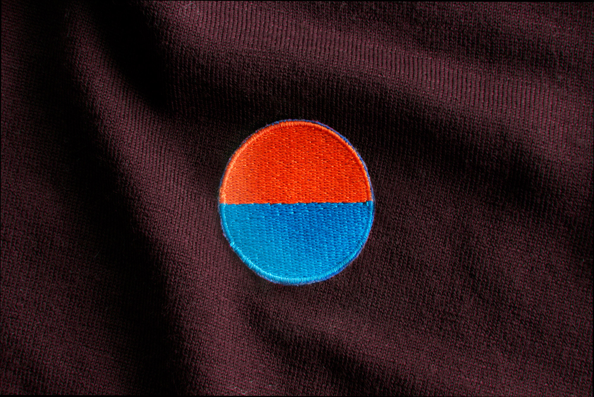
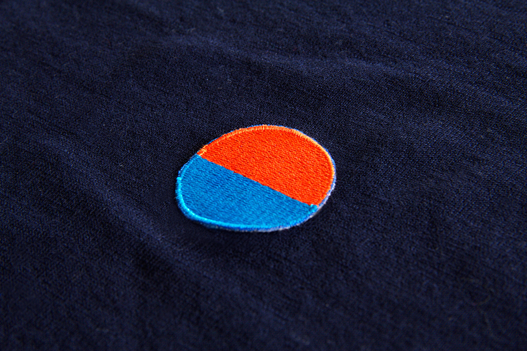
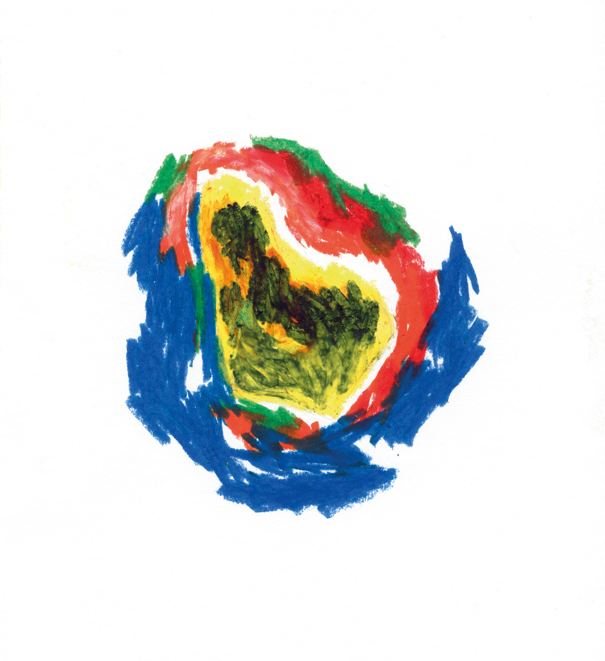
Logotypes are made of words and words need to be read. The search for Eldorado is universal so we made the exercise of taking a more abstract approach, creating a visual symbol that would represent the essence of the brand. The sun symbol is found in all cultures throughout history, representing the cosmic power of Nature and in some cases even the power of mind. Sun is responsible for light, and as we all commonly know photography is literally writing with light, which is the base for Eldorado’s primary form of expression. The symbol encloses, in its the drastic and abstract synthesis, the dialectic opposition of earth and sky, of waters and sand, of light and darkness.