Year: 2013 - Present
Tags: Art Direction, Branding, Concept
Awards: 3 Silver Laus (2014), ADC*E Award Nomination (2014), Bronze Laus (2014), Golden Laus (2014)
Designed by Folch
Designed by Folch
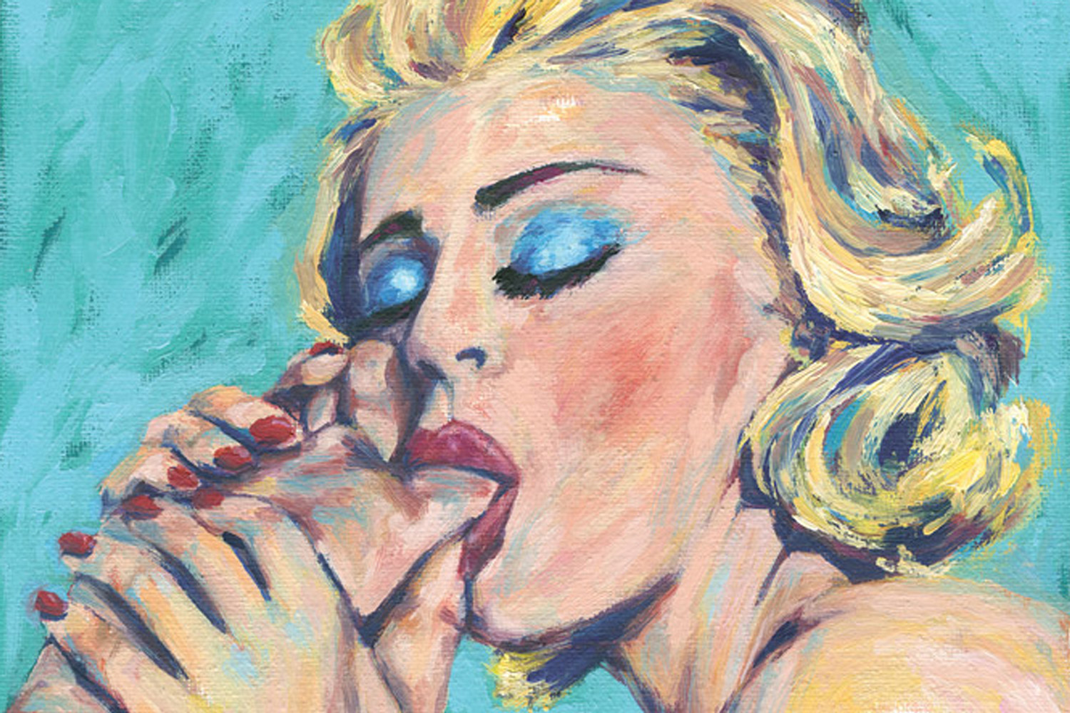
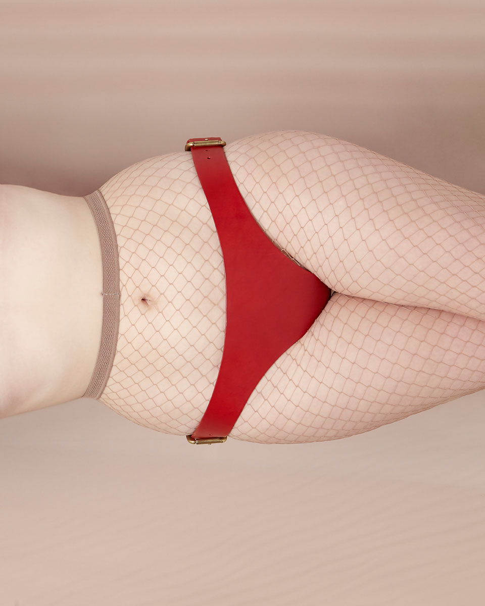
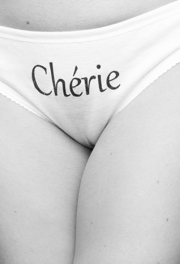
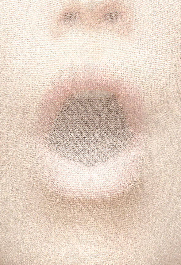
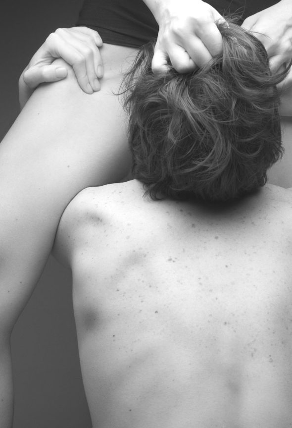
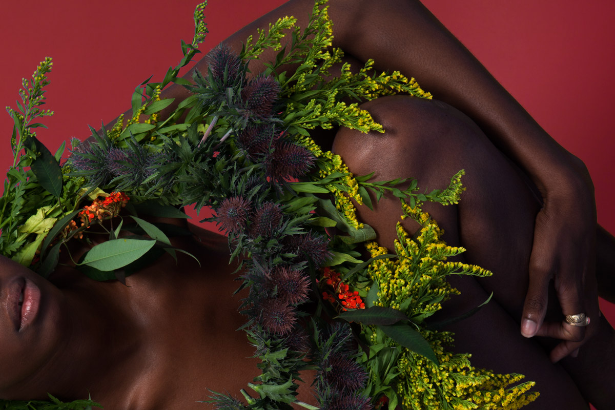
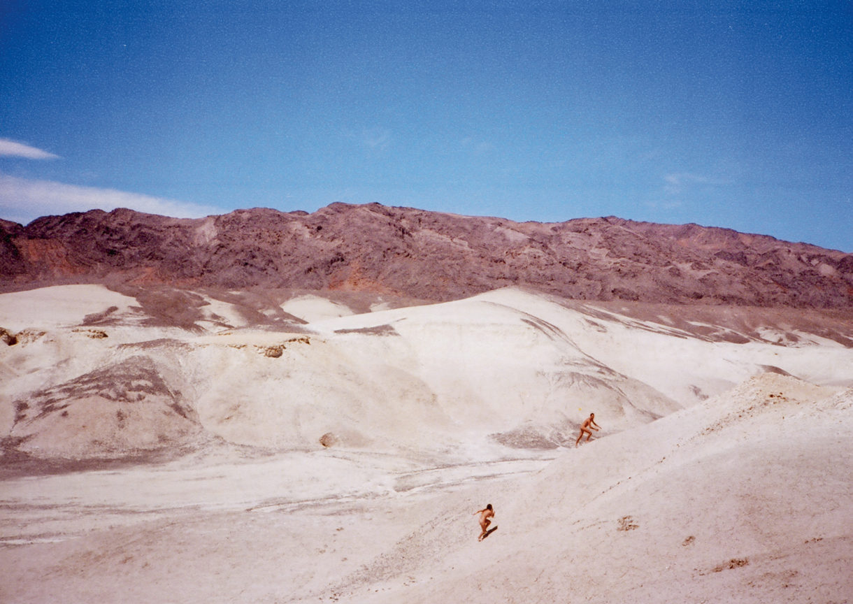
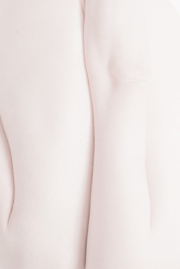
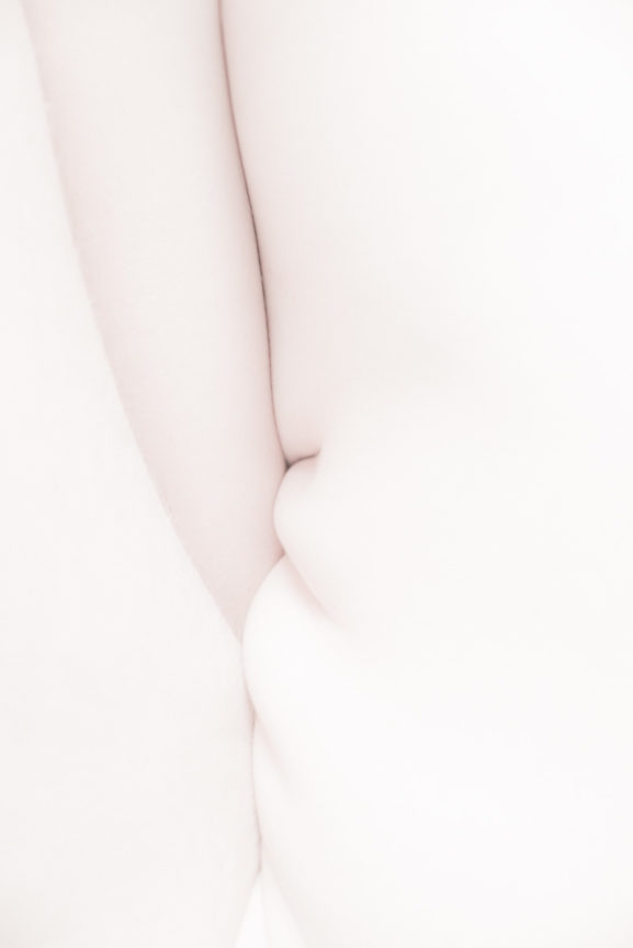
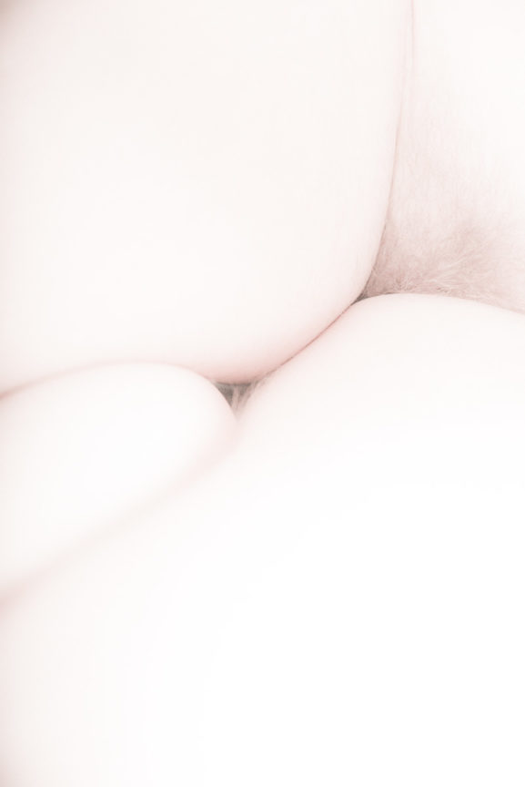
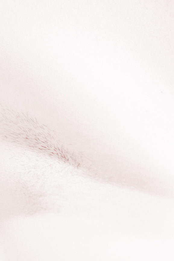
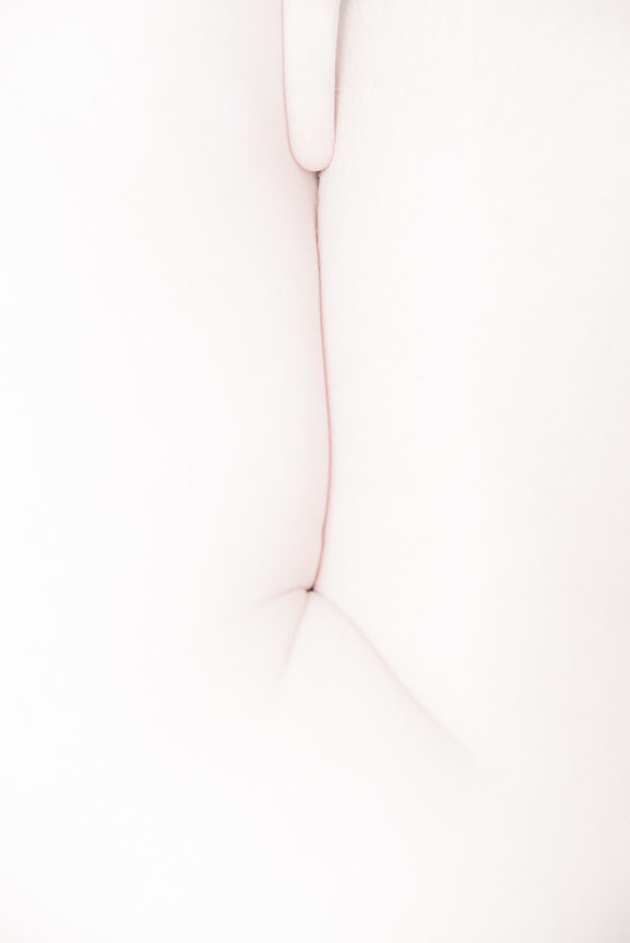
We aim not only for a visual experience; we strive for intellectual seduction. Odiseo shouts out the unseen: it is contradictory, mysterious, intellectual and intuitive. Odiseo illustrates our mission: the exploration of new ways of doing and seeing, offering a different vision on erotism, going beyond gender, seeking seduction through bodies and abstraction.
“With Odiseo we seek a deliberately visual, unique and authorial vision of erotism.” Albert Folch, Founder and Creative Director at Folch
Combining erotic imagery with insightful texts and crossing the boundaries between books and magazines, Odiseo defines itself as a hybrid. With Odiseo, we don’t seek to publish current normative content, but focus on the extended present, retaining the periodicity but doing away with the obsolete. This complex and contradictory nature shaped Odiseo as a small, bi-annual hardcover publication. Moving away from the tradition of magazine mass consumption, Odiseo is a publication to be appreciated and read without pressure. It deserves quality time invested into its content.
“While it is easy to appreciate Odiseo on the surface, spend some quality time between those covers and it is clear that the true beauty lies in the underlying details.“ Dazed and Confused
We wanted to make a progress in the way we understand and approach fashion, eroticism and art. To tell a story through another perspective without being explicit – and instead create many layers of interpretation to reach the people who understand our positioning. This is our way to conceptually tackle a theme, work according to a specific aesthetic and aim to make a statement on a long term basis – a kind of quiet activism. We are not using ads and sponsors which also gives us more freedom to explore and provoke through an independent idea of understanding.
“Odiseo is devoted to ripping up the erotica rulebook and replacing it with a “vision of seduction” designed to provoke new sensations from its reader.” Its Nice That
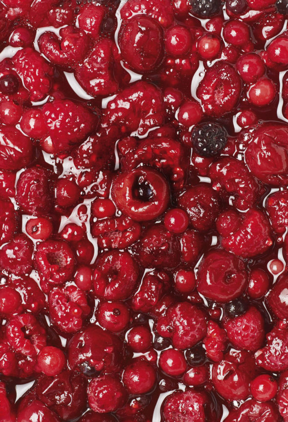
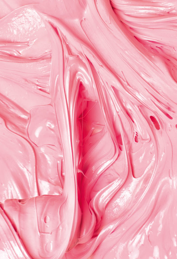
Likewise many initiative and projects that explore human sexuality and gender consciousness, Odiseo aims to neutralise strict categorisations by featuring a mix of sexual imagery and poignant art essays, enabling the gradual move away from genres and stereotypes as well as fleeing the conventional predominance of male gaze in erotica. We believe that eros lies in a more profound level and more primitive desire: this is why we are in the constant search for a more abstract and conceptual vision of what erotica is. Erotism is too ethereal to be enclosed in gender bias.
“It’s about overcoming distance and allowing fantasy to take over.”
Vice
The name, Odiseo, comes from multiple ideas. First, we wanted a name that could work on a worldwide level and be easy to understand without translation for the English-speaking market, but which remained true to our roots in the classical tradition. And Ulysses—the Latin translation of the Greek Odysseus—meant to us curiosity, bravery, youth and beauty. Moreover, we were fascinated by the aesthetic value of the word itself: it features a harmonious and sensual combination of letters, and the word starts with the same letter as the one it ends up with.
Odiseo Vol. 2 teaser by CANADA
Odiseo also became a good excuse to freely explore our artistic intuition as a visual and conceptual reference to client commissions.
By founding the first volume we understood the complex challenging task to create an erotic magazine. Once it was printed we realised this was quite far away from what we wanted to express. The discourse had to be more profound and abstract. Odiseo Volume 2 was the real beginning.
Odiseo is a lot about learning by doing, about an organic evolution, and from that point we built, volume by volume, our brand to be more daring, provocative, abstract, complex, independent and surprising.
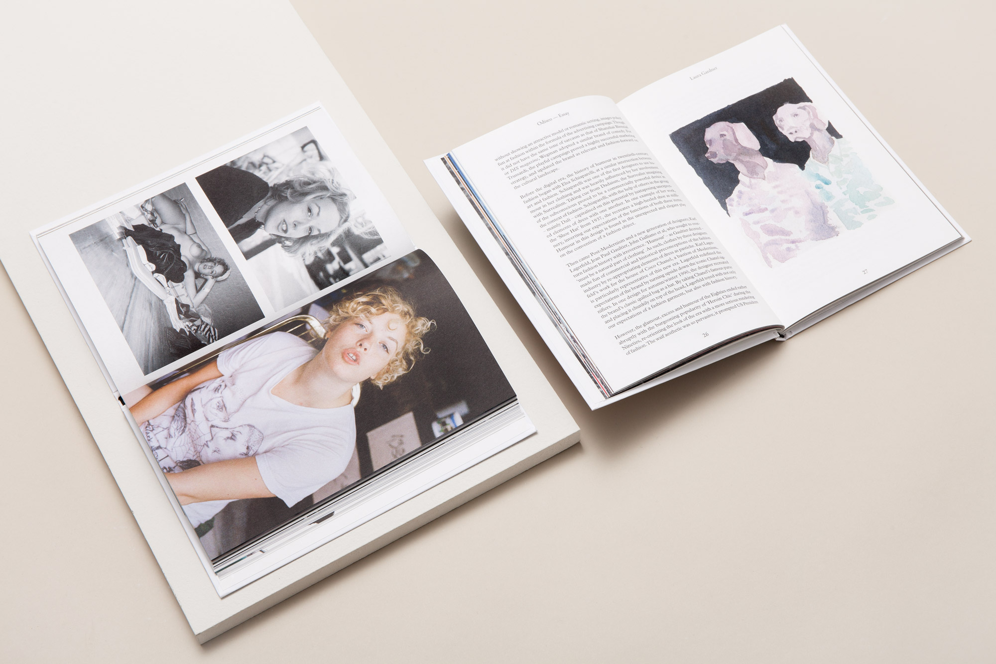
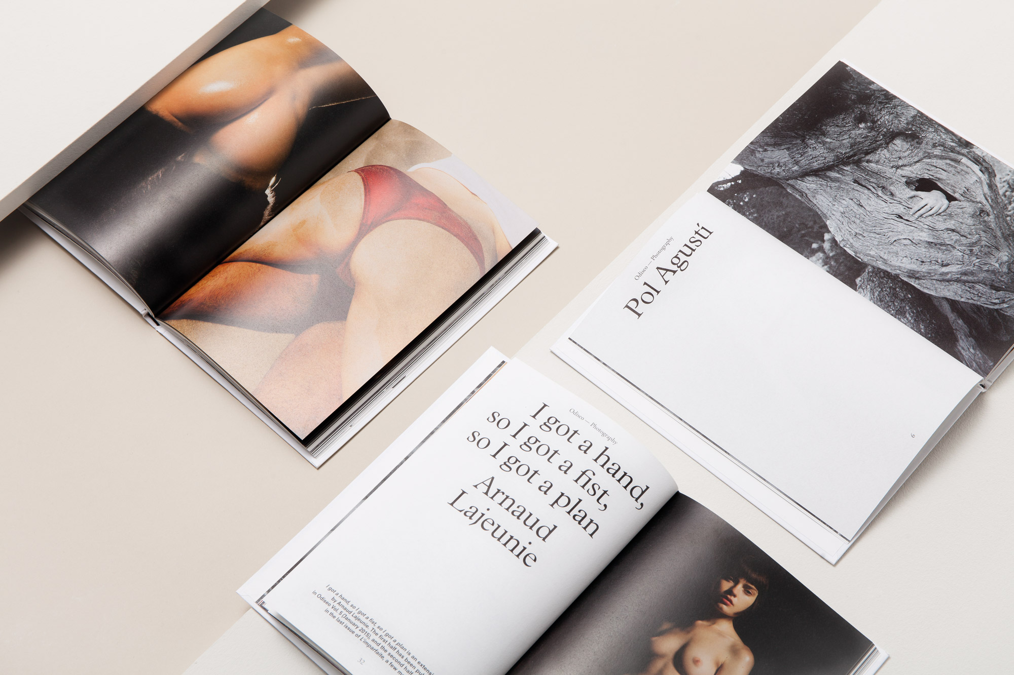
Photography by Pol Agustí for Odiseo Vol.5 (not) safe for work
“From the outset, we hoped to create a hybrid between book and magazine. A tangible space through which Odiseo could offer up a consciously complex vision of seduction and sensation, all of which should be grounded in the context of a thoroughly multidisciplinary approach.” Emmy Koski, Editor in Chief
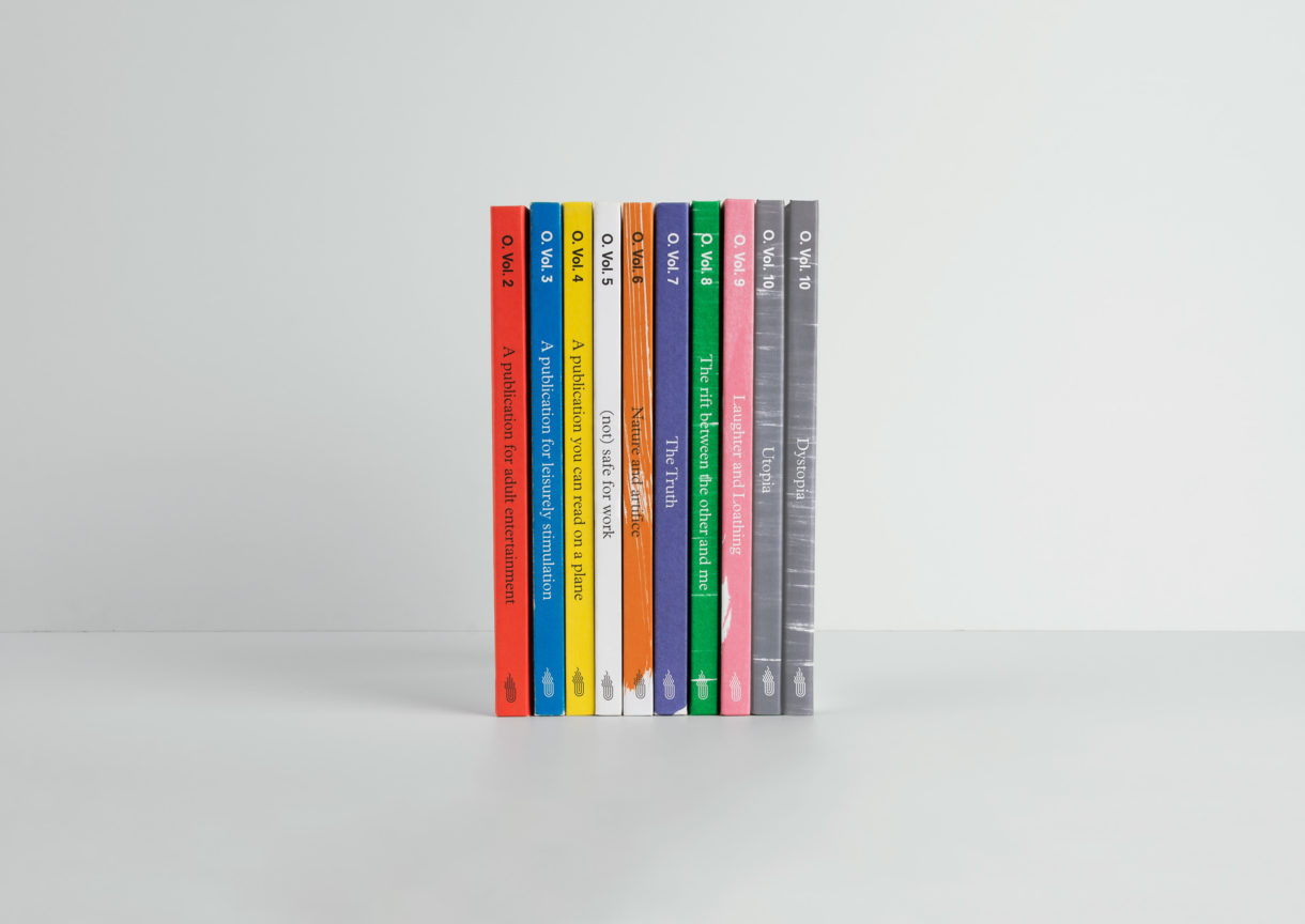
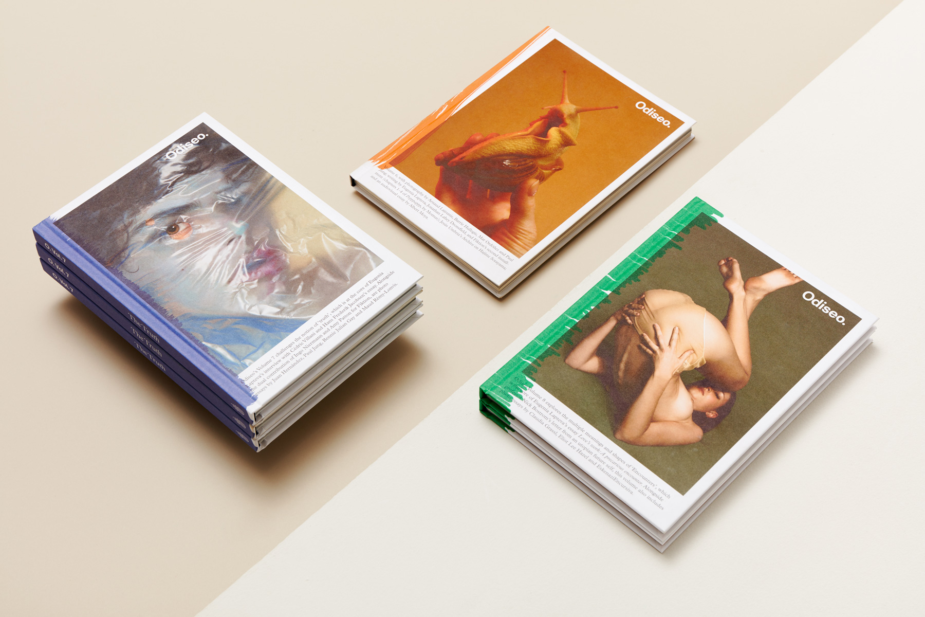
Odiseo’s first volume worked as a pilot episode. After its release, however, we realised that what we published wasn’t anything new or innovative and so it became clear volume two needed a swift redesign and re-think. We re-conceptualised the project and looked for a different and intimate take on photography. Odiseo Volume 2 was the real beginning. With its now iconic sprayed spine, Volume 2 claims to be ‘A publication for adult entertainment’, starting the tradition of the publication’s dynamic.
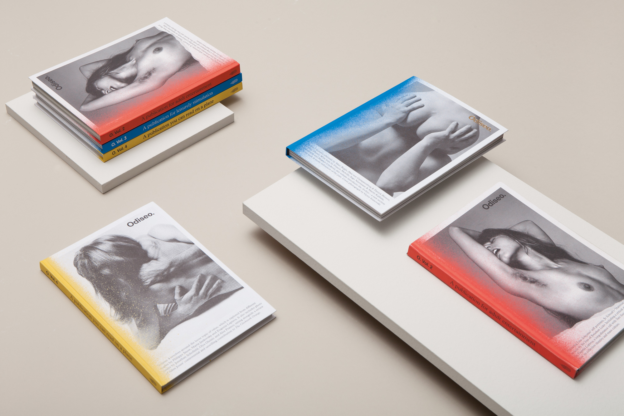
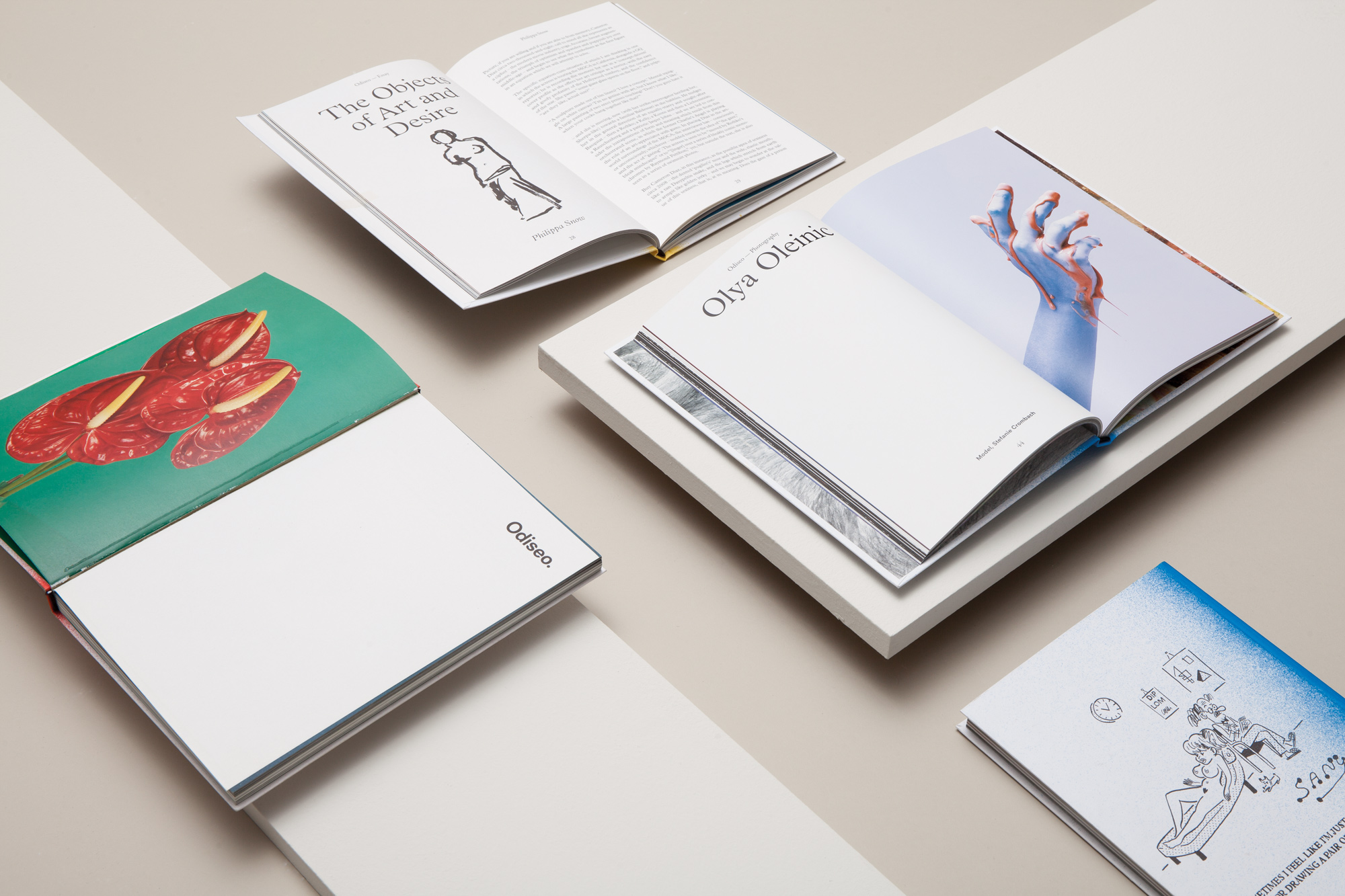
With Odiseo Vol.3 and Vol. 4, we continued to explore our conceptual approach to eroticism. The third issue delved into the theme of Sustainability. ‘A publication you can read on a plane’ was the strapline of the fourth volume, printed with a black foil stamping on the signature coloured spine. The issue focuses on the loose topic of Value, explored from different angles.
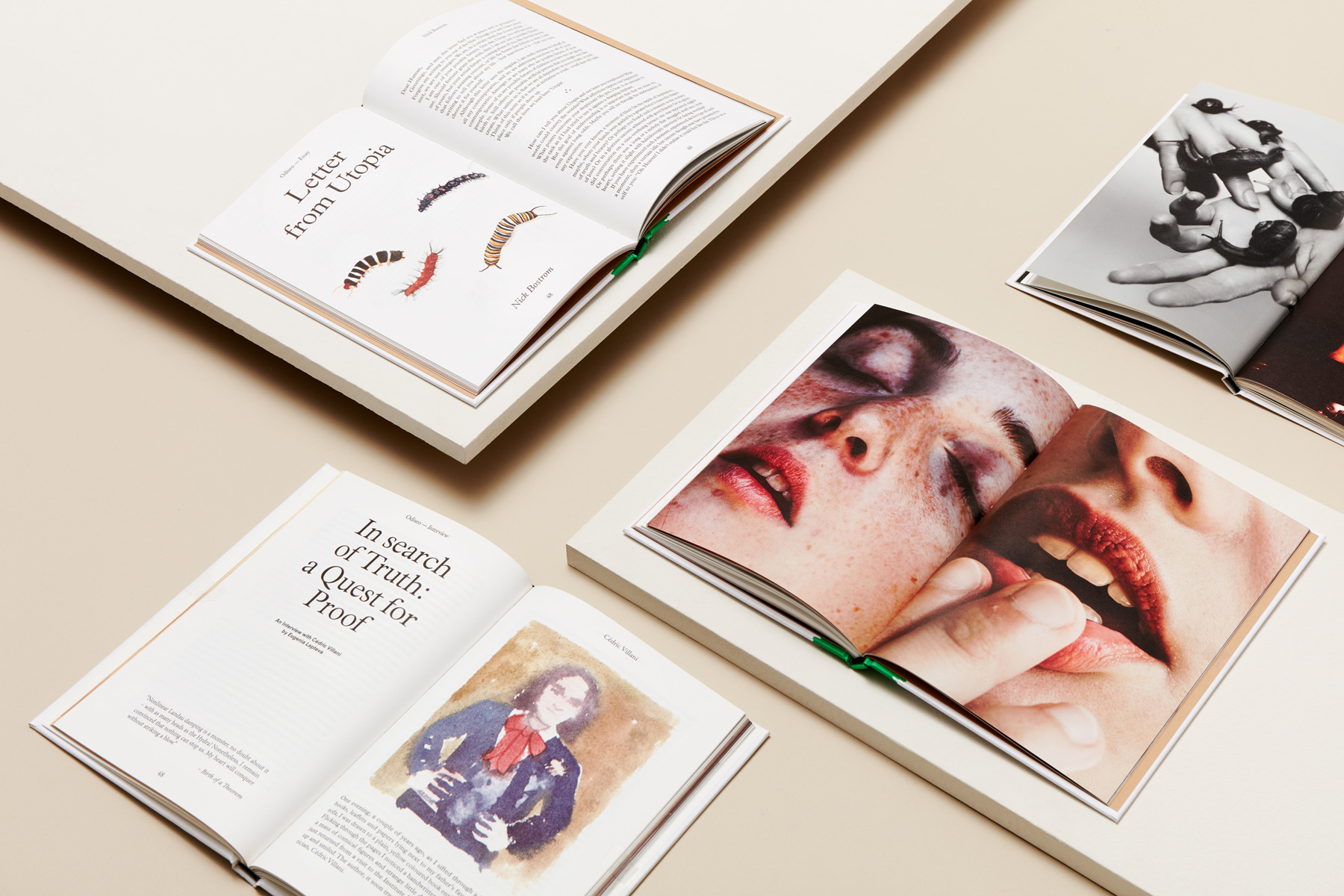
Photography by Eliot Lee Hazel for Odiseo Vol.8 The rift between the other and me
For the fifth volume we wanted to keep evolving. As a tribute to erotic mags’ conservative paper sleeve cover and as a strategy to increase the hype and the fascination around the issue, we introduced changes to the format and put the magazine inside an envelope concealing the cover image. Unlike previous issues, we moved away from a paint splattered spine and a black and white cover image. Instead we chose a painting by artist Ángela Palacio, giving the cover a distinguishable character. We themed the issue around Humour under the title ‘(Not) Safe For Work.’
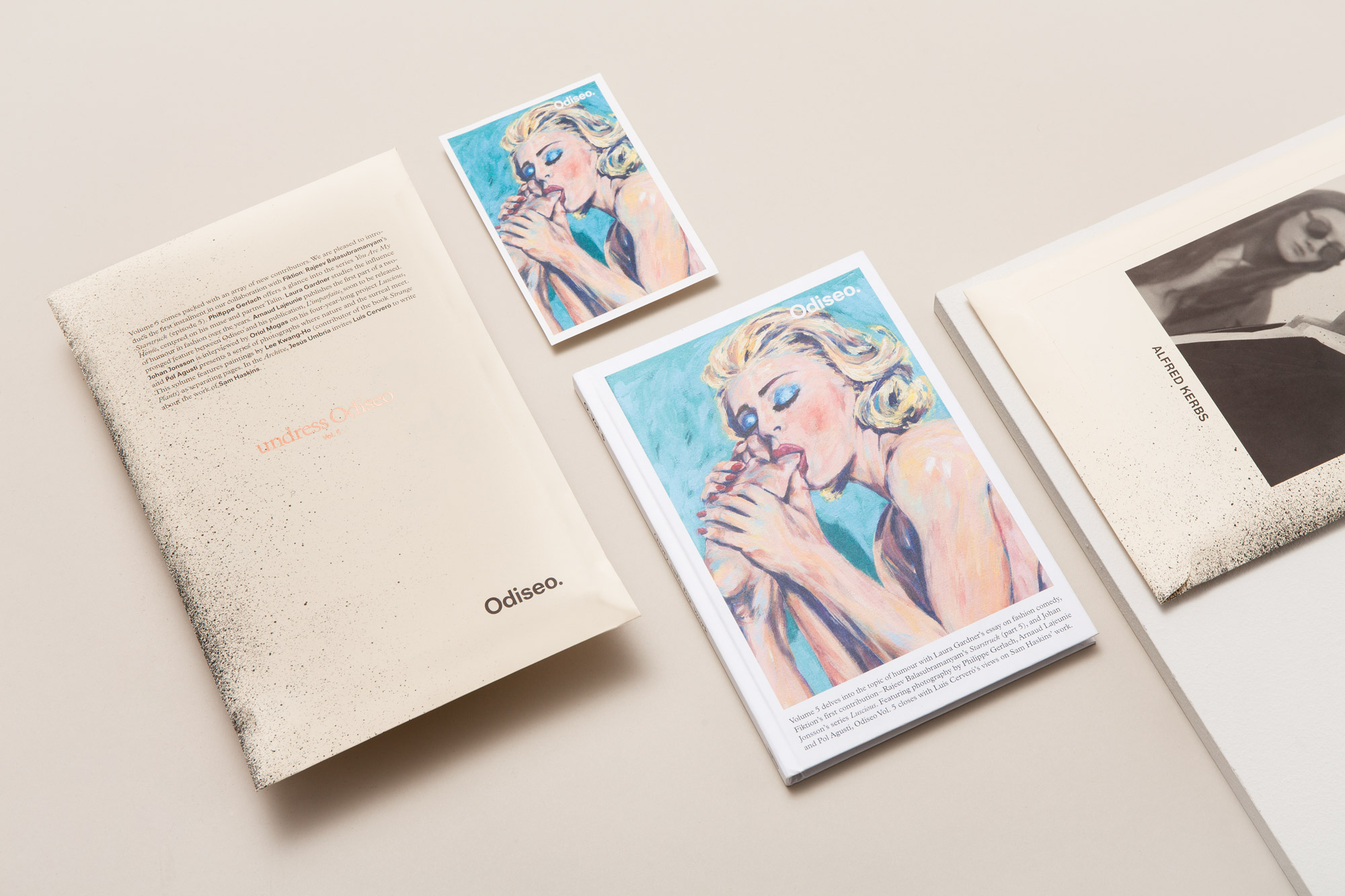
Odiseo Vol.5 (not) safe for work
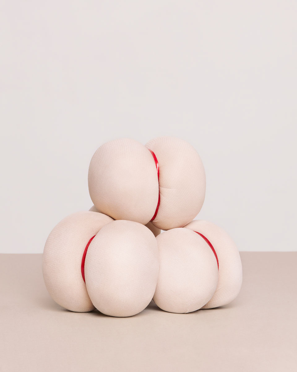
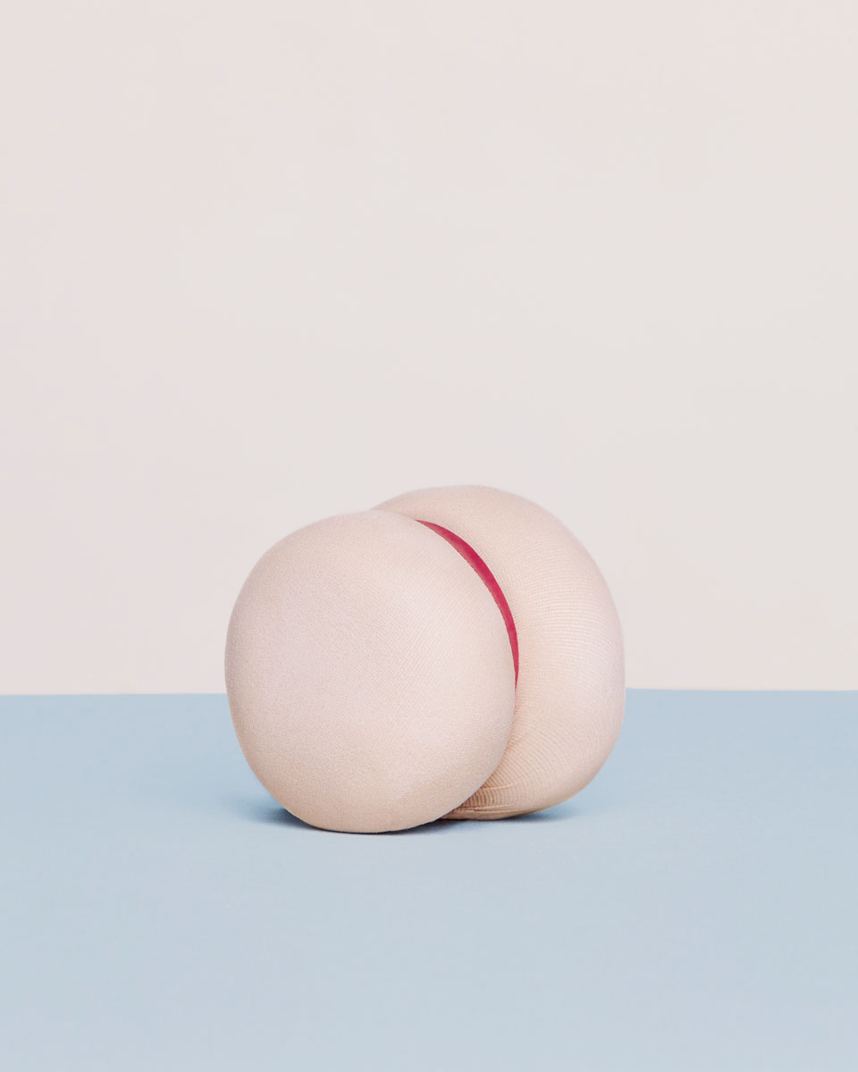
Volume 6 recovered Odiseo’s original paint splattered spine and carries a playful, evocative still-life cover picture by Arnaud Lajeunie under the theme Nature and artifice. Odiseo Volume 7 is dedicated to the notion of Truth. The triptych of covers by Juan Hernández opens the issue. Odiseo Volume 8 explores the multiple meanings and shapes of Encounters. Claudia Grassl creates new shapes of the human body in connection with erotic elements in her introducing cover photo essay. Volume 9 takes a puff of Satire by casting an acid, provocative glance on love, progress and society – Introducing the theme through a photographic essay by photographer Alexandra Von Fuerst which depicted two flaccid lumps of pink-hued clay flopped on top of one another. The current issue Volume 10 is a double edition anniversary celebration dedicated to the opposing notions of Utopia and Dystopia where the contrasting visions of the world are reflected through photography and text. The Utopia edition is introducing the topic through the cover story ‘Asepsis’ by Kelia Anne, and the dystopic edition takes shape through the provocative photographic essay ‘You checked your texts while I masturbated’ by Ana Cuba.
“Taking care of every detail of the distribution model was as important as the content edition for the success of the magazine.”
Rafael Martínez, COO & Branding consultant at Folch
Finding an alternative model for distribution was one of the most daring challenges we faced. Every detail has been taken into account in order to optimise our distribution and promotion possibilities and opportunities. We chose to manage the main sales directly with the customers, whilst maintaining communication with a network of strategic selected resellers across the world, as well as controlling the subscription system, the limited print run and the periodic partnerships and collaborations with filmmakers and video producers. This informed decision contributed significantly to the success of our independent self-published project and its readership’s loyalty. Production and materials are crucial to Odiseo; particular care has been given to small aesthetic details. Odiseo is printed with creative direction in production with Artifact, using Arctic Paper Munken Print and Fedrigoni Tatami for interior pages, and Geltex White for the hardcover paper.


