Year: 2014
Tags: Art Direction and Design, Creative Production, Book, Creative direction in production
-
 Share
Share
7,956 views
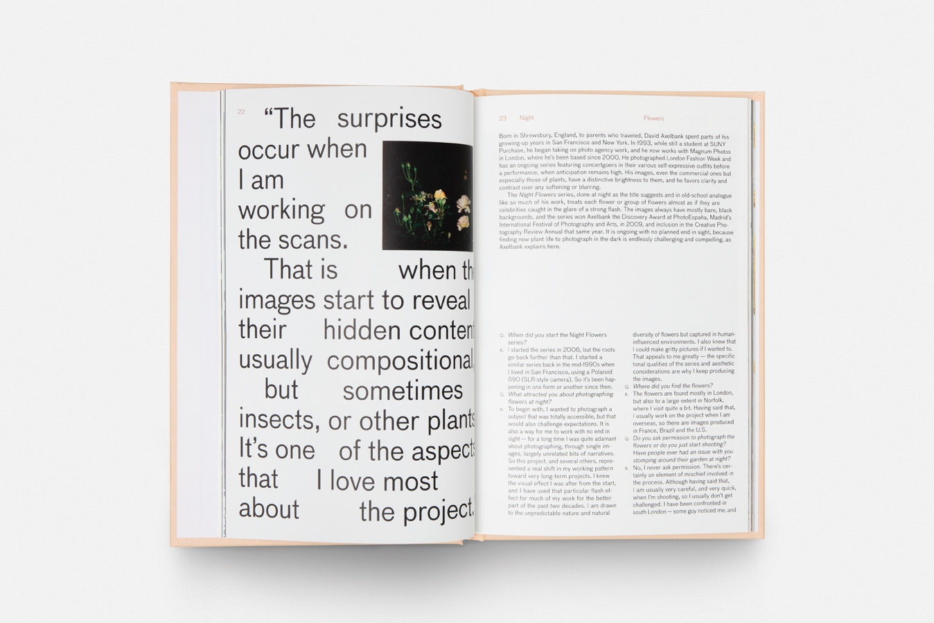
A celebration of plants in contemporary art
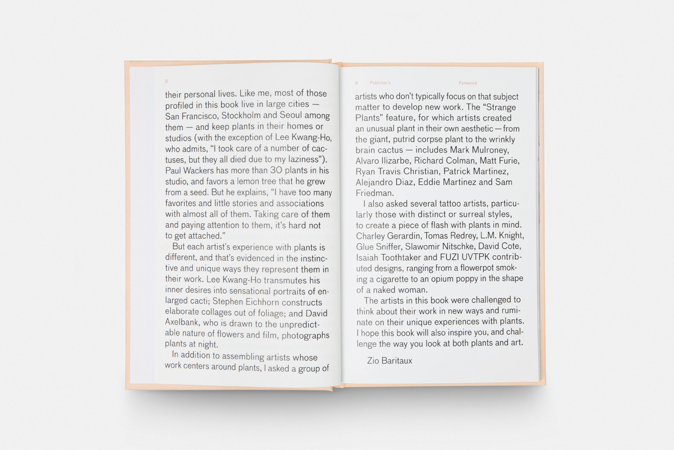
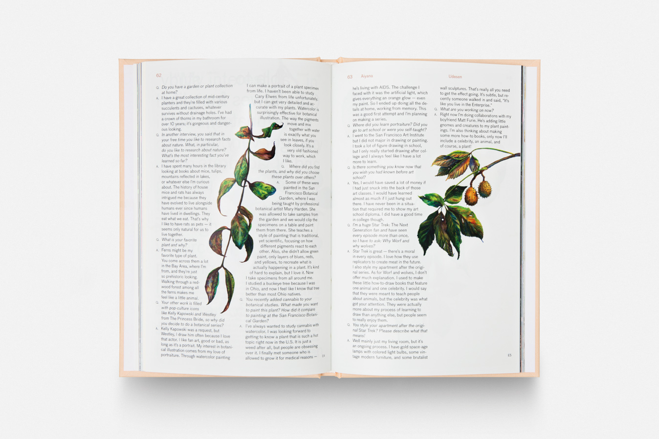
When the Los Angeles editor, writer and publisher Zio Baritaux first stepped into our studio in Barcelona she knew she hadn’t gone wrong, she was holding in her hands an art book which we had designed, showing the research involved in the artistic work of Ángela Palacios. Zio —founder of the creative agency and independent publishing house Zioxla— has written and edited several books on art and culture during her career. With Strange Plants, she offers a celebration of plants in contemporary art through the work of 25 artists (like Helene Schmitz, Paul Wackers, Lee Kwang-Ho, among others). The book explores the role plants play in both their lifes and their creative process. From oozing paintings of rotting cacti to eerie, mesmeric photos of the leafy kudzu vine, Strange Plants combines extensive interviews with photography, paintings and sculptures from established and emerging artists who focus on flora in their work, as well as creatives who have not been inspired by plants.
“I viewed curating the book in the same way someone looks at planting a garden. You don’t plant a garden with one type of flower — you plant a variety of species that bloom at different times but work within the environment that you live.”
Designing with “strange” and “plants” in mind
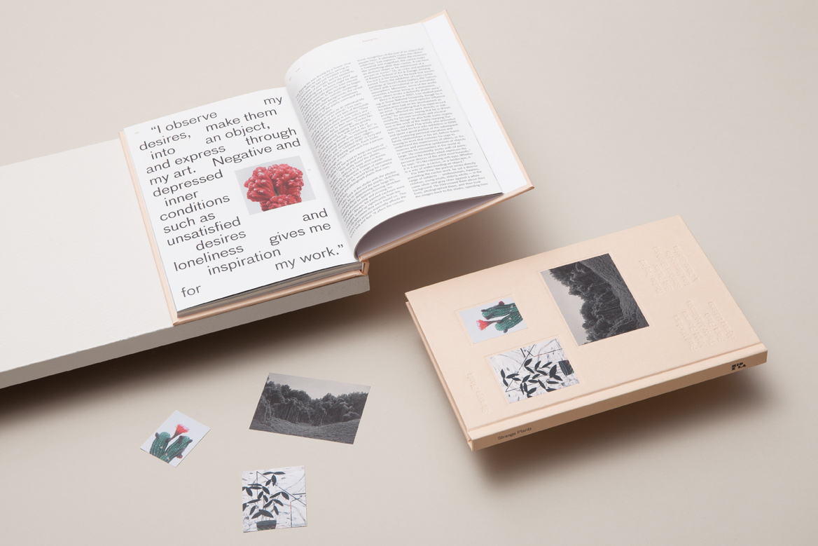
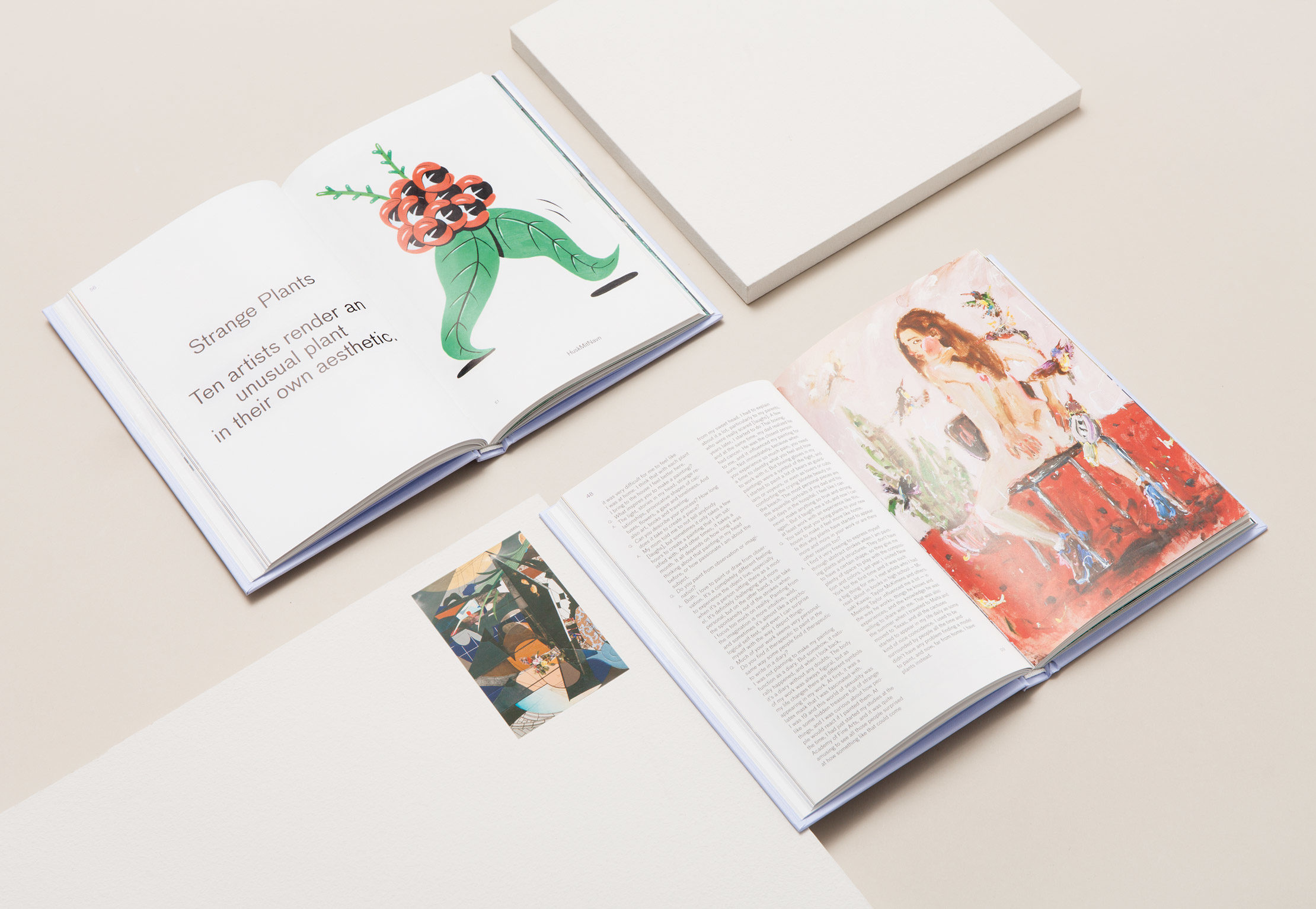
We loved the project from the start. The first meeting with the content was really pleasant and surprising, there was so much high-quality material available for the book, was finding a way to incorporate the variety of content (photography, illustration, flash tattoo drawings, etc.) into a book. When Zio provided us with all the content for the book, we discussed the concept and ideas for the design. We were inspired by the old and classic way of illustrating books of flora, by sticking real leaves and branches into the interior pages of the book, that thanks to the pressure of the book itself, they become flat and bonded to the paper. So the book was supposed to mimic a vintage book of botanical illustrations.
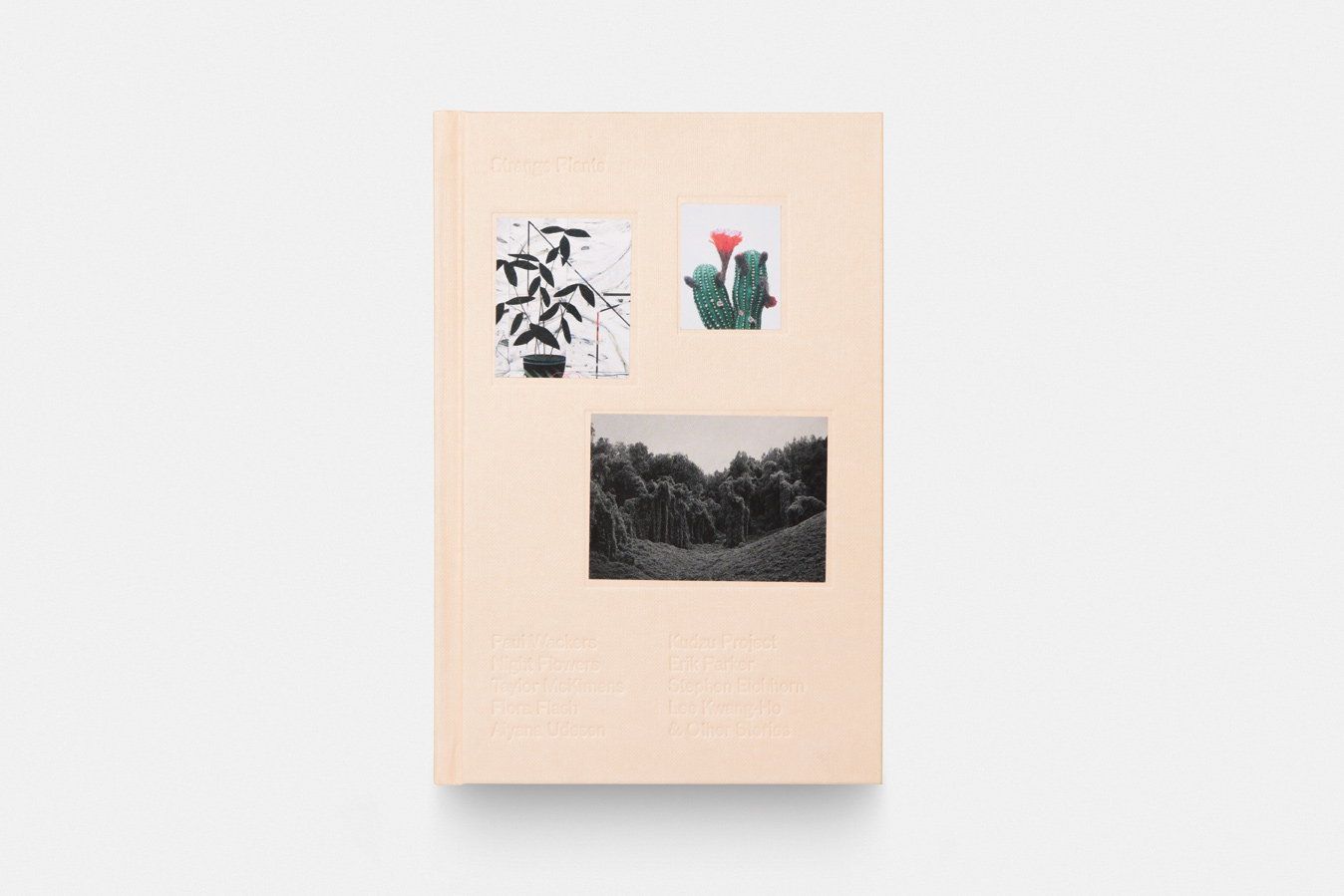
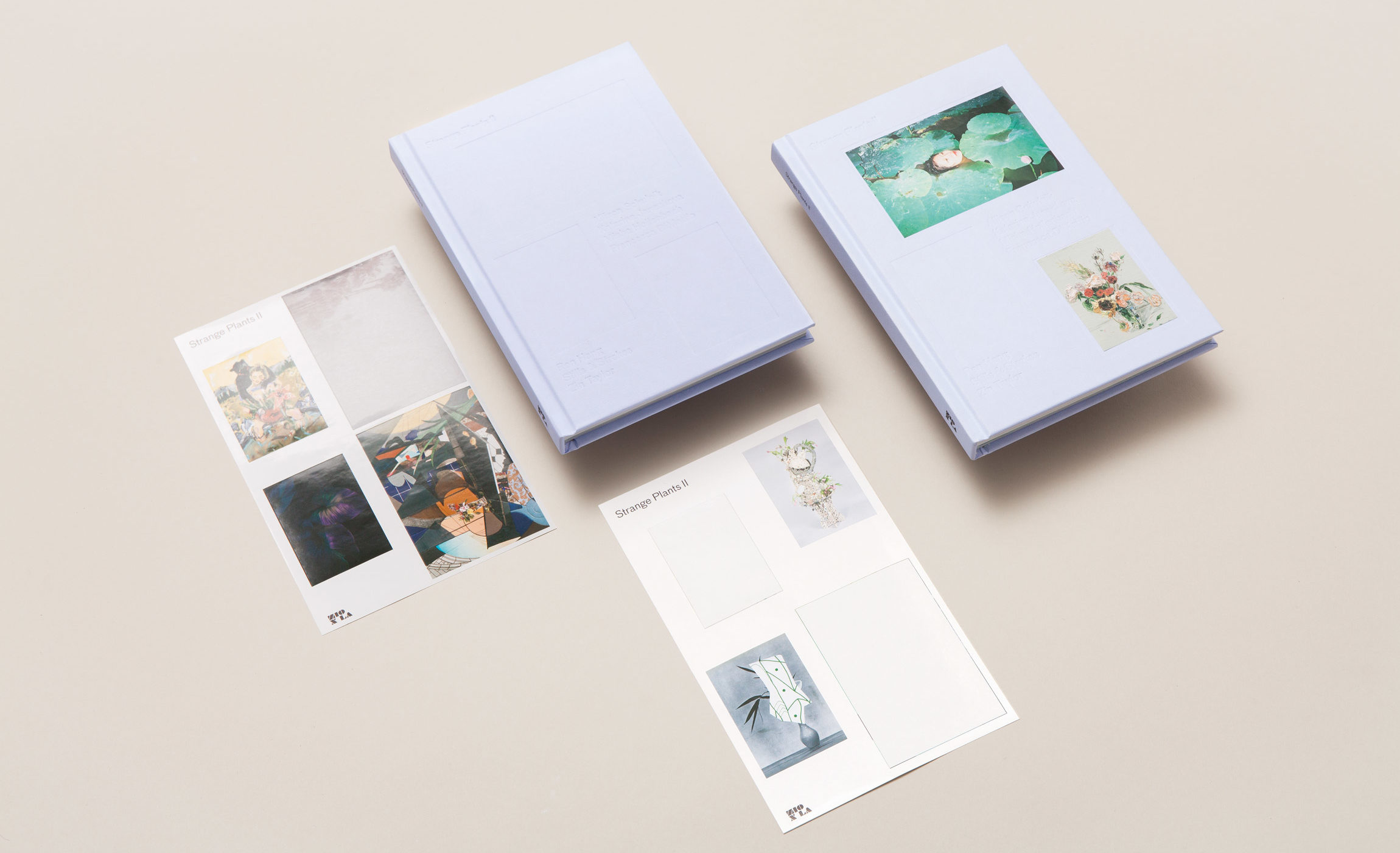
The design was meant to be delicate, where images and letters were placed as if they were a living form, recalling the unpredictable emergence and growth of plants. We were inspired by the old and classic way of illustrating books of flora, by sticking real leaves and branches into the interior pages of the book, which became flat and bonded to the paper because of the books pressure. We designed the cover with both “strange” and “plants” in mind. To reflect the strangeness, the cover arrives with a blank surface, which is definitely unusual for a book. To emphasise plants, and inspire the feeling of pressing flowers inside a book, the cover images come as matte paper adhesives, which can be found as soon as the reader opens the book. “It is the reader’s choice if they want to leave the cover blank, or add one, two or all three images”, Pep says. By the use of low-relief, and no images on the cover (at first sight), we wanted to create a mysterious object of desire, something that pushes you to discover the interior world of the book. As a result, the interaction of the reader-user with the book-object is inherited from the digital environment and recombined into an analogue and classical way: this process is part of Folch’s comprehensive vision of the new complex meaning of the word “editorial”.
“I think the best feeling of all is when you go to the printer and see the book for the first time. Albert (Folch) met me there, and we got to experience the book for the first time together. It’s an amazing experience to hold it in your hands for the first time.” Zio Baritaux
Giving plants a shape
Details were essentials. As plants were the focus of the content in this kind of publication, attention to detail was crucial in terms of production and choice of materials. We wanted to create a neutral design with a rich intention; this is why the object itself has a blank exterior with a rich interior. The format of the book and the material used for the cover creates a tactile, curious and charming finish. For the layout design, we wanted to play with just one typeface throughout the book, letting us play with letters as if they were recalling the unpredictable emergence and growth of plants. Therefore we chose a typeface created by type designer Christian Schwartz, based on a 19th century German typeface called Grotesk, which has the charisma and personality we wanted — a neutral but sinuous look with some organic and curved details which fit the concept of the design.
No big distribution, a huge success
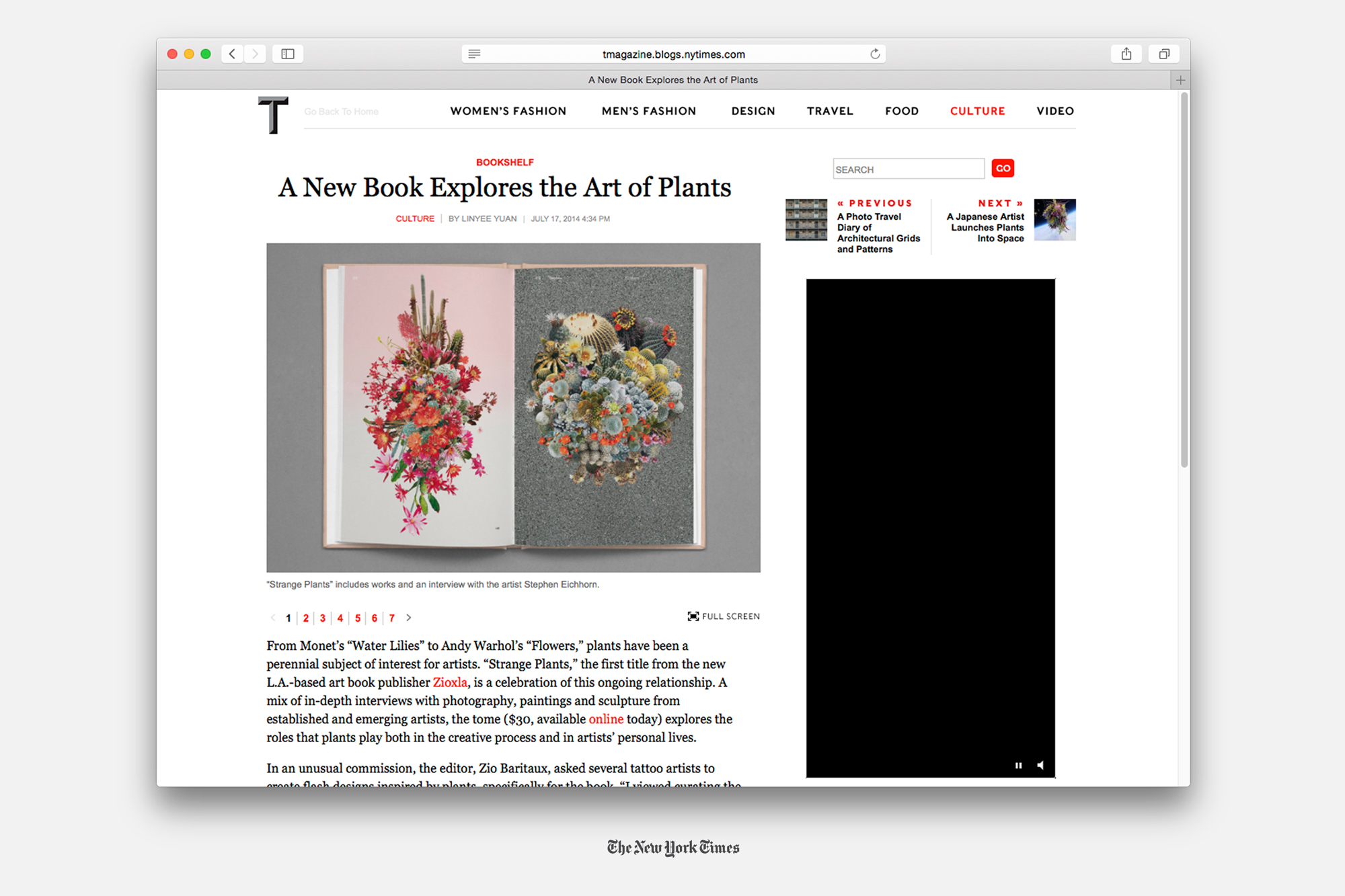
The book has been an outstanding success. The first edition was sold out in less than a month and it was was featured on The New York Times T Magazine, It’s Nice That, Nowness, Another Mag and Sight Unseen, among others. The amazing thing is that all this happened without any big distribution chain, mainly by spreading the word on social media platforms. Many people and blogs talked about Strange Plants and the great diffusion it achieved with such little means makes it a true, small masterpiece in independent publishing.
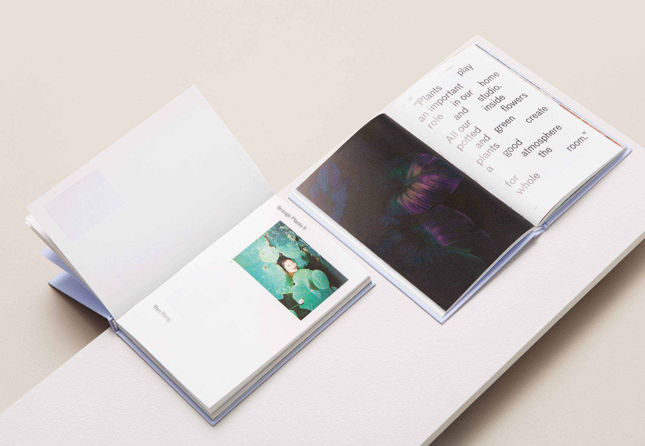
More weird plants: Strange Plants II
After the big success of the first volume, the editor decided to continue exploring this perennial subject of interest for artists and their relationship with the flora: Strange Plants II was a natural result. This time, Zio Baritaux brought together a new selection of 30 artists such as Allison Schulnik, Misha Hollenbach, Francesca DiMattio, Zin Taylor, Katarina Janeckova, Stills & Strokes and Ren Hang, and each artist’s work comes with a text that delves deeper into the relationships between plants and people. The book includes viscous paintings of drooping flower arrangements; intuitive photographs of lily pads and lithe bodies; mixed-media collages that juxtapose the tranquility of Japanese Ikebana with the chaotic energy of vandalism; and much more.
-
 Shareof
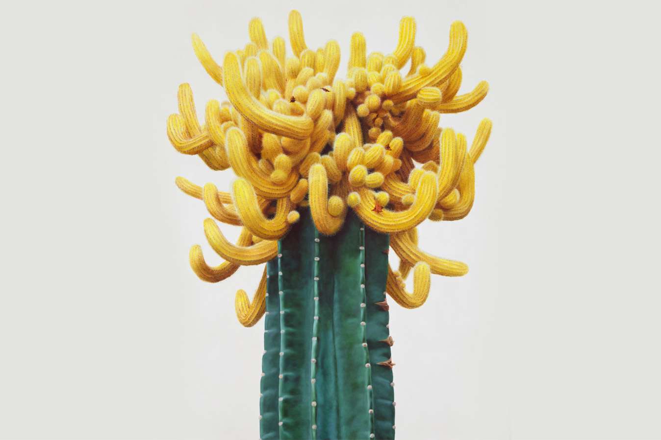
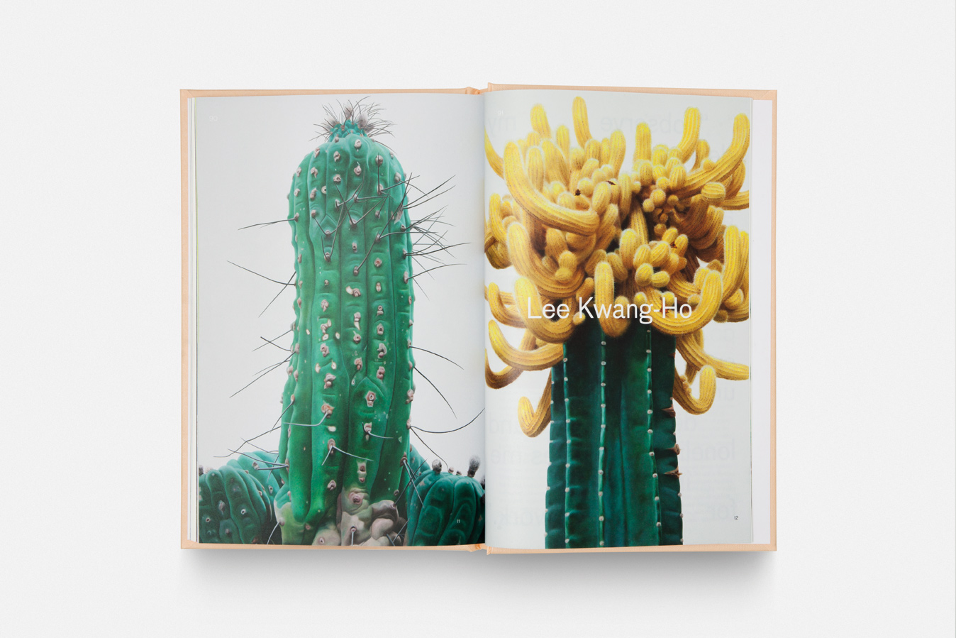
(Project cover image by Lee Kwang-Ho)


