-
 Share
Share
The initial commission for our latest work for Mesura –an established Barcelona-based architectural company– was the redesign of the firm’s online environment, we ended up strengthening the brand’s positioning through a transversal approach. By stepping out from the architectural logic, we worked on the construction of a narrative, alongside the rebranding of the brand’s visual identity, a new look and feel for its website and the design of a corporate editorial piece.
“Nowadays, branding is about how to set a mental frame work connecting with people emotionally and rationally beyond the graphic limits. Without focusing only on clients, but on prescribers. That’s what we did for Mesura.”
Rafa Martínez, COO & Head of Brand Strategy, Folch

Rethinking Mesura
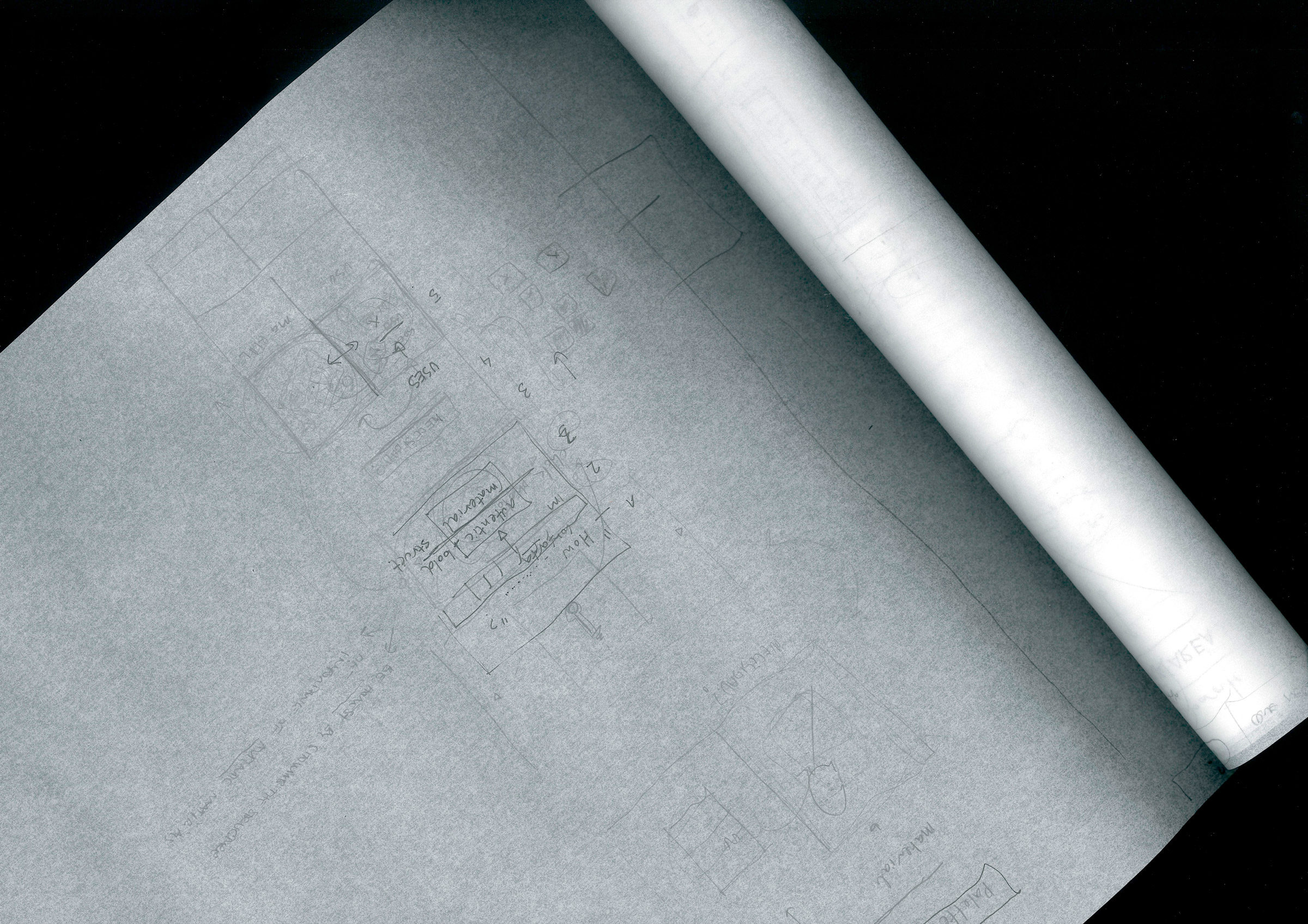
After analysing Mesura’s communication we realised that, like many other architectural companies, the brand’s voice and messages were not aligned with the goals they aimed to achieve. We needed to step out of the sober, yet the quite distant approach they were using, in order to embrace a more contemporary, solvent, simple and sophisticated mood.
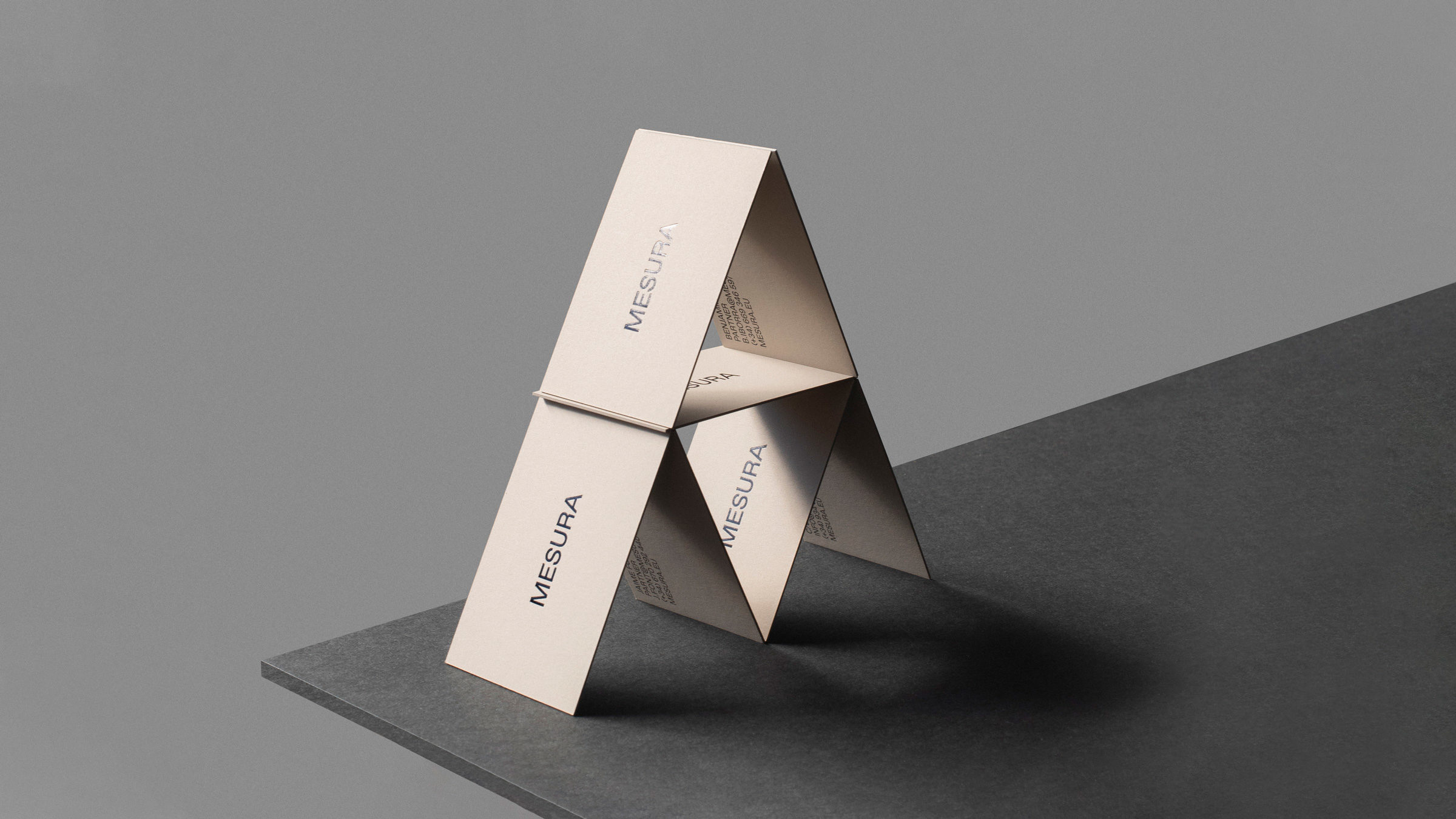
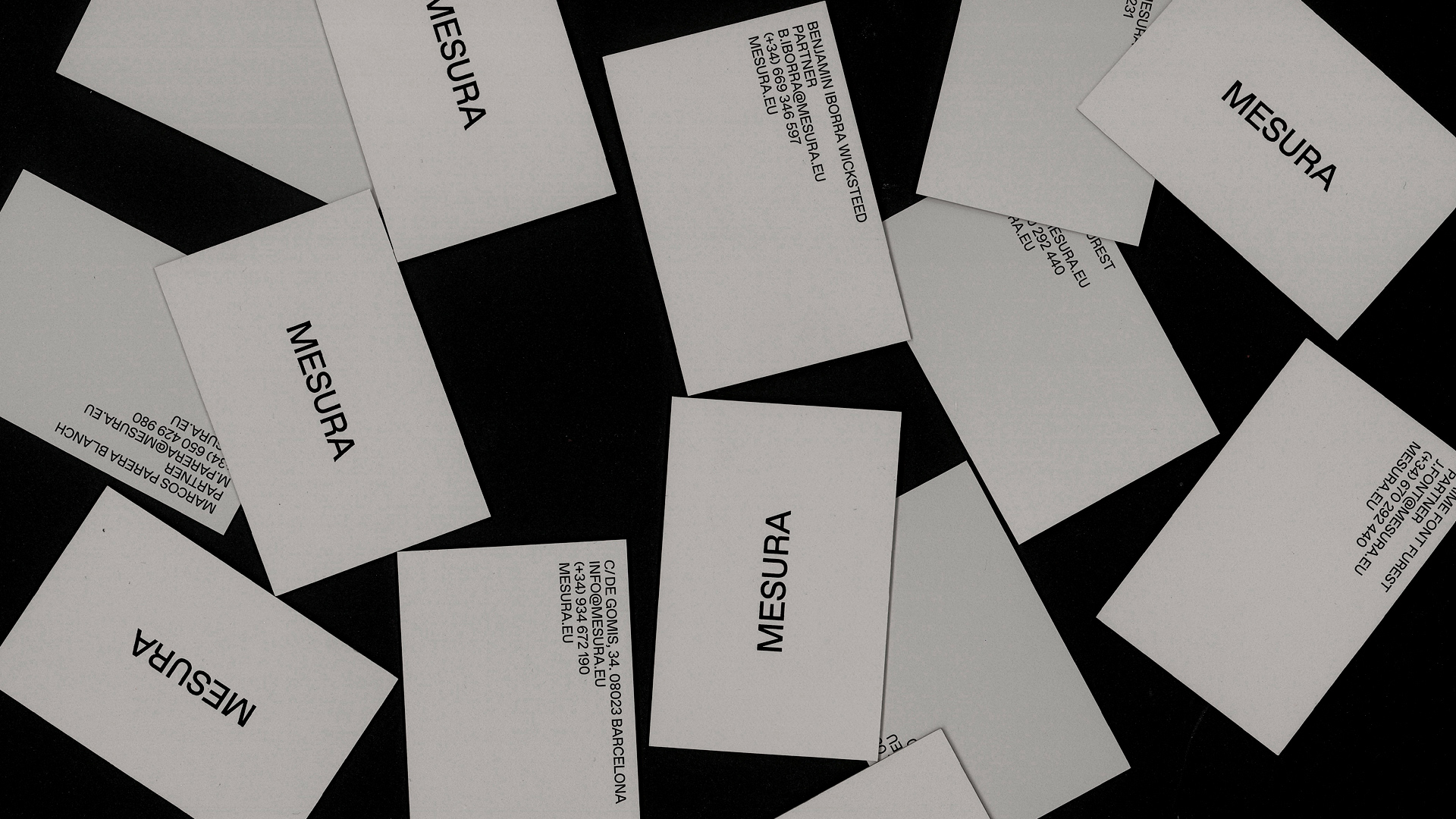
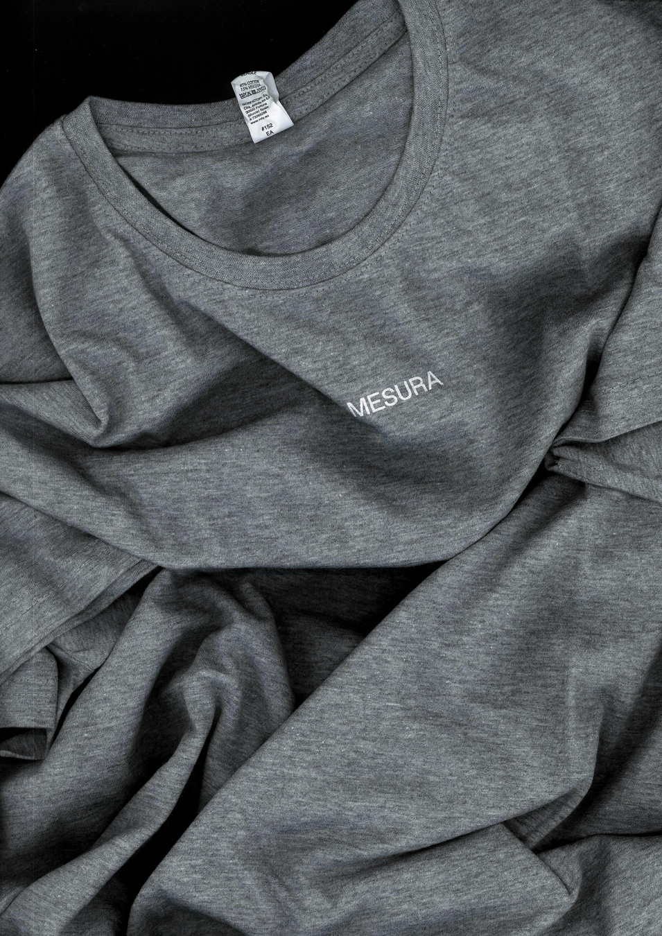
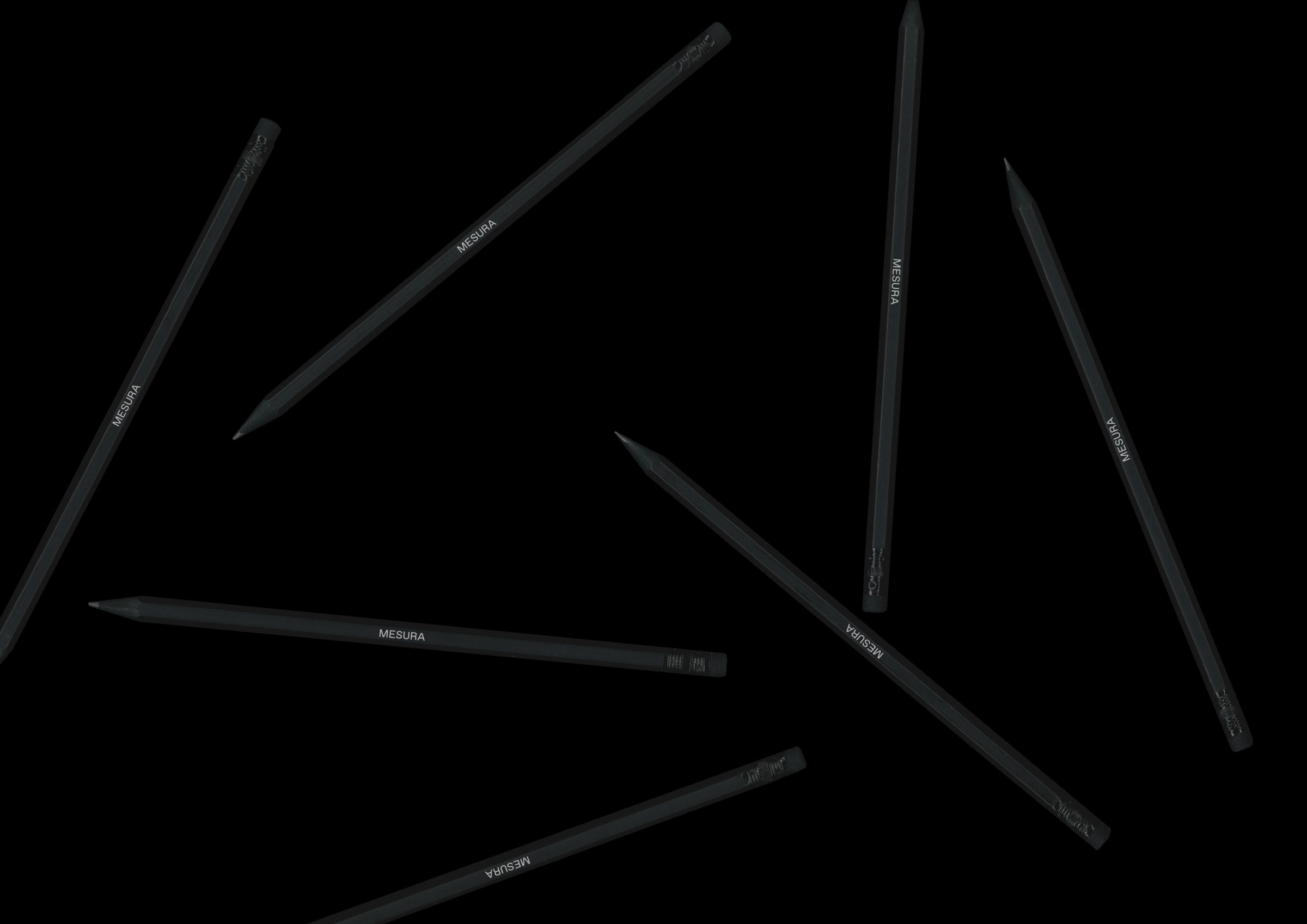
An identity reduced to its essential
Mesura is a short word with graphically interesting characters. While the old visual identity highlighted the most technic side of the brand the new identity had to transmit another side of the brand. We disposed of the brand’s claim and designed a new graphic system for Mesura. For its redesign, we selected Favorit, a straightforward low-contrast grotesque typeface.
The result of the rebranding is a contemporary visual identity, flexible enough to transmit the brand’s core values while projecting a more humanistic approach.
Envisioning architecture through a humanistic vision
By understanding that emotional appeals are the truest way to connect with customers, and seeing stories are the most powerful method for doing so, we took Mesura’s narrative to a new realm. A more humanistic voice was needed, and to reach it the brand had to move away from the traditional project-centred approach it had been using for years.
It was time to focus on the driving force of the company and to do so, people and insights needed to be brought to the spotlight.
From projects to stories
If every project has a story. By highlighting the people and the insights behind each project, we created an storytelling which conceived every project as a microsite with an editorial treatment. This involved identifying the ideal approaches to be highlighted depending on strategic interests with the goal of enlarging the lifespan of each project, allowing Mesura to reinforce its positioning in new territories through contents that explore relevant strategic fields.
By turning projects into stories, we stepped out of the portfolio mood and set up the beginning of a new content-centred way of communicating.
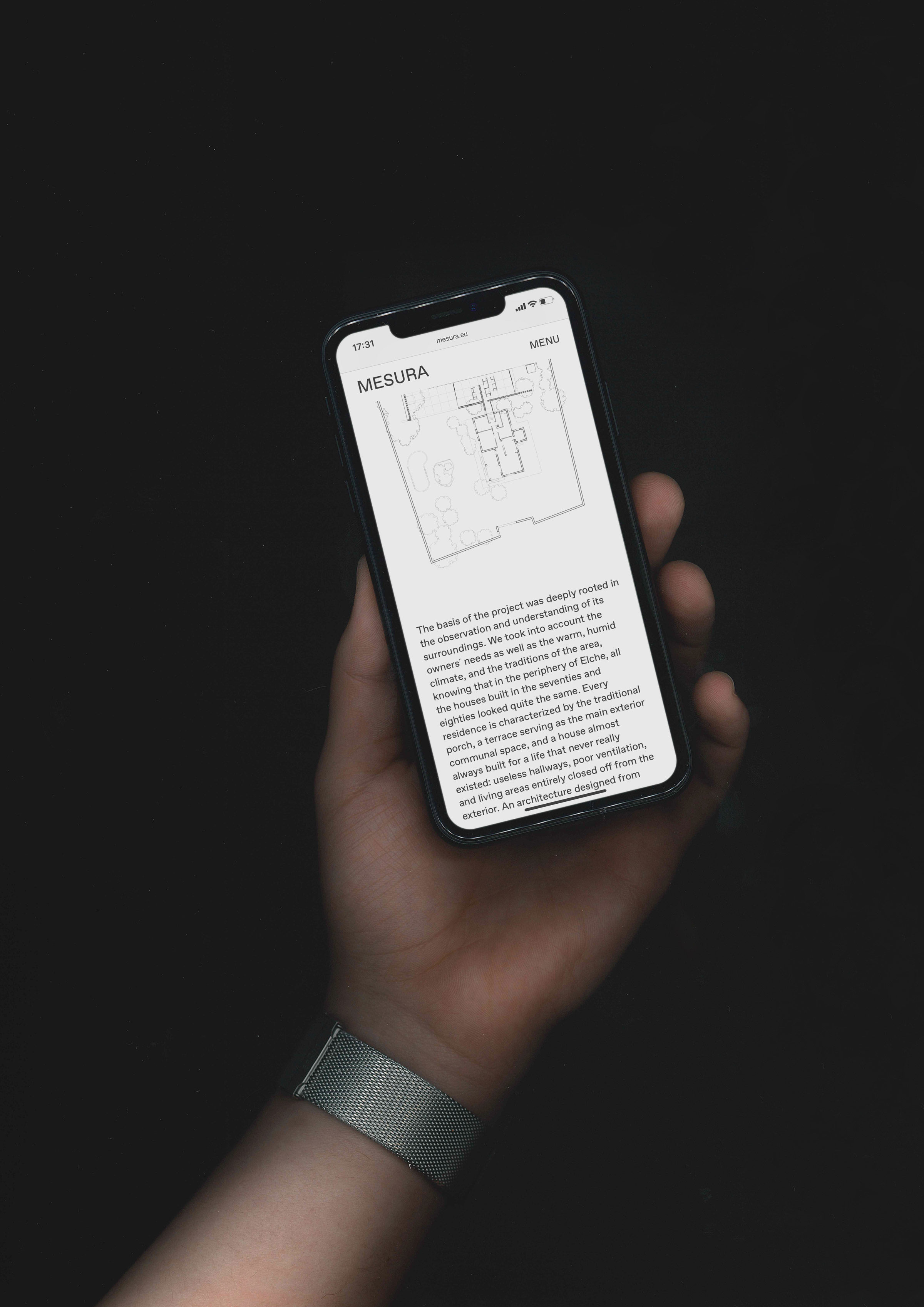
Changing the user’s experience
The website’s redesign aims to improve the brand’s storytelling by highlighting the most relevant and interesting content in each field and by breaking up with the archaic idea that websites are simple brands’ portfolios. Rethinking the site’s hierarchy through a conscious establishment of categories and subcategories translated into a better user experience. An improvement reinforced by a new content display and copywriting, which played an essential role in making the content more appealing.
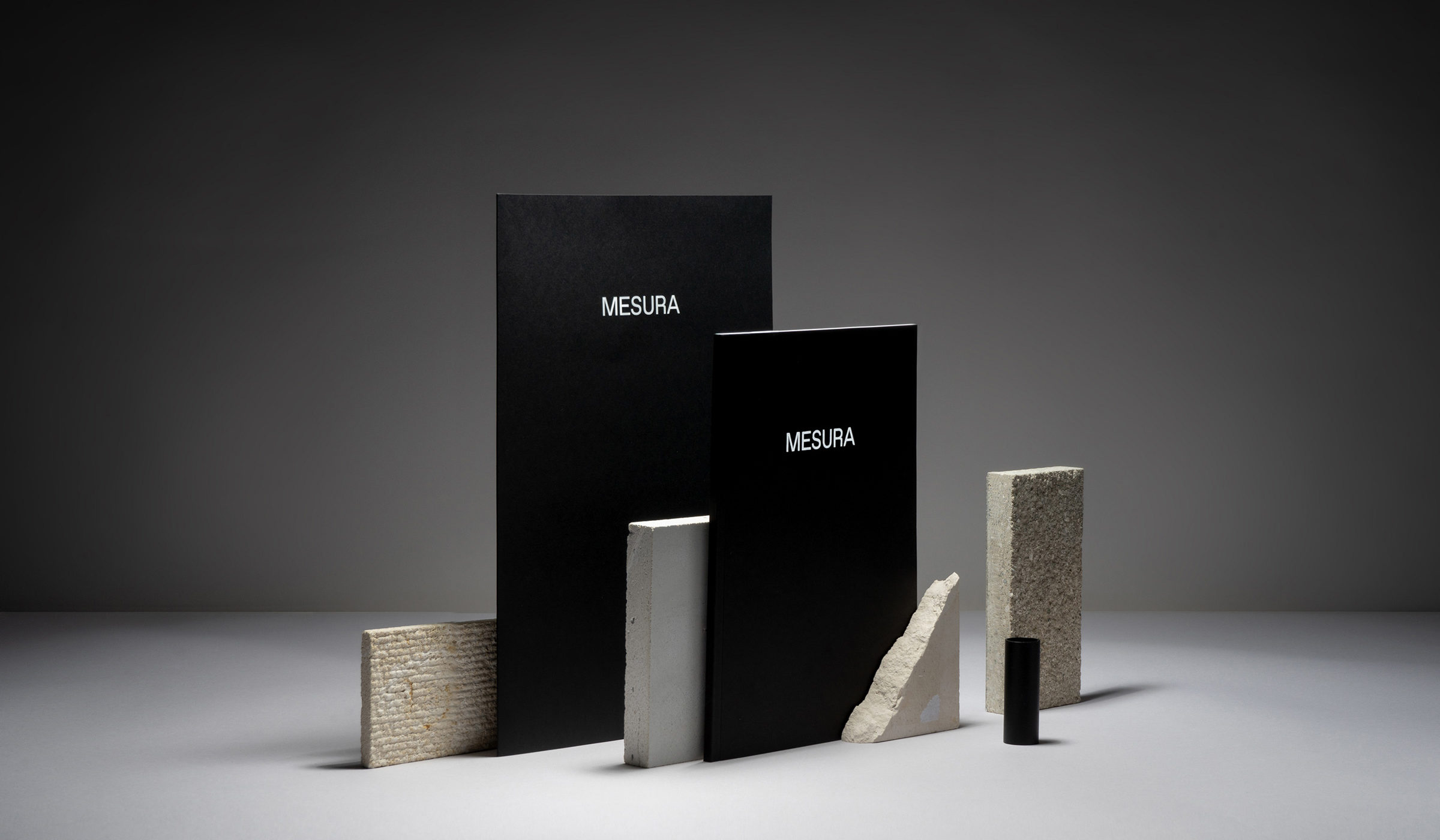
Creating a physical experience
We conceptualised and designed Mesura’s “Brand Profile”, an annual publication born out of the intrinsic need of communicating the brand’s essence to new or potential customers. This corporate piece projects the brand’s core values and becomes a powerful, elegant and differential statement for introducing and reinforcing the company, its team and projects to a potential audience.


