Year: 2018
Creative direction and graphic design by Folch
Barcelona Design Week is organised by FAD and BCD, in collaboration with the Museu del Disseny de Barcelona, and promoted by the Ajuntament de Barcelona.
Year: 2018
Creative direction and graphic design by Folch
Barcelona Design Week is organised by FAD and BCD, in collaboration with the Museu del Disseny de Barcelona, and promoted by the Ajuntament de Barcelona.
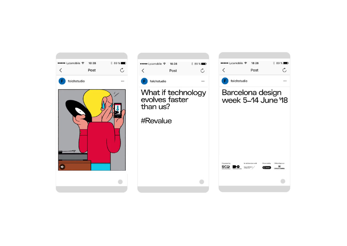
For the second year in a row we were given the honour of managing the graphic campaign for Barcelona Design Week. Exploring design, creativity and innovation, the 13th edition, from 5 to 14 June, brings together some of the biggest names in design in a series of exhibitions, talks, workshops and celebrations. After the success of our 2017 campaign, which focused on the concept of transformation and bringing design to the masses, our challenge this year was to take the concept one step further, encouraging a more critical mindset through an intellectual as well as popular approach.
Before 2017 the event focused on design for designers, however, last year the challenge was to take it outside of just the design field, to understand design more as a driver for change and as the key to transforming society. Our aim was to reach everyday people by creating a homage to six pioneers of our time who passed away recently and whose legacy has been driven by the evolution and change of mindset within different fields. This year we wanted to push the concept further, taking the idea of design as a performance or act and focusing more on how design can make you think about the world around us. Collaborating with the combined teams at both FAD and BCD, we worked closely with them to envision everyday situations and develop a critical dialogue for each scenario.
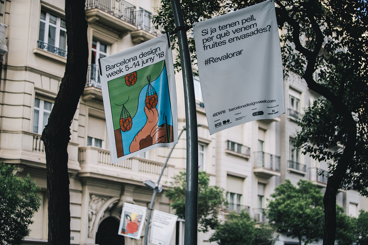
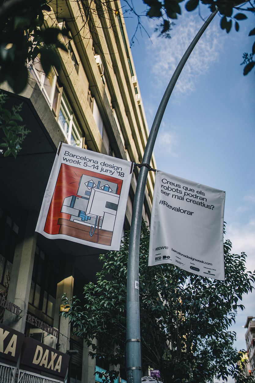
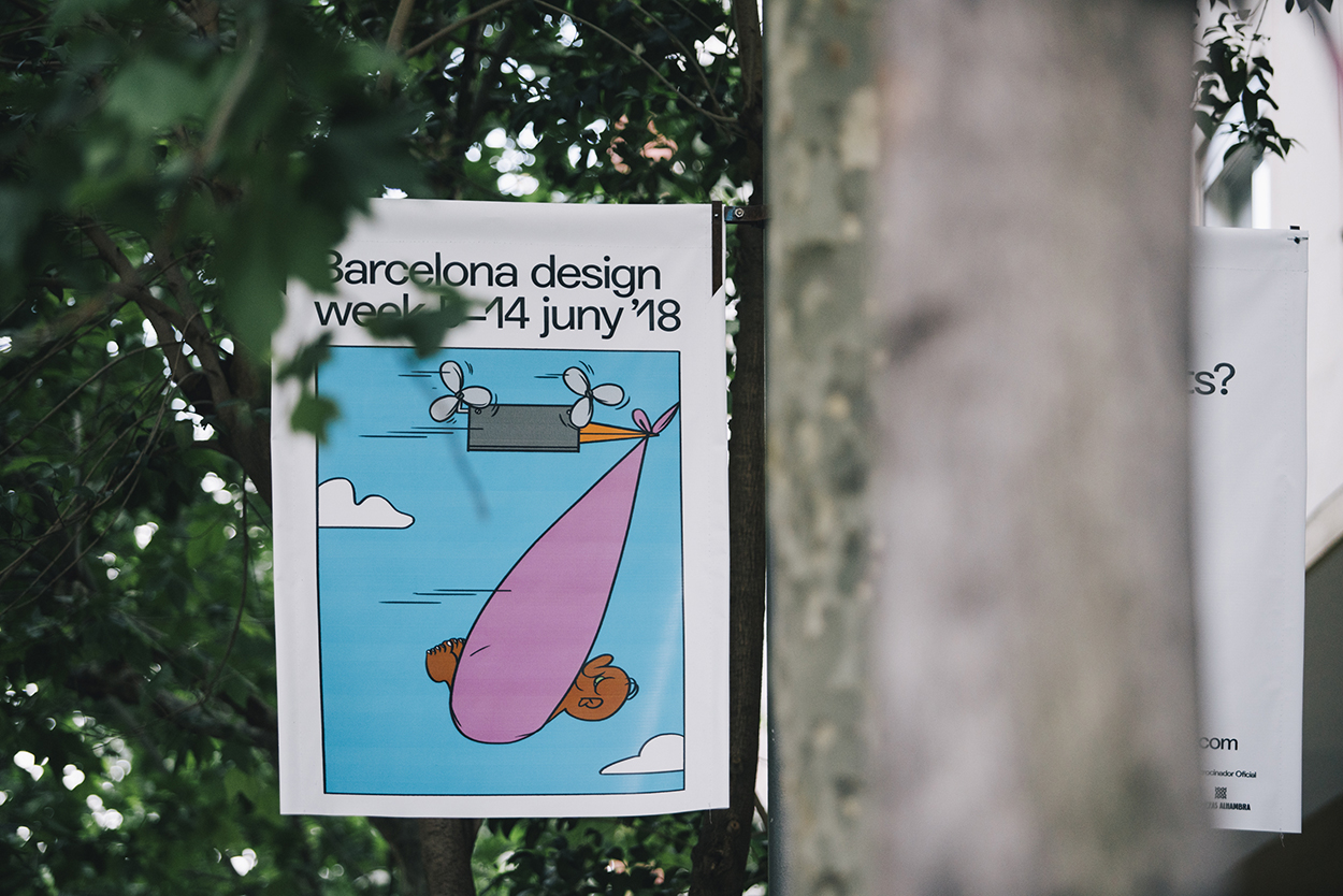
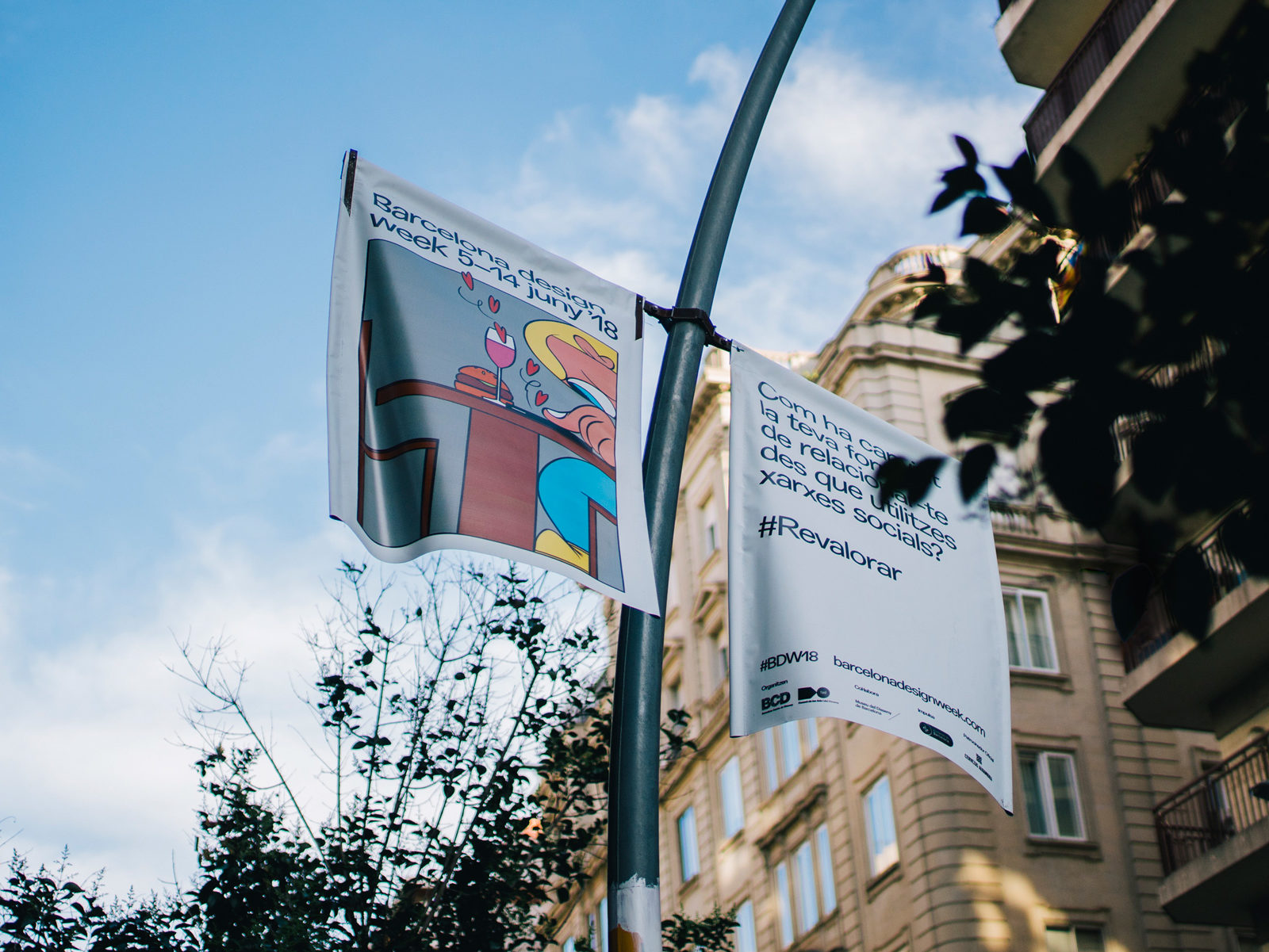
This year’s Barcelona Design Week encourages people to re-value the concept of good design for the ultimate purpose of serving society. The event focuses on the fact that we cannot continue with the current model of production and consumption. Every day we have an overwhelming desire to buy things which we are often aware we do not need. A few people question how they were made, what they bring us, where they come from, what materials they were made with, which hands and technologies made them possible and what their working life will be. But not enough of us. We needed to develop a powerful and thought-provoking campaign to shed light on this issue.
Design in all its expressions is one of the most powerful tools that we have as human beings to reverse the path toward destruction of the earth’s ecosystem.
The central idea is that we need to rethink processes in order to redirect the system toward more sustainable production and society toward more critical and conscious consumption. With the concept of ‘revaluing’ at the core of all communication, the campaign invites the design profession and the public to re-value everything which surrounds us and to offer arguments which question how we should consume in the present in order to achieve sustainability in the future. In order to engage people and develop a sense of inclusivity, our first step was to open up the debate to the public during the pre-campaign phase. By doing so we wanted to directly involve people as part of a wider discourse, sharing ideas and preparing our audiences for a good reception. Above all we wanted to stress the social nature of the campaign.
“For this 2018 campaign, our main challenge was ourselves, Folch. In 2017 under the concept of Transformation we created the sculptures of Bowie, Bauman, Lee, Hadid, Ali and Berger, and achieved widespread success. In 2018, BCD, FAD and ourselves wanted to keep this ‘pop’ approach while being critical and subversive at the same time. Sharing this idea of design as a mindset, a state of mind that allows us to see something in a different way, much more than just the action of designing.”
Rafa Martínez, COO, Partner & Brand Strategist, Folch
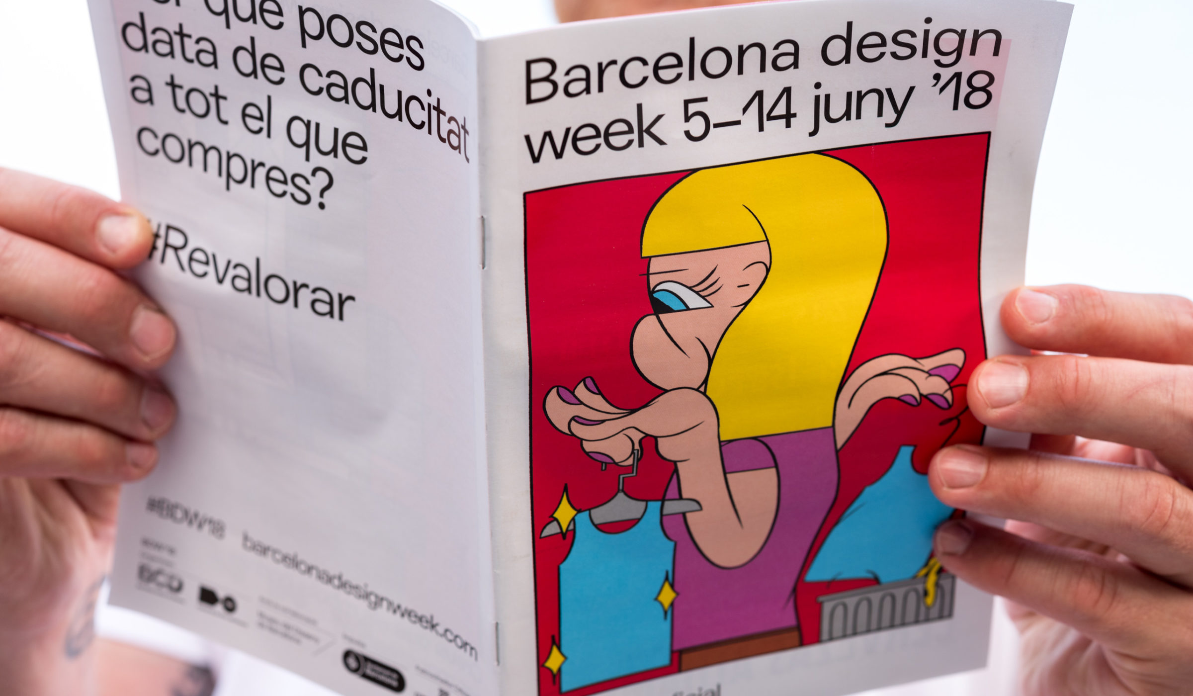
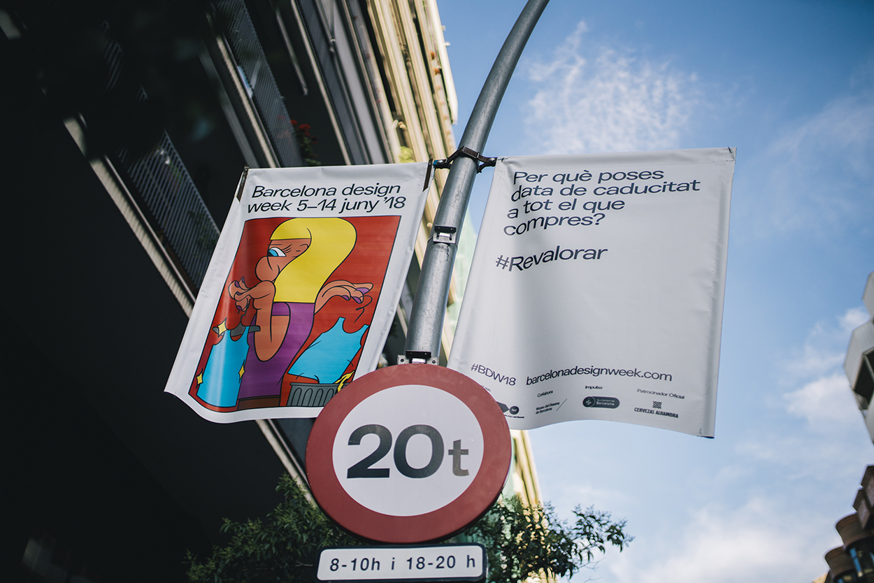
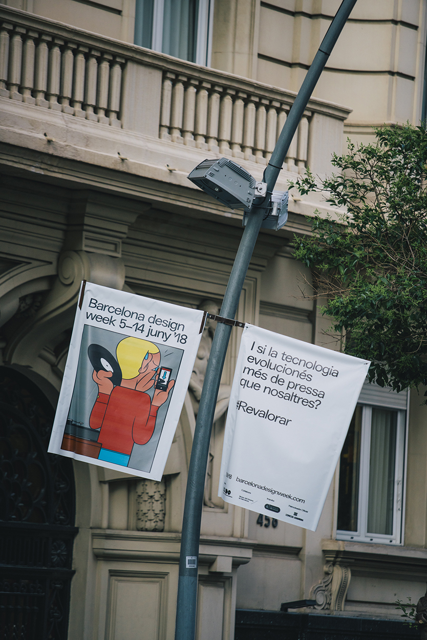
We created a web portal in three languages (Catalan, English and Spanish) asking people to define or describe an example of what it means to ‘revalue’. The question was also distributed through the various Barcelona Design Week social channels to create expectation and encourage participation ahead of the event. We used the web portal as a tool with which to capture and share these definitions, generating a database of ideas and knowledge, many of which we would later use during the campaign as key messages, combined with a set of illustrations. We used bright, bold colours to align with last year’s campaign, combined with a more structural, block layout. Much of the roll out, both digital and printed, followed this binary code, with a split screen or parallel blocks enhancing the overall structure of question & answer, concept & definition, illustration & messaging.
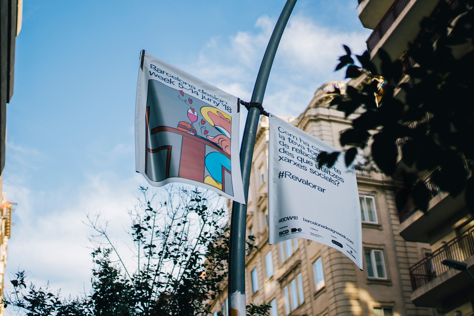
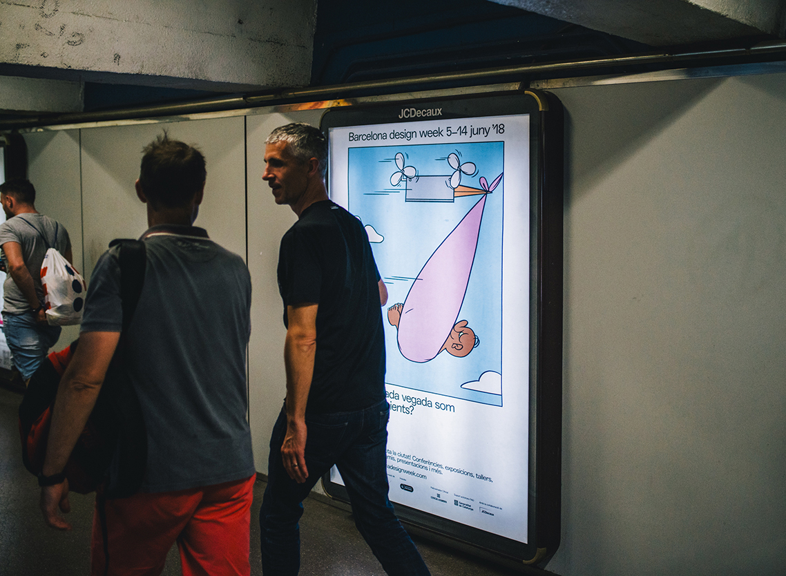
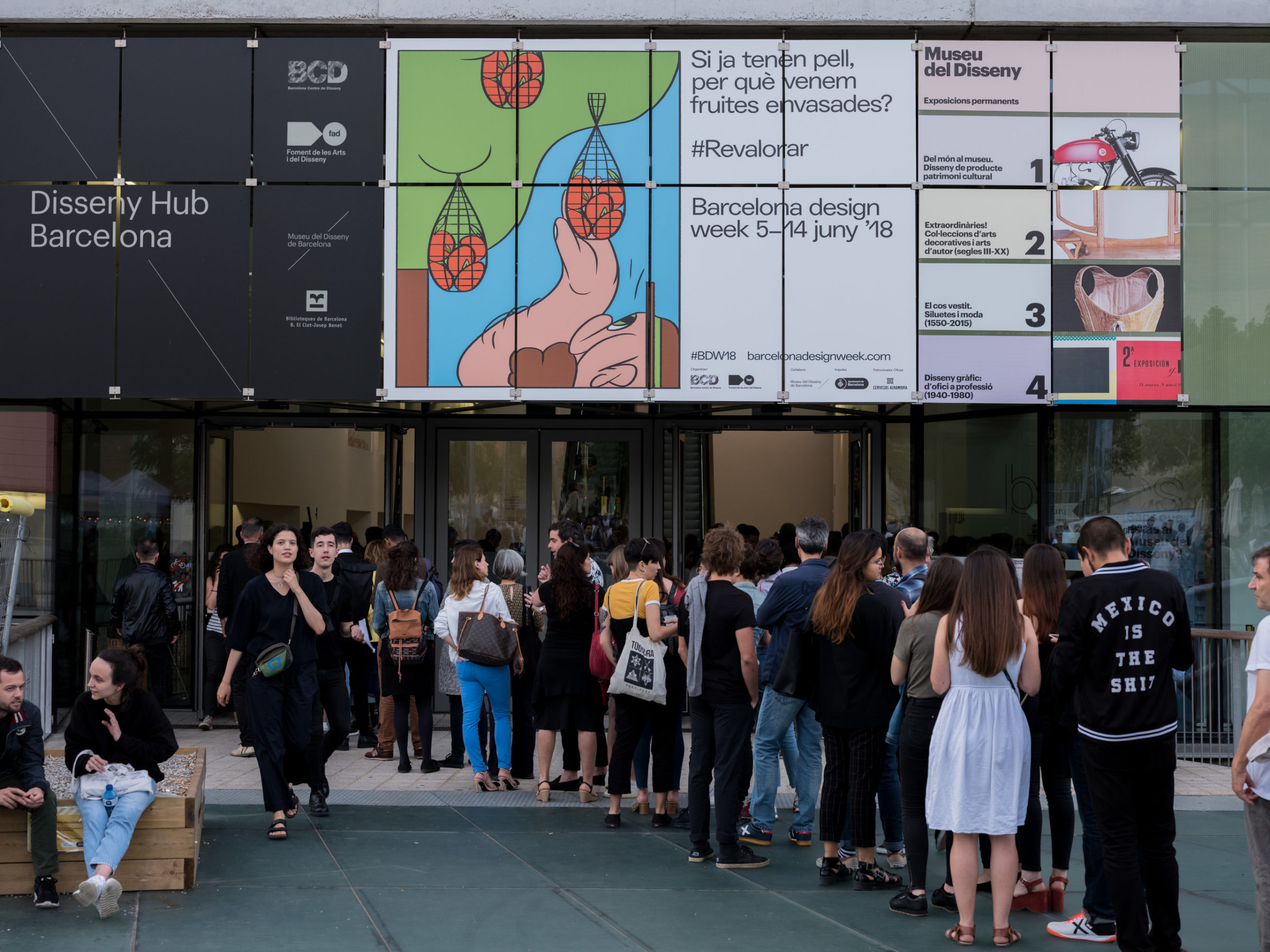
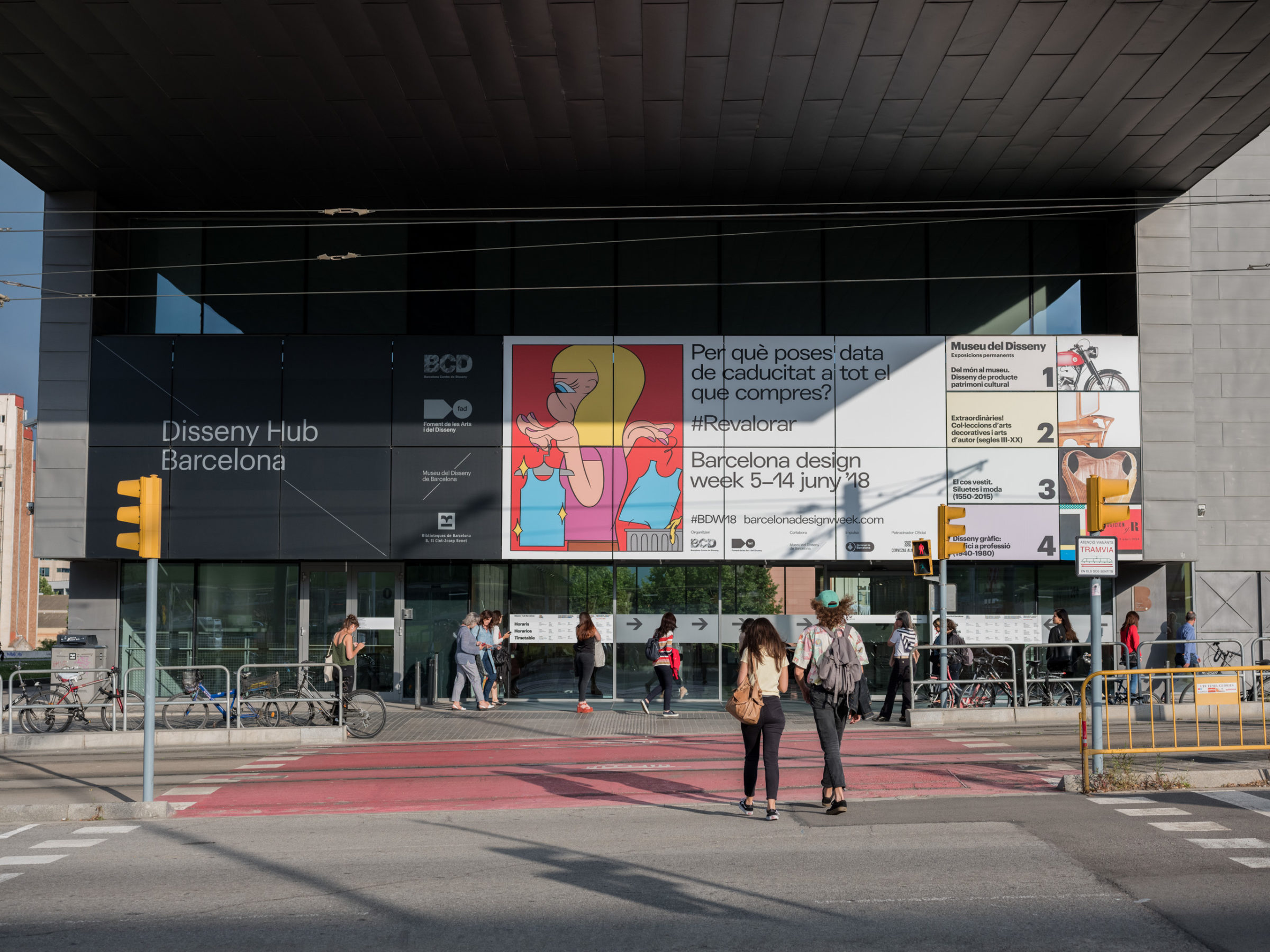
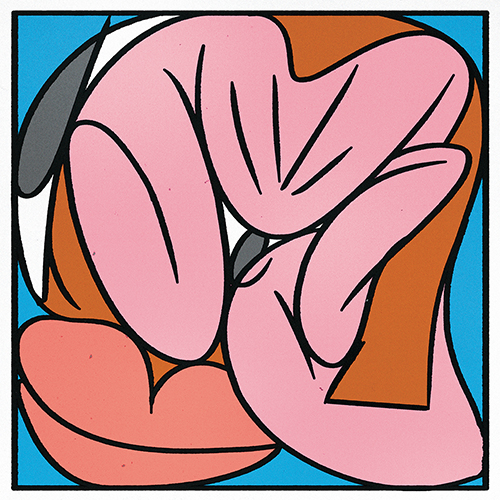
With the concept of “Revalue” we envisioned a series of situations, where objects, spaces – literally anything – could be revalued, reconsidered, used or perceived in a different way. World renowned Portuguese graphic designer and illustrator, Bráulio Amado, brought these situations to life through six satirical illustrations revealing different social criticisms. Each illustration combines with a specific message about re-thinking current models of production, consumption and technology, allowing for diverse interpretation and encouraging widespread debate. The first illustration was unveiled on May 9 by Barcelona Design Week with a newsletter. Following this an illustration was distributed every few days with more information about the events and activities of the Design Week. Each illustration is animated to bring it to life wherever possible via social media and digital advertising.
“I think Bráulio Amado’s illustrations contributed a great deal to the campaign. I especially like the tension between their playfulness and the way they’re critical of our current consumption habits.”
Giacomo Boffo, Senior Designer at Folch
“Through illustration´s subtle movements, the message is more engaging and the narratives are more descriptive.”
Alex Marqués, Motion Designer at Folch
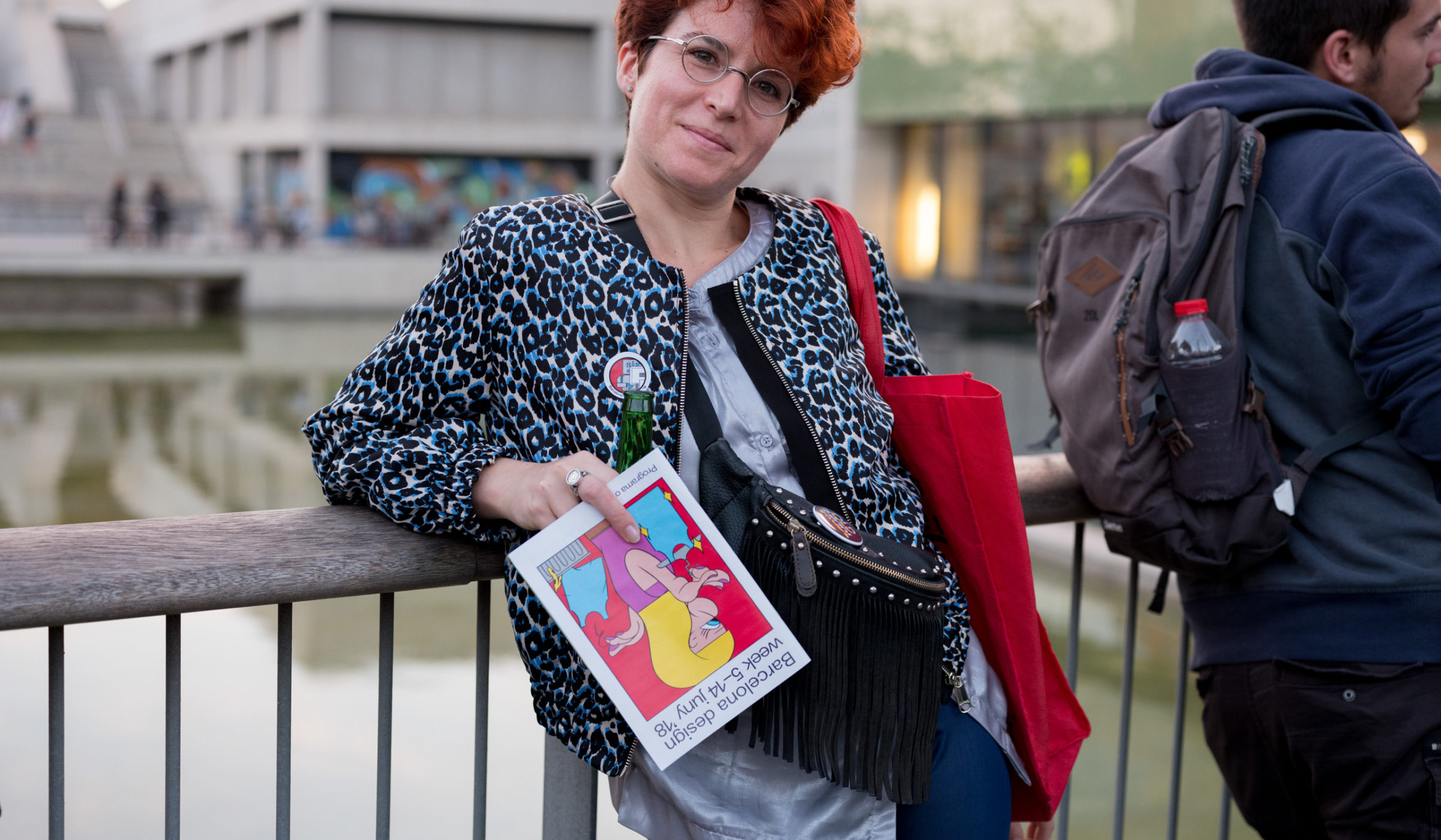
As well as developing the landing page of Barcelona Design Week’18 we also designed a 64 page programme in booklet format using a regular grid structure, highlighting the main events and providing detailed information about each of the activities available. The booklet is divided per day, each spread includes an introduction on the left with highlights and the programme of events on the right. The design follows this year’s identity and colour palette – green for the conferences, blue for the prices, pink for the highlights and white for the breakdown of events and activities.
“We embraced this new episode of BDW working hand by hand with FAD and BCD. Our starting point was creating a work flow and communication system to maintain the campaign as a collaborative project. Beyond the graphic campaign we were introduced to the entire creative process and communication strategy.”
Elena Qureshi, Junior Studio Manager at Folch
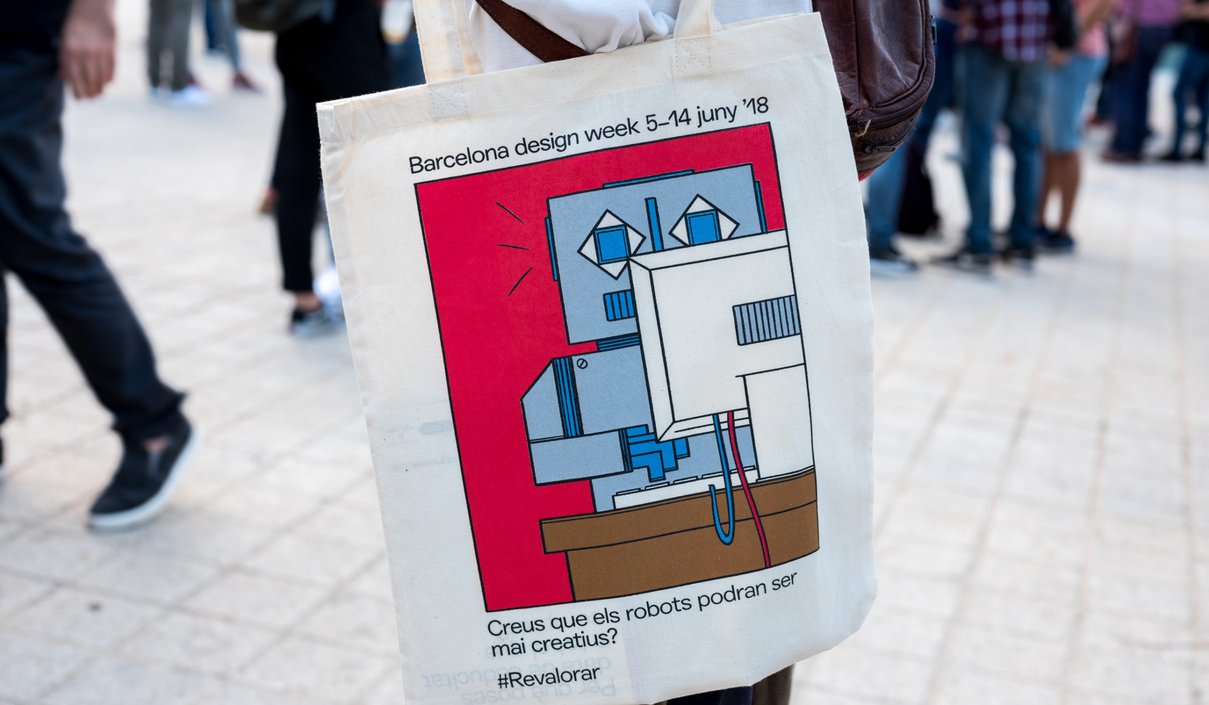
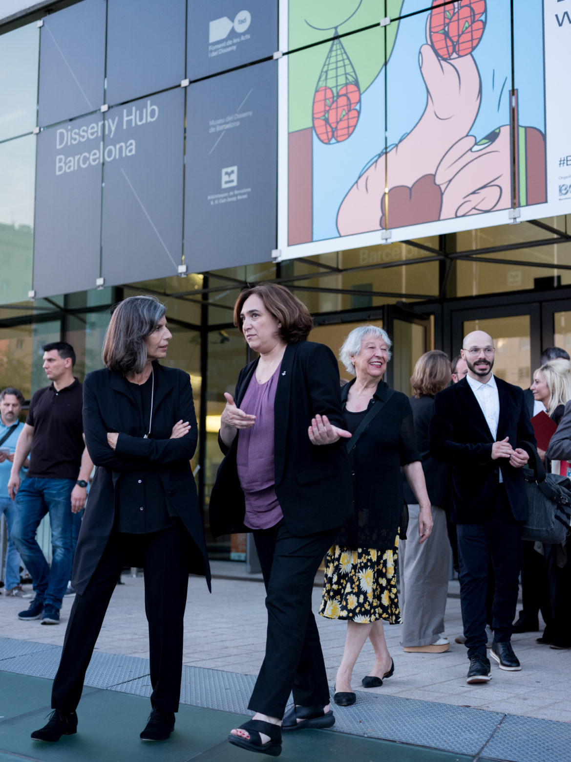
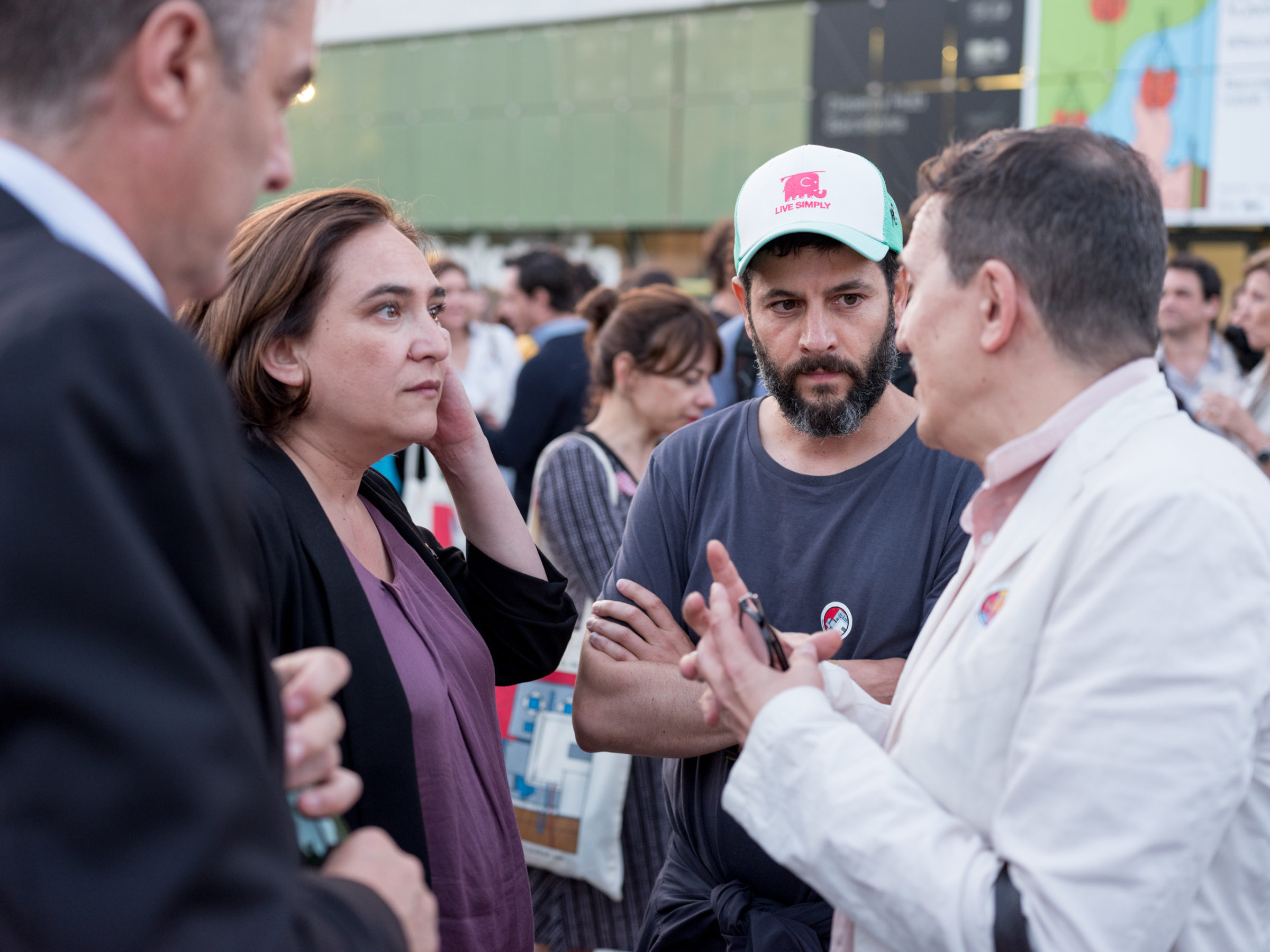
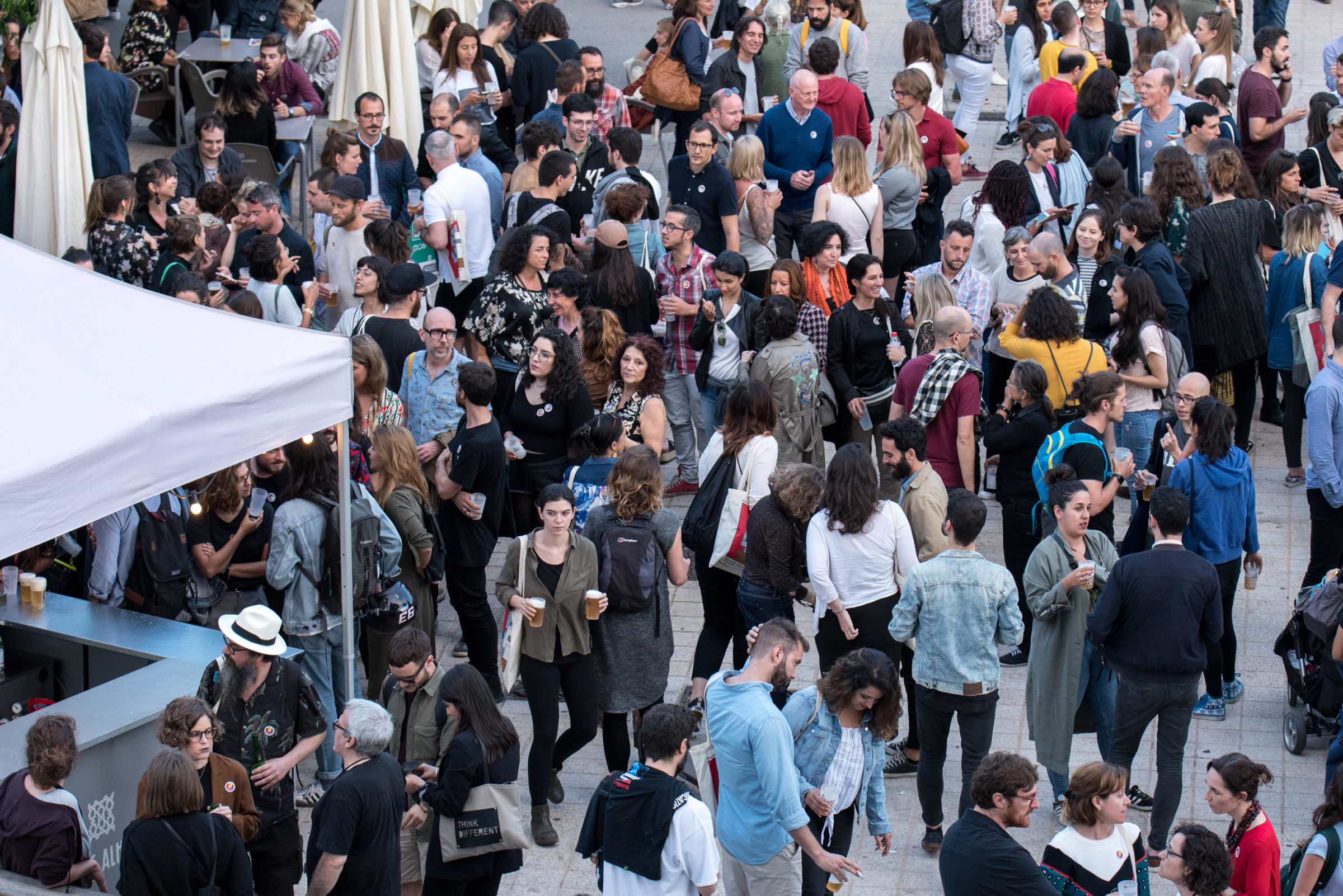
A big part of the process was working together as a team to give the event and the messaging a strong presence in the street. Beyond the graphic campaign we advised on how to bring the campaign closer to society, speaking not just to the design community but to everyone. The graphics not only worked for digital, but they were rolled out across flags around the city, bus vinyls, BDW city stickers, opis, tote bags, and large scale vinyl facades for the Disseny Hub building. Throughout the project, we worked hard to stay aligned across all teams, sharing ideas and creating everything in partnership.
We initially made contact with It’s Nice that in order to gauge their interest in being our international media partner for the campaign. Having confirmed this we found out that instead of doing an announcement before the event, they were more interested in a doing full round up of the campaign. We liaised with them consistently during the pre-campaign stages, keeping them informed of any significant developments, particularly regarding timings and updated assets. Once we had all the finalised assets we shared them with It’s Nice That along with a press release for publication ahead of the event. As a follow up we also sent the press release and a selection of images to our wider national and international graphic design focused media list.
“With FAD and BCD handling an extensive communications programme about the event during the pre-campaign stages, we decided to develop a public relations strategy from a purely graphic design angle.”
Bis Turnor, Communications Manager at Folch
An important part of the process was deciding how best to diffuse the campaign across social media as well as via the physical assets designed to catch people’s attention on the streets. The campaign had to be spread in a way that would not only reach but be understood by many different sectors of society, catching the attention not just of the design community but of society as a whole through a combination of playful imagery alongside thought-provoking messaging.
The Barcelona Design Week paid media campaign accumulates more than 5.3 million impressions in the digital media. The audiovisual pieces of the campaign have reached the 116.000 views and the objectives of impressions and traffic have ended up above the prevision after closing the campaign having exceeded the prevision of impressions by over a 28%. The impacts distribution of the campaign according to the language in which posts have been published has been a 64% in English, a 19% in Spanish and a 17% in Catalan.
Bráulio Amado is a graphic designer and Portuguese illustrator, currently affiliated to New York. He has worked as a designer at Pentagram NY and Bloomberg Businessweek as art director. He has illustrated by media such as The New York Times, The New Yorker, Wired Magazine and Bloomberg Businessweek among others. We had a little chat with him about the ideas behind his designs…
Design is a vehicle to help us rethink society. Do you agree with this statement? Is this something you look for in your work?
I like to think so. I don’t agree with the classic phrase “design can save the world”, but I do think that, as a designer, you can re-think, communicate and shape new tools that can be used for good in society or the world. Or for bad. Or for that place we mostly all live in that’s between good and bad.
What were your initial thoughts on this years theme of re-evaluating current models of production and consumption?
I can’t really say I’m not part of “the problem” — I may spend money on clothes that I don’t really need, I definitely look too much at my phone, and etc. It’s easy to be sucked into how things seem to go on these days, although I do make an effort to look at it from the outside and understand how they are not good for me or others — and change my behaviour. My initial thought was to come up with something that people could identify with and make a bridge between a serious subject versus the somewhat cartoonish and humoristic feel of the illustrations.
How did you decide to approach the project and why?
Lots of sketching and drawing on how I could twist the concept into a smart and simple illustrations. Was super fun to work with you guys and I thought we did a great job as a team!
How would you describe your approach to design and communication?
It really varies a lot. I think I’m slowly becoming more of an illustrator rather than a graphic designer, or I’m constantly shifting from one to the other. I normally try to solve the problem or briefing with coming up with something purely conceptual, a rough sketch with a clear idea in it — and only then think about what style I should use to make sure that concept is communicated well.
Who – or what – are you most influenced by?
Too many people! Saul Bass, M/M Paris, Mirko Borsche, Chris Ware, Ed Fella, Barney Bubbles, Tadanori Yokoo, Op Art, etc etc.
In the first place, Editorial Design is a way of organizing information. Don’t you think that in our hyper-satured world, it’s more needed than ever?
Completely. Both in the printed and digital world, editorial design is very much necessary, but it could and should also be applied to other platforms and areas outside of the editorial world. I worked for 4 years at Bloomberg Businessweek and I learned so much in how to organize and process raw information into something that’s clear and concise, in and out of a publication.
Last but not least… Where do all your weird faces come from?!
From all the faceless profiles on Grindr.


