Year: 2021
Tags: Typography
-
Share
4,621 views
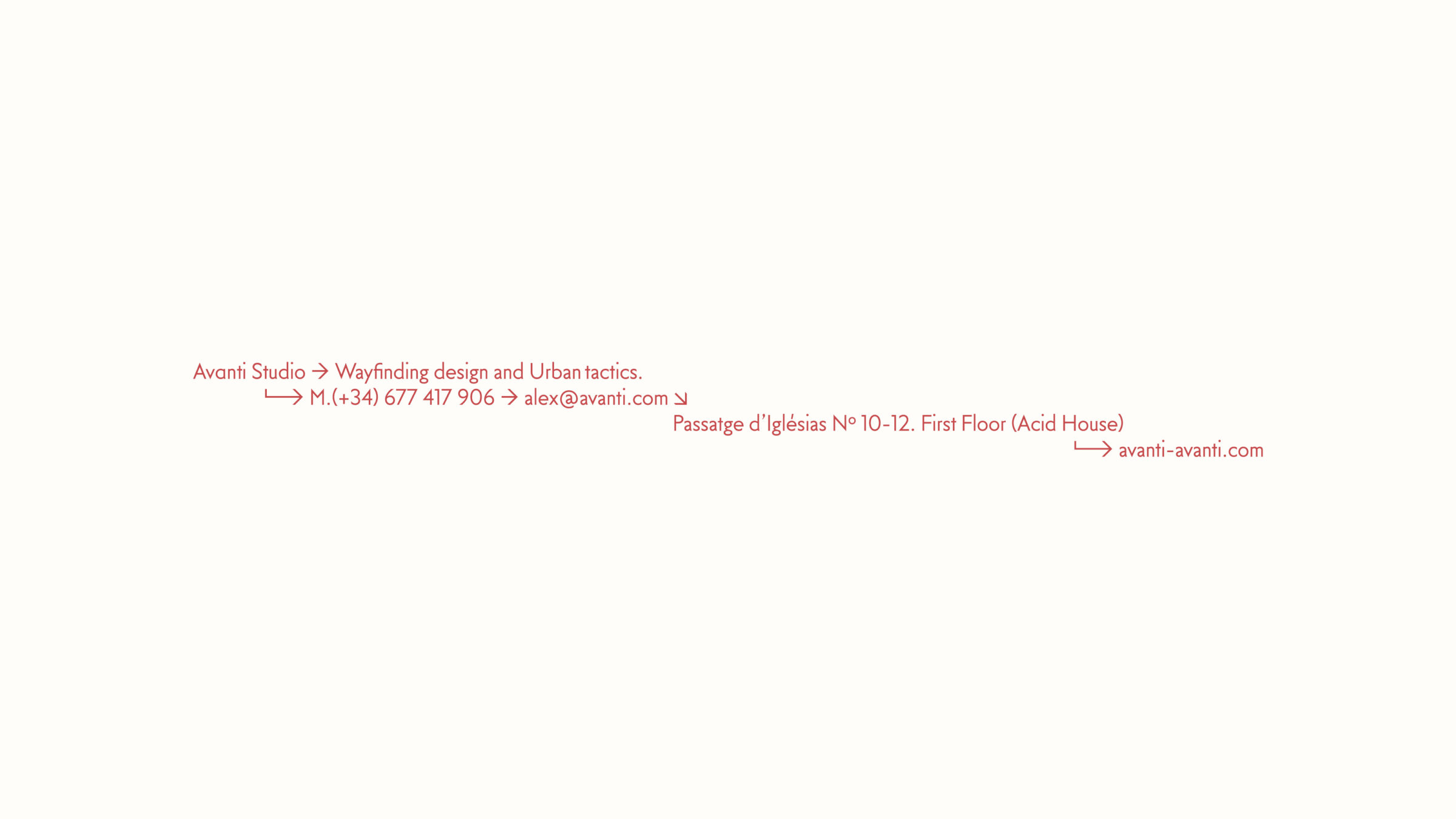
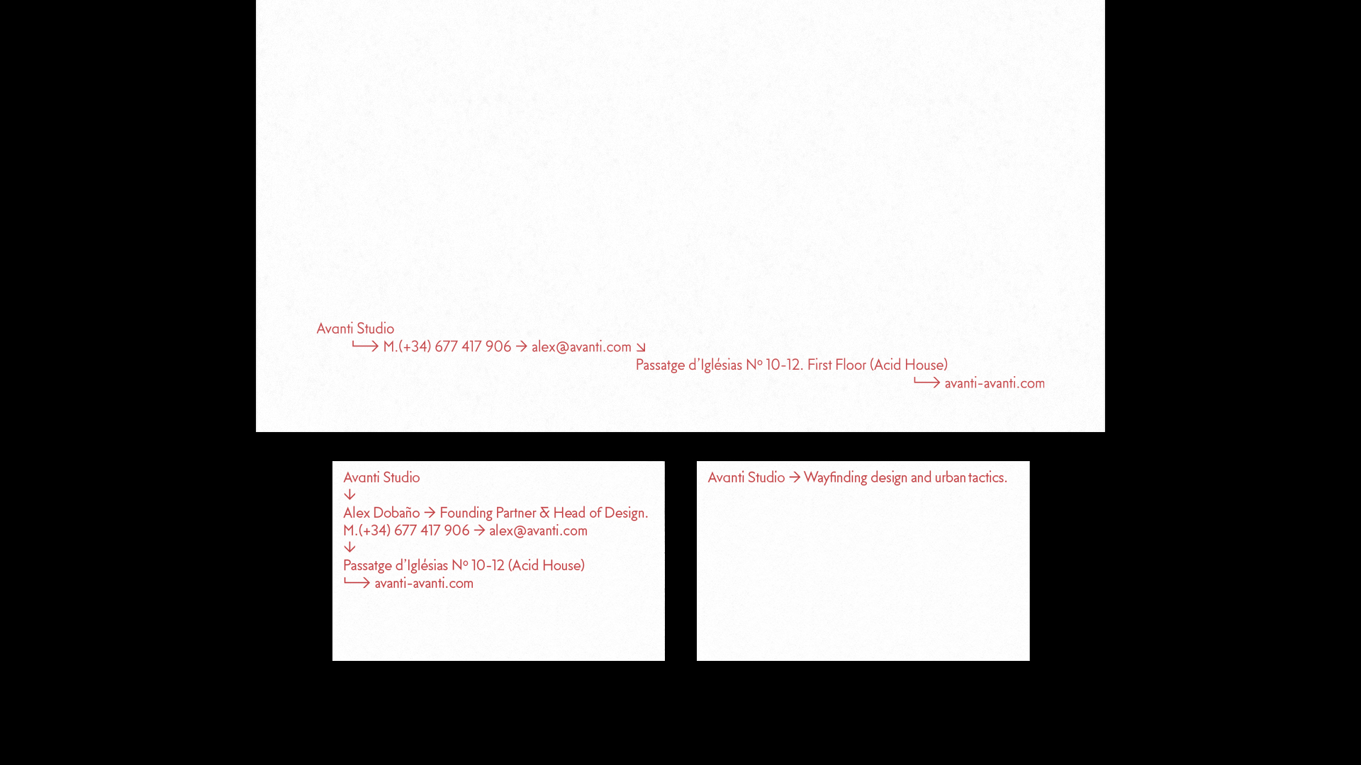
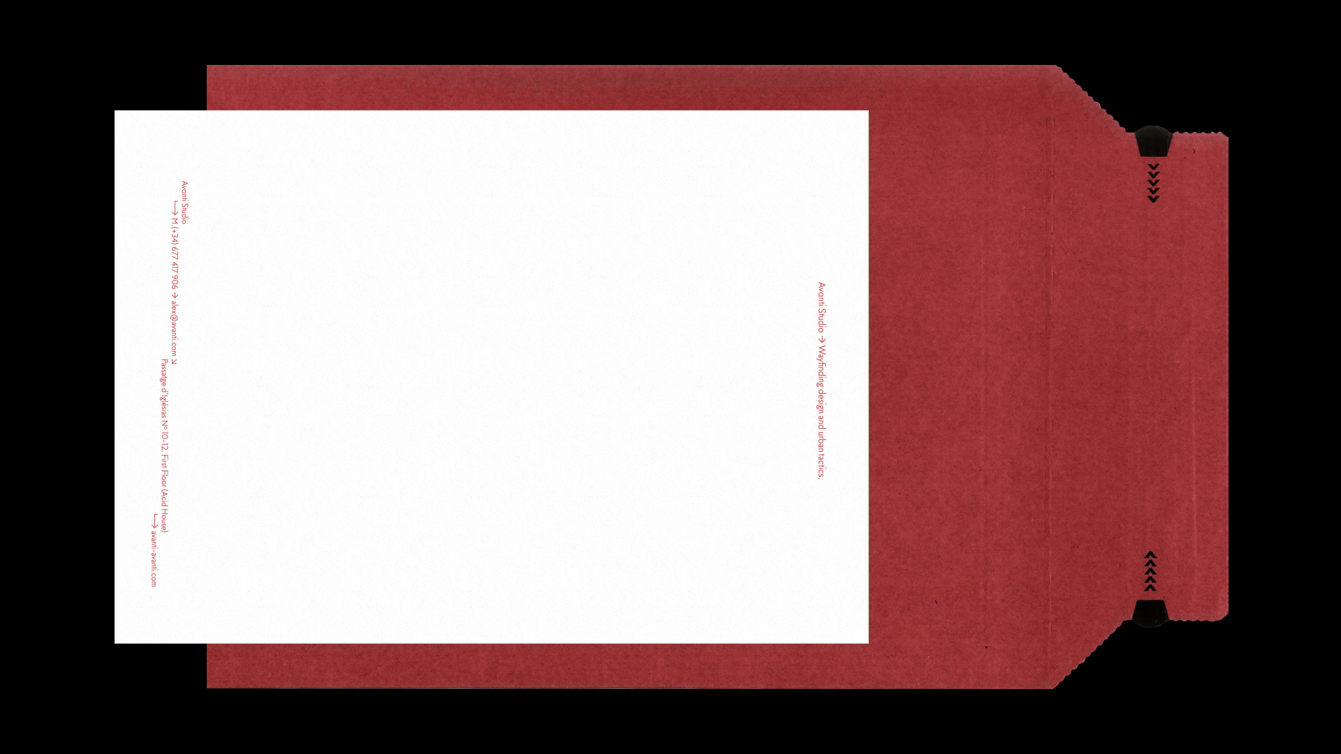
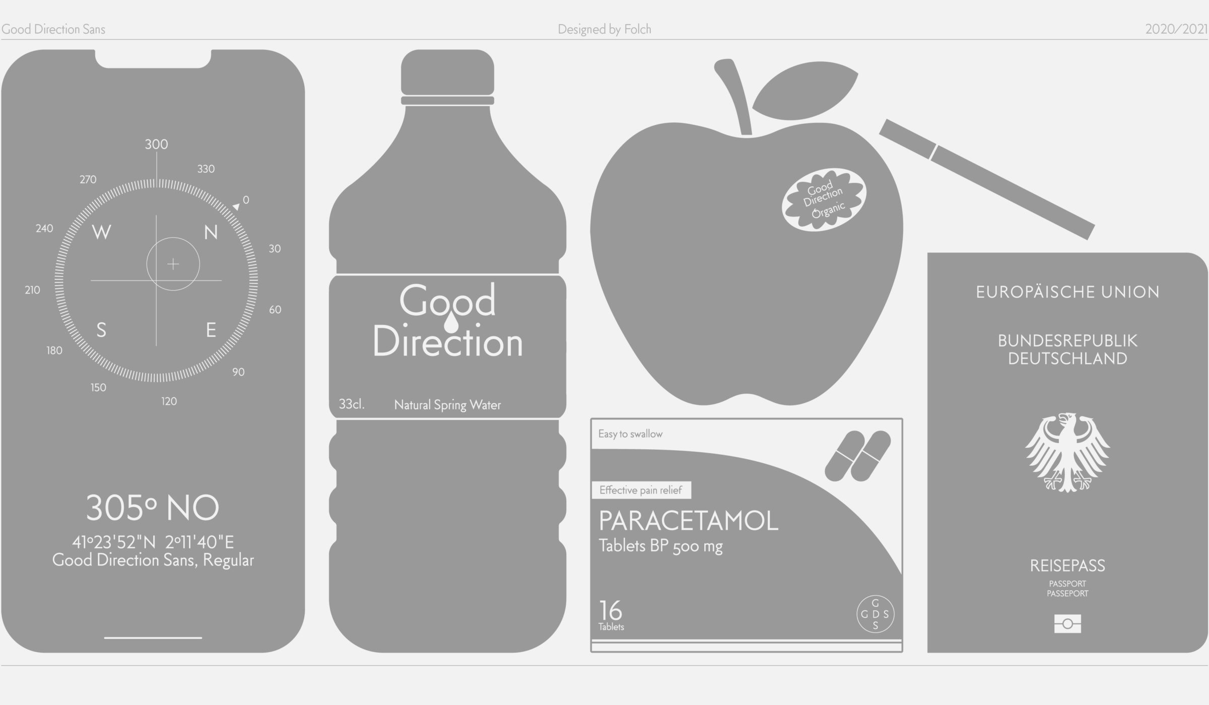
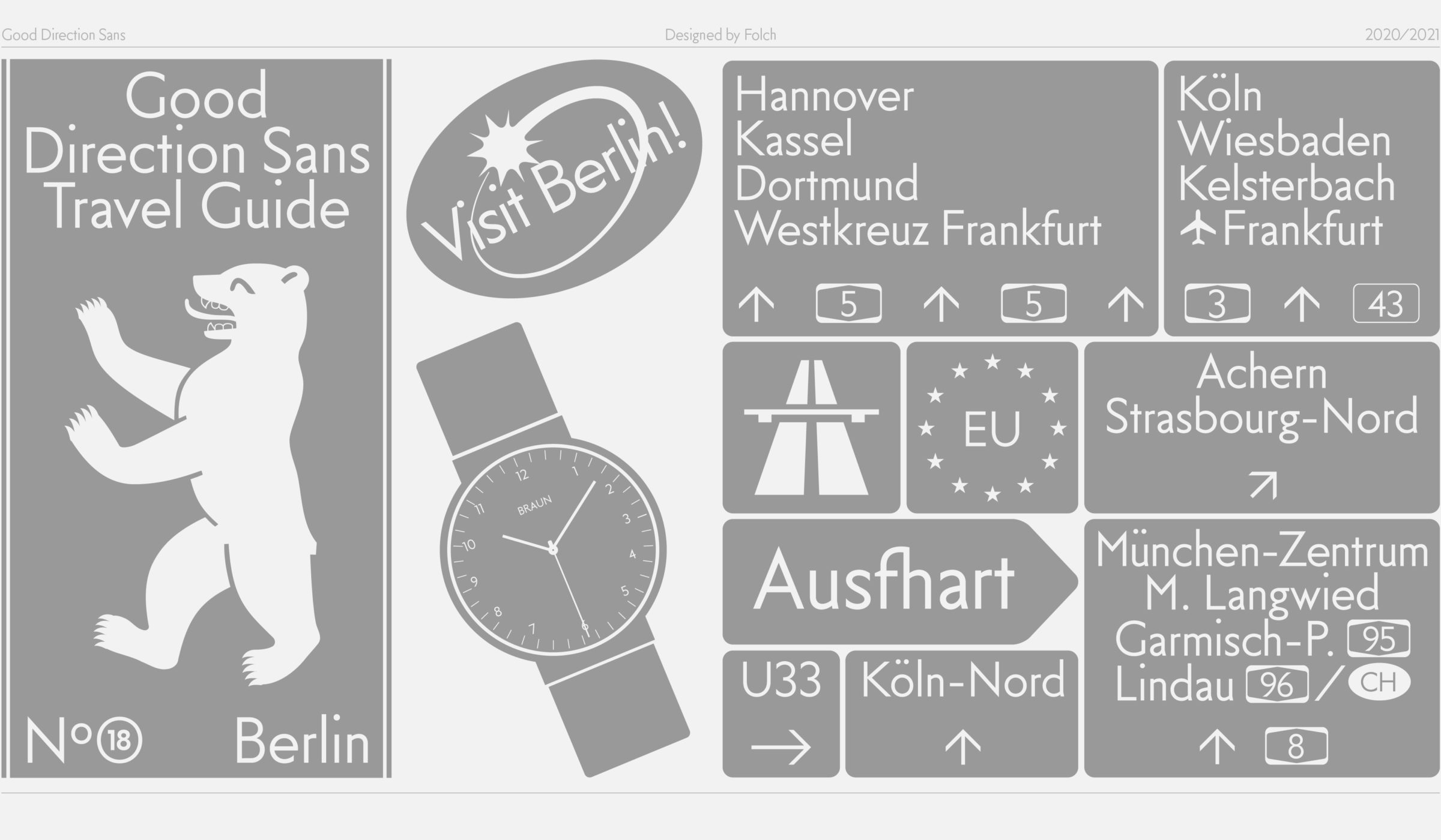
Good Direction Sans was designed by Folch for Avanti, a strategic design agency focused on way-finding design and urban tactics. It translates Avanti’s mission –to enhance the identity, orientation, and narrative of public and corporate spaces– into a custom typeface for their identity.
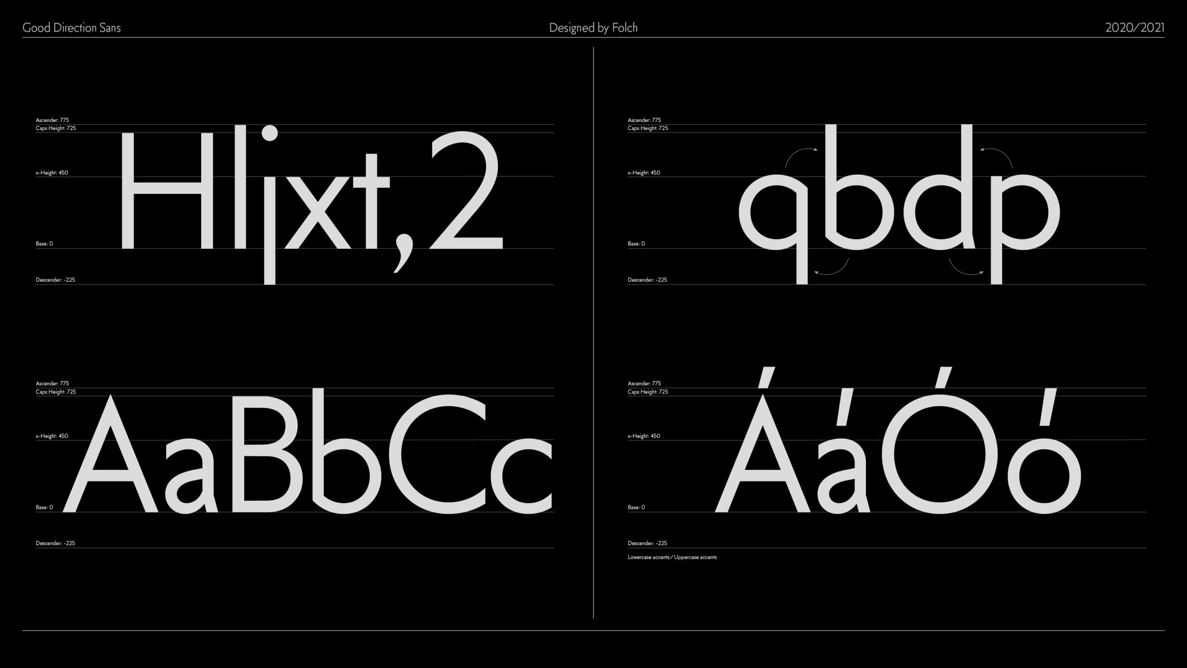
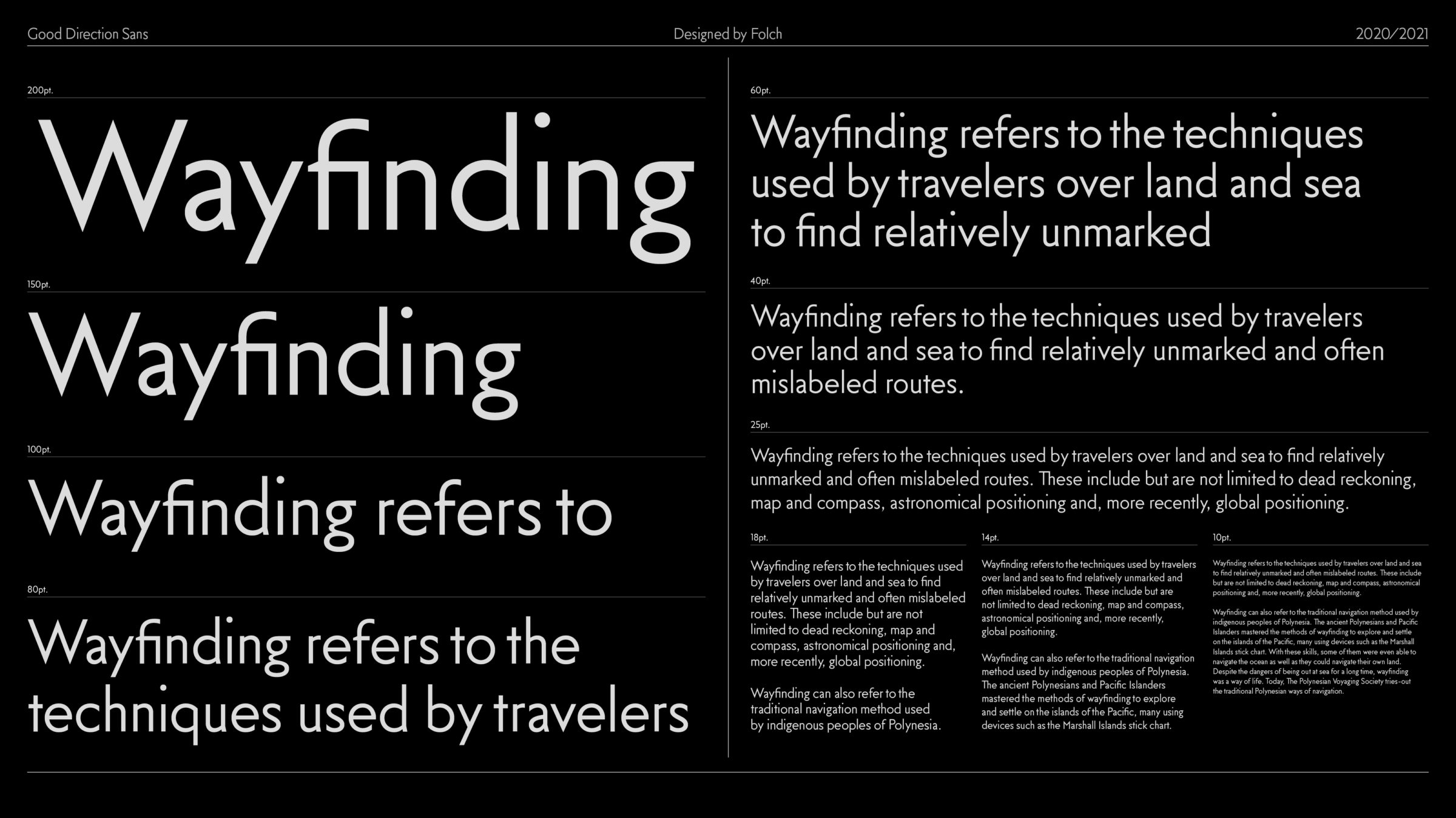
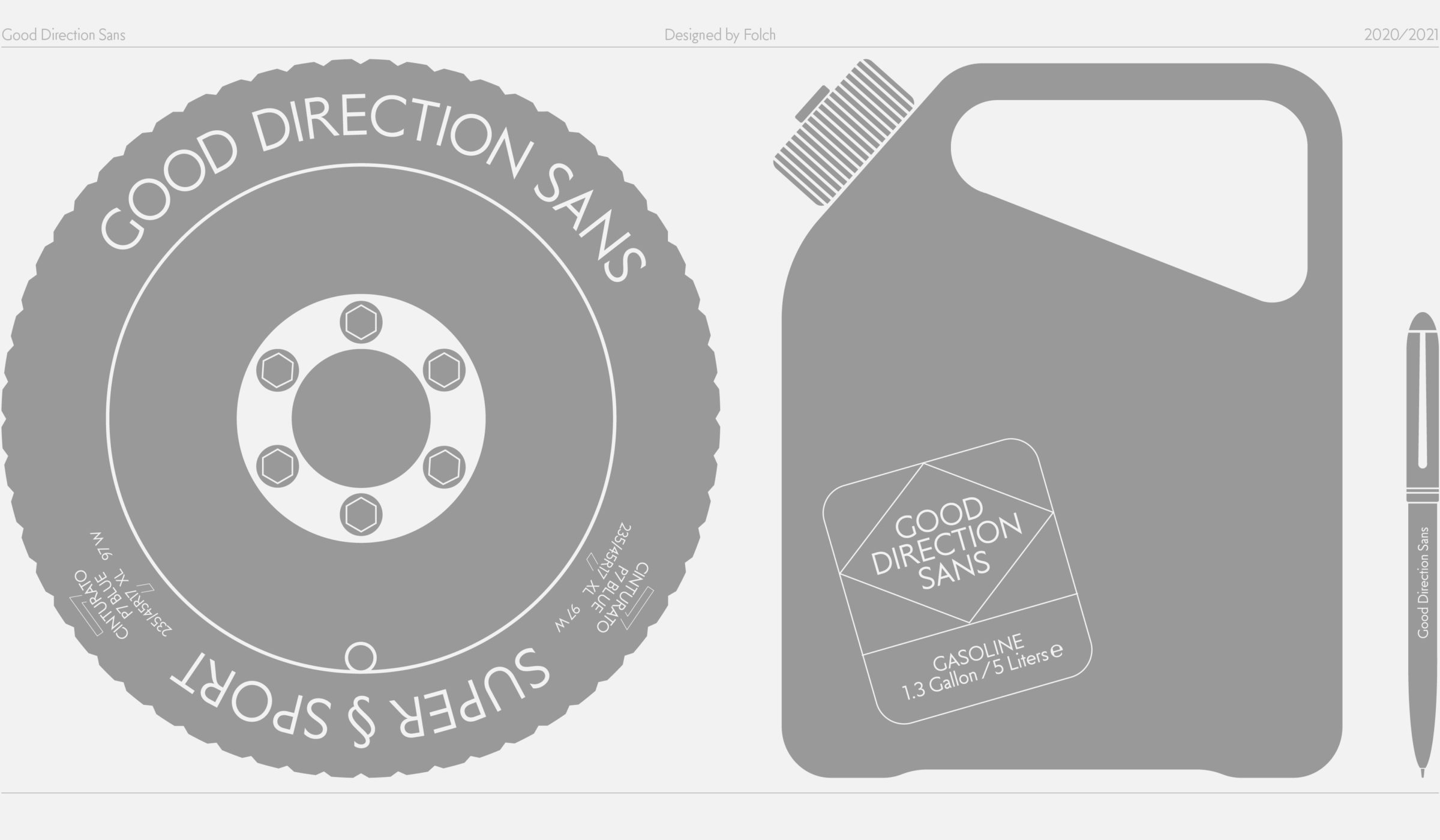
The typeface needed to be very legible to meet the accessibility standards of the Avanti brand while giving a contemporary twist to the classic signage style. Inspired by the influence of geometric and humanist typefaces, it represents the universe of typography used in signage.
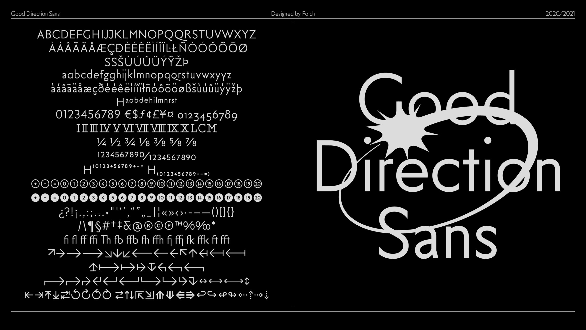
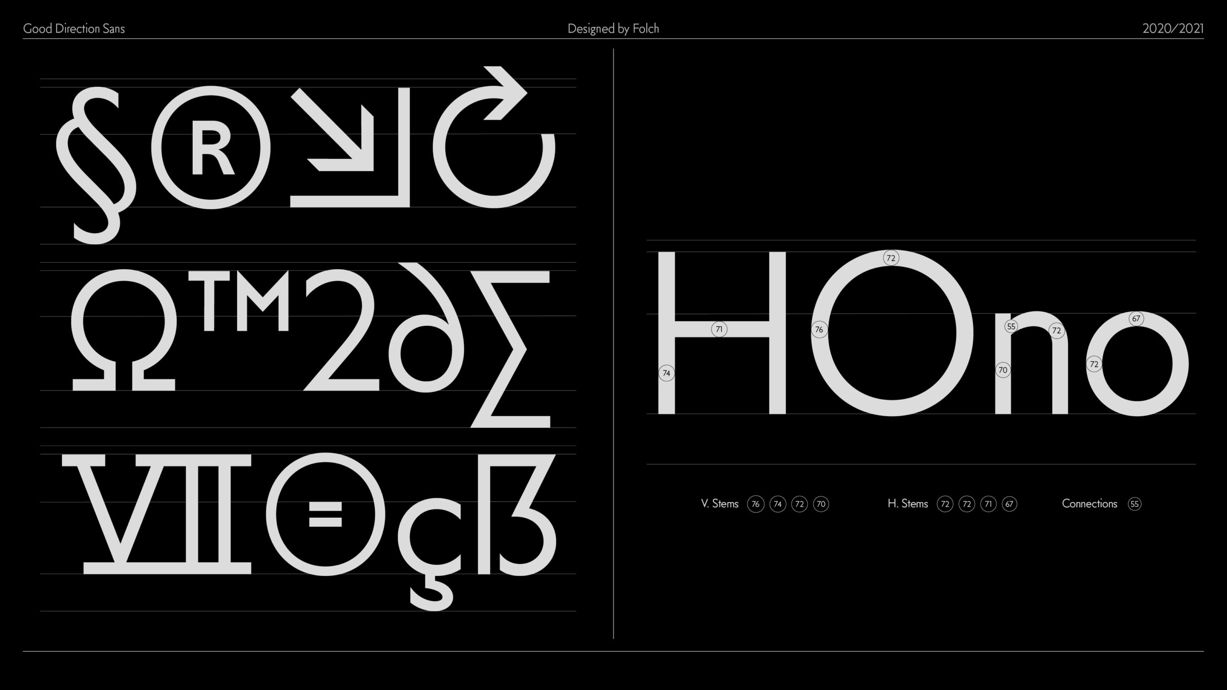
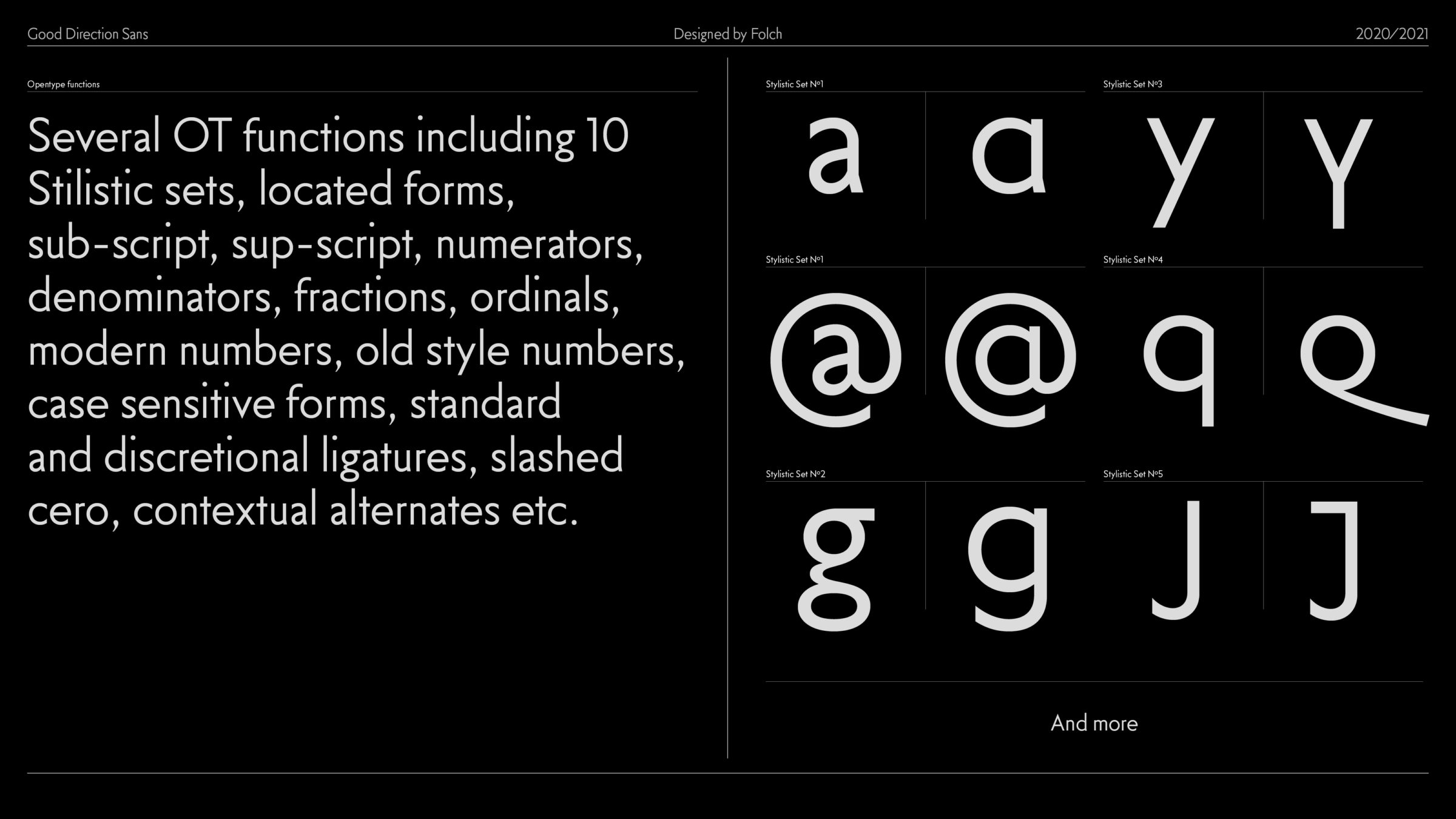
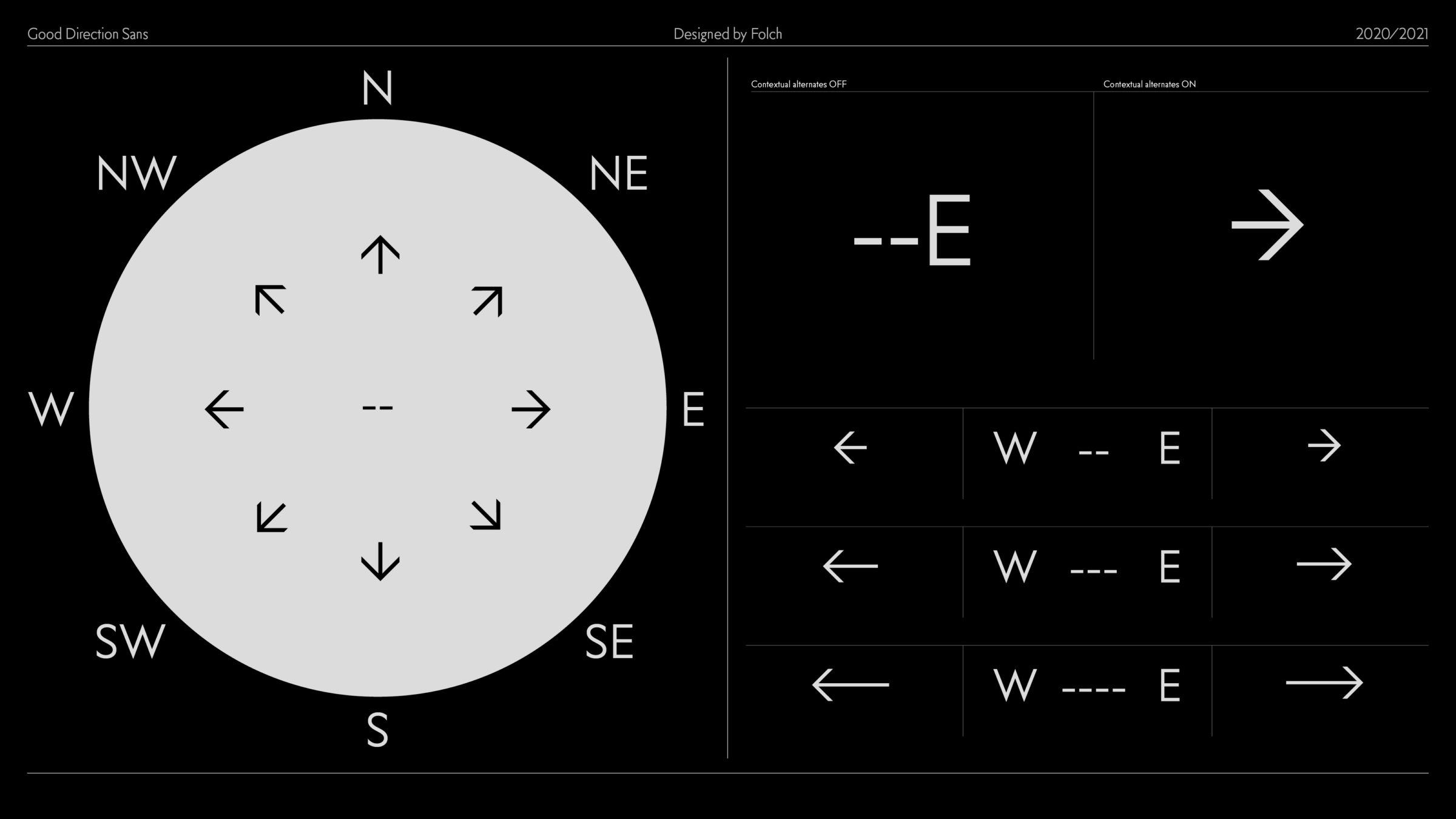
The combination of geometric-based shapes with abrupt unions and open letterforms made the font highly functional and versatile. The different number and stylistic sets and multiple open type functions mean that Good Direction Sans caters to all branding needs. The typeface also includes a wide range of arrows.
“Inspired by the humanist and geometric typefaces used in classic signage, Good Direction Sans is a homage to Avanti’s way-finding history.”
Pablo Fernandez, typeface designer at Folch
“The design of alphabets and typographies is not a momentary whim, but a long-term bet on which we have been working internally for more than a year. We believe it is a discipline that will strengthen the agency’s recognition in the branding sector and reinforce our approach to brand creation.”
Albert Folch, Creative Director & Founder at Folch
“Brands need to develop essential skills in order to be recognised beyond their logotype. Creating a typeface can be a great tool to adapt to the new communications paradigm. For this reason, we decided to license our typeface as a business opportunity allowing for growth in the mid term.”
Rafa Martínez, Founding Partner & Business Development Manager at Folch