Tags: Branding, Identity, Naming, Web design
Concept and Art Direction by Folch
Illustration by Camilo Huinca
Concept and Art Direction by Folch
Illustration by Camilo Huinca

Spanish Tech Center (now, Desafía) is an accelerator programme that facilitates the successful launching of Spanish tech companies in Silicon Valley and the USA. Since its founding in 2011, this initiative created by Red.es and ICEX has been acknowledged as a remarkable element in the most innovative ecosystems, assessing and connecting businesses with key agents and experts. Now it was time to take the leap and to transfer the brand’s mood from a San Francisco-based center to a global community that congregates entrepreneurs, mentors and established companies from all over the world – and this meant rethinking the brand from the beginning.
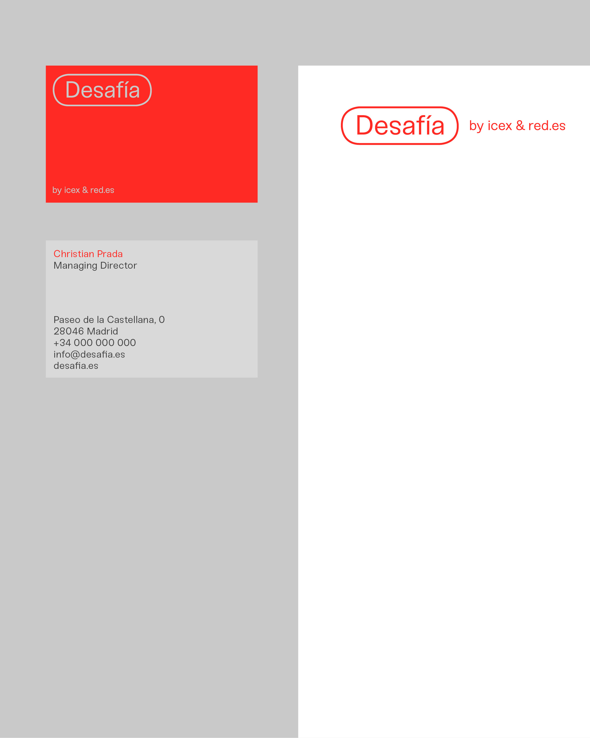
The naming was essential in attracting entrepreneurs and encouraging them to embark on this voyage. Desafía is based on the concept of ‘challenge’ – this helped us project the brand towards a feeling of transformation and give it a more humanistic voice. Unlike Spanish Tech Center, the new identity both connects with the Spanish community as a recognizable word and communicates a certain disruptive value.
Public institutions need a more appealing approach to their communication. They focus a lot on giving order and sense to the information, without instead keeping in mind that people receive thousands of messages a day. In communicative terms, audiences do not discern public from private or commercial. This is where we started with Desafía.
Rafa Martínez, COO & Head of Brand Strategy, Folch
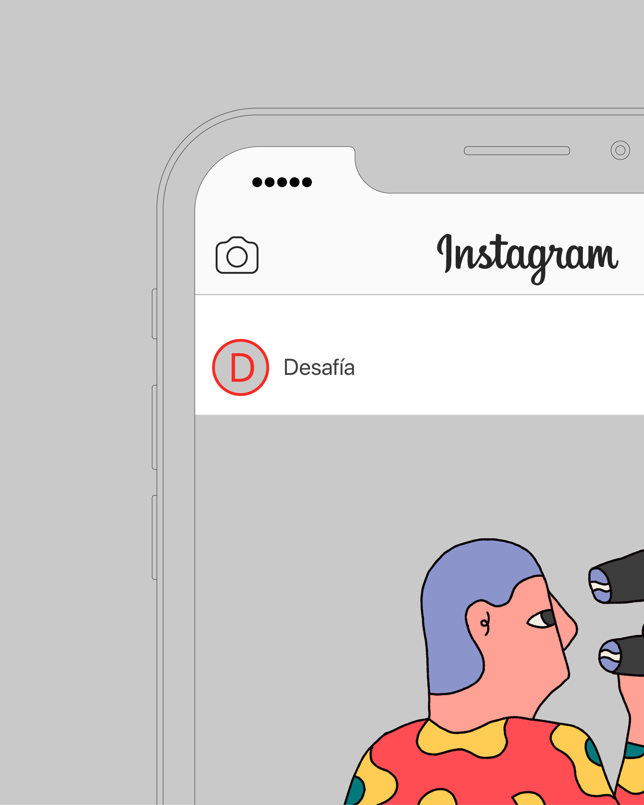
The new look needed to match this evolution and reflect a more contemporary vision, without losing its established heritage. Encapsulating the logo in the shape of an icon or tag, we refer to the buttons of the digital language, communicating the brand’s association with contemporary technology and the online environment. In addition, this new visual identity communicates their key values, helping tech companies transition to a new stage.
Using Sneak by Fabian Fohrer became our answer to address a more personal dialogue. In contrast with the solemnity of the typeface skeleton, the inverted characters created a crucial graphic richness, helping to strengthen a transgressive identity.
We decided to stick with black, grey and white as primary colours, as a way to maintain simplicity, using a vibrant red for key highlights to reflect the ideas of growth and creativity.
Oriol Corsà, Junior Designer, Folch
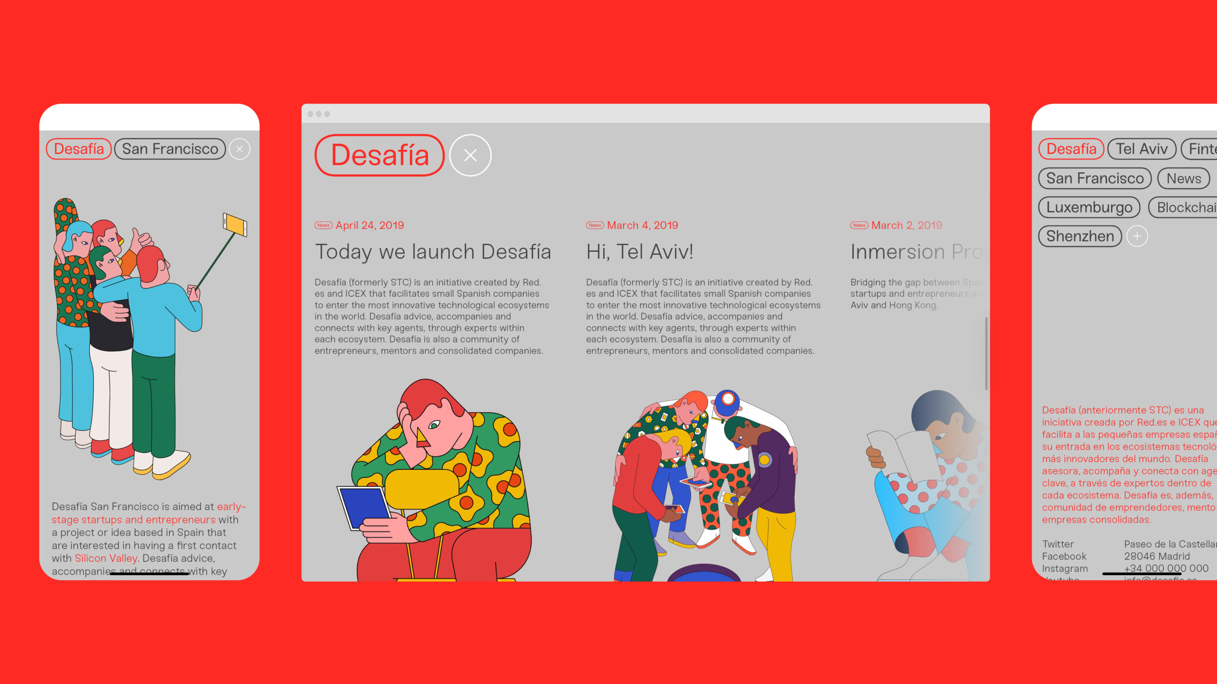
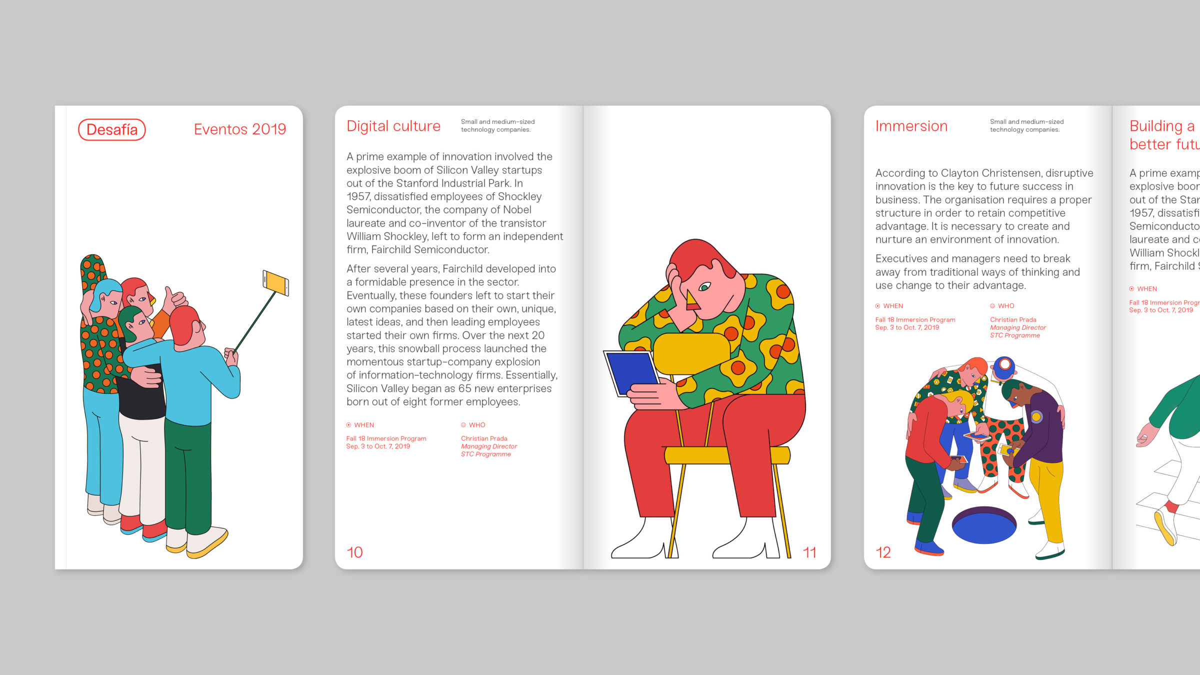
In its various programmes, Desafía works with very abstract concepts. Camilo Huinca was selected as the illustrator to generate a whole new language and to make these ideas easily identifiable. This allowed us to bring together all the pieces of the puzzle through a contemporary, colorful and unique visual identity. In addition, we opened up new ways of telling stories, setting up a new content-centred way of communicating that could work across a variety of media, both online and offline.
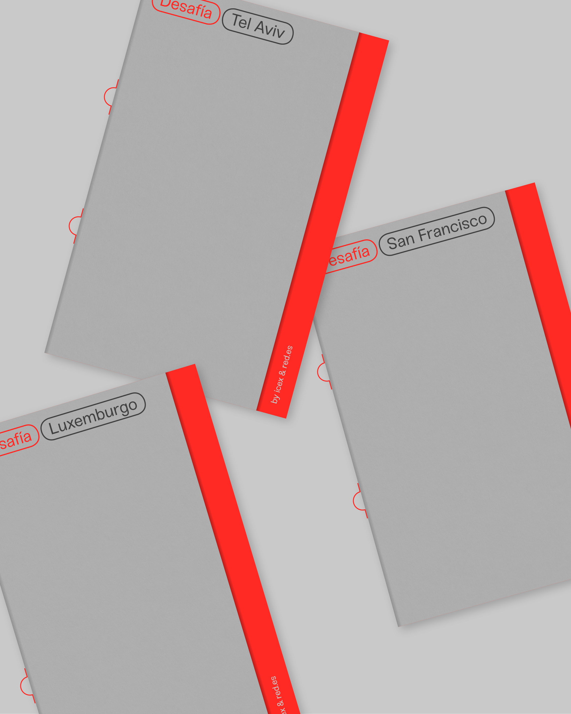
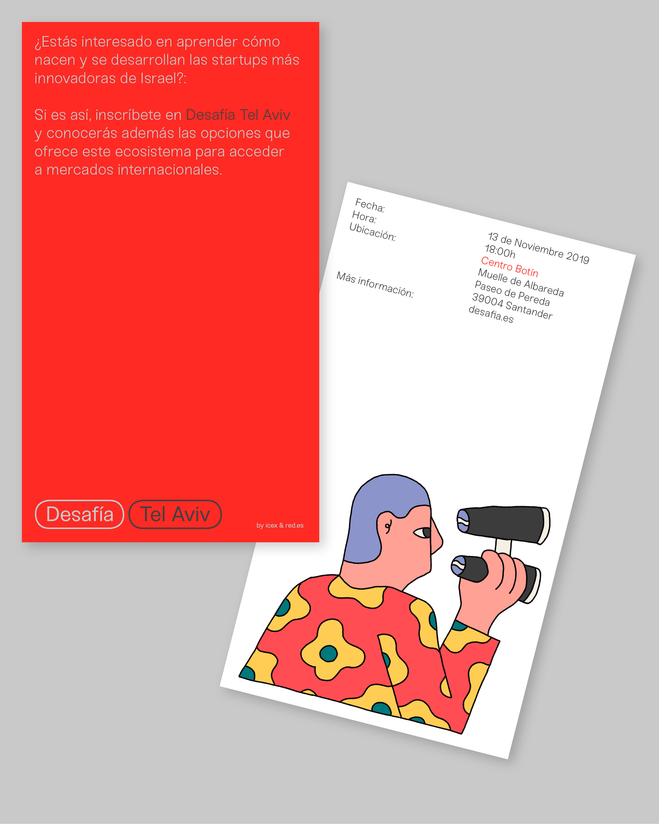
Experiential value was the code at every level. The new infographic system worked in our favour, providing a wide range of possibilities. Under the pretext that the digital environment is part of Desafía’s DNA, the website needed to keep this visual language while relating a switch of paradigm. The resulting landing page works as a general overview of the brand’s programmes, as well as news and events. We also applied and adapted the new visual code to printed assets, such as catalogues and invitations.