The proposal was finally not applied by the client.
-
Share
4,669 views
We were commissioned by publishing house Arpa Editores to redesign their series of book collections. Finally, our proposal was not applied by the client, yet we decided to show the process behind.
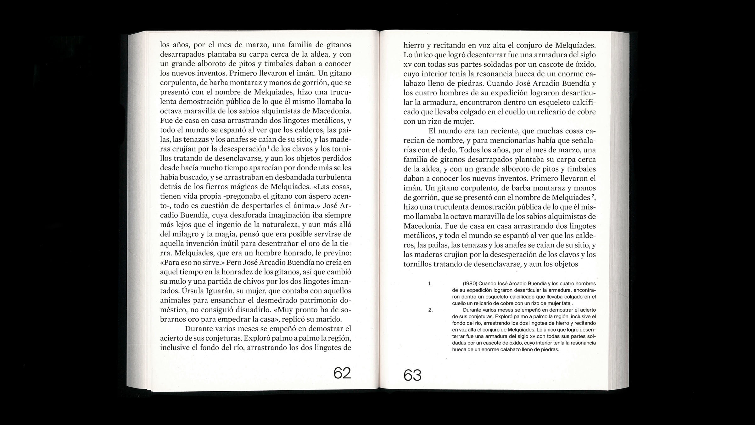
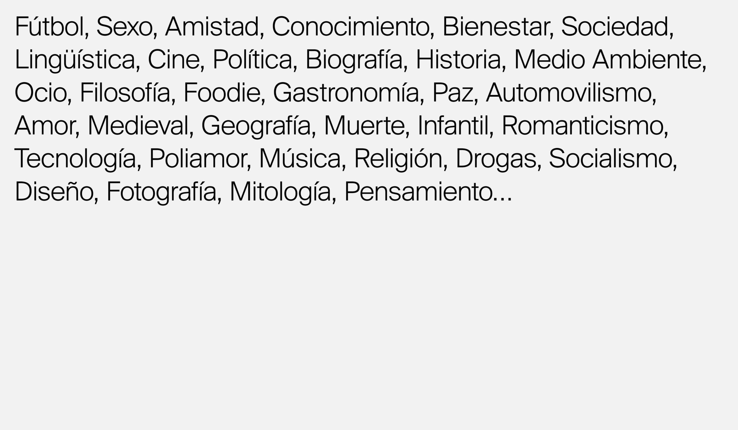
The collections include a wide selection of different publications within different fields of interest, such as politics, sex, history, religion and technology to mention a few. We wanted to move away from strict categorisation (Arpa Ideas, Arpa Benistar, Arpa Empresa) and instead unify the collection under one common determinator: Arpa.
Creating a new language
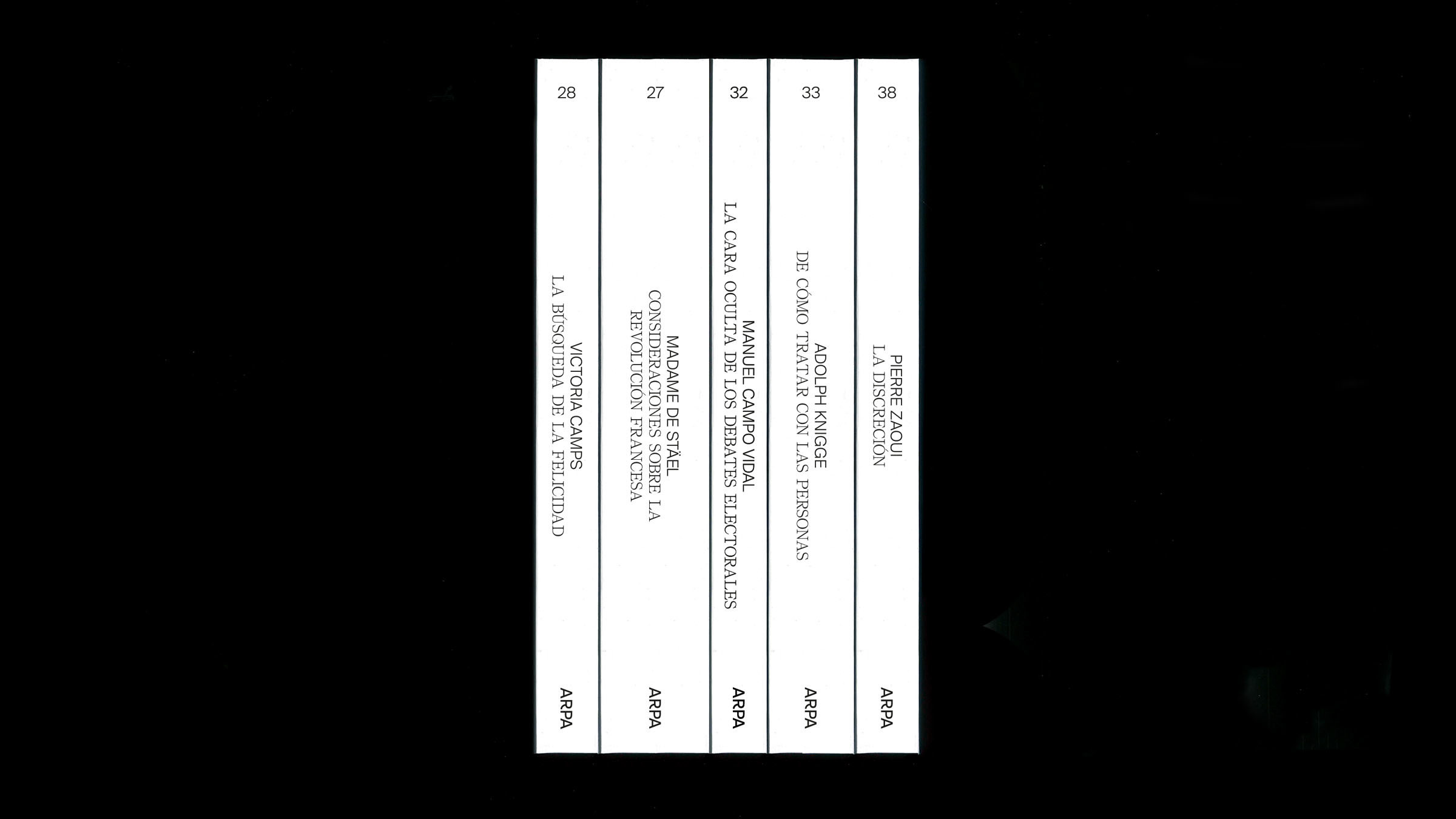
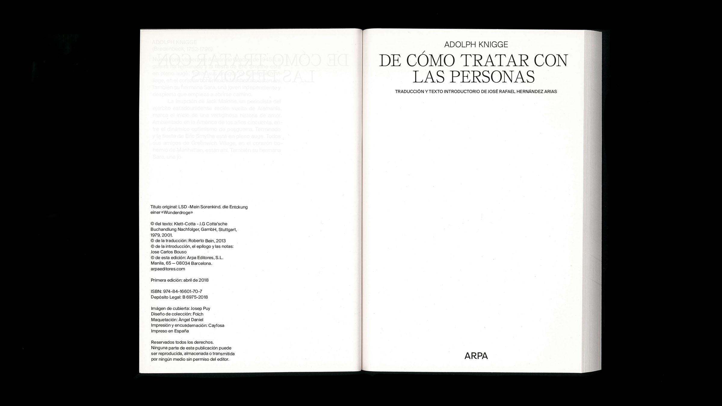
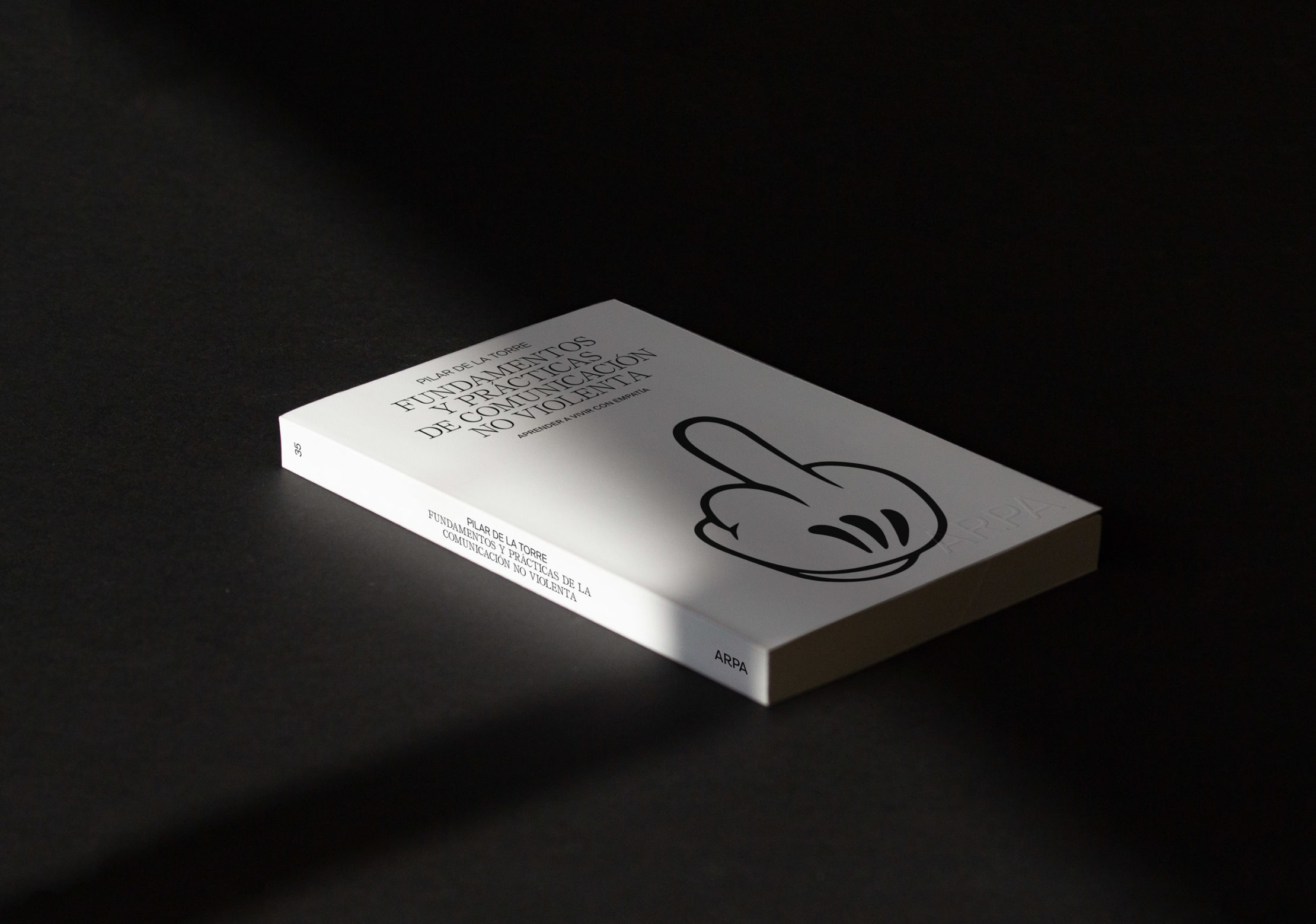
The identity was dated and needed to match their contemporary content. The timeless Suisse Int’l became the protagonist, with a modified “R” to resemble the physical appearance of a folded page in a book. Together with a secondary typeface, Self Modern, we built up a central language, moving across the whole collection, and across every edition.
Finding the crucial match
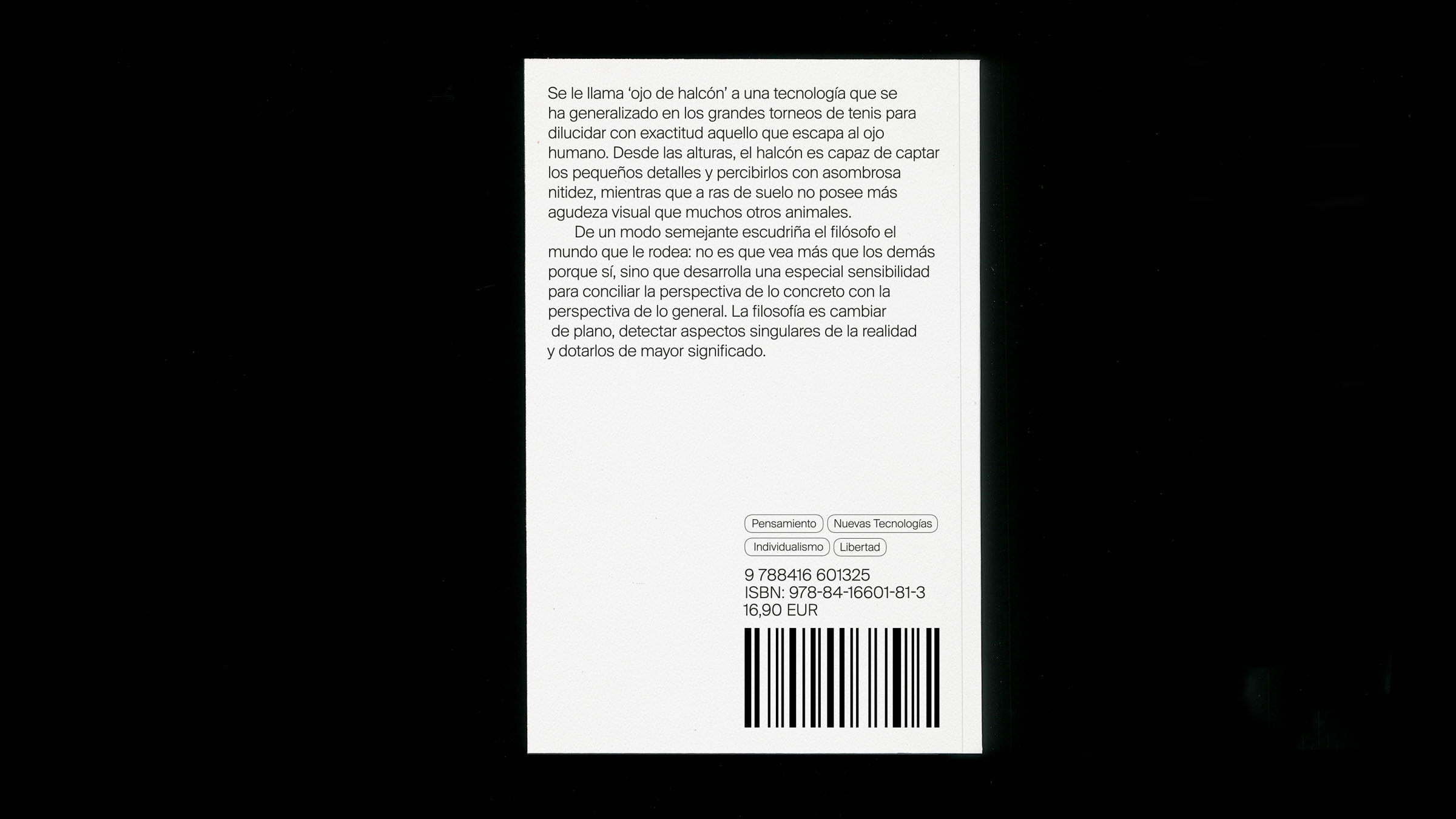
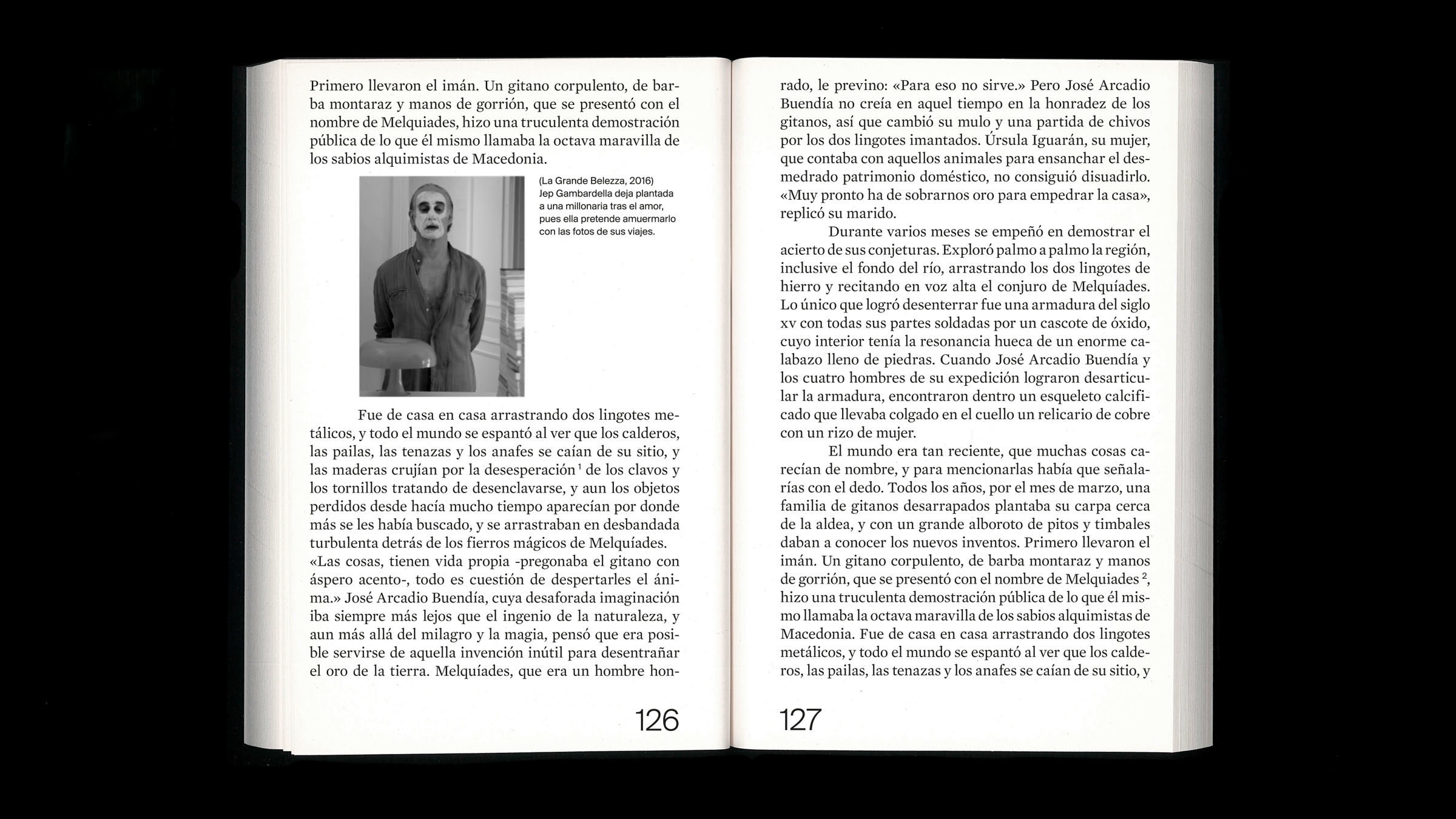
To accompany the strong use of type, the imagery had to be related to the content, yet “out of context”. With abstract illustrations and collages from diverse local and international artist we found an abstract way to convey the message of each title. The importance lay in finding a crucial match – the right artist for the right author.
Adaption for communicative needs
With the titles ranging in four different sizes, we could adapt to each publications’ communicative needs as well as creating an interesting tension. The identity also adapts to the size and thickness of the spines of each edition.